Nov 26, 2025·8 min
How to Build a Web App to Track Operational Bottlenecks
Step-by-step guide to plan, design, and ship a web app that captures workflow data, spots bottlenecks, and helps teams fix delays.
Start With the Problem and the Decisions
A process tracking web app only helps if it answers a specific question: “Where are we getting stuck, and what should we do about it?” Before you draw screens or pick a web application architecture, define what “bottleneck” means in your operation.
Define what counts as a bottleneck
A bottleneck can be a step (e.g., “QA review”), a team (e.g., “fulfillment”), a system (e.g., “payment gateway”), or even a vendor (e.g., “carrier pickup”). Pick the definitions you’ll actually manage. For example:
- A step is a bottleneck when its average queue time exceeds 24 hours.
- A team is a bottleneck when work-in-progress stays above a set threshold for 3 days.
- A system is a bottleneck when incidents cause cycle time to spike beyond an agreed range.
List the decisions the app must enable
Your operations dashboard should drive action, not just reporting. Write down the decisions you want to make faster and with more confidence, such as:
- Staffing: “Do we move one person from Team A to Team B this week?”
- Prioritization: “Which orders/tickets should jump the line to protect SLAs?”
- Automation: “Which step is stable enough (and expensive enough) to automate first?”
Identify primary users and what they need
Different users need different views:
- Ops managers need a clear “where to intervene today” view.
- Team leads need drill-down to individual queues, blockers, and handoffs.
- Analysts need consistent definitions and exports for workflow analytics.
Set success metrics for the app itself
Decide how you’ll know the app is working. Good measures include adoption (weekly active users), time saved on reporting, and faster resolution (reduced time-to-detect and time-to-fix bottlenecks). These metrics keep you focused on outcomes, not features.
Choose the Workflow and Write a Simple Process Map
Before you design tables, dashboards, or alerts, pick a workflow you can describe in one sentence. The goal is to track where work waits—so start small and pick one or two processes that matter and generate steady volume, like order fulfillment, support tickets, or employee onboarding.
A tight scope keeps the definition of done clear and prevents the project from stalling because different teams disagree on how the process should work.
Start with 1–2 high-signal processes
Choose workflows that:
- Happen frequently (enough data to spot patterns)
- Cross at least one handoff (where queues form)
- Have a clear customer impact (time, cost, satisfaction)
For example, “support tickets” is often better than “customer success” because it has an obvious unit of work and timestamped actions.
Map steps and handoffs in plain language
Write the workflow as a simple list of steps using words the team already uses. You’re not documenting policy—you’re identifying states the work item moves through.
A lightweight process map might look like:
- Ticket created → triaged → assigned → agent working → waiting on customer → resolved
At this stage, call out handoffs explicitly (triage → assigned, agent → specialist, etc.). Handoffs are where queue time tends to hide, and they’re the moments you’ll want to measure later.
Define start/end events and “done” for each step
For every step, write two things:
- Start event (what proves the step began?)
- End event (what proves the step finished?)
Keep it observable. “Agent starts investigating” is subjective; “status changed to In Progress” or “first internal note added” is trackable.
Also define what “done” means so the app doesn’t confuse partial completion with completion. For example, “resolved” might mean “resolution message sent and ticket marked Resolved,” not just “work completed internally.”
Note common exceptions you’ll track later
Real operations include messy paths: rework, escalations, missing information, and reopened items. Don’t try to model everything on day one—just write down the exceptions so you can add them intentionally later.
A simple note like “10–15% of tickets are escalated to Tier 2” is enough. You’ll use these notes to decide whether exceptions become their own steps, tags, or separate flows when you expand the system.
Define Metrics That Actually Reveal Bottlenecks
A bottleneck isn’t a feeling—it’s a measurable slowdown at a specific step. Before you build charts, decide which numbers will prove where work piles up and why.
Pick a small set of core measures
Start with four metrics that work across most workflows:
- Cycle time: how long an item takes from start to done.
- Wait/queue time: how long an item sits idle between steps.
- Throughput: how many items are completed per time period.
- WIP (work in progress): how many items are currently “in the system.”
These cover speed (cycle), idleness (queue), output (throughput), and load (WIP). Most “mystery delays” show up as growing queue time and WIP at a particular step.
Define calculations (including edge cases)
Write definitions your whole team can agree on, then implement exactly that.
- Cycle time =
done_timestamp − start_timestamp.- Edge cases: items reopened (treat as a new cycle vs. extend the original), items never started (exclude from cycle time but count in WIP), missing timestamps (flag as data quality).
- Queue time = sum of gaps between steps where status is “waiting.”
- Edge cases: nights/weekends (calendar time vs. business hours), blocked states (count separately from normal waiting if you want clearer causes).
- Throughput = count of items with
done_timestampin the window.- Edge cases: cancellations (exclude or track separately), partial completions.
- WIP = count of items not in a terminal state at a point in time.
- Edge cases: on-hold items (still WIP, but you may want a separate “blocked WIP”).
Choose the breakdowns that drive decisions
Pick slices your managers actually use: team, channel, product line, region, and priority. The goal is to answer, “Where is it slow, for whom, and under what conditions?”
Set time windows and targets
Decide your reporting rhythm (daily and weekly are common) and define targets such as SLA/SLO thresholds (for example, “80% of high-priority items completed within 2 days”). Targets make the dashboard actionable instead of decorative.
Plan Your Data Sources and Collection Method
The fastest way to stall a bottleneck-tracking app is to assume the data will “just be there.” Before you design tables or charts, write down where each event and timestamp will originate—and how you’ll keep it consistent over time.
Inventory the sources you already have
Most operations teams already track work in a few places. Common starting points include:
- Spreadsheets used for handoffs, daily logs, or production counts
- ERP/CRM systems (orders, customers, fulfillment steps)
- Ticketing tools (support queues, change requests, maintenance tasks)
- Internal databases (warehouse scans, job scheduling tables, manufacturing execution data)
For each source, note what it can provide: a stable record ID, a status history (not just the current status), and at least two timestamps (entered step, exited step). Without those, queue time monitoring and cycle time tracking will be guesswork.
Pick a capture method that fits the source
You generally have three options, and many apps end up using a mix:
- API pull: scheduled sync from ERP/CRM/ticketing tools. Simple to reason about, but you’ll need to handle pagination, rate limits, and incremental updates.
- Webhooks: push updates as work changes. Great for near-real-time alerts for bottlenecks, but you must design for retries and out-of-order events.
- Manual entry / CSV upload: useful for teams starting from spreadsheets or edge cases. Make it safe with templates, validation, and clear error messages.
Plan for data quality (because it will happen)
Expect missing timestamps, duplicates, and inconsistent statuses (“In Progress” vs “Working”). Build rules early:
- Prefer an immutable event log over overwriting records
- Deduplicate by source ID + event time + status
- Normalize statuses into your app’s canonical steps
- Flag records that can’t produce reliable cycle time tracking
Decide the refresh cadence
Not every process needs real-time updates. Choose based on decisions:
- Real time: dispatching, support triage, SLA risk
- Hourly: warehouse throughput, queue time monitoring
- Daily: weekly reporting, continuous improvement reviews
Write this down now; it drives your sync strategy, costs, and the expectations for your operations dashboard.
Design a Data Model Built for Time-Based Analysis
A bottleneck-tracking app lives or dies by how well it can answer time questions: “How long did this take?”, “Where did it wait?”, and “What changed right before things slowed down?” The easiest way to support those questions later is to model your data around events and timestamps from day one.
Start with the core entities
Keep the model small and obvious:
- Process: the overall workflow (e.g., “Order Fulfillment”).
- Step: a stage within the process (e.g., “Pick”, “Pack”, “Ship”).
- Work item: the unit that moves through steps (ticket, order, claim).
- Event: a recorded change in state (entered a step, assigned, blocked, completed).
- User/Team and Assignment: who owned the work at a given time.
This structure lets you measure cycle time per step, queue time between steps, and throughput across the whole process without inventing special cases.
Prefer an event log over “current status” fields
Treat every status change as an immutable event record. Instead of overwriting current_step and losing history, append an event like:
- work_item_id
- from_step → to_step (or “entered_step”)
- event_type (assigned, started, blocked, completed)
- event_time
You can still store a “current state” snapshot for speed, but your analytics should rely on the event log.
Make time and traceability non-negotiable
Store timestamps in UTC consistently. Also keep original source identifiers (e.g., Jira issue key, ERP order ID) on work items and events, so every chart can be traced back to a real record.
Capture exceptions without creating busywork
Plan lightweight fields for the moments that explain delays:
- reason_code (standard options like “Waiting on customer”)
- comment (optional text)
- blocked_flag or severity
Keep them optional and easy to fill, so you learn from exceptions without turning the app into a form-filling exercise.
Choose an Architecture That Fits Your Team
Set Up Early Warnings
Create simple threshold rules so bottlenecks get noticed between weekly reviews.
The “best” architecture is the one your team can build, understand, and operate for years. Start by picking a stack that matches your hiring pool and existing skills—common, well-supported choices include React + Node.js, Django, or Rails. Consistency beats novelty when you’re running an operations dashboard that people depend on daily.
Separate concerns so the system stays editable
A bottleneck-tracking app usually works better when you split it into clear layers:
- Ingestion: receiving events (status changes, timestamps, handoffs) from forms, integrations, or imports.
- Storage: a transactional database for reliable writes and audit history.
- Analytics queries: read-optimized queries or views to compute cycle time, queue time, and throughput.
- UI/API: endpoints and screens that keep dashboards fast and predictable.
This separation lets you change one part (for example, adding a new data source) without rewriting everything.
Decide where calculations should live
Some metrics are simple enough to compute in database queries (e.g., “average queue time by step last 7 days”). Others are expensive or need pre-processing (e.g., percentiles, anomaly detection, weekly cohorts). A practical rule:
- Do real-time filters and breakdowns in the database.
- Use background jobs to precompute heavy aggregates and store them for quick dashboard loading.
- Add an analytics layer only if your team will maintain it confidently.
Plan for performance early
Operational dashboards fail when they feel slow. Use indexing on timestamps, workflow step IDs, and tenant/team IDs. Add pagination for event logs. Cache common dashboard views (like “today” and “last 7 days”) and invalidate caches when new events arrive.
If you want a deeper discussion of tradeoffs, keep a short decision record in your repo so future changes don’t drift.
A faster path for teams that want to ship quickly
If your goal is to validate workflow analytics and alerting before committing to a full build, a vibe-coding platform like Koder.ai can help you stand up a first version faster: you describe the workflow, entities, and dashboards in chat, then iterate on the generated React UI and Go + PostgreSQL backend as you refine your KPI instrumentation.
The practical advantage for a bottleneck-tracking app is speed to feedback: you can pilot ingestion (API pulls, webhooks, or CSV import), add drill-down screens, and adjust metric definitions without weeks of scaffolding. When you’re ready, Koder.ai also supports source code export and deployment/hosting, which makes it easier to move from prototype to a maintained internal tool.
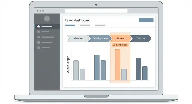
Design the Dashboard and Drill-Down Experience
A bottleneck-tracking app succeeds or fails on whether people can answer one question quickly: “Where is work getting stuck right now, and which items are causing it?” Your dashboard should make that path obvious, even for someone who only visits once a week.
Start with 2–3 core screens
Keep the first release tight:
- Overview dashboard: the “status board” for cycle time, queue time, and top blocked steps.
- Work-item list: a searchable, filterable table of items affected by delays.
- Workflow detail: a step-by-step view that shows time in each stage and handoff points.
These screens create a natural drill-down flow without forcing users to learn a complex UI.
Use visuals that explain time and flow
Pick chart types that match operational questions:
- Stage funnel: shows where volume accumulates (good for spotting queues).
- Time-in-stage bars: compares steps by median and percentile time, not just averages.
- Trend lines: answer “is this getting better or worse?” over weeks.
- Heatmaps: reveal patterns like “Mondays in Review” or “night shift handoffs.”
Keep labels plain: “Time waiting” vs. “Queue latency.”
Make filters consistent and hard to miss
Use one shared filter bar across screens (same placement, same defaults): date range, team, priority, and step. Make the active filters visible as chips so people don’t misread the numbers.
Design clear drill-down paths
Every KPI tile should be clickable and lead somewhere useful:
KPI → step → impacted item list
Example: clicking “Longest queue time” opens the step detail, then a single click shows the exact items currently waiting there—sorted by age, priority, and owner. This turns curiosity into a concrete to-do list, which is what makes the dashboard used instead of ignored.
Add Alerts and Early-Warning Signals
Ship the Core Dashboard
Spin up an ops overview with cycle time, queue time, throughput, and WIP.
Dashboards are great for reviews, but bottlenecks usually hurt most between meetings. Alerts turn your app into an early-warning system: you find problems while they’re forming, not after the week is lost.
Start with clear, boring rules
Begin with a small set of alert types your team already agrees are “bad”:
- Threshold breaches: cycle time or queue time above a known limit (e.g., “Review step > 24 hours”).
- Abnormal increases: today’s median cycle time is up 30% vs last week.
- Stuck items: no status change for N hours/days, or items exceeding a max age.
Keep the first version simple. A few deterministic rules catch most issues and are easier to trust than complex models.
Add lightweight anomaly checks
Once thresholds are stable, add basic “is this weird?” signals:
- Percent change vs last week (same weekday helps reduce false alarms).
- Moving average drift (e.g., 7-day average rising steadily).
- Volume mismatches (input rising faster than output at a step).
Make anomalies suggestions, not emergencies: label them as “Heads up” until users confirm they’re useful.
Deliver alerts where people work
Support multiple channels so teams can choose what fits:
- Email for managers and daily summaries
- Slack/Microsoft Teams for real-time triage
- In-app notifications for owners inside the tool
Make every alert actionable
An alert should answer “what, where, and what next”:
- Which step is affected, and the time window
- The top drivers (e.g., team, category, priority)
- A direct link to investigate, like:
/dashboard?step=review&range=7d&filter=stuck
If alerts don’t lead to a concrete next action, people will mute them—so treat alert quality as a product feature, not an add-on.
Handle Permissions, Security, and Auditability
A bottleneck-tracking app quickly becomes a “source of truth.” That’s great—until the wrong person edits a definition, exports sensitive data, or shares a dashboard outside their team. Permissions and audit trails aren’t red tape; they protect trust in the numbers.
Define roles and access rules
Start with a small, clear role model and grow it only when needed:
- Viewer: read-only access to dashboards and reports.
- Manager: can filter by team, create saved views, acknowledge alerts, and add notes (but can’t change global settings).
- Admin: manages process definitions, KPI formulas, integrations, and user access.
Be explicit about what each role can do: view raw events vs. aggregated metrics, export data, edit thresholds, and manage integrations.
Separate data by team or business unit
If multiple teams use the app, enforce separation at the data layer—not just in the UI. Common options:
- Multi-tenant: every record has a
tenant_id, and every query is scoped to it. - Partitions/projects: separate “workspaces” per business unit, with independent settings and dashboards.
Decide early whether managers can view other teams’ data. Make cross-team visibility a deliberate permission, not a default.
Secure authentication (SSO or MFA-ready)
If your organization has SSO (SAML/OIDC), use it so offboarding and access control are centralized. If not, implement a login that’s MFA-ready (TOTP or passkeys), supports password resets safely, and enforces session timeouts.
Make changes auditable
Log the actions that can change outcomes or expose data: exports, threshold changes, workflow edits, permission updates, and integration settings. Capture who did it, when, what changed (before/after), and where (workspace/tenant). Provide an “Audit Log” view so issues can be investigated quickly.
Turn Insights Into Actions and Process Improvements
A bottleneck dashboard only matters if it changes what people do next. The goal of this section is to turn “interesting charts” into a repeatable operating rhythm: decide, act, measure, and keep what works.
Create a lightweight bottleneck review
Set a simple weekly cadence (30–45 minutes) with clear owners. Start with the top 1–3 bottlenecks by impact (e.g., highest queue time or biggest throughput drop), then agree on one action per bottleneck.
Keep the workflow small:
- Owner: one accountable person per action
- Due date: next review by default
- Definition of done: a measurable change (not “investigate more”)
Capture decisions directly in the app so the dashboard and the action log stay connected.
Track improvements as experiments
Treat fixes like experiments so you learn quickly and avoid “random acts of optimization.” For each change, record:
- Hypothesis (what’s slowing things down and why)
- Change (what you’ll do)
- Expected impact (which metric should move, and by how much)
- Result (what actually happened)
Over time, this becomes a playbook of what reduces cycle time, what reduces rework, and what doesn’t.
Add context with annotations
Charts can mislead without context. Add simple annotations on timelines (e.g., new hire onboarded, system outage, policy update) so viewers can interpret shifts in queue time or throughput correctly.
Make sharing easy
Provide export options for analysis and reporting—CSV downloads and scheduled reports—so teams can include results in ops updates and leadership reviews. If you already have a reporting page, link to it from your dashboard (e.g., /reports).
Deploy, Monitor, and Keep Data Fresh
Capture Events Reliably
Set up API pulls, webhooks, or CSV import and keep an immutable event log.
A bottleneck-tracking app is only useful if it’s consistently available and the numbers stay trustworthy. Treat deployment and data freshness as part of the product, not an afterthought.
Use separate environments and repeatable deploys
Set up dev / staging / prod early. Staging should mirror production (same database engine, similar data volume, same background jobs) so you can catch slow queries and broken migrations before users do.
Automate deployments with a single pipeline: run tests, apply migrations, deploy, then run a quick smoke check (log in, load the dashboard, verify ingestion is running). Keep deploys small and frequent; it reduces risk and makes rollback realistic.
Monitor the app and the pipeline
You want monitoring on two fronts:
- App health: error rates, latency, slow endpoints, and slow queries.
- Data health: ingestion failures, backlog size, and “time since last event received.”
Alert on symptoms users feel (dashboards timing out) and on early signals (a queue growing for 30 minutes). Also track metric computation failures—missing cycle times can look like “improvement.”
Keep data fresh: late events, corrections, and backfills
Operational data arrives late, out of order, or gets corrected. Plan for:
- Idempotent ingestion (reprocessing the same event doesn’t double-count).
- Backfills for date ranges when a source was down.
- Recomputes when reference data changes (e.g., updated shift calendars).
Define what “fresh” means (e.g., 95% of events within 5 minutes) and show freshness in the UI.
Write runbooks so fixes aren’t guesswork
Document step-by-step runbooks: how to restart a broken sync, validate yesterday’s KPIs, and confirm a backfill didn’t change historical numbers unexpectedly. Store them with the project and link them from /docs so the team can respond quickly.
Iterate With Users and Expand Coverage
A bottleneck-tracking app succeeds when people trust it and actually use it. That only happens after you watch real users try to answer real questions (“Why are approvals slow this week?”) and then tighten the product around those workflows.
Start with a pilot and learn what breaks
Begin with one pilot team and a small number of workflows. Keep the scope narrow enough that you can observe usage and respond quickly.
In the first week or two, focus on what’s confusing or missing:
- Which charts do users misread?
- Where do they get stuck when drilling down?
- What data do they expect to see but can’t find?
- Which operational bottlenecks feel “obvious” to them but aren’t reflected in the app?
Capture feedback in the tool itself (a simple “Was this useful?” prompt on key screens works well) so you’re not relying on memory from meetings.
Validate metrics to prevent “dashboard arguments”
Before expanding to more teams, lock down definitions with the people who will be held accountable. Many rollouts fail because teams disagree on what a metric means.
For each KPI (cycle time, queue time, rework rate, SLA breaches), document:
- Exact start and end events
- Handling of pauses, weekends, and missing timestamps
- How exceptions are counted (cancellations, escalations, reopens)
Then review those definitions with users and add short tooltips in the UI. If you’re adjusting a definition, show a clear changelog so people understand why numbers moved.
Expand coverage without turning the app into a mess
Add features carefully and only when the pilot team’s workflow analytics are stable. Common next expansions include custom steps (different teams label stages differently), additional sources (tickets + CRM + spreadsheets), and advanced segmentation (by product line, region, priority, customer tier).
A useful rule: add one new dimension at a time and verify it improves decisions, not just reporting.
Make onboarding easy and repeatable
As you roll out to more teams, you’ll need consistency. Create a short onboarding guide: how to connect data, how to interpret the operations dashboard, and how to act on alerts for bottlenecks.
Link people to relevant pages inside your product and content, such as /pricing and /blog, so new users can self-serve answers instead of waiting for training sessions.