Jun 29, 2025·8 min
Build a Web App for Centralized Reporting Across Tools
Learn how to design, build, and launch a web app that pulls data from multiple tools into one reporting hub—secure, reliable, and easy to use.
Learn how to design, build, and launch a web app that pulls data from multiple tools into one reporting hub—secure, reliable, and easy to use.
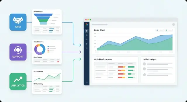
Centralized reporting means pulling data from the tools you already use (CRM, billing, marketing, support, product analytics) into a single place where everyone can view the same numbers—defined the same way—on dashboards that update on a schedule.
In practice, it replaces the “spreadsheet relay race” with a shared system: connectors ingest data, a model standardizes it, and dashboards answer recurring questions without someone rebuilding the report every week.
Most teams build a reporting app for the same reasons:
Centralization also improves accountability: when metric definitions live in one place, it’s easier to spot when a number changes—and why.
Once you can combine sources, you can answer questions that single-tool dashboards can’t, such as:
A centralized reporting app can’t fix problems that originate upstream:
The goal isn’t perfect data on day one. It’s a consistent, repeatable way to improve reporting over time while reducing the daily friction of getting answers.
Centralized reporting only works when it’s built around real decisions. Before you pick tools or write a connector, get clear on who the app is for, what they’re trying to learn, and how you’ll know the project is succeeding.
Most reporting apps serve multiple audiences. Name them explicitly and write down what each group needs to do with the data:
If you can’t explain a dashboard in one sentence to each group, you’re not ready to build it.
Collect the “top 10” questions people ask repeatedly and tie each to a decision. Examples:
This list becomes your backlog. Anything not linked to a decision is a candidate to defer.
Pick measurable outcomes:
Write down what’s in and out: which tools, which teams, and what time range you’ll support (e.g., last 24 months). This prevents a “reporting app” from turning into an endless integration project.
Planning note: aim for a final build plan that supports an article-length implementation guide of roughly 3,000 words—detailed enough to execute, short enough to stay focused.
Before you design pipelines or dashboards, get clear on what data you actually have—and how reliably you can pull it. This prevents two common failures: building reports on the wrong “source of truth,” and discovering late that a key system can only export monthly CSVs.
Start by mapping each business domain to the tool that should “win” when numbers disagree.
Write this down explicitly. It will save hours of debate once stakeholders see metrics side-by-side.
For every tool, record realistic ways to extract data:
Constraints determine refresh cadence, backfill strategy, and even which metrics are feasible.
List what’s required to connect safely:
Store credentials in a secrets manager (not in code or dashboard settings).
Make a simple table: source → entities → fields needed → refresh cadence. For example: “Zendesk → tickets → created_at, status, assignee_id → every 15 minutes.” This matrix becomes your build checklist and your scope control when requests expand.
This choice determines how “real” your numbers feel, how often reports break, and how much you’ll spend on infrastructure and API usage. Most reporting apps end up using a mix, but you still need a clear default.
1) Live queries (pull on demand)
Your app queries each tool’s API when a user loads a dashboard.
2) Scheduled pipelines (ETL/ELT into your storage)
You copy data on a schedule (e.g., hourly/nightly), then dashboards query your own database/warehouse.
Where ETL vs. ELT fits:
3) Hybrid (scheduled + selective live/near-real-time)
Core datasets are scheduled, but a few “hot” widgets (e.g., today’s spend, active incidents) use live queries or more frequent syncs.
Freshness is not free: the closer you get to real time, the more you pay in API calls, caching, and failure handling. Scheduled ingestion is usually the most stable foundation for a reporting product, especially when users expect dashboards to load fast every time.
For most teams: start with scheduled ELT (load raw + lightly normalized data, then transform for metrics), and add near-real time only for a few high-value metrics.
Choose Live Queries if:
Choose Scheduled ETL/ELT if:
Choose Hybrid if:
A centralized reporting app succeeds or fails on two things: a data model people can understand, and metrics that mean the same thing everywhere. Before building dashboards, define the “business nouns” and the exact math behind your KPIs.
Start with a simple, shared vocabulary. Common entities include:
Decide which system is the source of truth for each entity (e.g., billing for invoices, CRM for deals). Your model should reflect that ownership.
Cross-tool reporting requires reliable keys. Prefer joins in this order:
Invest early in mapping tables—they turn “messy but workable” into “repeatable and auditable.”
Write metric definitions like product requirements: name, formula, filters, grain, and edge cases. Examples:
Assign a single owner (finance, revops, analytics) who approves changes.
Pick defaults and enforce them in the query layer:
Treat metric logic as code: version it, include effective dates, and keep a short changelog (“MRR v2 excludes one-time fees from 2025-01-01”). This prevents “the dashboard changed” confusion and makes audits much easier.
A centralized reporting app is only as trustworthy as its pipelines. Think of each connector as a small product: it must pull data consistently, shape it into a predictable format, and load it safely—every time.
Extraction should be explicit about what it requests (endpoints, fields, time ranges) and how it authenticates. Immediately after pulling data, validate basic assumptions (required IDs present, timestamps parse, arrays aren’t unexpectedly empty).
Normalization is where you make the data usable across tools. Standardize:
account_id)Finally, load into your storage in a way that supports fast reporting and safe re-runs.
Most teams run critical connectors hourly and long-tail sources daily. Prefer incremental syncs (e.g., updated_since or a cursor) to keep jobs fast, but design for backfills when mapping rules change or a vendor API was down.
A practical pattern is:
Expect pagination, rate limits, and occasional partial failures. Use retries with exponential backoff, but also make runs idempotent: the same payload processed twice should not create duplicates. Upserts keyed by a stable external ID usually work well.
Store raw responses (or raw tables) next to your cleaned/normalized tables. When a dashboard number looks off, raw data lets you trace what the API returned and which transformation changed it.
Storage is where centralized reporting succeeds or fails. The “right” choice depends less on your tools and more on how people will query: frequent dashboard reads, heavy aggregations, long history, and how many users hit the system at once.
A relational database is a good default when your reporting app is young and your dataset is moderate. You get strong consistency, straightforward modeling, and predictable performance for filtered queries.
Use it when you expect:
Plan for typical reporting patterns: index by (org_id, date) and any high-selectivity filters like team_id or source_system. If you store event-like facts, consider monthly partitions by date to keep indexes small and vacuum/maintenance manageable.
Warehouses are built for analytics workloads: large scans, big joins, and many users refreshing dashboards at once. If your app needs multi-year history, complex metrics, or “slice-and-dice” exploration, a warehouse usually pays off.
Modeling tip: keep an append-only fact table (e.g., usage_events) and dimension tables (orgs, teams, tools) and standardize metric definitions so dashboards don’t re-implement logic.
Partition by date and cluster/sort by fields you filter often (org/team). This reduces scan costs and speeds up common queries.
A lake is great for cheap, durable storage of raw and historical data, especially when you ingest many sources or need to replay transformations.
On its own, a lake isn’t reporting-ready. You’ll typically pair it with a query engine or warehouse layer for dashboards.
Cost is usually driven by compute (how often dashboards refresh, how much data each query scans) more than storage. Frequent “full-history” queries are expensive; design summaries (daily/weekly rollups) to keep dashboards fast.
Define retention rules early: keep curated metric tables hot (e.g., 12–24 months), and archive older raw extracts to the lake for compliance and backfills. For deeper planning, see /blog/data-retention-strategies.
Your backend is the contract between messy, changing data sources and the reports people rely on. If it’s consistent and predictable, the UI can stay simple.
Start with a small set of “always needed” services:
/api/query, /api/metrics).Keep the query layer opinionated: accept a limited set of filters (date range, dimensions, segments) and reject anything that could turn into arbitrary SQL execution.
Centralized reporting fails when “Revenue” or “Active Users” means something different in every dashboard.
Implement a semantic/metrics layer that defines:
Store these definitions in versioned config (database table or files in git) so changes are auditable and rollbacks are possible.
Dashboards repeat the same queries. Plan caching early:
This keeps the UI fast without hiding data freshness.
Choose between:
Whichever you pick, enforce tenant scoping in the query layer—not in the frontend.
Backend support makes reporting actionable:
Design these features as first-class API capabilities so they work everywhere your reports appear.
If you want to ship a working internal reporting app quickly, consider prototyping the UI and API shape in Koder.ai first. It’s a vibe-coding platform that can generate a React frontend plus a Go backend with PostgreSQL from a simple chat-driven spec, and it supports planning mode, snapshots, and rollback—useful when you’re iterating on schemas and metric logic. If you later outgrow the prototype, you can export the source code and continue development in your own pipeline.
A centralized reporting app succeeds or fails in the UI. If the dashboards feel like “a database with charts,” people will keep exporting to spreadsheets. Design the frontend around the way teams ask questions, compare periods, and follow up on anomalies.
Start with the decisions people make. A good top-level navigation often maps to familiar questions: revenue, growth, retention, and support health. Each area can contain a small set of dashboards that answer a specific “so what?” rather than dumping every metric you can compute.
For example, a Revenue section can focus on “How are we doing vs. last month?” and “What’s driving the change?” instead of exposing raw invoice, customer, and product tables.
Most reporting sessions begin with narrowing scope. Put core filters in a consistent, always-visible place and use the same names across dashboards:
Make filters sticky as users move between pages so they don’t have to rebuild context. Also be explicit about time zones and whether dates represent event time or processed time.
Dashboards are for noticing; drill-downs are for understanding. A practical pattern is:
Summary chart → detail table → source record link (when available).
When a KPI spikes, users should be able to click the point, see the underlying rows (orders, tickets, accounts), and jump to the originating tool via a relative link like /records/123 (or a “view in source system” link if you maintain one). The goal is to reduce the “now I need to ask the data team” moment.
Centralized reporting often has known delays—API limits, batch schedules, upstream outages. Surface that reality directly in the UI:
This small element prevents mistrust and endless Slack threads about whether numbers are “wrong.”
To support a dashboard app beyond a small pilot, add lightweight self-serve features:
Self-serve doesn’t mean “anything goes.” It means common questions are easy to answer without rewriting reports or building one-off dashboards for every team.
A centralized reporting app earns trust the same way it loses it: one confusing number at a time. Data quality isn’t a “nice to have” after dashboards ship—it’s part of the product.
Add checks at the edges of your pipelines, before data reaches dashboards. Start simple and expand as you learn failure patterns.
When a validation fails, decide whether to block the load (for critical tables) or quarantine the batch and mark the data as partial in the UI.
People will ask, “Where does this number come from?” Make the answer one click away by storing lineage metadata:
metric → model/table → transformation → source connector → source field
This is invaluable for debugging and for onboarding new teammates. It also prevents metric drift when someone edits a calculation without understanding downstream impact.
Treat pipelines like production services. Log every run with row counts, durations, validation results, and the max timestamp loaded. Alert on:
In the dashboard UI, surface a clear “Data last updated” indicator and a link to a status page like /status.
Provide an audit view for admins that tracks changes to metric definitions, filters, permissions, and connector settings. Include diffs and the actor (user/service), plus a short “reason” field for intentional edits.
Write a short runbook for the most common incidents: expired tokens, API quota exceeded, schema change, and delayed upstream data. Include the fastest checks, an escalation path, and how to communicate impact to users.
Centralized reporting apps often read from multiple tools (CRM, ads, support, finance). That makes security less about a single database and more about controlling every hop: source access, data movement, storage, and what each user can see in the UI.
Create dedicated “reporting” identities in each source tool. Grant the smallest scope required (read-only, specific objects, specific accounts) and avoid using personal admin tokens. If a connector supports granular scopes, prefer them—even if it takes longer to set up.
Implement role-based access control in your app so permissions are explicit and auditable. Common roles include Admin, Analyst, and Viewer, plus “Business Unit” variants.
If different teams should only see their own customers, regions, or brands, add optional row-level rules (e.g., region_id IN user.allowed_regions). Keep these rules server-side, enforced in the query layer—not just hidden in the dashboard.
Store API keys and OAuth refresh tokens in a secrets manager (or encrypted at rest if that’s your only option). Never ship secrets to the browser. Build rotation into operations: expiring credentials should fail gracefully with clear alerts, not silent data gaps.
Use TLS everywhere: browser to backend, backend to sources, and backend to storage. Enable encryption at rest for your database/warehouse and backups where your stack supports it.
Write down how you handle PII: what fields you ingest, how you mask or minimize them, and who can access raw vs. aggregated views. Support deletion requests (user/customer) with a repeatable process. Keep access logs for authentication events and sensitive report exports so audits are possible.
Shipping a reporting app isn’t a one-time “go live.” The fastest way to keep trust is to treat deployment and operations as part of the product: predictable releases, clear expectations for data freshness, and a maintenance rhythm that prevents silent breakage.
Set up at least three environments:
For test data, prefer a mix: a small, versioned dataset for deterministic tests, plus a “synthetic but realistic” dataset that exercises edge cases (missing values, refunds, timezone boundaries).
Add automated checks before every deploy:
If you publish metric definitions, treat them like code: review, version, and release notes.
Centralized reporting systems usually bottleneck in three places:
Also track API limits per source. A single new dashboard can multiply calls; protect sources with request throttling and incremental syncs.
Define expectations in writing:
A simple /status page (internal is fine) reduces repeated questions during outages.
Plan recurring work:
If you want a smooth cadence, schedule “data reliability” sprints every quarter—small investments that prevent big firefights later.
Centralized reporting pulls data from multiple systems (CRM, billing, marketing, support, product analytics) into one place, standardizes definitions, and serves dashboards on a schedule.
It’s meant to replace ad-hoc exports and one-off spreadsheets with a repeatable pipeline + shared metric logic.
Start by identifying primary user groups (leadership, ops, finance, sales, support, analysts) and collecting the top recurring questions tied to decisions.
If you can’t describe a dashboard’s purpose in one sentence for each audience, narrow scope before building anything.
Define measurable outcomes like:
Pick a few and track them from the first pilot to avoid “we shipped dashboards, but nobody uses them.”
Use a “source of truth by domain” map: billing/ERP for revenue, helpdesk for tickets, CRM for pipeline, etc.
When numbers disagree, you’ll have a pre-agreed winner—reducing debates and preventing teams from cherry-picking the dashboard they like best.
Live queries hit external APIs when a dashboard loads; scheduled ETL/ELT copies data into your own storage on a cadence; hybrid mixes both.
Most teams should start with scheduled ELT (load raw, transform for metrics) and add near-real-time only for a small set of high-value widgets.
A semantic (metrics) layer defines KPI formulas, allowed dimensions, filters, time logic, and versions the definitions.
It prevents “Revenue” or “Active Users” from being calculated differently across dashboards and makes changes auditable and reversible.
Prefer joins in this order:
external_id)crm_account_id ↔ billing_customer_id)Investing in mapping tables early makes cross-tool reporting repeatable and debuggable.
Build connectors to be idempotent and resilient:
updated_since/cursor) + bounded backfillsExpect schema drift and partial failures; design for them upfront.
Choose based on query patterns and scale:
Cost is often driven by compute scans; add rollups/summaries to keep dashboards fast.
Centralization doesn’t fix upstream issues:
A reporting app makes problems visible; you still need data governance, instrumentation, and cleanup to improve accuracy over time.