Mar 30, 2025·8 min
How to Build a Website for AI Tool Explainers & Tutorials
Plan, design, and launch a clear site for AI tool explainers and tutorials with the right structure, SEO basics, UX patterns, and ongoing upkeep.
Clarify Goals, Audience, and Success Metrics
Before you pick a theme or write your first tutorial, decide what this site is for and who it serves. A clear goal keeps your content focused, your navigation simple, and your calls-to-action natural.
Define your audience (and their starting point)
Most AI tool tutorial sites actually have multiple audiences. Be explicit about which one you’re prioritizing first:
- Beginners who need plain-English explanations and “what to click” steps
- Teams who care about workflows, permissions, and repeatability
- Developers who want API examples, edge cases, and quick reference
Write down 2–3 primary reader questions your site should answer quickly (e.g., “Is this tool right for me?”, “How do I get my first result?”, “How do I avoid common mistakes?”). These questions become your content north star.
List the outcomes you want
Tutorial traffic is only valuable if it leads somewhere. Choose 1–2 primary outcomes and support them consistently across pages:
- Explain the tool clearly (reduce confusion and support requests)
- Teach real usage (help users succeed and stick around)
- Drive sign-ups (convert readers into trials, demos, or newsletters)
If sign-ups matter, decide what “conversion” means for you: newsletter, free trial, demo request, or click-through to /pricing.
Pick success metrics you can actually track
Avoid vague goals like “more awareness.” Use measurable signals:
- Newsletter sign-ups, trial clicks, demo requests
- Time on tutorial, scroll depth, completion rate
- Return visits to tutorial series pages
Choose a consistent voice and reading level
Set a default reading level (often “smart friend, not a textbook”). Define a few style rules: short sentences, explain terms once, and always include a quick “You’ll learn” intro plus a clear “Next step” at the end.
Plan the Site Structure and Navigation
A good AI tutorial site feels predictable: readers always know where they are, what to read next, and how to get help. Start by deciding your top-level navigation, then build categories and internal links that guide people from “what is this tool?” to “how do I use it?”
Core top-level pages
Keep the main menu focused on the paths people actually take:
- Home: your promise and best starting points.
- Tutorials: step-by-step guides with clear outcomes.
- Tool Explainers: plain-English overviews, features, limitations, and examples.
- Blog: updates, opinions, comparisons, and lighter content.
- Pricing (if relevant): keep it straightforward.
- About and Contact: credibility and an easy way to reach you.
If you want to reduce clutter, group secondary items under “Company” or in the footer.
Trust and support pages (often in the footer)
Tutorial sites build confidence when readers can quickly verify what’s happening and where to get answers:
- FAQ (/faq)
- Changelog (/changelog)
- Status (/status)
- Terms (/terms) and Privacy (/privacy)
Choose a category structure that matches intent
Pick one primary organizing axis so pages don’t feel duplicated:
- By use case (e.g., “Summarize PDFs,” “Write email replies”)
- By skill level (Beginner → Advanced)
- By feature/workflow (Prompting, Integrations, Automation)
You can still filter by the others, but keep URLs and breadcrumbs consistent.
Plan internal links on purpose
Each Tool Explainer should link to “next steps” tutorials (“Try it now”), and each Tutorial should link back to the relevant explainer (“Understand the feature”). Add “Related tutorials” and “Works with” sections to create a loop that keeps readers moving forward without feeling lost.
Design Repeatable Page Templates
When your site publishes lots of explainers and tutorials, consistency is a feature. Repeatable templates reduce writing time, make pages easier to scan, and help readers trust what they’re reading.
Two core templates: Explainer vs. Tutorial
Explainer page template (for “What is X?”):
- What it does: one-paragraph summary that avoids hype.
- Who it’s for: the ideal user and a quick “not for you if…” note.
- Limitations: accuracy issues, data/privacy constraints, pricing gotchas, or common failure modes.
- Examples: short, concrete use cases (include the exact prompt or input when relevant).
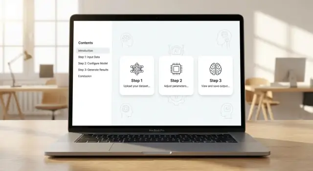
Tutorial page template (for “How to do Y with X”):
- Prerequisites: accounts, files, skills, costs, and time estimate.
- Steps: numbered actions with one clear outcome per step.
- Screenshots: only where they remove ambiguity (buttons, settings, outputs).
- Expected output: what “success” looks like and how to verify it.
Reusable blocks that keep pages readable
Create standard components your authors can drop in:
- Callouts: “Key idea” or “Quick summary” boxes.
- Tips: best practices that speed results.
- Warnings: risks (privacy, hallucinations, irreversible actions).
- Glossary terms: definitions for beginner-friendly reading.
Content rules for consistency
Write down lightweight rules and enforce them in your CMS:
- Tone: helpful, specific, and honest about uncertainty.
- Headings: predictable structure (H2 sections like “Steps,” “Troubleshooting,” “FAQ”).
- Naming: consistent tool names, feature labels, and version/date notes.
Once you have templates, every new page feels familiar—so readers focus on learning, not figuring out how your site works.
Choose the Right Platform and CMS
Your platform choice affects how fast you can publish, how consistent your tutorials look, and how painful updates feel six months from now. For an AI tutorial site, you’ll usually choose between a traditional CMS and a static site setup.
CMS vs. static site: what you’re trading off
A CMS like WordPress (or a headless CMS such as Contentful/Sanity) is great when non-technical contributors need to draft, edit, and schedule posts without touching code. You get roles, revisions, and an editorial UI out of the box.
A static setup (for example, Next.js with Markdown/MDX) tends to be faster, cheaper to host, and easier to keep consistent with reusable components (callouts, step cards, “copy” buttons for prompts). The trade-off is that publishing often requires Git workflows unless you add a CMS layer.
If you want to ship both the tutorial site and interactive “try it” experiences quickly, a vibe-coding platform like Koder.ai can also fit the stack: you can iterate on a React front end, add a Go + PostgreSQL back end when needed (e.g., for accounts, saved templates, or a prompt library), and keep deployment/hosting in one place.
Make editing easy for non-technical writers
If multiple people will ship content, prioritize:
- A clean editor with previews (including mobile preview)
- Version history and approvals
- Simple “content blocks” (steps, warnings, FAQs) to keep tutorials uniform
If you go static, consider pairing it with a headless CMS so writers can edit in a web UI while developers keep the front end stable.
Support rich tutorial content
AI explainers frequently need more than paragraphs. Confirm your platform supports:
- Tables for comparisons and parameter lists
- Fenced code blocks and inline code for prompts/CLI snippets
- Embeds for short demos (or lightweight alternatives)
- Image captions and accessible alt text
Staging, production, and backups
Set up a staging environment for new tutorials and design changes, then promote to production when verified. Automate backups (database + uploads for CMS; repo + content exports for headless/static) and test restoring at least once. This one habit prevents “we lost the tutorial library” disasters.
If your product or site includes frequent changes, features like snapshots and rollback (available in platforms such as Koder.ai) can reduce the risk of a bad release—especially when multiple authors and editors are publishing weekly.
UX Patterns That Make Tutorials Easy to Follow
Good tutorial UX is mostly about reducing “where am I?” and “what do I do next?” moments. If readers can keep their place, scan confidently, and recover quickly when they get lost, they’ll finish more guides—and trust your site more.
Mobile-first reading, not just mobile-friendly
Assume most people will start a tutorial on a phone and finish on a laptop (or vice versa). Use readable typography: generous line height, clear heading hierarchy, and comfortable paragraph width. Buttons and links should be easy to tap, and code snippets should scroll horizontally without breaking the layout.
Make long tutorials navigable
Add a sticky or inline table of contents for any guide that takes more than a few minutes. Readers use it as a progress tracker, not just a jump menu.
A simple pattern that works:
- Show the TOC near the top
- Highlight the current section while scrolling
- Add “Back to top” links after major milestones
Help people find the right tutorial fast
Tutorial sites grow quickly. Add search that prioritizes titles, tasks, and tool names, then layer filters such as difficulty (Beginner/Intermediate/Advanced), task type (e.g., “summarize,” “analyze,” “generate”), and feature area.
If you have a tutorials hub, keep categories consistent and predictable (the same labels everywhere). Link out to it from your main navigation (e.g., /tutorials).
Speed and accessibility basics
Fast pages keep readers in flow. Compress images, lazy-load heavy media, and avoid auto-playing embeds that push content down.
For accessibility, cover the essentials: sufficient color contrast, properly nested headings (H2/H3), descriptive link text, and alt text for meaningful visuals. These choices also improve skimmability for everyone.
SEO Setup for Explainers and How-To Content
Go mobile when ready
Create a companion Flutter app for tutorials, checklists, or a prompt library.
SEO for tutorial sites is mostly about clarity: make it obvious what each page teaches, and make it easy for both readers and search engines to follow the trail from basics to advanced.
On-page SEO that fits tutorials
Start with a clean page hierarchy. Use a single, specific H1 that matches the main promise of the page (for example, “How to Create a Resume with Tool X”). Then use H2s as checkpoints a reader would actually scan: prerequisites, steps, common mistakes, and next actions.
Keep URLs short and descriptive. A good rule: if you can read the URL out loud and it still makes sense, it’s probably fine.
- Good:
/tutorials/tool-x/create-resume - Not great:
/post?id=1847&ref=nav
Write meta titles and descriptions like mini-ads for the lesson. Focus on the result (“Generate a resume”) and who it’s for (“beginners,” “students,” “recruiters”), not on buzzwords.
Keyword mapping: one primary topic per page
Tutorial sites often lose rankings by trying to rank one page for ten different “how to” queries. Instead, map one primary keyword/topic per page, then support it with closely related subtopics.
Example mapping:
- Page: “How to summarize a PDF with Tool X” (primary)
- Supporting sections: “best settings,” “privacy notes,” “common errors” (secondary)
If two pages target the same intent, merge them or differentiate clearly (e.g., “Tool X vs Tool Y for PDF summaries”). This reduces cannibalization and improves internal linking.
Schema ideas (use only when it fits)
Structured data can help search engines understand your content type.
- Article: good default for explainers, comparisons, and news-style updates.
- HowTo: use for genuine step-by-step instructions with clear actions.
- BreadcrumbList: helps reflect your tutorial hierarchy in search results.
Avoid forcing HowTo schema onto pages that are mostly commentary or theory—misalignment can backfire.
Internal linking that prevents orphan pages
Treat internal links like “next lessons.” Each tutorial should link to:
- A prerequisite (if any)
- The next logical tutorial
- One relevant explainer (definitions, concepts)
Also build hub pages like /tutorials/tool-x that summarize the best guides and funnel readers deeper. This keeps new posts from becoming orphan pages and makes your information architecture visible.
XML sitemap and robots.txt basics
Create an XML sitemap that includes only canonical, indexable pages (not tag archives, internal search results, or parameter URLs). Submit it in Google Search Console.
Keep robots.txt simple: block admin areas and duplicate/low-value paths, not your actual tutorials. When in doubt, don’t block—use noindex intentionally on pages that shouldn’t appear in search.
Write Tutorials That Actually Work
A good AI tutorial reads like a lab recipe: clear inputs, exact steps, and an obvious “done” moment. If readers can’t reproduce the result on their first try, they won’t trust the rest of the site.
Start with a tight promise and prerequisites
Open with a one-sentence outcome (“By the end, you’ll generate a support email reply in your brand voice”) and list only the prerequisites that truly matter (account, plan level, access to a model, sample text). Keep assumptions explicit: what tool you’re using, what model, and what settings.
Provide copy‑paste prompts + expected results
Readers shouldn’t have to invent the prompt. Give them a copy-ready block, then show what a “good” response looks like so they can compare.
Prompt (copy/paste)
You are a customer support agent. Write a friendly reply to this complaint:
"My order arrived late and the box was damaged."
Constraints:
- Apologize once
- Offer two resolution options
- Keep it under 120 words
Expected response (example): 80–120 words, includes two options (refund/replacement), no extra policy text.
Use code blocks for anything that must be exact
When you include JSON, CLI commands, or API snippets, put them in fenced code blocks with syntax highlighting (e.g., ```json). On the site, add a visible copy button for each block and label what the user should change (like API key, file path, or model name).
Add version notes so steps don’t “mysteriously” break
AI tools change fast. At the top (or near the first step), add a small “Tested with” line:
- Tool version / model: (e.g., GPT-4.1)
- Date tested
- Settings that matter (temperature, system prompt, retrieval on/off)
When you update, keep a short changelog so returning readers know what changed.
Troubleshooting: make failure feel normal
Include a “Common errors” subsection with plain-language fixes:
- Output is too long → tighten word limit, add a structure (“3 bullets”), lower temperature.
- Hallucinated facts → require citations, provide source text, ask it to say “I don’t know.”
- Refuses the request → rephrase, remove restricted content, add intent (“for internal training”).
Offer downloadable examples when it saves time
If the tutorial uses reusable assets (prompt packs, sample CSVs, style guides), provide a download. Keep filenames descriptive and reference them in the steps (e.g., brand-voice-examples.csv). For related templates, point to a single page like /templates to avoid scattering links.
Use Visuals and Demos Without Slowing the Site
Take your code with you
Keep full ownership by exporting source code when you want to move or extend.
Visuals make AI tools easier to learn, but heavy media can quietly tank page speed (and with it, SEO and reader patience). The goal is to show the learning moment—not to upload the biggest file you can export.
Create a lightweight screenshot style guide
Consistency helps readers scan.
Keep screenshots the same width across the site, use the same browser frame (or none), and standardize callouts (one highlight color, one arrow style). Add short captions that explain why the step matters, not just what’s on screen.
A simple rule: one screenshot = one idea.
Use short motion only when it removes confusion
For tricky steps—like configuring a prompt template, toggling a setting, or navigating a multi-step wizard—use a very short video or GIF.
Aim for 5–12 seconds, cropped tightly to the UI area, with a loop that starts where it ends. If you use video, consider autoplay-muted with controls and a poster frame, so the page still feels calm and readable.
Write alt text that teaches
Alt text shouldn’t be “screenshot of dashboard.” Describe the learning point:
“Settings panel showing ‘Model: GPT-4o mini’ selected and ‘Temperature’ set to 0.2 for more consistent outputs.”
This helps accessibility and makes your explainers more searchable.
Optimize media so pages stay fast
Export screenshots as WebP (or AVIF if your stack supports it), and compress them aggressively—UI screenshots often compress well. Use responsive images (different sizes for mobile vs desktop) and lazy-load below-the-fold media.
If you host many tutorials, consider a dedicated /blog or /learn media pipeline so you don’t manually optimize every asset.
Add interactive demos when it’s worth it
When possible, embed a small sandbox: a prompt playground, a parameter slider, or a “try it” example that runs in the browser. Keep it optional and lightweight, with a clear fallback (“View static example”) for slower devices.
If you’re building interactive “try it” pages, treat them like product surfaces: saveable examples, snapshots, and quick rollback are useful safeguards while you iterate. Platforms like Koder.ai (with chat-driven app building plus snapshots/rollback and deployment) can be a practical way to prototype these demos without slowing down the content team.
Convert Readers Into Users (Without Being Pushy)
Tutorial readers are goal-oriented: they’re trying to get something done. The best “conversion” is simply helping them succeed—then offering a next step that fits what they just learned.
Place CTAs after you deliver value
If your first screen is a big “Buy now,” you’re asking for trust before you’ve earned it. A better pattern is:
- A quick win (clear steps, working example)
- A small “next step” CTA right after the key result
- A stronger CTA near the end for people who want to go further
For example: after the user completes a prompt workflow, add a short block like “Want this as a reusable template? Try it in our tool.” Keep the wording specific to the page.
If your next step is “build the workflow into an app,” make that CTA concrete: “Turn this into a simple web tool.” A platform like Koder.ai can be a natural fit here because readers can go from tutorial → chat → working React + Go + PostgreSQL app, export the source code, and deploy/host it with a custom domain.
Use a “Start here” guide that stays accessible
New visitors often don’t know which tutorial to read first. Add a sticky “Start here” link in your header or sidebar that points to a curated onboarding page (e.g., /start-here). Keep it short: 3–7 tutorials, ordered by difficulty, plus a one-paragraph explanation of who it’s for.
Email capture that’s helpful, not interruptive
Offer an optional “Get new tutorials” signup on relevant pages—especially at the end of a tutorial or in a sidebar. Keep the promise tight:
- What they’ll get (new tutorials, templates, updates)
- How often (e.g., weekly)
- One field if possible (email only)
Avoid popups that block the content, especially on mobile.
Make /pricing and /contact easy to reach
Some readers are already convinced—they just need logistics. Ensure there’s always a clear path to /pricing and /contact in your main navigation and footer. Consider adding a light “Questions?” line at the end of advanced tutorials with a link to /contact.
If you offer multiple tiers, keep the differences tied to real reader needs (e.g., team permissions, collaboration, hosting). For example, Koder.ai uses clear tiers (free, pro, business, enterprise), which maps well to “learning solo” → “shipping with a team.”
Comparison pages: only when you can be fair
Comparison pages can convert well, but they can also damage trust if they feel biased. Publish them only when you can be accurate, include trade-offs, and explain who each option is best for. Link to them naturally from related tutorials rather than forcing them everywhere.
Analytics and Feedback Loops
Analytics for a tutorial site isn’t about vanity metrics—it’s about spotting where readers get stuck and which pages actually drive sign-ups or product usage.
Instrument the moments that matter
Start with a lightweight analytics setup, then add a few high-signal events:
- Scroll depth (e.g., 25/50/75/100%) to see if tutorials are too long or slow to get to the payoff.
- Table of contents clicks to learn which sections people jump to (often a clue for better intros, clearer headings, or re-ordering steps).
- CTA clicks (try tool, start free, subscribe) to connect content to outcomes.
If you have interactive elements—copy buttons for commands, “show more” for code, or accordion FAQs—track those too. They often reveal confusion points.
Track on-site search queries
If you add on-site search, log anonymous search queries and “no results” terms. This becomes a ready-made content backlog: missing tutorials, unclear naming, or synonyms your audience uses.
Use UTMs for campaigns (and keep them consistent)
For newsletters, social posts, and partnerships, use UTM-tagged links so you can compare traffic that bounces vs. traffic that completes a goal. Keep a simple naming convention (source, medium, campaign) and document it in your team notes.
If you run affiliate-style programs (like referral links or “earn credits for content,” which Koder.ai supports), UTMs plus referral codes make attribution cleaner—and keep incentives aligned with genuinely helpful tutorials.
Build a weekly dashboard you’ll actually check
A practical weekly view might include:
- Top tutorial pages by entrances
- Time to first CTA click
- Search “no results” queries
- Conversion rate by traffic source (via UTMs)
Respect privacy and disclose tracking
Only collect what you need. Publish a clear tracking disclosure in your footer (e.g., /privacy), honor consent requirements where applicable, and avoid recording sensitive inputs from forms or searches.
Maintain and Update Content Over Time
Release updates safely
Use snapshots and rollback to test design changes without breaking the live site.
Tutorial sites fail when they freeze. AI tools ship new features weekly, UIs change, and a “working” workflow can quietly break. Treat maintenance as part of your publishing workflow, not a cleanup task.
Build an editorial calendar (and mix levels)
Plan content in a predictable rhythm so readers know what to expect—and your team can batch work.
A simple monthly mix works well:
- Explainers: “What is X and when to use it?” (good for search and onboarding)
- Beginner guides: first success in 10–15 minutes
- Advanced workflows: multi-step, real scenarios (teams, automation, integrations)
Keep the calendar tied to product releases. When your AI tool adds a feature, schedule (1) an explainer update and (2) at least one tutorial that uses it.
Create a maintenance plan for outdated tutorials
Add a small “health check” checklist to every tutorial page:
- Last verified date (e.g., “Tested on version 2.6 / Dec 2025”)
- Required prerequisites (accounts, permissions, model access)
- Known breaking points (UI labels, deprecated options)
When something breaks, decide fast: fix, deprecate, or replace. If you deprecate, say so clearly at the top and link to the current path.
Assign owners and a review cadence
Every section should have an owner (name or team) and a review schedule:
- Beginner tutorials: every 60–90 days
- Advanced workflows: every 30–60 days (more integrations = more churn)
- Evergreen explainers: every 90–180 days
Ownership prevents the “everyone thought someone else had it” problem.
Add a changelog that connects to content
Publish a public /changelog that links directly to updated docs/tutorials. Readers shouldn’t have to hunt for what changed—especially if they’re mid-project.
Use redirects when URLs change
If you rename or reorganize pages, use 301 redirects so old links keep working (and your SEO doesn’t reset). Keep a simple redirect log (old URL → new URL) and avoid chaining redirects more than once.
Launch Checklist and Ongoing Improvements
A tutorial site feels “done” only when readers can reliably find, follow, and finish your guides. Before you announce the launch, run a quick, repeatable checklist—and set up habits that keep quality high as content grows.
Pre-launch checklist (the unglamorous stuff that matters)
Start with the basics:
- Security: HTTPS everywhere, automatic platform/plugin updates where possible, and least-privilege accounts (writers can’t change billing; admins use 2FA). Remove old test users.
- QA for navigation: click every menu item, footer link, category page, and “next/previous tutorial” link. Broken internal links quietly kill trust.
- Forms and CTAs: test contact forms, newsletter signup, and any “request a tutorial” flows end-to-end (including confirmation emails).
- Meta tags and sharing cards: verify titles/descriptions on key pages, plus Open Graph/Twitter cards so links look good when shared.
Performance checks you can repeat monthly
Tutorial readers bounce fast when pages feel heavy. Run Core Web Vitals checks and do an image audit:
- Compress large screenshots, use modern formats where supported, and lazy-load below-the-fold visuals.
- Spot pages with slow LCP/INP and fix the largest offenders first (usually hero images, embeds, or excessive scripts).
Search that understands how people ask
Add site search that handles synonyms and typos (e.g., “prompting” vs “prompt engineering,” “ChatGPT” misspellings). If your CMS search is weak, consider a dedicated search tool and tune it using real queries.
Plan for multilingual early (even if you start with one language)
If you expect global readers, decide now: which pages get translated, how URLs are structured (e.g., /es/…), and how you’ll handle language switching without duplicating content chaos.
Ongoing improvements
Track what people struggle with (high exit pages, failed searches, repeated support questions), then schedule small updates weekly. A steady cadence beats big redesigns.
FAQ
What should I define before choosing a theme or writing my first tutorial?
Start by writing:
- Primary audience (beginners, teams, or developers) and their starting skill level
- 1–2 primary outcomes (e.g., reduce support requests, drive trials/newsletter)
- Success metrics you can track (CTA clicks, completion rate, return visits)
Those decisions should shape your navigation, page templates, and CTAs so the whole site feels consistent.
How do I choose a category structure that won’t get messy as the site grows?
Pick one organizing axis for your URLs and breadcrumbs, then add filters if needed:
- By use case (best for task-driven search intent)
- By skill level (best for onboarding and courses)
- By workflow/feature (best for product-led documentation)
Commit to a single primary structure so you don’t publish duplicate pages that compete for the same intent.
What pages should be in the main navigation for an AI tutorial site?
A practical top-level set is:
- Home (promise + best starting points)
What’s the difference between a tool explainer page and a tutorial page?
Use two repeatable templates:
- Explainer (“What is X?”): what it does, who it’s for, limitations, concrete examples (include exact prompts/inputs when helpful)
- Tutorial (“How to do Y”): prerequisites, numbered steps, expected output, verification, and troubleshooting
Consistency reduces writing time and makes pages easier to scan—especially when you publish at scale.
How should I plan internal linking so readers always know what to do next?
Treat internal links as next lessons:
- From each Explainer: link to 1–3 “Try it now” tutorials
- From each Tutorial: link back to the relevant explainer (“Understand this feature”) and to the next tutorial
- Add Related tutorials sections and hub pages like /tutorials/tool-x
The goal is to prevent orphan pages and keep readers moving forward naturally.
Should I use WordPress (CMS) or a static site setup for tutorials?
Choose based on who publishes and how fast you need to ship:
- Traditional CMS (e.g., WordPress): easiest for non-technical editors, roles, revisions, scheduling
- Static (e.g., Next.js + Markdown/MDX): fast, consistent components, cheaper hosting; publishing often needs Git unless you add a CMS
If multiple writers will contribute, a headless CMS + static frontend is often a good middle ground.
What UX elements make long tutorials easier to follow?
Use patterns that reduce “where am I?” moments:
- A table of contents for longer guides (ideally highlights the current section)
- Readable typography and mobile-first layouts (code blocks should scroll cleanly)
- Search that prioritizes tasks and tool names, plus filters like difficulty
Small navigation cues often improve completion rate more than redesigns.
What SEO setup matters most for explainer and how-to pages?
Do the basics consistently:
- One clear H1 matching the outcome (“How to…”)
- Descriptive, short URLs (e.g., /tutorials/tool-x/summarize-pdf)
What analytics should I track to improve tutorials (without vanity metrics)?
Instrument high-signal events:
- Scroll depth to spot where people drop off
- TOC clicks to find sections readers jump to
- CTA clicks to connect content to outcomes (trial, demo, newsletter)
- On-site search queries, especially “no results” terms
Use this data to prioritize rewrites, add missing tutorials, and improve intros/troubleshooting where readers stall.
How do I keep AI tool tutorials from going out of date?
Treat maintenance as part of publishing:
- Add “Tested with” notes (tool/model, date, key settings)
- Assign an owner and review cadence (more frequent for integrations)
- When a tutorial breaks: , , or and redirect