Jul 19, 2025·8 min
How to Build a Website for a B2B Use-Case Library
Learn how to plan, design, and build a B2B use-case library website with the right structure, CMS, search, SEO, and tracking to support sales.
Learn how to plan, design, and build a B2B use-case library website with the right structure, CMS, search, SEO, and tracking to support sales.
A B2B use-case library is not a “nice-to-have” gallery of success stories. It’s a decision tool. Done well, it helps prospects quickly answer: “Is this for a team like mine, with a problem like ours?”—and it helps your sales team answer: “Have you done this before?” with specific, credible examples.
Your primary goal is self-qualification. Each use-case page should let a reader assess fit without booking a call first—while naturally making the next step (demo, trial, contact) feel like the logical move.
A secondary goal is sales enablement: a consistent, searchable set of pages reps can share in emails, proposals, and follow-ups.
Most libraries serve multiple audiences at once:
These groups scan differently, so the library should support both fast skimming and deeper reading.
Avoid measuring “traffic” alone. Track signals that show the library is helping real decisions, such as:
Set boundaries early to prevent messy content later. A use case is typically a problem-to-outcome story that cuts across industries. It’s not the same as:
When you clarify these distinctions, visitors find answers faster—and your team can publish consistently.
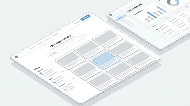
A use-case library only works if people can find it quickly, understand where they are, and take the next step without getting lost. Your site structure makes that possible.
Pick a single, obvious home for the library and stick to it. Common options:
Whatever you choose, make it consistent across navigation, internal links, and URLs. If you already have a /solutions area, consider keeping solutions pages high-level and using the use-case library as the detailed layer beneath.
Most visitors follow a simple path:
Homepage → use case → proof → CTA
Your structure should support that flow on every use-case page:
Also design for “quick exits”—the fast clicks people make to validate fit:
Use a predictable, repeatable browsing model:
This keeps visitors moving laterally instead of bouncing back to the menu.
Treat internal links as guided routes, not decoration. Each use-case page should link to:
When your structure and journeys match real buyer behavior, the library becomes a self-serve sales assistant—helpful for new visitors and efficient for returning evaluators.
A use-case library succeeds or fails on how quickly someone can recognize “this is for me.” That’s a taxonomy problem: the labels you choose, how they relate, and how consistently they’re applied.
Start with a small set of primary ways people look for solutions. For most B2B libraries, these dimensions work well:
Make these dimensions explicit in your CMS so every use-case page can be classified the same way.
Overlapping labels create confusion and messy filters (e.g., “Customer Success” as both a role and a workflow). Decide what each dimension means and enforce it:
If a label could fit in multiple places, rename it (“Renewals” as a workflow, “CS” as a role) or pick one home and use cross-links instead of duplicates.
Alongside structured categories, add lightweight tags written in plain language that mirror how buyers describe pain.
Examples: “Reduce manual reporting”, “Eliminate data silos”, “Speed up approvals.” Keep them short, verb-led, and user-centric. These tags are great for on-page navigation and SEO without bloating your core taxonomy.
B2B sites accumulate jargon fast. Maintain a simple glossary page (and link to it where relevant) that defines recurring terms and acronyms. It prevents misunderstandings, helps new visitors, and keeps naming consistent across the library.
A use-case library only scales when every page follows a consistent “data recipe.” That recipe is your content model: the set of content types, required fields, and relationships that power templates, filters, SEO, and future maintenance.
Start by deciding what kinds of pages your library will publish. Most B2B libraries need a small set of structured types:
Keep the number of types low; you can always add more later.
Define a minimum set of fields so every page can be rendered, searched, and compared:
Treat outcomes and proof as structured data, not just paragraphs, so they can surface in cards and filters.
Plan relationships that help visitors keep browsing:
These rules should be explicit in the CMS (relationships or tags), not manually curated on every page.
Identify what should be reusable across pages: snippets (one-line value props), customer quotes, metrics, and CTA modules. Reuse reduces editing effort and keeps claims consistent everywhere.
A use-case page should feel less like a blog post and more like a decision-ready brief. When every page follows the same structure, visitors learn how to scan quickly—and your team can produce new pages without reinventing the wheel.
Keep the core blocks consistent across the library:
This structure maps to intent: “Is this relevant to me?”, “Will it work here?”, “What do I get?”, “What’s the catch?”
Use short paragraphs, tight bullets, and callouts for key proof points. If you use a diagram, treat it like a captioned explanation (what’s happening, what inputs are needed, what the output is). The goal is clarity, not decoration.
Include trust signals near claims—not at the very bottom. Examples: customer logos (if permitted), one-sentence quotes, and security/compliance notes relevant to the use case (SOC 2, GDPR, data retention). If you can’t name customers, describe the customer type (“Global logistics provider”).
Offer one primary CTA and one secondary CTA:
Link to supporting pages when helpful (e.g., /pricing, /security), but keep the page focused on the use case—not your whole company.
Great use-case content can still be hard to use if visitors can’t quickly narrow it down to “something like me.” Your browsing experience should help people get from a broad question (“What can you do for companies like ours?”) to a specific page they can act on.
Add a prominent keyword search across the library, not hidden behind a tiny icon.
Include autosuggest so users see results as they type (use cases, industries, integrations, even common problems). If your search tool supports it, enable typo tolerance—B2B terms are easy to misspell (product names, acronyms, vendor spellings).
Filters should map directly to your taxonomy so people can build a “slice” of the library that fits their context. Common, high-value filters include:
Keep filters stable across the site and avoid creative names. If visitors need to interpret labels, they’ll abandon filtering.
Not everyone wants the same “best” page. Support sorting such as most viewed (social proof), newest (freshness), and best match (relevance). If you show “best match,” explain it subtly (for example, “Based on your filters and search”).
Plan for “no results” moments. Instead of a dead end, offer suggestions:
Empty states are where you either lose the visitor—or guide them to something useful.
A use-case library only works if it stays current. That means the CMS and the editorial workflow should make it easy to add, update, and retire pages—without turning every change into a mini project.
Headless CMS (e.g., Contentful, Sanity, Strapi) is a strong fit when you want a flexible content model and custom front-end templates. It’s ideal if you have developer support and expect the library to grow in complexity.
Website builder CMS (e.g., Webflow, HubSpot) can be faster for marketing-led teams. It works well if your use-case pages follow a consistent structure and you want editors to ship updates without engineering.
Custom admin is worth considering only when you have unusual requirements (complex permissions, deep integrations, bespoke workflows) and the ongoing budget to maintain it.
If you want to prototype the experience quickly—filters, search, templates, and an internal admin—teams sometimes use a vibe-coding platform like Koder.ai to generate the initial React UI and a simple backend (Go + PostgreSQL) from a structured spec, then iterate with stakeholders in “planning mode” before investing in deeper custom work. The goal isn’t to replace your CMS; it’s to shorten the path from idea → working library.
Use clear stages so pages don’t get stuck in Slack:
At minimum, separate roles for:
A simple checklist prevents inconsistent pages:
When the CMS, permissions, and checklist align, your library becomes a repeatable publishing system—not a one-off content push.
Your use-case library doesn’t need exotic tech—it needs predictable publishing, fast pages, and components your team can reuse without friction.
There are three common approaches, and the “best” one is usually the one your team can ship and maintain.
If engineering time is scarce, prioritize an editor-friendly CMS and a templating system that can scale to hundreds of pages without manual layout work.
For teams that want to move even faster, building a first version as a small dedicated app can be surprisingly effective: a React front end, a lightweight API, and a PostgreSQL-backed content layer (even if the CMS remains the long-term source of truth). Platforms like Koder.ai can help you generate that scaffolding quickly, with deployment, custom domains, and snapshots/rollback so you can iterate safely while the taxonomy and template stabilize.
Use-case pages often rank and convert because they feel immediate and trustworthy. Treat performance as part of UX:
Fast pages also reduce bounce rate on high-intent searches—especially on mobile.
A use-case library becomes manageable when pages are built from repeatable blocks:
Accessibility improves usability for everyone and prevents expensive rework later:
Use-case libraries win on SEO when pages match real intent, not internal jargon. Your goal isn’t to rank for “Use Case: X”—it’s to answer the queries buyers type when they’re trying to solve a specific problem.
Build a keyword list around how prospects frame needs:
For each use case, map one primary keyword and a handful of close variants. If two use cases target the same query, consolidate them into one stronger page and use sections (or FAQs) to cover variations.
Define a simple, enforceable template so pages don’t drift:
Keep URLs readable and consistent (e.g., /use-cases/vendor-onboarding-automation). Add internal links to related use cases and one relevant next step, such as /pricing or /contact.
Add structured data when it matches the page:
Don’t publish placeholders. Require a minimum content standard before a page can go live: a defined problem statement, a concrete solution walkthrough, proof points (metrics or credible examples), and clear “who it’s for / not for.” This prevents your library from becoming a large set of low-value pages that compete with each other.
A use-case library works best when it’s easy to find, skim, and share. Lead capture should support that goal—not interrupt it. The simplest rule: keep the core use-case pages ungated, and offer optional “next steps” for readers who want more depth.
If you gate content, do it for assets that clearly justify the trade:
Avoid gating the primary page people arrive on from search. A gated landing page can reduce visibility, break sharing, and push visitors back to results.
Use short forms when the intent is early-stage:
Reserve longer forms for high-intent actions like demos or pricing, where visitors expect a bit of friction.
Every use-case page should offer clear paths based on intent:
Make the CTA specific to the use case (“Book a 15‑minute walkthrough for X”), and pre-fill context in your CRM (use-case name, industry, role) so follow-up is fast and relevant.
If you add pop-ups, keep them restrained (time-delayed, easy to close, never on first scroll). The library’s job is to earn trust with clarity; lead capture should feel like a helpful upgrade, not a toll booth.
A use-case library is never “done.” The best versions get sharper because they’re measured like a product: you watch how people explore, where they get stuck, and what convinces them to take the next step.
At minimum, track events that tell you whether discovery is working:
Keep event names consistent so reporting stays readable over time (e.g., filter_applied, search_submitted, cta_clicked).
Build two lightweight views:
Marketing dashboard: top use cases by sessions, entry pages, organic traffic share, and CTA click-through rate.
Sales dashboard: most-viewed use cases by account/industry (when known), assisted conversions, and “research sequences” (common paths like Use Case → Integrations → Pricing).
If you can, connect these to pipeline outcomes (even directional). The goal isn’t perfect attribution—it’s spotting what content influences revenue.
If your analytics needs outgrow what your marketing site offers, a small internal dashboard can pay off quickly—especially if sales enablement needs account-level views. Building that as a lightweight web app (rather than a spreadsheet workflow) is a common use case for rapid app-building approaches, including tools like Koder.ai, where you can ship a working dashboard, iterate with snapshots, and export the source code if you later want to bring it fully in-house.
“Zero-result searches” are free research. Log them, review monthly, and decide whether to:
Run simple tests continuously: CTA wording, card layout density, and filter order. Change one variable at a time, set a time window, and pick a single success metric (e.g., CTA clicks per visit). Document outcomes so the library improves without guesswork.
A use-case library isn’t a one-time project—it’s a product. Without ongoing operations, it quietly drifts out of sync with what sales is pitching, what customers are asking for, and what your product actually supports.
Pick a cadence you can keep even during busy quarters.
A practical baseline:
Treat “refresh” as real work, not a quick proofread. If a page makes a claim (“cuts onboarding by 30%”), confirm the underlying source still exists and is still accurate.
Outdated pages create distrust faster than missing pages. If a use case no longer reflects your product or market:
Make redirects part of your workflow checklist, not an afterthought.
Your best topics often come from repeated questions in deals and renewals. Create a lightweight request form or ticket template that asks for:
Triaging these requests monthly helps you choose pages that will actually be used—not “nice-to-have” content.
Governance keeps the library consistent across many contributors.
The payoff compounds over time: fewer rewrites, fewer legal/product fire drills, and a library that stays credible as it grows.
A B2B use-case library should function as a decision tool, not a gallery.
Prioritize:
/demo, /pricing, or /contact feel natural based on intent.Design for skimming and depth because different audiences scan differently.
Common audiences include:
Track metrics tied to decision-making, not traffic alone.
Useful signals:
If possible, segment by channel (organic vs. paid) and by persona to see what actually influences pipeline.
A use case is typically a problem → solution → outcome story that can apply across industries.
It’s not the same as:
Defining these boundaries early prevents overlapping pages and inconsistent publishing.
Pick one obvious home and keep URLs and navigation consistent.
Common locations:
/use-cases when browsing use cases is the main discovery path/solutions when your GTM is solution-led and use cases are the detailed layer/customers when proof/customer stories are the primary anchorChoose one and avoid scattering similar pages across multiple sections.
A reliable path is:
Homepage → use case → proof → CTA
On each use-case page, include:
/demo for evaluation, for budget)Use a predictable browsing model so visitors move laterally instead of bouncing.
Practical patterns:
Consistency matters more than cleverness—labels should be instantly understood.
Start with a small set of primary dimensions and enforce their meaning.
Common dimensions:
To reduce confusion:
Make pages template-driven so they read like decision briefs.
A strong use-case page typically includes:
Keep the core page ungated for discovery and sharing, then gate optional assets.
Good candidates to gate:
Match friction to intent:
/pricingAlso provide “quick exits” like /pricing, /contact, and /demo so validation is fast.
/demo or /pricingAvoid aggressive pop-ups—lead capture should feel like an upgrade, not a toll.