Dec 16, 2025·8 min
How to Build a Website for an Example-Based Teaching Tool
A practical plan to design and launch a website for an example-based teaching tool—positioning, page structure, UX, content, SEO, and analytics.
A practical plan to design and launch a website for an example-based teaching tool—positioning, page structure, UX, content, SEO, and analytics.
Before you design pages or write copy, decide who the site is for, what visitors want to achieve, and what you want them to do next. If these aren’t clear, an example-based tool can look like “a bunch of demos” instead of a learning product.
Choose one main audience to optimize the site for:
Then name the runner-up audience and what they’ll need to see to feel included (usually in a short section, not the whole site). Write down their top 5 questions in their words. Those questions become your nav labels, section headers, and FAQ prompts.
Example-based learning works when visitors can immediately map it to a job they already have. Common jobs include:
Turn each job into a plain outcome statement (e.g., “Write a strong client email in 10 minutes” beats “Improve communication”).
Pick the action that best matches your buyer and sales cycle:
Design every page to support that primary action, with a secondary option only when it reduces friction.
Define 3–5 metrics you’ll track from day one: signup rate, activation (first meaningful example completed), trial-to-paid, and demo-to-close if relevant.
Finally, decide what “teach through examples” must prove in under 10 seconds. A good test: can someone glance at your homepage and immediately answer:
What can I learn here?
What does an example look like?
What should I do next?
Your positioning should tell visitors what they get after using your tool, not what the tool is. Aim for a sentence someone can repeat to a colleague without sounding like marketing.
“Learn faster by studying real examples, so you can apply the skill confidently in your next task—not just understand it in theory.”
Adjust the nouns (“write better emails,” “solve algebra problems,” “design better prompts”) but keep the structure: learn faster → through examples → apply confidently → in a real situation.
Explanations are useful when people already have context. Many learners don’t. Examples reduce the guesswork by showing:
If your audience is busy (students, new hires, professionals), examples also cut time spent translating theory into action.
Use three messages everywhere (hero, subheads, callouts, FAQs). Each message should have a matching proof type you can show.
Speed: “Get to a usable answer in minutes.”
Proof types: time-to-first-result metric, onboarding flow screenshot, short demo video.
Clarity: “See the pattern, not just the rule.”
Proof types: before/after example pair, annotated example snippet, sample lesson page.
Confidence: “Know how to handle a new case, not just copy one.”
Proof types: learner quotes, mini case studies, completion/return-rate trends.
Objection: “If it’s example-based, won’t people just copy without understanding?”
Counter-message: “We teach transfer, not copying—each example is paired with a short takeaway and a ‘try one’ variation so learners practice adapting.”
Work and education increasingly demand practical output—messages, solutions, projects—often with less time for deep study. A site that leads with examples matches how people learn when they need to deliver something soon: see a model, understand the pattern, then produce their own version.
A clear information architecture helps visitors understand your tool in minutes—and helps returning learners jump straight back into practice. For an example-based teaching tool, your structure should highlight three things: what the tool is, how it works, and where the examples live.
Keep the first version simple and focused:
If you publish content, add a Blog/Learning Hub later—don’t force it into the first navigation if it’s not essential.
“Examples” can be structured in three common ways:
Pick one primary model, then optionally support the others as filters or views. Mixing three models equally often confuses users.
Use labels people already understand. Prefer Examples, Templates, Lessons, Pricing, FAQ over internal jargon like “Workbench” or “Engine.” If you need a branded term, pair it with clarity (e.g., “Examples (Library)”).
Create two main paths:
Your page map should make both journeys obvious, with consistent CTAs to /examples, /pricing, and /signup.
Your homepage has one job: help visitors understand the outcome they’ll get, then prove it with real examples—fast. If your tool teaches through examples, the page should feel like an example page within the first screen.
Lead with a clear promise tied to a learner result (not a feature list), followed by a one-line explanation of the mechanism.
Example structure:
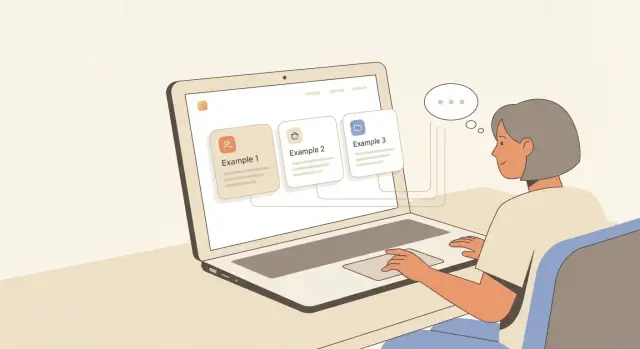
Right under the hero, show 2–3 clickable cards that look like what people will actually use. Each card should include:
This reduces doubt because visitors can judge fit in seconds.
Add a short block that matches your learning loop:
See example — what good looks like, with annotations
Practice — try a similar task with a template or prompt
Feedback — get specific notes and a better version to compare
Keep each step to 1–2 lines so it reads at a glance.
Include a simple comparison section: your tool vs. random tutorials/search results. Focus on outcomes: structured progression, consistent quality, faster practice-to-feedback cycles.
Close with one clear next step and two links: “Start with examples” (/examples) and “View plans” (/pricing). Avoid extra offers that pull attention away from learning.
A strong How-It-Works page should make your teaching method feel predictable: users should know what will happen, what they’ll do, and what they’ll get at the end. Keep it step-based, but grounded in one concrete walkthrough.
Use a short stepper (with icons or numbers) that reads like a learning loop:
Pick a skill or topic
Study a worked example
Try a near-variation
Get hints and checks
Unlock the next step based on your result
Each step should be one sentence, with a supporting line underneath that explains the “why” in plain language.
Add a mini case study that shows the flow end-to-end. Example structure:
This section should look like a preview of the product, not marketing copy.
Be explicit about what’s included: curated example sets, variations, hinting, correctness checks, and recommended next examples. If there’s tracking, say what it tracks (progress, streaks, mastered skills) and what it does not.
List supported subjects/levels in one tight block, then a small “Coming soon” note (only if you’re confident). Set expectations without promising dates.
Add a “Time to first win” callout: “Start learning in ~3 minutes: pick a topic → open your first example → try one variation.” Place a primary CTA (“Start learning”) and a secondary CTA: See the examples.
If you’re moving fast and want to prototype this flow end-to-end, tools like Koder.ai can help you stand up a React-based marketing site plus a working examples library from a single chat-driven build process—useful for validating your IA and CTAs before investing in a longer engineering cycle.
An example-based tool becomes dramatically more useful when visitors can find “an example like mine” in seconds. Treat your examples library as a product feature, not a blog category.
Pick 3–6 top-level categories users naturally ask for, then add a small set of filters that narrow results without overwhelming.
Common filters that work well:
Make filters visible on desktop, but keep them compact on mobile (a single “Filter” button that opens a panel).
Consistency helps people scan and learn faster. A reliable template also helps you publish at scale.
A simple structure:
Problem: what the learner is trying to do (and constraints)
Example: the model answer/output (clearly formatted)
Variation: one change that affects the outcome (show the difference)
Practice: a short prompt or exercise with a “check yourself” hint
Comparison is where patterns become obvious. A few low-effort UI options:
Under each example, add “Related examples” and “Next step” links (e.g., “Same skill, harder” or “Same use case, different format”). Keep pages easy to scan, but include indexable text: a short intro, clear headings, and brief explanations around the example so search engines—and learners—understand what they’re seeing.
Your examples library will only feel teachable if it stays consistent as it grows. A content strategy makes that possible: you decide what you’ll publish, how it should look, and how it gets maintained.
Start with 3–5 cornerstone topics that map to the main reasons people show up. Each cornerstone becomes a hub, with clusters of examples that progress from simple to nuanced.
For each cornerstone, plan:
This structure makes browsing easier, and it gives your SEO a clear hierarchy without chasing random keywords.
Write down standards your team can actually follow. Strong rules usually cover:
A simple checklist at the top of your editor goes a long way.
Templates should reduce blank-page effort while leaving room for nuance. A practical example template:
Title + use case
The example (the “thing” to learn from)
Why it works (2–4 bullets)
Try a variation (one guided tweak)
Common pitfalls
Next step (link to a related example)
Include a call to action inside the content—ideally right after the variation prompt—such as “Try this variation” linking to /signup.
Decide who owns each step: writing, review, and upkeep. Even a small team benefits from a clear cadence (weekly or biweekly) and a lightweight update rule (for example, “review top pages quarterly”). Track updates like product docs: when an example changes, note what changed and when.
If you want to scale, prioritize updating what readers already use instead of publishing endlessly.
Pricing is part of teaching: it tells people how to start, how far they can go, and what “success” looks like at each level. For an example-based tool, package around access to examples, learning paths, and sharing features—not vague “value.” Keep every plan description specific enough that a buyer can predict what they’ll get on day one.
Most example-based products work well with a subscription (updates and new examples are a clear ongoing benefit) plus a team option for shared libraries.
Use plan bullets that name the concrete inclusions, such as number of example collections, saved folders, exports, templates, and whether new examples are included during the subscription.
Keep labels plain and outcome-focused:
If you offer a free trial, state exactly what’s unlocked and what happens when the trial ends.
Add a short FAQ under the table that targets common blockers:
Spell out the first-time path: confirmation email → account creation → short onboarding → “Start with your first example set.” Mention time-to-first-win (“Get your first saved example in 3 minutes”).
Link to /pricing from the header and from key pages (homepage, examples library, how-it-works). Avoid “surprise fee” wording by listing taxes, add-ons, and seat limits clearly in the plan details.
People decide quickly whether an education tool feels safe, credible, and worth their time. Your job isn’t to promise perfect results—it’s to show what’s true, specific, and repeatable.
Add lightweight proof points that reduce risk without marketing spin: clear privacy wording, basic security practices (e.g., encryption in transit, account protections), and visible support options. If you have them, link to an uptime or incident page; if you don’t, don’t invent one.
You can list trust elements like:
Ask for testimonials that mention outcomes and a concrete “example moment.” Instead of “Helped me learn faster,” aim for “The worked example for X made the pattern click, and I stopped making Y mistake.”
Turn your best stories into mini case studies:
Keep claims bounded: “helped me” beats “guarantees.”
A trustworthy FAQ answers what the tool does not do (e.g., doesn’t replace a teacher, doesn’t grade open-ended work, can’t cover every curriculum). Add practical questions about pricing, data, and how examples are sourced.
Finish with a clear contact path to /contact and, if you can commit, response expectations like “We reply within 2 business days.”
Good UX for example-based learning is less about flashy visuals and more about making patterns easy to notice, compare, and remember.
Pick a clean type system with clear hierarchy (H1/H2/H3, body, captions). If your examples include code, math, or diagrams, test early: monospace code blocks should be readable, inline math shouldn’t break line height, and diagrams need enough spacing to “breathe.” Keep line length comfortable (especially on desktop) and use generous paragraph spacing for long explanations.
Examples get easier to scan when they look consistent. Create a small set of components you can repeat across pages:
Consistency reduces cognitive load and makes browsing feel predictable.
Ensure strong color contrast, visible focus states, keyboard navigation for filters/search, and headings that form a logical outline. Use alt text for any instructional graphics (describe the learning point, not just the picture).
On mobile, comparisons are hard. Use sticky “key takeaway” summaries, collapsible sections, and quick jumps (e.g., “Problem → Example → Explanation → Practice”). Avoid side-by-side layouts that become tiny columns.
Pick one primary CTA label (e.g., “Try an example”) and reuse the same button style and destination across the site. If you offer a guided path, link it consistently to a single onboarding flow like /start so users never wonder where a button will take them.
SEO for an example-based teaching tool works best when it mirrors how people search: they rarely look for your brand first—they look for a concrete example or a step-by-step method. Build your site so those queries land on useful pages, then guide visitors toward the product.
Start with topic clusters (writing, math, prompts, emails, lesson plans—whatever your tool teaches). For each cluster, prioritize two query types:
Each cluster should have a hub page (a “learning hub”) plus multiple example pages that target narrow phrases.
Use predictable, SEO-friendly structure so both users and search engines understand where they are:
/examples/<topic>/examples/<topic>/<example-name>/guides/<topic>/<how-to>Add breadcrumbs on hub and example pages (e.g., Examples → Email Writing → Welcome Email). Breadcrumbs improve navigation and can enhance search snippets.
Add schema only when it matches the page content:
Avoid marking everything up as FAQs—search engines tend to ignore repetitive markup.
Every example page should link to:
Also link laterally (“Next example”) to keep people exploring.
Examples libraries can get heavy. Keep them quick by:
Fast example pages reduce bounce and help rankings over time.
Shipping the site is the start of learning, not the end. The goal is to see whether people actually use examples the way you intended—and where they drop off.
Define a small set of core events that represent learning intent and product interest:
These events help you answer practical questions like: “Do people browse examples but never practice?” or “Which categories drive the most signups?”
Start with one primary funnel and make it visible to everyone on the team:
Landing page → example → signup → activation milestone
Your activation milestone should be a concrete learning action (e.g., “completed 1 practice set” or “saved 3 examples”), not just “visited the dashboard.”
Put a lightweight prompt at the end of each example:
“Was this example helpful?” (Yes/No) + one optional text field: “What would make it clearer?”
Treat this as product input. Tally themes monthly and update the example library accordingly.
Run simple tests that don’t risk breaking the experience:
If you want faster iteration on these experiments, a chat-first build workflow like Koder.ai can be useful for shipping small UI changes, rolling them back via snapshots, and keeping the site’s React frontend aligned with a Go/PostgreSQL backend as your product matures.
Create a launch checklist (events firing, funnel visible, feedback enabled). Then a monthly checklist for your ~3,000-word guides: refresh screenshots, validate links, update examples, and re-check search queries in your SEO hub (see /blog/seo-plan).
Start by choosing a primary audience (students, professionals, or educators) and writing their top questions in their own words. Then define 1–2 primary conversions (e.g., /signup or book a demo) and make every page support that action.
Turn each job into a plain, measurable outcome statement (e.g., “Write a strong client email in 10 minutes”). Good examples-based jobs include:
Pick the CTA that matches your sales cycle:
Keep the secondary CTA only if it reduces friction (often linking to /pricing).
It’s a quick “proof of value” test for your homepage. In under 10 seconds, a visitor should be able to answer:
If any of those are unclear, add a concrete example preview and a single obvious CTA to /examples or /signup.
Lead with what users get after using it, not what it is. A repeatable structure:
Keep it colloquial enough that someone could repeat it to a colleague without sounding like marketing.
Publish a clear counter-message in your positioning and reinforce it in the product:
This reframes the tool as teaching transfer, not templates-only.
Start with a small, standard set:
Choose one primary model:
Pick one as the default experience, then optionally support the others as filters or alternate views to avoid confusing users.
Use a consistent template so people can scan quickly. A practical structure:
Consistency helps users learn faster and helps your team publish at scale.
Track a small set of events tied to learning intent and conversion:
Define an activation milestone like “completed 1 practice set” (not “visited dashboard”), and review the funnel weekly: landing page → example → signup → activation.
Add a blog later only if it supports discovery and isn’t cluttering navigation.