Mar 26, 2025·8 min
How to Build a Website for a Tool That Replaces Spreadsheets
Learn how to plan, design, and launch a website for a tool that replaces spreadsheets—clear messaging, key pages, onboarding, SEO, and trust.
Learn how to plan, design, and launch a website for a tool that replaces spreadsheets—clear messaging, key pages, onboarding, SEO, and trust.
If you’re replacing spreadsheets, your website shouldn’t lead with “tables,” “filters,” or “API access.” Visitors already have a tool that can do those things. What they’re searching for is relief from the specific pain spreadsheets create once a process becomes shared, repeated, or business-critical.
Be explicit. Spreadsheets fail in predictable ways:
Write your opening message like a diagnosis, not a feature list:
Stop chasing the latest file. Get one source of truth with clear ownership and approvals.
Define the audience in plain language: which teams, roles, and typical company size.
Examples: operations managers tracking requests, finance teams collecting spend, HR running onboarding checklists.
Then state the job:
Collect structured data, route it for approval, and report on it instantly—without spreadsheet wrangling.
List 3–5 outcomes people actually want: speed, accuracy, visibility, accountability, auditability. These become your homepage promises and section headers.
Keep scope manageable by drawing a line:
A clear MVP makes your product easier to explain—and your website easier to convert.
If you’re building this product from scratch, it helps to choose a development approach that keeps MVP scope honest. For example, a vibe-coding platform like Koder.ai can be useful for quickly turning a spreadsheet workflow into a database-backed app through a chat interface—while still allowing source code export and iteration (including snapshots and rollback) as your requirements evolve.
Before you design pages or write copy, translate what people actually do in Excel or Google Sheets into a clear, repeatable app flow. Most spreadsheet “systems” follow the same pattern:
input → review → approve → report
The goal isn’t to recreate the grid—it’s to preserve the outcome while removing the chaos.
Pick one spreadsheet that matters (timesheets, inventory, requests, budgets) and write down:
This becomes the backbone of your app workflow: “submit,” “review,” “approve,” and “report.”
Instead of listing every annoyance, focus on the top failure points that consistently slow teams down:
List the top 3 issues users complain about. Those become your highest-priority product requirements and the strongest claims to make on your site.
For each step, decide what the app should provide:
Define a measurable win, such as “save 2 hours per manager per week” or “cut entry errors by 50%.” This keeps your build focused—and gives your website a concrete promise to communicate.
Your website will only convert if it’s obvious who the product is for and why it’s better than “just keeping it in Sheets.” Positioning is the filter that keeps your copy focused.
Pick one primary reader for the homepage and write directly to them.
You can still serve both, but decide whose question you answer first. A clear “for teams that…” statement prevents your message from sounding like a generic spreadsheet replacement website.
Use a simple structure: what it replaces + the key benefit.
Example formula:
Replace shared spreadsheets with a database-backed web app that keeps your team’s data accurate and approvals on track.
This works because it names the alternative (Excel/Sheets) and promises an outcome (accuracy + smoother workflow), not a feature list.
Keep these concrete and human. If you’re tempted to mention “permissions,” translate it into the result.
Pick a single primary action and repeat it consistently. Examples:
Everything on the page should support that one step—especially if you’re marketing a workflow app for teams moving from spreadsheets to a web app.
A spreadsheet replacement needs a website that answers one question quickly:
Can this fit my team’s process without breaking what already works?
The simplest way to do that is to organize pages around how buyers evaluate the switch: outcomes, workflows, proof, and next steps.
Your homepage should lead with a clear value proposition (what improves compared to Excel/Sheets), then immediately show 3–5 common use cases. Add lightweight social proof (logos, short quotes, numbers) near the top, and repeat one primary call to action (start trial, book demo) throughout the page.
Avoid a long “feature list.” Instead, structure the product page around stages people recognize:
This makes the product feel like a workflow app, not “a better spreadsheet.”
Create a use-cases page with sections for ops, finance, HR, inventory, and other core audiences. Each use case should include: the problem, the before/after workflow, and a concrete example (what gets tracked, who approves, what gets reported).
Pricing should be easy to interpret: what’s included, how seats work, and which plan fits which team size. If you’re sales-led, your “Talk to sales” page should still show what buyers get and what happens after they submit the form.
If you offer multiple tiers, make the progression obvious. (Koder.ai, for example, keeps this simple with Free, Pro, Business, and Enterprise tiers—an approach that maps well to “try it → adopt it as a team → standardize across the company.”)
A small help center reduces friction: setup steps, common tasks, and troubleshooting. Add contact, security, and terms/privacy pages as needed—especially if you’re replacing spreadsheets used for sensitive work.
Your homepage isn’t the place to explain every feature. It’s where people decide, in seconds, whether your tool is the “obvious next step” after Excel or Google Sheets.
Open with a simple comparison that feels familiar:
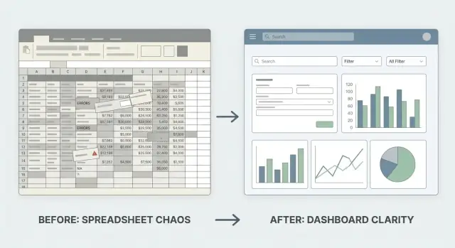
If you use visuals, keep them dead simple: a messy spreadsheet snapshot on the left, a clean form + dashboard view on the right, each with a one-line caption. The goal is instant recognition, not a UI tour.
Pick screenshots that demonstrate what spreadsheets struggle with:
Avoid “blank app UI” screenshots. Use realistic sample data so visitors can picture their own workflow.
A short, plain-language block can do a lot of selling. For example:
Keep it concrete: “No more accidental row deletes” beats “improved data integrity.”
A four-step strip works well, especially for spreadsheet replacements:
Import → Clean → Use → Report
Write one sentence per step. Make it feel quick and reversible (“Import your sheet in minutes,” “Fix duplicates with suggestions,” “Use forms and approvals,” “Generate reports without manual pivots”).
Don’t make people scroll back to take action. After the hero, the proof screenshots, and the “How it works” flow, repeat a clear CTA like:
Keep the CTA text aligned to intent: early CTAs should feel low-commitment, later ones can ask for a demo or trial.
Spreadsheets win because they’re flexible: people can type anywhere, copy/paste quickly, and sort their way to answers. A replacement tool needs a UX that keeps that speed—while removing the mess that happens when “anything goes.” The easiest way to do that is to design around three building blocks: forms (how data gets in), views (how data is found and used), and permissions (who can do what).
A great form feels like a guided spreadsheet row.
Use smart defaults so users don’t have to think about repetitive fields (today’s date, current project, last-used value). Add validation that prevents common errors (required fields, number ranges, unique IDs) and explains what to fix in plain language.
Keep forms fast: support keyboard navigation, autofill where possible, and show only the fields that matter for the current task. When a form saves, confirm clearly and let users add “one more” without reloading their mental context.
People don’t just store data in spreadsheets—they retrieve it constantly.
Provide filters, search, and sorting that feel immediate. Then go one step further with saved views like “My open requests,” “Awaiting approval,” or “Overdue this week.” These should be easy to create and share so teams align on the same “source of truth” without passing around copies.
For teams used to spreadsheets, include at least one familiar view: a table with sensible column widths, sticky headers, and quick inline edits (where allowed).
Spreadsheets are strong when users need to change a lot at once.
Support import/export (CSV/Excel), multi-select edits (update owner/status on 50 items), and simple bulk workflows (archive, tag, reassign). Show a preview before applying changes, and make it easy to undo when possible.
Add roles and permissions early: viewers, editors, approvers, and admins. Restrict sensitive fields, and prevent accidental edits by default.
Include change history per record (what changed, when, by whom). This single feature replaces a lot of spreadsheet detective work.
Make collaboration part of the record: comments, @mentions, assignments, and approvals. When the workflow is visible inside the item—not in a separate chat—teams stop using the spreadsheet as a message board and start using your tool to complete work.
People don’t leave spreadsheets because they love change—they leave because the file is breaking under real-world teamwork. Your onboarding should minimize risk and make the first 10 minutes feel familiar.
Create a simple, guided path: Sign up → pick a template → import data. Avoid dumping users into a blank workspace with no direction.
A good first-run experience includes two options:
Spreadsheet import is where trust is won or lost. Make mapping explicit: show the spreadsheet columns on the left and the app fields on the right, with clear defaults.
Be specific and kind with errors. Instead of “Import failed,” say what happened and what to do next:
Provide sample data in templates so the app feels alive immediately. Pre-filled examples help users understand what “good” looks like (statuses, owners, due dates, tags) before they invest time migrating.
Every empty state should answer: “What should I do next?” Add short tooltips near key actions (Add row, Create view, Share, Set permissions) and suggest the next best step.
Send a welcome email that includes:
When onboarding and migration feel safe, switching stops being a project and becomes a quick upgrade.
People use spreadsheets because they feel “owned” and understandable. If you want them to move to your tool, your website must clearly explain where their data lives, who can see it, and what happens when something goes wrong.
Say, simply, where data is stored (for example: “in our cloud database” or “in your company’s workspace”), whether it’s separated by account, and who can access it. Avoid vague claims. Spell out the everyday meaning: “Only users you invite can view or edit records,” and “Admins control what each role can do.”
A short Security page builds confidence because it answers practical questions:
Keep it factual—only list what exists today.
If you run on managed cloud infrastructure, say so plainly. For instance, Koder.ai runs on AWS globally and can deploy apps in different regions to support data residency needs—this is the kind of concrete “where does my data live?” detail buyers look for when moving off spreadsheets.
Make your privacy and data ownership statements easy to scan. Clarify whether you sell data (ideally: no), how you use customer data to run the service, and what happens when an account is closed. If customers can export their data, say so, and describe the format.
If you have audit trails or activity logs, surface them. People moving off spreadsheets want accountability: who changed a value, when it changed, and what the previous value was. If you support field-level or table-level permissions, explain that in one or two examples.
Add a straightforward support note: what channels you offer (email, chat, ticketing) and a typical response window (for example, “within 1 business day”). This reduces the fear of being stuck after switching.
Pricing is part of your product message. For a spreadsheet replacement, the best pricing is the one users can explain to their manager in one sentence.
Most spreadsheet-driven teams think in terms of access and ownership. That’s why per user (seat) and per workspace/team pricing tends to feel familiar.
If your costs scale mainly with data volume, you can add a second dimension like records, rows, or storage—but keep it as a simple limit per tier rather than a complicated calculator.
A practical rule: choose one primary metric (usually seats), and use 1–2 supporting limits (like records, automation runs, or integrations).
Name tiers by audience and intent:
For each tier, show 4–6 key limits that match real buying questions: seats included, number of workspaces, records/rows, permissions and roles, audit history, and support level. Avoid listing every minor feature; it makes the decision harder.
Add a short comparison box that frames the tradeoff:
You’re not arguing that spreadsheets are bad—you’re explaining why teams outgrow them.
Include an FAQ focused on common purchase blockers:
Finally, make Pricing easy to find in your top navigation, and repeat “See pricing” or “Start trial” calls-to-action across key pages so visitors never have to hunt for it.
Most people won’t switch from spreadsheets because of a feature list—they switch because they recognize their own messy workflow and see a cleaner way to run it. Your website should make that recognition fast.
Treat each use case like a mini story with a clear outcome. Keep it concrete and team-based (who does what, when, and why it matters). Good use-case pages often read like:
Here’s the problem in spreadsheets → here’s the workflow in the app → here’s what you get at the end.
Examples that convert well for spreadsheet-replacement tools:
Use one consistent example and walk it end-to-end. A simple diagram beats a long paragraph:
Request submitted → Auto-routes to approver → Approved items appear in a report
        ↓                 ↓                         ↓
     Form page        Permissioned view         Dashboard/export
Then add 3–5 screenshots worth of explanation in words: what fields exist, who can see what, what happens automatically, and what someone does next.
Templates should be tied to outcomes, not objects. Instead of “Inventory table,” use “Track office equipment with check-in/out and alerts.” Add a short “Works best when…” line so people self-qualify.
If you’re using a platform to build quickly, templates can also be internal accelerators—prebuilt workflows you can clone and adapt. In Koder.ai, teams often start from a simple spec in chat, use Planning Mode to lock requirements, then iterate with snapshots so changes are reversible.
Use calls-to-action that fit the moment:
Place CTAs after the workflow diagram and again after results (time saved, fewer errors, clearer ownership).
People who want to “get out of spreadsheets” rarely search for your product name—they search for their problem. Your job is to show up for that intent and then measure whether the page actually moves them toward switching.
Start with searches that include a team, function, or workflow. These are often higher intent than broad terms like “spreadsheet alternative.” Examples:
Create a simple keyword-to-page map so each page has a clear job (one primary query, a few close variants) rather than stuffing everything onto the homepage.
Write titles and H1s that match how someone speaks about the problem:
Meta descriptions should promise a specific outcome (fewer errors, permissions, audit history, faster handoffs) and match the page’s content.
Link between use-case pages, templates/examples, docs, and blog posts so visitors can self-educate. Use descriptive anchor text like “Inventory request approvals” instead of “click here.” Keep navigation consistent so search engines (and humans) understand what matters.
Comparison pages can convert well, but avoid claims you can’t prove. Stick to clear, verifiable differences: permissions, audit trail, database-backed records, structured forms, and role-based views.
Set up events and funnels for:
Track each landing page’s conversion rate, not just traffic, and use that data to refine messaging and page structure.
Launching a website for a spreadsheet replacement isn’t just “push it live.” Your first goal is to make the experience smooth enough that visitors can understand the switch, request a demo, and try the product without friction.
Start with performance and usability—these are the silent deal-breakers.
Do a full run-through like a real visitor:
Also confirm basics: analytics events fire once (not twice), emails deliver to the right inbox, and any “contact us” addresses are monitored.
Collect feedback fast, but don’t chase every request. Use a lightweight weekly rhythm:
Prioritize changes that reduce uncertainty: clearer migration messaging, stronger examples/templates, and fewer steps to reach a first successful workflow. Each week, ship one small improvement, measure it, and keep the loop tight.
If your product team is moving quickly, operational safeguards matter too: snapshots, rollback, and reliable deployments reduce the risk of breaking core workflows right after launch. Platforms like Koder.ai bake these iteration mechanics into the build process, which can be especially helpful when you’re replacing spreadsheet systems that teams depend on daily.
Lead with a clear diagnosis of the pain your visitor already feels, then connect it to an outcome.
Describe the buyer in plain language (team/role/company size) and the job they’re trying to get done.
Example: “Operations managers at 20–200 person companies who need to collect requests, route approvals, and report status—without chasing the latest spreadsheet.”
Pick 3–5 outcomes and make them your homepage promises and section headers.
Common outcome set:
Draw a hard line between what must exist to replace the spreadsheet and what can wait.
A smaller MVP is easier to explain and usually converts better.
Translate what people do today into a simple flow you can build and explain.
Most spreadsheet “systems” fit:
Write down who does each step, how often, and what “good” looks like. Then design the app to support the flow—not the grid.
Use a structure buyers recognize when evaluating the switch.
Recommended core pages:
Show the moments where spreadsheets break—and how your product prevents it.
Good screenshots highlight:
Avoid empty UI; visitors need to picture their workflow.
Make the first 10 minutes feel safe and familiar.
Include:
Be explicit and factual, in plain language.
Cover on a Security/Trust page:
State the tradeoff and make pricing easy to explain internally.
Tactics that work:
If you have a pricing page, link it clearly in top navigation (e.g., /pricing).