Jul 06, 2025·8 min
How to Build a Coaching Website With Online Scheduling
Learn how to create a coaching website that wins trust and lets clients book and pay online. Includes pages, copy tips, scheduling setup, and launch steps.
Learn how to create a coaching website that wins trust and lets clients book and pay online. Includes pages, copy tips, scheduling setup, and launch steps.
Before you touch a template or connect a calendar, get clear on what you’re selling and what “success” looks like. A coaching website with scheduling works best when it’s designed around one primary decision: book, inquire, or subscribe.
Start with a simple statement: who you help, what you help them achieve, and in what context. “I help new managers lead confident 1:1s” is easier to act on than “I help people grow.”
Then choose the single action you want most visitors to take. For many coaches, that’s booking a consultation. For others, it’s joining a waitlist or downloading a lead magnet. Keep everything else as a secondary path so your site doesn’t feel like a menu.
Write down your current offers and decide how each should be scheduled:
This is also the moment to decide what you won’t offer yet. Fewer choices usually means more bookings.
Circle what needs to run without back-and-forth emails.
Booking confirmation, reminders, intake forms, and payments are the typical “must automate” items. If you plan to sell packages, decide whether clients should book all sessions at once or one at a time.
Pick 2–4 numbers to track for the first month:
Bookings per week, inquiry rate (inquiries/visits), email sign-ups, and show-up rate are all useful. With those targets set, every page and every button can be judged by one question: does it increase the right kind of booking?
Before you write copy or choose tools, map the handful of pages your site needs to guide a visitor from “Is this for me?” to “I’m booked.” A coaching website works best when each page has one clear job—and a single next step.
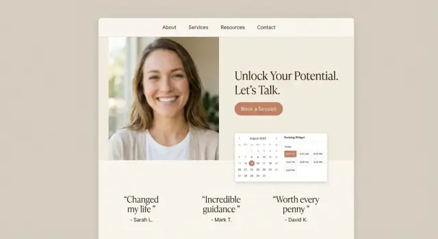
Your homepage should answer three questions within a few seconds: who you help, what outcome they can expect, and how to start.
Include one primary call-to-action (CTA) like “Book a consultation” that repeats in the header and again after you explain your offer. Add a brief proof element (a testimonial, a client count, or a short case result) to reduce hesitation.
List your coaching options in plain language: what the package is for, how it works, how long it lasts, and what’s included (sessions, support between calls, resources, etc.).
If you offer multiple tiers, show a simple pricing structure and add a recommendation (“Most clients start with…”). Each option should link into the same booking flow so people don’t get stuck deciding what to do next.
Your About page isn’t a full life story—it’s reassurance. Share your approach, what you believe about coaching, and who you work best with. Include 2–3 credibility signals (certifications, experience, recognizable clients, or results).
Use a short form for non-booking questions and include a backup email for people who prefer it. Avoid making “Contact” the main path to becoming a client.
Make booking the easiest action on the site: use an embedded scheduler or a dedicated booking flow. Confirm what happens next (confirmation email, intake form, and how you’ll meet).
Your copy has one job: help the right person feel understood, feel safe, and take the next step—booking time with you. Keep it specific, calm, and action-oriented.
Start your page with an outcome-first headline that answers: “Why should I book?” A simple structure is:
Book a clarity session to [desired outcome]—without [common pain].
Examples:
Then add 2–3 short sentences describing who it’s for, what you’ll do in the session, and what they’ll walk away with.
Trust grows from specifics. Use testimonials that mention measurable or tangible changes (even small ones), and pair them with context:
If you don’t have testimonials yet, use anonymized “case examples,” your relevant credentials, and your process. Avoid exaggerated promises—clear expectations convert better than big claims.
Make it easy to say “yes” by answering practical concerns:
Link to details where helpful (e.g., /faq or /privacy).
Pick one primary CTA label and use it everywhere—header button, hero section, and service blocks. “Book a Session” is clearer than mixing “Schedule a Call,” “Book Now,” and “Get Started.” Consistency reduces hesitation and keeps the booking flow feeling straightforward.
Your platform choice matters less for “design freedom” and more for whether you’ll actually keep the site updated. A coaching site is a living tool: you’ll tweak offers, adjust availability, and refine your booking flow.
If you’re not planning to hire ongoing help, choose the option you can confidently edit in 15 minutes on a random Tuesday.
If you want a more tailored flow than most templates allow—custom booking logic, packages, intake steps, or a lightweight client portal—consider building with a vibe-coding platform like Koder.ai. You can describe what you want in chat (pages, CTAs, scheduling flow, payments, and forms) and generate a working web app quickly, then iterate as your offer evolves.
This approach can be especially useful if you:
You typically have two ways to handle bookings:
A practical approach: start with a hosted scheduling page, then embed later if you want a more integrated feel.
Confirm your platform supports: mobile-friendly pages, SSL (https), fast hosting, and a simple editor you won’t dread using.
Even if you’re starting lean, choose a platform that can grow with you: a blog, email capture, online payments, and optionally a client portal for resources and session details.
A coaching website feels “real” when the basics are tidy: a custom domain, consistent visuals, and a structure that makes booking obvious.
Buy a domain that matches your name or niche (e.g., janedoe.coach, brightcareercoaching.com). Keep it short, easy to spell, and avoid hyphens if you can.
Then connect the domain to your website platform and set up a professional email like name@yourdomain. It boosts trust immediately—and it keeps client communication separate from your personal inbox.
You don’t need a full rebrand to look polished. Create a lightweight brand kit you can reuse everywhere:
Use your accent color for calls-to-action like “Book a Call,” so visitors learn what to click.
Keep navigation simple and predictable. For most coaches, this set works well:
If you offer multiple services, “Work With Me” should help people self-select, while “Book” stays focused on scheduling.
Most people will find you on a phone. Design accordingly:
A clean setup here makes every later step—copy, scheduling, payments—work better.
Your scheduling setup is where “nice website” turns into “clients can actually book.” Keep it simple, predictable, and aligned with how you coach.
Start with a small menu of appointments so clients don’t get stuck deciding.
Common options:
Give each type a clear name and one-sentence description. If you serve different audiences (career vs. leadership), consider separate booking links later—don’t overload the first version.
Availability is more than “working hours.” Add guardrails so your calendar stays usable:
If you only coach on certain days, make that explicit. Consistency reduces reschedules.
Enable time zone detection so clients book in their local time by default, and display the time zone on the confirmation.
Also state the “location” clearly:
At minimum, send an automated booking confirmation and a reminder (e.g., 24 hours and/or 1 hour before). If SMS is available, use it as an optional add-on—email alone is usually enough to start.
Write a short policy clients can understand: the cutoff time, any fees, and how to reschedule. Display it directly in the booking flow so expectations are set before anyone clicks “Confirm.”
When your website takes bookings, your calendar setup is what keeps everything sane. A clean integration prevents double-booking, avoids awkward “Sorry, I’m not actually free” emails, and makes the whole experience feel professional.
Most scheduling tools can sync with Google Calendar, Outlook/Microsoft 365, or iCloud. Connect the calendar where your real life lives (client sessions, personal commitments, travel), not a “clean” calendar you forget to update.
If you run multiple calendars (for example: Personal + Business), consider connecting both so the booking tool can check availability across them.
Before you publish your booking link, choose conflict rules that match your workflow:
A small decision here saves a lot of rescheduling later.
Edge cases are where booking systems usually break:
Do a quick dry run by making a test booking and checking whether the calendar event lands where you expect.
If you coach online, automate the meeting link so you don’t manually create Zoom/Google Meet calls.
Most tools can add a unique link to every confirmed booking and place it in:
If you prefer manual instructions (for example, you use a private room link), include clear steps in the confirmation message—keep it short, and put the link on its own line so it’s easy to find.
A booking flow works best when clients can understand the cost, pick the right option, and pay without emailing back and forth. Your goal is to reduce “Wait—how much is this?” moments.
Start by choosing whether your first touchpoint is free or paid:
Be consistent: if the session is paid, show the price on the booking page and again at checkout.
Enable the payment methods your clients actually use—typically card payments, plus any local options if your audience expects them. Confirm your currency and whether tax is included.
Where your tools support it, turn on automatic invoices/receipts. This reduces admin work and reassures clients immediately after purchase.
Offer a small set of choices that map to common needs:
Keep package names plain and outcome-oriented. If you include extras (email support, resources, between-session check-ins), list them right next to the price.
Put your policies directly in the booking flow—near the pay button and in the confirmation email. State:
Clarity here protects your time and makes clients feel they’re dealing with a professional process, not a negotiation.
Your intake form should make the first session better—not feel like homework. The goal is to collect just enough context to prepare, set expectations, and reduce back-and-forth, while keeping the booking flow fast.
Start with short, high-signal questions:
Keep it to 5–8 questions. If you need a detailed assessment, send it after the booking (or after payment) so it doesn’t slow down conversion.
Add clear checkboxes near the end:
Link to your policies using relative URLs (for example, /privacy and /terms).
Don’t let answers disappear into a form tool. Configure your system so submissions:
A good intake form feels quick for the client—but saves you minutes before every call and makes your coaching noticeably more personal.
A great booking flow doesn’t end when someone picks a time. The real client experience is what happens next—and automation is how you deliver it consistently, even on busy weeks.
Map the moments you want every client to experience after they book:
Confirmation → Prep → Session → Follow-up.
Your scheduling tool can usually trigger emails (or SMS) at each step. Keep the sequence simple and predictable so clients never wonder what to do next.
Set one email to go out immediately after booking (or 24 hours before). Include:
This reduces no-shows and helps clients arrive ready, which makes your sessions feel more valuable.
After each session, send a follow-up message using a template you can personalize in under a minute:
If you offer packages, include a quick reminder of what’s left and the best next appointment type.
Instead of cramming everything into an email, link clients to a clean thank-you page after booking. It can host:
This keeps your messages short, reduces support questions, and gives clients one reliable place to find what they need.
A coaching website doesn’t need fancy tricks to convert—just clarity, confidence, and a friction-free booking path. Make sure every important page answers two questions fast: “Is this for me?” and “What do I do next?”
Keep SEO simple by organizing your services logically:
If your platform supports it, add schema to improve how your pages appear in search results:
Set up analytics so you know what’s working:
This gives you a clean feedback loop: adjust copy, page structure, or pricing presentation based on real booking behavior—not guesswork.
Before you announce your new site, test it like a client who has never met you. A coaching website with online scheduling isn’t “done” until the booking flow works smoothly from first click to calendar invite.
Do at least three complete test bookings (or ask a friend to do one) and document what happens at each step:
If anything feels confusing, fix the copy or reduce steps—small friction costs real bookings.
You don’t need an audit to cover the essentials. Scan key pages and forms for readable font sizes, good color contrast, and keyboard-friendly fields (tabbing through should work). Clear error messages matter: “Please enter your phone number” beats “Invalid input.”
Before launch, click every menu item and important button. Confirm policies are easy to find (cancellation, rescheduling, privacy), and that your thank-you pages match what you promise (e.g., “You’ll receive an intake form within 5 minutes”). Also check for broken links and any placeholder text.
Set a monthly 20-minute routine:
If you’re iterating fast (new packages, new landing pages, new flows), prioritize a setup that makes changes low-risk. For example, platforms that support versioning—like snapshots and rollback—make it easier to test improvements without worrying you’ll break your booking path.
Small, consistent upkeep prevents surprise issues and keeps your coaching calendar reliably full.
Start with one primary action (most often booking a consultation) and design every page around moving the right visitors to that step.
Keep secondary actions (contact form, email signup) available but visually quieter so your site doesn’t feel like a menu.
A simple niche statement includes:
Example: “I help new managers lead confident 1:1s” is easier to understand—and book—than a broad promise.
Keep choices small and clear. Common offer types include:
Decide how each is booked (one at a time vs. all sessions upfront) and remove anything you’re “not offering yet” to reduce decision fatigue.
Automate the steps that usually create email back-and-forth:
If you sell packages, also automate tracking what’s remaining and make rebooking easy (e.g., link back to /book).
A lean, effective structure is:
Use an outcome-first headline, then quickly clarify:
Avoid leading with your bio. Keep paragraphs short and make the CTA label consistent (e.g., “Book a consultation” everywhere).
Both can work—choose based on reliability and setup speed:
A practical approach is to start hosted, then embed later if you want a more integrated experience.
Use a small set of appointment types so clients don’t get stuck deciding, such as:
Add guardrails like buffers, minimum notice, and explicit coaching days to protect your calendar and reduce reschedules.
Test the common failure points before launch:
Do at least one full test booking on mobile and confirm the calendar invite + reminders work end-to-end.
Keep it short and high-signal (aim for 5–8 questions):
If you need a deeper assessment, send it (or after payment). Include consent checkboxes and link to and .
Each page should have one clear job and one next step.