Aug 10, 2025·8 min
How to Build a Website for Community Groups That Works
Learn how to plan, design, and launch a clear, accessible website for community groups—events, membership, volunteers, donations, and updates.
Learn how to plan, design, and launch a clear, accessible website for community groups—events, membership, volunteers, donations, and updates.
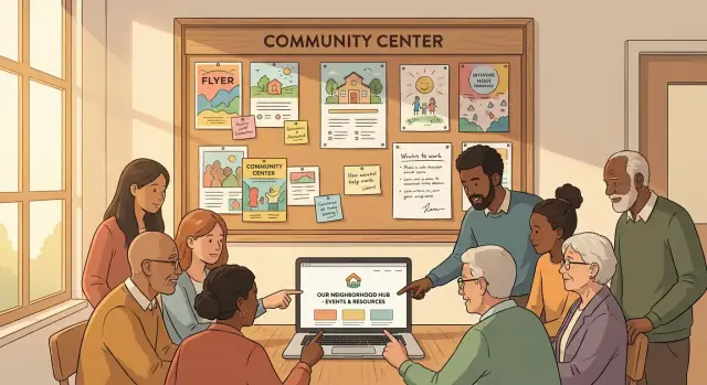
A community organization website shouldn’t try to do everything for everyone. It should do a few things extremely well—so volunteers can keep it updated and residents can quickly find what they need.
Start by agreeing on the primary purpose (or two). Most websites for local groups end up serving four common jobs:
Pick your “top two” and treat everything else as supporting content. This decision will shape the homepage, navigation, and which membership website features (like logins or member directories) are truly necessary.
Success metrics keep the team aligned and prevent endless debates about design preferences. Choose a small set that matches your goals and can be measured with basic analytics.
Examples:
Write these down in a shared doc and review them after launch. If you can’t track a metric without a lot of setup, it’s probably not the right one for a small team.
A community website content plan is only realistic if it names owners. Assign roles in plain language:
Then set an update cadence you can keep: weekly for events, monthly for news, and quarterly for evergreen pages. A simpler plan that happens is better than an ambitious one that doesn’t.
Even “simple” nonprofit website basics have ongoing expenses. Plan for both launch and maintenance:
A practical approach is to set a launch date for a minimum viable site (core pages, event calendar, volunteer signup, donation page best practices) and schedule improvements for later—once you’ve learned what people actually use.
A community organization website works best when it answers real people’s questions in seconds—not minutes. Before you write pages or pick features, get clear on who the site is for and what they’re trying to do when they arrive.
Most local groups serve several audiences at once. Common ones include:
You don’t need a separate section for each audience, but you do need to know their priorities.
For each audience, list the top questions they’re likely to ask on their first visit:
If you can’t answer these clearly from the homepage and main navigation, the site will feel confusing—even if it looks nice.
Pick 2–4 primary actions you want visitors to take. For many groups, that’s:
These calls to action should appear consistently (homepage, header, and relevant pages) with simple labels like “Join” or “Donate,” not insider terms.
Community sites often serve people who are busy, on older phones, or not confident online. Make tasks easy with:
When you prioritize audiences and their top tasks, every other decision—content, navigation, and features—gets simpler.
A good community organization website feels simple because the structure is doing the hard work. Before you pick themes or colors, sketch a site map (the list of pages and how they connect). This helps visitors find what they need in one or two clicks—and helps your team avoid a pile of half-finished pages later.
Most websites for local groups need a small set of core pages that answer the big questions fast:
These pages cover the “top tasks” people come to do, and they align with common nonprofit website basics.
Optional pages can make your community organization website richer—if someone owns them:
If no one can realistically update a page, don’t launch it yet. An empty “News” section can hurt trust more than it helps.
Before writing new copy, list what you already have: flyers, PDFs, email newsletters, social posts, sign-up sheets, event descriptions, photos, and logos. Then decide what should be converted into web pages (easy to read on phones) versus what should remain a download.
A community website content plan works best when updates are assigned:
This keeps your site map from turning into a one-time project and supports long-term maintenance with a small volunteer team.
A community group website succeeds when it’s easy to update on a Tuesday night by whoever has time. Before you compare features, be honest about your team’s skills, availability, and how often the site will change.
Website builders (Wix, Squarespace, etc.) are a good fit when you want an all-in-one setup with minimal technical work. Editing is usually point-and-click, hosting is included, and updates are handled for you.
WordPress is a strong choice if you want flexibility and the ability to grow over time. Many volunteers already know it, and you can add features through plugins. The trade-off is you’ll need to keep themes/plugins updated and choose reliable hosting.
Custom builds (a developer-built site) can be great for unique needs, but they’re often harder for new volunteers to maintain. If you go custom, insist on a simple editing interface and clear documentation.
If you like the flexibility of custom without rebuilding everything from scratch, a vibe-coding platform like Koder.ai can be a practical middle ground: you describe the site (pages, forms, event calendar website behavior, and membership website features) in chat, iterate quickly, and still keep a clear path to exporting and owning the source code.
Focus on:
Most groups quickly need the same basics: email newsletter signup, contact/volunteer forms, donations or payments, and an event calendar. Confirm these work smoothly on your platform (and don’t require expensive add-ons).
Budget for the full picture: domain name, hosting or builder plan, paid plugins/apps, email marketing, and payment processing fees for donations or tickets. A platform that’s “cheap to start” can become expensive if every essential feature is an add-on.
A community organization website should answer three questions in seconds: who you are, what you’re doing next, and how someone can get involved. Clarity beats creativity here—especially for visitors on phones or in a hurry.
Use a straightforward header menu with only the pages most people need. Too many choices makes it harder to find anything.
A typical set might be: Home, About, Events, Get Involved, News, Donate, Contact. If you don’t take donations, swap “Donate” for something like “Resources” or “Membership.”
If you have more content, group it under one item (for example, “About” can include history, leadership, and partners) rather than adding extra top-level links.
Your homepage isn’t a brochure—it’s a guide.
Include these elements near the top:
Make buttons specific: “Sign up to volunteer” is clearer than “Learn more.”
Create a dedicated block on the homepage (and consider a page it links to) that quickly explains:
This reduces repeat questions and helps new people feel welcome.
Add a footer that appears site-wide with email, phone (if used), meeting address/area, and social links. Many visitors scroll straight to the bottom looking for this.
If you have a primary contact method, label it clearly (for example, “Email the coordinators”).
An accessible website helps more people participate—older neighbors, people using screen readers, anyone on a slow phone, and visitors who don’t speak your organization’s “inside” terminology. It also reduces support emails like “I can’t find the meeting time” or “the form won’t work on my phone.”
Start with a few high-impact items that don’t require a redesign.
Inclusive content is mostly about clarity. Use plain language, define abbreviations, and keep paragraphs short (one idea per paragraph). If you must use a term like “AGM” or “bylaws,” add a quick explanation the first time it appears.
Also, use descriptive links so people know what they’ll get before clicking. For example: “/volunteer-signup” labeled as Volunteer signup form is better than “Click here.”
Many community members will only visit from a phone. Test key tasks on mobile: finding the next event, calling or emailing you, and completing forms.
Make sure buttons are easy to tap, form fields are not tiny, and event details (date, time, location, accessibility notes) are visible without hunting. If anything feels fiddly on your phone, it will feel impossible for someone else.
A community organization website works best when it answers the same questions every visitor has: “What’s happening?”, “How do I join or help?”, and “Where does my money go?” The features below cover those needs without adding complexity your team can’t maintain.
Your events section should work for both regulars and first-time visitors.
Include:
On each event page, add practical details that reduce back-and-forth: accessibility information (step-free access, hearing loop, accessible restroom), parking/transit tips, and a contact method for questions.
If you have memberships, don’t bury them in a PDF. Create a clear join/renew flow with:
If you truly need member-only updates, keep it lightweight: a password-protected page for minutes or announcements is often enough.
A volunteer page should help people self-select. List roles with time commitment, typical tasks, and any requirements (training, background checks, age limits). Then connect each role to a short signup form.
After signup, show basic onboarding steps: when they’ll hear back, who to contact, and how to get started.
A good donation page makes the impact clear. Explain the purpose (“supports venue rental for monthly meetups”) and offer suggested amounts plus a recurring option.
Always include a clear thank-you confirmation (and email receipt if possible) so donors know their gift went through.
Forms are often the busiest parts of a community organization website: volunteer signups, event questions, “contact us,” and membership enquiries. They’re also where trust can be won—or lost. The goal is to make it easy for people to reach you while protecting their personal information and your team’s time.
Only collect what you truly need to respond. For a volunteer signup page, that might be name, email/phone, and availability—nothing more.
If you ask for something sensitive (like an address, age, or accessibility needs), add a short note right next to the field explaining why you’re asking and how it will be used. A single sentence can prevent drop-offs and reduce follow-up questions.
Also clarify expectations after submission:
Spam can overwhelm a website for local groups, especially if your contact form email is posted publicly. Add protection that doesn’t frustrate genuine visitors:
If your form tool supports it, limit repeat submissions from the same address in a short period.
You don’t need a legal novel. A clear, plain-language privacy note near your forms builds confidence and supports nonprofit website basics.
Include:
If you use analytics, embedded maps, or ad pixels, check whether your region requires a cookie banner/consent tool and implement the simplest compliant option.
Many community teams are volunteer-run, which means inbox chaos is common. Instead of sending every form to one person’s personal email, set up a shared inbox (e.g., [email protected]) or a lightweight ticketing approach.
Create a basic routing plan:
This improves response times, protects continuity when roles change, and helps your community organization website feel dependable.
Trust is the difference between “nice website” and “people actually show up.” For community groups, the easiest way to build confidence is to make the basics visible and verifiable.
List the people responsible for the group, with names and roles (as appropriate for your context). Keep it simple: who handles events, finances, membership, and general enquiries.
Add a short note on how decisions are made—monthly meetings, an elected committee, a vote at the AGM, or another process. People are more likely to join (or donate) when they understand how the group is run.
Stock photos can feel anonymous. A few genuine photos from activities—clean-up days, workshops, meetups—show that the group is active. Always get permission from attendees, especially when children are present, and consider posting a brief photo policy on /privacy.
For contact details, avoid making visitors hunt. Put an email address and a simple contact form on /contact, plus any official social accounts you actually monitor.
If your group has formal documents, make them easy to find and download:
A “Documents & Policies” page (e.g., /documents) signals accountability without overwhelming people.
Testimonials and partner logos can help, but only if you can verify them and keep them current. Outdated partner lists can reduce credibility. If you include them, add context: what the partnership involves, and when it was last active.
People usually search for help and activities by place, not by your organization’s exact name. Local SEO is simply making it easy for search engines (and humans) to understand what you do and where you do it.
Optimize key page titles and headings with a clear “who + what + where” pattern:
Don’t stuff keywords—just be specific and consistent with your city/area names.
Create one page per recurring program or service so people can land on the exact thing they searched for. For example:
Each page should include: who it’s for, schedule, location, cost (if any), and a clear “How to join” section.
For your event calendar, use a repeatable structure so visitors can instantly find time, place, and next date. On every event listing include:
A simple blog/news section helps with freshness and visibility. Monthly is enough: short recaps, upcoming dates, calls for volunteers, or meeting notes. Link from each post to the relevant program or signup page so search visitors have a “next step.”
A community organization website stays useful when it stays current. The challenge is that updates often depend on a few busy people (or one person). A simple, repeatable workflow prevents “we’ll fix it later” from turning into outdated events and broken contact pages.
Use a short checklist every time you publish—or once a month if you post rarely:
Put this checklist in the same place you edit the site (a pinned note, a shared doc, or a page in your workspace).
Templates reduce editing time and keep your site consistent. Make 3–4 standard post types you can duplicate:
When a volunteer steps in mid-year, templates mean they can publish without guessing your format.
Write down a basic flow: editor → reviewer → publisher. If it’s just one person, still pause and review with “reviewer eyes” (typos, clarity, missing links). If you have two people, the reviewer can focus on accuracy and tone.
Keep a shared folder with clear naming for logos, photos, and brand colors. Use conventions like:
Logo_Primary.png, Logo_Icon.svg2025-04_EarthDay_Photos/BrandColors.txtThis prevents last-minute scrambling and keeps pages looking consistent across updates.
A community organization website isn’t “done” when it goes live. A good launch makes it easy for people to take action right away (attend, join, volunteer, donate), and a simple maintenance rhythm keeps the site trustworthy without burning out your team.
Before you announce anything, run a quick practical check on the pages people will actually use:
You don’t need complicated dashboards. Set up analytics and track a few actions that match your goals:
This gives you early feedback on what’s working—and what people can’t find.
When you share the new website for local groups, don’t just post the homepage link. Point people to the pages that matter most:
Use the same links across email, social accounts, flyers, and partner organizations so your community learns where to go.
Consistency beats perfection. A simple plan:
Over time, this routine keeps your nonprofit website basics strong: accurate information, working calls-to-action, and a site people trust.
Start by picking your top 1–2 goals (for example: recruit volunteers and inform residents). Then choose 3–5 metrics that match those goals and are easy to track, such as:
Write them down and review them a few weeks after launch so decisions aren’t based on preferences alone.
A solid “minimum viable” set is:
Add optional pages (News, Resources, Programs) only if someone will maintain them.
Choose the platform that a volunteer can update quickly and safely.
Before committing, confirm you can handle newsletters, forms, donations, and events without expensive add-ons.
Keep top navigation to about 5–7 items and label them with plain words people expect:
If you have extra content, group it under a parent item (e.g., “About” → leadership, partners) instead of adding more top-level links.
Design for older phones and busy visitors:
Test your core tasks on a phone before launch: finding the next event, contacting you, and submitting a form.
Each event should have an easy-to-scan listing and a detail page that includes:
Provide both list and calendar views if you can, but prioritize clarity over fancy layouts.
Make donating feel simple and trustworthy:
If you can, add a short “what happens next” note so donors know their gift was received and how it will be used.
Collect only what you need to respond (name + email/phone is often enough). Next to the form, add a short privacy note that explains:
To reduce spam without blocking real people, use an accessible CAPTCHA only where needed and consider a honeypot field. Route messages to a shared inbox (e.g., info@) so they don’t disappear when volunteers change.
Local SEO is mostly about being specific about what you do and where you do it.
Avoid keyword stuffing; consistency with your neighborhood/city name usually helps more than clever wording.
Assign owners and set a cadence you can keep:
Use templates for repeat content (event announcement, recap, volunteer call) and keep a simple checklist for dates, links, and contact info so publishing doesn’t depend on one expert editor.