Mar 25, 2025·8 min
How to Build a Speaker Website That Wins More Bookings
Step-by-step guide to create a professional website for speakers and public figures—bio, topics, media kit, bookings, SEO, and launch checklist.
Step-by-step guide to create a professional website for speakers and public figures—bio, topics, media kit, bookings, SEO, and launch checklist.
A speaker website isn’t a portfolio for everyone—it’s a tool that guides specific visitors to a clear next step. Before you pick colors, templates, or photos, decide what “success” looks like for this site.
Most speaker sites lean toward one primary purpose, with a couple of secondary benefits:
Pick one main goal. If you try to optimize equally for everything, the site usually feels vague—and vague sites don’t convert.
List your top visitor types and the questions each one asks in the first 30 seconds:
Limit your primary calls to action to one or two buttons repeated across the site, such as “Check availability” (linking to /book) and “Get the media kit” (linking to /press).
Write down the proof you must show early: recognizable logos, measurable outcomes (not just “inspiring”), short video clips, a few strong testimonials, and clear logistics (location, travel, typical formats). This becomes your design brief—and prevents a beautiful site that doesn’t win bookings.
Your site structure should match how people book speakers: they skim, look for proof, and need clear next steps. A clean structure also makes it easier for you to keep the site current—outdated pages quietly reduce trust.
A one-page speaker site works well if you have one core talk, a clear audience, and limited assets. It’s faster to build, easy to navigate on mobile, and keeps attention focused on one booking action.
A multi-page site is better if you have multiple talk tracks, several audience segments (e.g., sales vs. leadership), a strong media library, or frequent press mentions. Separate pages let planners jump straight to what they need and help search engines understand your topics.
Keep it familiar. Most event organizers expect these pages:
If you’re starting with one page, you can still use the same sections as anchors.
Before designing, list what’s ready: headshots, intro video, talk descriptions, past client names, testimonials, and a short/long bio. Then identify gaps you can fill quickly—often it’s “one good video” and “three specific testimonials,” not more pages.
Decide what you’ll refresh monthly: upcoming events, new clips, fresh testimonials, and press mentions. If you won’t maintain a news blog, skip it—add a small “Recently” section on Home instead, or link to a media/press page you can update in minutes.
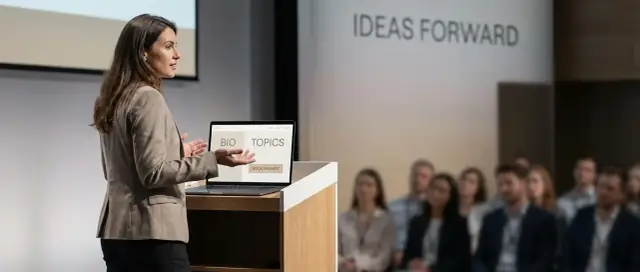
Your homepage should answer one question in the first five seconds: “Is this the right speaker for my event—and how do I book them?” Event organizers are scanning, not reading, so clarity beats cleverness.
Write a headline that says who you help and what changes after your talk. Think in outcomes and audiences, not job titles.
Examples:
Under the headline, add one short credibility line that removes doubt fast—your role, a book, or a notable credential. Keep it skimmable (one sentence), like: “Author of _____, former VP at _____, featured in _____.”
Add a professional photo near the top. It should feel like a speaker headshot (clear face, confident, well-lit), not a cropped vacation photo.
Then place one primary call-to-action button above the fold—and make it the obvious next step. Use simple labels that match how planners think:
Avoid competing buttons like “Subscribe,” “Buy,” and “Follow” in the hero area. You can include those later, but your homepage job is bookings.
Planners are managing risk: budget, reputation, and attendee satisfaction. Help them feel safe with fast credibility cues near the top—logos, short mentions, or a compact “As seen at” strip.
Good trust signals include:
Keep it tight and honest. A few high-quality logos beat a wall of tiny ones. If you want to go one step further, link your hero CTA to your /booking page so organizers immediately find pricing ranges, formats, and what happens next.
Your bio isn’t just “about you”—it’s copy-paste material for event pages, agenda PDFs, and introduction scripts. The easier you make that job, the more likely you’ll be booked (and presented accurately).
Add both of these on your site as clearly labeled blocks:
Write them so they still make sense out of context. Avoid inside jokes, overly personal backstory, or references like “as you’ll see below.”
Many organizers need third-person text. Provide a third-person variant (or write everything in third-person by default) so it can be pasted directly into:
In the first 1–2 sentences, state your “what” and “for whom.” Then add proof:
Right next to the bio, include a compact facts section:
Also provide a downloadable headshot (high-res JPG/PNG) so organizers don’t have to request it. Label usage rights if needed (e.g., “Approved for event promotion”).
A list of clever talk names isn’t enough for an event organizer to picture how you’ll fit their program. Give them clarity: what the session is about, what the audience will leave with, and why it’s safe to book you.
Include 3–6 core talks. For each one, add a short, skimmable paragraph and a few concrete takeaways.
1) The High-Trust Room: How to Earn Attention in the First 5 Minutes
A practical keynote on opening strongly, reading the room, and keeping energy up without gimmicks.
2) Decision-Making Under Pressure: A Repeatable Framework
A workshop-style session that helps teams avoid “analysis paralysis” and make faster, clearer calls.
3) Storytelling for Leaders: Make Your Message Stick
A hands-on talk on turning complex ideas into stories people remember and repeat.
4) From Expert to Influence: Building Credibility Without Self-Promotion
A keynote for professionals who want to grow authority through consistent value and clear positioning.
5) Q&A That Doesn’t Go Off the Rails: Facilitation Skills for Any Stage
A tactical session on moderating panels, handling tough questions, and keeping discussions productive.
For each talk, include:
This turns your talks page from a menu of titles into a booking-ready brief organizers can reuse in their agenda and marketing.
Your media section is where organizers answer a simple question: “Will this speaker work on our stage?” Make it easy to preview your delivery, share assets internally, and confirm production requirements—without back-and-forth emails.
Put a short speaker reel first (60–120 seconds). It should show quick cuts of you on stage, audience reactions, and a clear sense of your energy and clarity.
Then add 2–4 full clips (5–20 minutes each) so planners can evaluate substance and pacing. Choose variety: a keynote moment, a practical segment, and one clip that matches your most-booked audience.
If possible, include captions. They help reviewers watching without sound and make your content more accessible.
Include a small set of high-quality photos from real stages and audiences (with permissions). Aim for:
These are the images organizers will paste into agendas, speaker slides, and promo posts.
Don’t hide production details in a PDF. Add a short “Tech needs” block covering mic preference (lav/handheld/headset), clicker, confidence monitor, audio input needs, and any stage setup notes. This reduces surprises and builds confidence.
Embed videos instead of uploading huge files, and compress images so the page stays quick on mobile. A slow media page is a silent deal-breaker—especially when someone is reviewing multiple speakers in one sitting.
Event organizers don’t just want to know you’re “good.” They want reassurance that booking you is a safe decision—someone who will show up prepared, connect with the room, and help them hit their event goals. Social proof is how you reduce that perceived risk.
Testimonials that only say “Amazing speaker!” don’t help planners justify the budget. Aim for quotes that mention results and context:
If you need to guide people, send a simple prompt: “What was the event goal, what did I speak on, and what was the impact you noticed afterward?”
A strong testimonial includes who said it and why their opinion matters. Wherever possible, display:
Always get consent to publish. Some organizers can approve a quote but prefer the company name omitted—offer options like “VP, FinTech Company” to keep it usable.
Logos can add instant trust, but only use them if you have permission to display them. If you’re unsure, skip the logo and list the company names as plain text. It’s cleaner—and safer.
Alongside quotes, include 2–4 compact case snapshots that show the booking situation and the result. Keep them scannable:
Only share metrics you can verify (survey scores, attendance, repeat bookings). If results are anecdotal, label them as such.
Place your best proof near high-intent areas like your /booking page, and include a shorter selection on the homepage so planners feel confident before they click anything.
Your booking page should feel like a helpful intake, not a sales pitch. Event planners arrive here with a simple goal: confirm fit and understand the next step.
Choose a single main call to action and repeat it consistently (button + top-of-page link). Pick one:
You can still offer a secondary option (e.g., “Prefer email?”), but keep the primary route obvious so people don’t hesitate.
Planners shouldn’t have to guess what information to send. Include a short note like “To confirm availability and provide a quote, please share:” then collect:
If you have non-negotiables (e.g., travel windows, minimum fee), state them clearly and politely.
Reduce uncertainty with two sentences:
Also link to supporting assets so planners can keep moving: /press-kit or /media-kit.
A quick line helps organizers plan well: “Let us know if you need captions, ASL, step-free access, or other accommodations.” If your name is often mispronounced, include a simple guide (phonetic spelling or a short audio link) so hosts can introduce you confidently.
A great speaker website answers questions. A great press kit removes friction. When an organizer is on a deadline, they want assets they can copy, paste, and trust—without chasing you for approvals.
Offer a single PDF that an organizer can forward internally. Keep it clean, skimmable, and updated. Include:
Place the download near your booking path (often the /booking page), but also link it in the header or footer so it’s always reachable.
Add a dedicated page (e.g., /press) that contains “official” materials. This helps journalists and conference marketing teams avoid grabbing outdated photos or incorrect links.
Include:
Keep everything easy to download—either as individual files or a single ZIP.
Write a 2–4 sentence intro that an MC can read on stage. This is one of the most reused pieces of copy on a speaker website, and it ensures your name, credentials, and topic are introduced the way you want.
A newsletter or community can build credibility, but don’t distract from your main goal. If it helps event organizers (e.g., “monthly speaking topics and new keynote clips”), add a subtle link on /press or your homepage. If it’s unrelated, keep it off your primary speaker booking flow.
Event organizers don’t search for “great speaker.” They search for a name, a topic, and a format—often on mobile, between meetings. Good SEO simply makes your site the obvious match.
Make your most important pages explicit:
Keep each page focused: one primary topic per page is easier for search engines—and people—to understand.
A short FAQ often ranks well because it matches exact planner questions. Cover:
Write answers in plain language and be specific where you can (even ranges or “typical” policies help).
Compress images, avoid huge background videos, and test your site on your phone.
Add descriptive alt text to key images (e.g., “Your Name speaking on stage at [Conference]”). Alt text improves accessibility and helps search engines understand your visuals.
Schema is a structured “label” for search engines. A simple start:
<script type="application/ld+json">
{
  "@context": "https://schema.org",
  "@type": "Person",
  "name": "Your Name",
  "jobTitle": "Keynote Speaker",
  "url": "/",
  "worksFor": {"@type": "Organization", "name": "Your Company"}
}
</script>
If you feature demo reels, add VideoObject schema on the media page to help your videos appear more prominently in results.
Your website doesn’t need to be fancy to feel premium—it needs to be consistent, easy to use, and quick to load. Event organizers often review speaker sites between meetings, on a phone, with limited time.
Pick 1–2 brand fonts and stick with them across every page. A clean pairing (one for headings, one for body text) looks intentional and keeps reading comfortable.
Use a small color palette—think one main color, one accent, and neutrals. This helps your buttons, section headers, and highlights look unified. If your vibe is energetic, go brighter; if you’re a corporate keynote speaker, lean classic and calm.
Mobile-first choices usually improve the desktop experience too:
Accessibility isn’t just compliance—it reduces friction for everyone.
Fast sites feel more professional. Use compressed images, keep animations minimal, and avoid piling on extra widgets you don’t need. For video, prefer lightweight embeds and don’t autoplay heavy backgrounds.
Use consistent naming and tone: title case headings, standardized talk titles, and the same CTA language everywhere. When your site reads like one coherent story, booking feels like the obvious next step.
A speaker website is never really “done.” The fastest way to increase bookings is to launch, watch what real organizers do, and improve the pages that influence decisions.
Set up analytics and conversion tracking so you know which parts of the site create inquiries. Useful events to track include:
If you want a simple setup, use GA4 events and add UTM links to your outreach emails so you can see which campaigns drive visits and inquiries.
Before announcing your launch, test every link, video, and form on both desktop and mobile. Pay special attention to:
Also test on a slow connection. If pages feel heavy, trim large videos, compress images, and remove unnecessary embeds.
Create a simple quarterly routine so your site stays fresh without becoming a chore:
Before you share the site, confirm:
After launch, review your metrics weekly for the first month. Small improvements—clearer CTAs, fewer form fields, better proof near the booking button—often outperform big redesigns.
If your priority is getting a clean, conversion-focused speaker site live quickly, a vibe-coding platform like Koder.ai can help you go from a short chat brief (pages, sections, CTAs, and copy blocks) to a working site fast—then iterate without rebuilding from scratch. It’s especially useful when you need standard speaker pages (/speaking, /media, /booking, /press), want a modern React frontend with a Go + PostgreSQL backend if you later add forms/CRM-style intake, and still want the ability to export source code, use custom domains, and rely on snapshots/rollback while you tweak messaging and layout.
Start by choosing one primary goal (usually bookings) and optimizing the whole site around it. Then pick 1–2 primary CTAs (e.g., “Check availability” to /book and “Get the media kit” to /press) and repeat them consistently.
If everything is equally important, the site reads as vague—and vague sites convert poorly.
Focus on what they need in the first 30 seconds:
Build pages and sections so each group can skim and find proof fast.
Use a one-page site if you have one core talk, one clear audience, and limited assets—it’s fast and keeps attention on one booking action.
Choose a multi-page site if you have multiple talk tracks, different audiences, lots of media/press, or you want stronger SEO with dedicated topic pages.
A practical baseline sitemap is:
Your homepage should answer: “Is this the right speaker for my event—and how do I book?”
Lead with an outcome-focused headline, show one strong visual, and put one primary CTA above the fold. Add a few high-quality trust signals (logos, short testimonials, notable stages) near the top.
Provide copy-paste assets:
Include a downloadable high-res headshot so organizers don’t have to ask.
List 3–6 core talks, and for each include:
Outcomes sell; clever titles alone don’t.
Include:
Keep the page fast: embed video and compress images.
Make the booking page feel like a helpful intake:
/press or /media-kit so planners can keep movingClarity and fewer fields usually increase submissions.
Cover planner questions that match real searches and decisions:
Person, and VideoObject for reels)If you start one-page, use these as on-page sections (anchors).
SEO works best when each page has one clear focus.