Sep 08, 2025·8 min
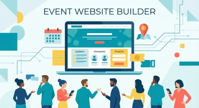
How to Build a Website for Events, Conferences, or Meetups
Learn how to build an event website that drives registrations: pages to include, design tips, ticketing, SEO, email flows, and launch checklist.
Learn how to build an event website that drives registrations: pages to include, design tips, ticketing, SEO, email flows, and launch checklist.
Before you choose a template or write a headline, decide what “success” looks like for this event website. A conference website, a meetup website, and a paid workshop page all need different content—and different calls to action.
Start by naming the format: conference, meetup, workshop, webinar, or hybrid. Then pick the primary goal:
Your goal dictates whether you need a full site (multiple pages for speakers, venue, policies) or a single high-focus event landing page that answers the essentials and pushes one action.
Write down who the site is for (first-time attendees, returning community members, executives, students, local developers, etc.). Ask: what do they need to decide in 30 seconds?
Most visitors scan for:
If any of these are hard to find, your conversion rate will suffer—even with great design.
Choose 2–4 numbers you’ll track from day one:
List what’s ready now (speaker bios, session titles, venue details, partners) and what’s missing. This prevents last-minute gaps that stall event registration—and reduces rework when you expand the site later.
Before you write a single line of copy, decide whether you’re building a single-page event landing page or a multi-page event website. This choice affects everything: navigation, SEO, how easy it is to update, and how quickly attendees can find what they need.
A single-page landing works well for smaller meetups, simple ticketing, or events with limited program detail. It’s faster to build and easier to keep consistent.
A multi-page conference website is better when you have multiple tracks, many speakers, sponsorship tiers, venue logistics, and content people want to share (like individual speaker pages).
A practical middle ground is a landing page plus a few supporting pages (Agenda, Speakers, Venue, FAQ).
Keep your main navigation predictable and short:
If you’re using a single page, these can be anchored sections (e.g., /#agenda). If you’re multi-page, make them separate URLs.
Your top section should answer “Should I attend?” immediately:
Use short, readable slugs people can paste into chat:
Avoid long parameters and unclear pages like /page?id=12.
Aim for a final guide around 3,000 words. A simple distribution across the 12 sections is ~200–300 words each (for example: 10 sections at ~240 words = 2,400, plus two deeper sections at ~300 words = ~3,000). This keeps the content complete without overwhelming readers—and it mirrors how your event website should feel.
Your landing page has one job: help a visitor decide quickly whether this event is for them—and make registering feel effortless.
Above the fold, include the essentials in plain language:
A simple structure works well: headline + one-sentence value + key details + CTA button.
Pick a single, clear label and repeat it everywhere: “Register”, “Get Tickets”, or “RSVP.” Don’t mix multiple options like “Join,” “Sign up,” and “Buy now” on the same page—visitors hesitate when the action feels unclear.
If you have multiple ticket types, the main button can still say “Get Tickets” and scroll to the pricing section (or link to /register). Secondary actions (like “View Agenda”) should look less prominent.
Urgency can help people act, but only if it’s accurate:
Avoid vague pressure like “Hurry!” without a reason. If numbers change, make sure your page stays updated.
Most visitors are asking, “Is this legit?” Add trust signals near the CTA:
Many people will come back just to confirm details. Add quick-access links near the top (and in the sticky navigation if you use one):
Done well, your landing page feels like a confident invitation: clear details, a single next step, and enough proof to click without second-guessing.
If you’re moving fast—launching a meetup series, spinning up a conference microsite, or iterating week-to-week—tools that shorten the build loop matter. For example, Koder.ai lets you create event sites by describing what you want in a chat (pages, CTAs, agenda layout, forms), then iterate quickly as speakers and schedules change. If you later need full control, you can export the source code and deploy under a custom domain, with snapshots and rollback for safer edits.
Your agenda is often the most visited page on an event website. People aren’t “reading” it—they’re skimming to answer a few fast questions: What’s happening when, and what should I attend?
Pick one primary view and make it obvious:
If your event is small, keep it simple: one page with clear time blocks usually beats fancy navigation.
Each session should look like a quick “card” with the same fields every time:
That consistency helps attendees compare sessions at a glance.
For online or hybrid events, show the time zone next to every time (not just once at the top). If you offer multiple time zones, provide a clear selector and remember the choice.
Filters (track, level) help only when the schedule is large. Limit to a few meaningful options and avoid filter overload that hides sessions by accident.
Schedules change. Add a “Last updated” timestamp on the agenda, and define how you’ll notify attendees (email update, banner on the agenda page, and a short note on what changed). That way, people trust the schedule—even when it moves.
Speaker and session pages are where many people decide whether your event is “for them.” Clear, consistent profiles reduce uncertainty, make the agenda feel real, and give attendees confidence that the content will be worth their time.
Keep every speaker page structured the same way so people can scan quickly. A simple template usually works best:
Add small trust signals: links to past talks, publications, or a personal website—only if the speaker provides them.
On each session page, include the essentials upfront: time, duration, format (keynote, panel, workshop), level (beginner/intermediate), and what attendees will walk away with.
If you have keynotes or featured sessions, highlight them with a “Keynote” badge or a featured slot on the agenda—without hiding the rest of the program.
Small fields can make a big difference. Consider adding:
Link speakers → their sessions, and sessions → speaker pages so visitors never hit a dead end. If your event accepts proposals, add a simple call-to-action like “Apply to speak” that points to /call-for-speakers or your submission form.
Your registration setup is where interest turns into attendance. The goal is simple: help people pick the right ticket quickly, pay confidently, and know what happens next.
Most events do best with a small set of ticket types rather than a long menu. Common options include General, Student, VIP, and Early-bird.
If you offer an early-bird, make the deadline obvious and avoid “mystery pricing.” If you offer Student tickets, state what proof is required (and when you’ll ask for it) so there are no surprises.
Write inclusions in plain language so people don’t have to email you to understand value. A ticket description should answer questions like:
If something is not included (for example, workshops or recordings), say so clearly.
Registration should take only a few steps, with no unexpected add-ons at the end. If there are processing fees, show them early.
Link to your refund policy right next to the purchase button (for example, /refunds or /policies) and confirm what happens if the event date changes.
After payment, send a confirmation email immediately that includes: ticket details, receipt, how to edit attendee info, and what to do if they didn’t receive the email.
Payment issues happen. Put a visible “Billing help” contact (email or short form) near the checkout area, and mention typical response time. This alone can reduce abandoned purchases.
If you promote tickets via newsletters, partners, or ads, add UTM parameters to your ticket links so you can measure which campaigns drive registrations (for example, ?utm_source=newsletter&utm_campaign=earlybird).
People decide whether they can attend based on logistics. If the “where” and “how” are unclear, they hesitate—or they email you. A good venue + travel section answers practical questions in one place and sets expectations early.
Include the essentials, written as copy-and-paste friendly details:
If the venue is hard to find, add a short “what you’ll see” description (e.g., “enter through the glass atrium next to Building B”).
Accessibility details build trust—especially when they’re concrete.
Mention what’s available and what isn’t:
If accommodations require advance notice, say so and point to a contact method (e.g., “Email us by May 10”).
Hotel and travel tips are helpful only if you can maintain them. If you list hotels, include “last updated” dates and avoid time-sensitive pricing claims. A small “Getting here” list often beats a long directory.
For streaming, set clear rules: where links will appear, whether they’re personalized, and what tech is needed (browser, bandwidth, time zone notes). If access requires registration, say so.
Add a brief safety note and link to your full policy: /code-of-conduct. Include who to contact onsite for help.
These “support” pages often decide whether someone registers, sponsors, or bounces. Keep them easy to find from the header or footer, and write them like you’re answering a real email—clear, specific, and current.
Don’t guess. Pull questions from inbox messages, DMs, and last year’s comments. At minimum, include:
Link to deeper pages when needed (for example, /terms or /code-of-conduct), but keep the FAQ readable on its own.
Offer a single primary contact method (a form or email) and set expectations: “We reply within 2 business days.” Add a separate option for urgent day-of issues if relevant (for example, a phone number displayed only during event week).
Create a sponsor section that includes:
If you need it, add a compact media kit with downloadable logo files, a short event description, and a small set of approved photos at /media-kit.
Policies build trust only when they’re true. Keep statements precise, avoid guarantees you can’t control (like “no schedule changes”), and ensure your refund, privacy, and conduct policies match what your team will actually enforce.
Most attendees will find your event site from a phone—often while commuting, between meetings, or mid-conversation. If the page is slow, cramped, or hard to read, they won’t hunt for details; they’ll leave.
Design for thumbs first. Use large, tap-friendly buttons for primary actions like Register, View agenda, and Get directions. Keep paragraphs short, use comfortable type sizes, and leave enough spacing so the page doesn’t feel crowded.
A simple rule: on a small screen, each section should answer one question quickly (What is it? When/where? How do I join?).
Good accessibility also improves conversions. Choose fonts that are easy to read, avoid tiny text, and ensure strong color contrast—especially for links, buttons, and key details like date and venue.
Be careful with background images behind text. When you can, use real photos (venue, previous events, speakers), but keep text areas clean. If you place text over an image, add a solid overlay so the copy stays readable.
Speed is a feature. Compress images, limit heavy scripts, and avoid loading five different widgets on every page. If you embed maps, videos, or social feeds, consider loading them only when someone taps “Show.”
Quick checkpoints:
Registration and contact forms should feel effortless on mobile. Ask only what you truly need, use autofill-friendly inputs (name, email, phone), and show clear error messages right next to the field. If you can, offer a “copy attendee info” option for ticket purchases to reduce re-typing.
Search and social are often how new attendees find you. A few focused tweaks can make your event site easier to discover—and more appealing to click—without turning it into a technical project.
Start with the essentials on your key pages (especially your main landing page):
Include phrases you expect attendees to search, naturally in copy:
Ask your developer (or platform) to add structured data so Google can better understand your pages:
You don’t need to memorize the format—just ensure the details match what’s on the page.
Set up Open Graph and Twitter/X metadata so shared links look good:
Backlinks help SEO and referral traffic. Aim for mentions from:
Provide a ready-to-copy blurb and link to the canonical page (e.g., /tickets or the main event landing page) to keep links consistent.
A good event website doesn’t end at “Thanks for registering.” Clear, timely communication reduces support requests, lowers no-shows, and helps attendees feel prepared.
Create a basic sequence you can reuse for every event:
Write the templates before launch so you’re not scrambling later. Keep each email to one main goal and one clear call-to-action.
Many attendees decide whether they’ll actually show up when the event hits their calendar.
If you change the schedule, call it out explicitly and resend an updated calendar file.
You don’t need daily posts—just predictable milestones. A simple content schedule might be:
Each update should link back to the most relevant page, not the homepage. For example, a speaker announcement should point to the speaker page, and an agenda update should point to the schedule section.
If tickets can sell out, add a waitlist with clear expectations:
This prevents inbox chaos and keeps demand organized.
For a practical promotion plan, see /blog/event-marketing-checklist. If you’re choosing tools for email + ticketing, compare options on /pricing.
A smooth launch is less about “finishing the website” and more about removing surprises. Treat launch day like a rehearsal: click every path a real attendee will take, from the first visit to the confirmation email.
Before you share the link widely, run through a quick set of tests:
At minimum, track:
This helps you see what’s working while you still have time to adjust copy, pricing, or calls to action.
If you use tracking or marketing pixels, add a cookie notice where required and be transparent about what you collect and why. Keep your privacy policy easy to find (often in the footer) and written in plain language.
Add a short “On the day” block (or a dedicated page) with:
Publish photos, slides, and recordings (with permissions), then email a short survey while the event is fresh. Finally, reuse the same URL for next year: update dates, keep the SEO value, and add a “Last year’s highlights” section to build trust for the next edition.
Event sites change constantly—new speakers, room swaps, sponsor updates, pricing changes. Whatever stack you use, aim for a workflow that supports quick publishing and easy rollback. Platforms like Koder.ai include snapshots and rollback, which can be a practical safety net when you’re shipping frequent updates close to the event date.
Start by defining the event type (conference, meetup, workshop, webinar, hybrid) and choosing one primary goal:
That goal determines your CTA, what content must be prominent, and whether you need a single landing page or multiple pages.
Use a single-page landing page when the event is small, the agenda is simple, and you want one focused action (RSVP or tickets).
Use a multi-page site when you have multiple tracks, many speakers, detailed logistics, or sponsorship packages.
A common middle ground is a landing page plus a few supporting pages like /agenda, /speakers, /venue, and /faq.
Make these details easy to spot near the top:
If visitors can’t find value, date/location, and cost quickly, conversions drop.
Pick one clear CTA label and repeat it everywhere (button, nav, sticky header, footer). Good options are Register, Get Tickets, or RSVP.
If you need a secondary action (like viewing the agenda), keep it visually less prominent so it doesn’t compete with the main conversion goal.
Use urgency only when it’s specific and verifiable, such as:
Avoid vague pressure (“Hurry!”) if you can’t keep it accurate—nothing hurts trust faster than outdated numbers or fake scarcity.
Treat the agenda like a scan-first document. Use consistent session “cards” with:
For online/hybrid events, show the time zone next to every time, not just once at the top.
Use a consistent speaker template:
Cross-link speakers → sessions and sessions → speakers so visitors never hit a dead end.
Keep ticket options minimal (e.g., General, Student, VIP, Early-bird) and explain inclusions in plain language (food, workshops, recordings, swag).
Make checkout predictable:
/refunds)Also add a visible “Billing help” contact near checkout to reduce abandoned purchases.
Include copy-and-paste-friendly logistics:
If accommodations require advance notice, say exactly how and by when (with a clear contact method).
Focus on practical basics:
/tickets, /agenda, /speakersFor measurable impact, track conversions (visits → registrations), key button clicks, and traffic sources.