Nov 18, 2025·8 min
How to Build a Government Public Service Info Portal Site
A practical guide to planning, designing, and launching a government or public service info portal: accessibility, content, security, hosting, and maintenance.
A practical guide to planning, designing, and launching a government or public service info portal: accessibility, content, security, hosting, and maintenance.
A public service portal can’t be “everything to everyone” on day one. Start by writing a clear purpose statement that fits on one page and can be read by procurement, leadership, and frontline staff.
Decide whether the portal is primarily:
This decision affects everything that follows—from content structure to identity verification and support.
List your key groups and the top tasks they must complete:
Keep it practical: audiences are defined by what they’re trying to do, not by demographics.
Agree on a small set of measurable outcomes, such as:
Plan how you’ll measure these (analytics, short feedback prompts, call center tagging).
Write down realities that shape scope:
A simple goals-and-metrics brief becomes the reference point when priorities compete later—and keeps the project focused on public value.
Good government portals start with clarity: what are people actually trying to accomplish when they arrive? If you design around internal departments, you’ll force residents to translate bureaucracy into plain intent. Research helps you flip that.
Begin by collecting “top tasks” from sources you already have:
Look for patterns like “renew,” “apply,” “pay,” “report,” and “check status.” These verbs will later shape navigation labels, landing pages, and form flows.
Pick a handful of priority services (for example: permits, benefits, payments) and map the journey from the user’s perspective. Include:
This prevents a portal that explains policies but doesn’t help people finish.
Keep personas simple and practical: “Someone applying for assistance for the first time,” “A small business owner paying a fee,” “A resident with limited English.” Focus on constraints (time, stress, device, literacy, accessibility needs) rather than demographics.
Run short interviews or lightweight usability tests with prototypes or even sketches. Ask participants to complete key tasks and narrate what they expect to find. You’ll uncover confusing terms, missing steps, and trust issues early—before content and build work hardens into expensive rework.
A public service portal succeeds when people can find what they need quickly—even if they don’t know which department owns it. Information architecture (IA) is the “map” of your site: what content exists, how it’s grouped, and how users move through it.
Before drawing menus, collect what you already have:
Tag each item with basic metadata (topic, audience, service type, last updated, owning team). This prevents rebuilding pages that already exist—and highlights where content is outdated or duplicated.
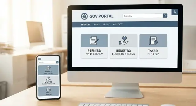
Most residents arrive with an intention: “renew a license,” “apply for benefits,” “report a problem.” Structure categories around those tasks rather than agency names. A simple test: if someone can’t guess the right menu item without knowing government structure, the grouping needs work.
Where multiple agencies contribute to one journey, treat it as one service with clear steps. Link to supporting pages (requirements, documents needed, contacts) from a single service hub.
Aim for key services in 2–3 clicks from the homepage. Use a small set of top-level categories, plus prominent shortcuts for high-demand tasks. Avoid “mega menus” full of internal terms; use plain labels people would say out loud.
Search often becomes the primary navigation. Plan it intentionally:
Done well, your IA and navigation reduce calls, complaints, and drop-offs—while making the portal feel calm and trustworthy.
Accessibility is not a “nice to have” for a government website—it’s part of providing equal access to services. Aim to meet WCAG (typically WCAG 2.2 AA) and treat accessibility as a design requirement, not a final review.
Use clear page structure: one main heading (H1), logical subheadings (H2/H3), and descriptive link text (avoid “click here”). Consistent navigation and predictable page layouts help everyone, including users with cognitive disabilities and people using screen readers.
Make readability effortless: choose high-contrast color combinations, keep line lengths comfortable, and avoid tiny text. Interactive elements should have consistent focus states so keyboard users can always see where they are.
Automated checks are useful, but they don’t catch everything. Include manual testing as part of your definition of done:
Inclusive design is also about words. Use plain language, explain required steps, and avoid jargon and unexplained acronyms. If a term must be used (e.g., a legal term), define it where it appears.
Forms are often where people get stuck. Ensure every field has a visible label, clear help text where confusion is likely, and error messages that are specific and announced to assistive tech (for example, “Enter your National Insurance number” rather than “Invalid input”). Don’t rely on color alone to indicate errors.
Add an accessibility statement explaining compliance status, known issues, and contact options to report problems. Put it in a consistent footer link (e.g., /accessibility) and make sure feedback routes are monitored and responded to.
A public service portal succeeds or fails on whether information stays accurate. Content governance is the practical system that answers: what gets published, by whom, how it’s checked, and how it stays up to date. Without it, pages drift out of date, duplicate answers appear, and trust erodes.
Before assigning tasks, define the main “things” your site publishes so everyone structures information the same way. A simple model for many portals includes: services (step-by-step guidance), news, alerts, locations, and contacts. For each type, decide the required fields (e.g., eligibility, fees, processing time, documents needed, office hours) so content is consistent across departments.
Governance works when responsibilities are explicit. Define who:
Document turnaround expectations, plus an “urgent change” route for emergency alerts and time-sensitive updates.
A portal needs plain, consistent language. Your style guide should specify tone and reading level, approved terminology (and forbidden synonyms), how to format dates, times, addresses, and numbering, and rules for links (e.g., avoid “click here”). Put it in one place and link it from your internal workflow docs.
Every page should have a review date and a way to flag “owner left the organization.” Define when content is archived, how versions are stored, and what must be logged in a change note. Versioning isn’t bureaucracy—it’s how you prove what changed, when, and why.
A public service portal should feel equally usable whether a resident reads the primary language or not. Multilingual support isn’t just translating words—it’s making sure people can complete the same top tasks with the same confidence.
Don’t try to translate everything on day one. Prioritize the pages that directly affect someone’s ability to get help or meet a requirement:
This “top tasks first” approach helps you deliver value quickly and reduces the risk of partial or outdated translations for critical services.
Machine translation can be helpful for discovery content, but it’s risky for legal, safety, financial, or compliance-related instructions. For anything that could cause a person to miss a deadline, submit the wrong form, or misunderstand their rights, use professional translation and a review step.
If you do provide automated translation for non-critical pages, label it clearly and keep the original language one click away.
A language toggle should preserve context: when someone changes the language, they should stay on the same page (and ideally the same section), not be dumped on the homepage.
Also make the switcher easy to find and predictable:
Cultural clarity includes the small details people rely on:
If forms are part of your portal, test them in each language to ensure placeholders, validation messages, and help text are also translated and culturally understandable.
Multilingual sites fail when translations lag behind updates. Add governance rules so content stays synchronized:
When you make platform decisions, ensure your information architecture and CMS support versioning and per-language content relationships so updates don’t get lost.
A government portal succeeds or fails on how reliably it can publish accurate information at scale. The CMS should make the “safe path” the easiest path for editors, while keeping content structured enough to reuse across the site and other channels.
Look for a CMS that supports clear permissions and accountability. At minimum, it should provide role-based access (e.g., author, reviewer, approver, admin), approval workflows, and a full audit trail so you can answer “who changed what, and when?” without guesswork.
Version history and easy rollbacks matter just as much. When policies change quickly, teams need to update pages confidently, knowing they can restore a previous revision if something goes wrong.
Avoid locking important information inside one-off page designs. Use structured fields (titles, summaries, eligibility, required documents, fees, processing times, contact channels) so the same content can appear consistently across:
This approach also helps multilingual content by keeping translations aligned field-by-field instead of copying whole pages.
Define a small set of page templates so people know what to expect:
Map the systems your portal must connect to: online forms, payment providers, case management systems, maps/location services, appointment booking, and analytics. Decide what content lives in the CMS versus what is pulled from external systems.
If you’re prototyping or validating service journeys before committing to a full build, a vibe-coding approach can help teams move faster without skipping governance. For example, Koder.ai lets teams draft citizen-facing flows via chat, generate a working web app (React) and backend (Go + PostgreSQL), and iterate in a “planning mode” before implementation details harden. When the approach is validated, you can export the source code to fit your security review and procurement requirements.
Write a short “editor playbook” covering naming conventions, review rules, accessibility checks, and how to handle urgent updates. Make it part of onboarding and keep it up to date in a central place (e.g., /content-guidelines).
Security and privacy aren’t “extras” for a government website—they’re part of service quality. People will only use a public service portal if it feels safe, explains itself clearly, and handles personal information with care.
Start with data minimization. For every form field, be able to answer two questions in plain language: Why do we need this? and What happens if the user doesn’t provide it? If a field is “nice to have,” remove it or make it optional.
Where you do collect data, add short helper text right next to the field (not buried elsewhere). This reduces abandonment and builds confidence.
Use HTTPS everywhere—no exceptions—and redirect any HTTP traffic automatically. Then lock down admin access:
Public forms attract automated abuse and can become unavailable at the worst time. Combine multiple safeguards rather than relying on a single tool:
Publish a privacy notice that matches local rules and is written for residents, not lawyers. State what you collect, why, who can access it, and how long you keep it. For cookies, use a straightforward consent approach and avoid unnecessary trackers.
If you accept attachments (IDs, certificates), treat them as high risk: restrict file types, scan uploads, store them securely, and limit who can access them. Define a deletion process and test it—privacy includes being able to remove data when required.
People come to a public service portal when they need answers quickly—often on older phones, limited data plans, or unreliable networks. If pages are heavy or the site is down, trust drops immediately.
Treat “slow but usable” as your baseline. Keep page weight low by default: compress images, avoid auto-playing media, and only load scripts that directly support the task on that page.
A practical rule: if a page doesn’t help a resident complete a service journey, it shouldn’t slow the journey down.
For content that is the same for everyone (guides, eligibility criteria, office locations), caching can dramatically reduce load times and server strain. A CDN can serve those assets closer to users and help absorb sudden demand. Make sure any caching rules respect privacy (for example, never caching personalized pages).
Define simple, measurable budgets early and enforce them during design and content updates:
Publish these targets internally so content and design teams understand the tradeoffs.
Deadlines, benefit renewals, weather events, and emergencies can cause dramatic surges. Prepare with load testing, scalable hosting, and a “degraded but functional” mode that keeps core tasks available (status updates, key forms, contact options) even if non-essential features are paused.
Add uptime monitoring, performance tracking, and alerting before launch. Track real-user performance (not just lab tests), set on-call expectations, and document response steps so issues can be handled quickly and consistently.
Most people visit a public service portal to do something: apply, renew, report, request, or pay. The job of a form is to get them through that task with minimal effort and maximum confidence.
Design the journey as a small set of clear steps (for example: Eligibility → Details → Documents → Review → Submit). Show where the user is with a simple progress indicator, and use plain language so each step answers “What do I need to do right now?”
Validate inputs inline as people type or leave a field—especially for common issues like dates, ID numbers, file size limits, and required fields. When something is wrong, show an actionable message next to the field (“Enter your date of birth as DD/MM/YYYY”) and keep what they already entered. Avoid vague alerts like “Invalid input.”
Where possible, let users save drafts and return later, especially for longer applications. After submission, provide a clear receipt: a reference number, what was submitted, and how to track status. Send a confirmation email/SMS if appropriate, and tell users what to do if they don’t receive it.
If you must publish a PDF, provide an accessible HTML version as the primary option, and ensure any downloadable documents meet accessibility requirements. This supports mobile users and screen readers (see /accessibility).
Set expectations right after submission: typical timelines, review stages, how decisions are communicated, and how to correct mistakes or appeal. Clear next steps reduce repeat calls and build trust.
A public service portal is never “done.” People’s needs change, policies change, and small usability issues can quickly become headline problems. A steady measurement and improvement routine helps you fix what matters, show accountability, and protect public trust.
Start with signals tied to real outcomes, not vanity metrics. Focus on:
Government sites should collect the minimum data required to improve services. Prefer aggregated reporting, shorter retention periods, and avoid capturing sensitive information in URLs, search logs, or event names. If you use session recording or heatmaps, have a clear public rationale and strict controls—or skip them entirely.
Create simple dashboards for content owners and service teams: “What pages are failing?”, “What content is outdated?”, “Which forms cause support calls?” Dashboards should lead to decisions, not just reporting.
Run lightweight usability tests on the highest-traffic tasks every quarter. Prioritize fixes that reduce errors, confusion, and repeat contact (calls, emails, in-person visits).
Provide a feedback channel on key pages (e.g., “Was this page helpful?” plus optional comments). Define who reads it, how issues are categorized (content bug, technical bug, policy question), and target response times—so feedback becomes improvements, not a black box.
Launching a public service portal isn’t the finish line—it’s the moment real usage begins. A smooth launch reduces support calls, protects trust, and gives your team room to improve the site safely.
Create a checklist that a non-technical launch owner can run, with clear “pass/fail” criteria. Include at least:
Plan training before launch, not after. Provide short, role-based sessions:
Pair training with a simple handbook stored where people will actually find it (for example, in your intranet and linked from /help).
Define recurring tasks and owners:
Write a one-page runbook for outages or security events: who is on call, how to post public updates, what data to capture, and when to involve legal/comms. Practice once before launch.
Reserve time and funding for post-launch fixes, user-requested enhancements, and accessibility improvements. A small, steady improvement budget beats a big rebuild every few years.
Start by deciding whether the portal is mainly information, transactions, or both with a small set of launch services. Then write a one-page purpose statement and agree on a few measurable outcomes (e.g., task completion, reduced calls, time to publish updates).
This keeps scope realistic and gives you a reference when priorities conflict.
Name audiences by the tasks they need to complete, not demographics. Typical groups include residents, visitors, businesses, and internal staff.
For each, list top tasks like “apply,” “renew,” “pay,” “report,” or “check status,” and use those tasks to drive navigation and content priorities.
Use metrics that reflect real service outcomes and are easy to track:
Decide up front how you’ll measure them (analytics, feedback prompts, call tagging).
Start with demand signals you already have:
Look for repeated verbs (“apply,” “renew,” “pay”), then validate with quick interviews or usability tests before committing to a full build.
Map the journey for a handful of high-impact services from the user’s perspective:
This prevents a portal that explains policies but doesn’t help people finish tasks.
Do an honest content inventory first (pages, PDFs, forms, microsites), and tag items with basic metadata like topic, owner, and last updated.
Then organize navigation around user tasks (e.g., “Apply,” “Pay,” “Report”) rather than departments, aiming for key services within 2–3 clicks from the homepage.
Treat accessibility as a design requirement and definition of done. Key practices include:
Publish an accessibility statement at a consistent path like /accessibility and provide a monitored feedback route.
Define a simple system for who writes, reviews, approves, publishes, and updates content—using named roles, not “the department.”
Add lifecycle rules (review dates, archiving) and a style guide that standardizes terminology, formatting (dates/times/addresses), and link writing. This keeps information accurate and consistent over time.
Prioritize translation for pages that affect someone’s ability to complete top tasks:
Avoid machine translation for critical legal/safety/financial instructions. Ensure the language switcher keeps users on the same page, and build translation status and review timing into the editorial workflow.
Choose a CMS that supports role-based permissions, approval workflows, audit trails, and version history with easy rollbacks. Structure content into fields (eligibility, fees, processing times, documents) so it can be reused across search results and related pages.
Plan integrations early (forms, payments, case systems, booking) and set non-negotiables like HTTPS, MFA for staff, data minimization, caching/CDN for public pages, and monitoring from day one.