Dec 09, 2025·8 min
How to Build a Website for an Industry Certification Overview
Learn how to plan, write, design, and launch a clear website for an industry certification overview—requirements, steps, FAQs, SEO, and maintenance.
Learn how to plan, write, design, and launch a clear website for an industry certification overview—requirements, steps, FAQs, SEO, and maintenance.
Before you write a single page, decide what the website is for. Certification websites often try to do everything at once (marketing, education, applicant support, member services), and that’s how they end up confusing people.
Pick the primary outcome you want a visitor to reach in one session. Common “main jobs” include:
It’s okay to serve multiple audiences, but the homepage and top navigation should clearly prioritize the main job.
Turn goals into metrics you can track. Choose a small set so reporting stays simple.
Examples of useful success metrics:
Write these down now, and make sure your analytics setup can measure them after launch.
Create two lists. The must-have list is what’s required for someone to confidently decide: “Yes, I should apply.” Nice-to-have is everything that can wait until version two.
A typical must-have set includes: overview, eligibility, steps/timeline, fees, renewal, and contact.
If you have gated resources, be intentional. Keep decision-making content public (requirements, fees, steps, verification). Reserve members-only areas for things like continuing education logs, downloadable badges, or private directories.
If something is gated, label it clearly (e.g., “Member portal”) and offer a public summary so visitors aren’t blocked at the first click.
A certification overview website works best when it answers the right questions for the right people—quickly. Before writing pages, list your primary audiences and what decision each one is trying to make.
Most industry certification programs serve three groups:
If you also serve regulators, members, or international applicants, add them now—each extra audience usually means extra content.
Think in terms of “decision-critical” information:
This list becomes your navigation labels, page sections, and FAQs.
Pull common questions from support emails, call logs, chat transcripts, and webinar Q&A. Sort them into themes (Eligibility, Process, Fees, Renewal, Verification) and use the exact wording people use—those phrases often match what they type into search.
If you don’t have data yet, ask your team to forward recurring questions for two weeks. You’ll get a strong first draft of your content plan.
Choose a consistent voice: plain language, minimal jargon, and short definitions when terminology is unavoidable. Aim for one idea per paragraph, clear headings, and direct “you” language. A friendly, precise tone reduces misinterpretation—especially around requirements and deadlines.
A certification overview website works best when it answers the same few questions in the same order: “What is this?”, “Am I eligible?”, “How does it work?”, “What does it cost?”, and “What do I do next?” Your site map should reflect that natural journey.
For most programs, a small, predictable menu outperforms a complex one. A practical starting set is:
If you have downloads, place them within the most relevant page (for example, the handbook link inside Overview or Requirements), rather than adding a separate “Resources” section that visitors may never find.
Many visitors arrive from search on a deep page and still need orientation. Add a short “Start here” block near the top of key pages that links in order:
Overview → Requirements → Process → Fees → Apply.
This reduces confusion and helps people self-qualify before they email you.
Certification details change. To avoid conflicting information across pages, decide where each fact “lives” (fees, eligibility rules, timelines) and reference it everywhere else.
For example, list prices only on Fees, and on other pages use a brief summary with a link to /fees.
Each page should have one primary next step, with supporting options:
Place these CTAs in predictable spots (top and bottom), so visitors never have to hunt for what to do next.
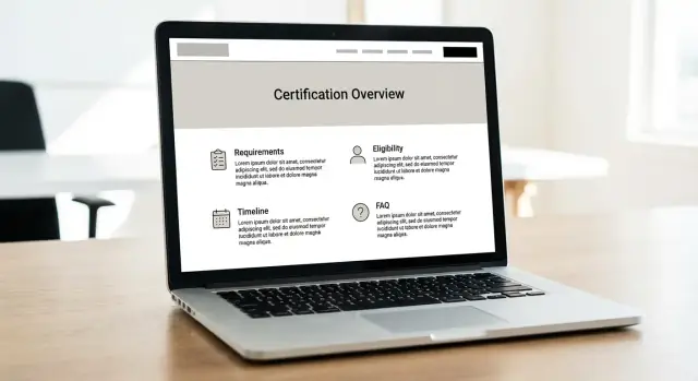
This is the page most people will land on first—often from search, a referral email, or a social post. Its job is to explain, in plain language, what the certification is and who it’s meant for, without making visitors hunt for basic details.
Start with a tight definition: what the credential validates (skills, knowledge, compliance, safety, ethics, etc.), who issues it, and where it’s recognized. Then add one short paragraph describing the typical candidate (job roles, experience level, or industries) and the most common reason they pursue it.
Summarize outcomes people can reasonably expect. Avoid promising salary increases or guaranteed employment. Strong benefit categories include:
| Quick fact | Typical answer (example) |
|---|---|
| Time to complete | 4–8 weeks (self-paced) |
| Format | Online exam + application review |
| Prerequisites | 1 year relevant experience (or training alternative) |
| Renewal cycle | Every 2 years |
| Renewal requirements | Continuing education + fee |
If your program has variations (tracks, levels, regional rules), note that here and link to the detailed requirements page.
Use an at-a-glance checklist so visitors can self-qualify quickly:
Close with a clear next step: Apply, Check eligibility, or View the step-by-step process—one primary call to action, not five competing buttons.
Your eligibility section should remove guesswork. If applicants have to email you “just to confirm,” the page isn’t doing its job. Write requirements in plain language, separate “must have” from “nice to have,” and show how decisions are made.
Start with a short eligibility summary, then expand each requirement with a concrete example.
/training if applicable).Include edge cases as short Q&A callouts:
For every document, specify:
If you can, provide a simple checklist and link to a single place to submit (for example, /apply).
If alternatives exist, describe them explicitly:
People visit a certification site to answer one question quickly: “What do I need to do, and how long will it take?” A clear, numbered flow reduces support requests and prevents applicants from dropping off mid-way.
Create an account + start application Provide a checklist of what they’ll need (ID, work history, references, training records).
Submit eligibility evidence State acceptable document types and file rules (PDF/JPG, size limits). If you allow substitutions, spell them out.
Administrative review (2–10 business days) Note what affects timing: incomplete uploads, manual verification with employers, peak periods, and time zone differences.
Pay fees + schedule assessment (same day–2 weeks) Clarify payment methods and whether an authorization-to-test email is required before booking.
Take the exam/assessment (single sitting or multi-part) Explain the format in plain language:
/certification/exam-outline if available).Results + final decision (immediate–15 business days) Explain whether results are instant, provisional, or reviewed by a board. Include retake rules and waiting periods.
Describe the next steps: digital certificate delivery (email within 1–5 days), wallet badge/download, and how others can verify status (link to /verify). Add renewal triggers (expiry date, continuing education, audits) and the fastest way to get help if something looks wrong.
People decide quickly whether a certification is “worth it,” and cost confusion is a common reason they abandon the page. Put fees and ongoing commitments in one place, written plainly, with dates and definitions.
List every required and optional charge, and say what each fee covers. If taxes, proctoring, shipping, or third‑party exam center charges may apply, state that clearly.
If you publish refunds, reschedules, or transfer rules, only include terms you can verify and keep current (and link to the authoritative policy page, e.g. /policies/exam-booking).
Spell out what holders must do to stay certified:
If you offer multiple levels or tracks, a small table prevents misunderstandings.
| Option | Best for | Upfront fees | Renewal | Ongoing requirements |
|---|---|---|---|---|
| Level 1 | New practitioners | $___ (application + exam) | Every ___ | ___ CE credits |
| Level 2 | Experienced roles | $___ | Every ___ | ___ CE credits + ___ |
| Bridge pathway | Related credential holders | $___ | Every ___ | ___ |
End with a “Total cost example” line (typical first‑year total) so visitors can budget with confidence.
People don’t just want to know what your certification is—they want to know why they should believe in it. A strong trust section reduces back-and-forth emails, helps employers feel confident, and protects your program from misuse.
Make it easy to verify the organization behind the certification. Include your legal name (and any “doing business as” names), where you’re based, and how to contact you.
Add a short, factual “about” block with:
If you have public documents—policies, bylaws, code of ethics—link them with clear titles (for example, /about, /governance, /policies).
If your certification relies on reviewers, proctors, or an exam committee, explain who they are in terms of qualifications rather than names (unless you have permission to publish names).
Examples of confidence-building details include:
This reassures visitors that decisions aren’t arbitrary.
Add a dedicated page (e.g., /verify) that explains exactly how to validate a credential. Keep it practical:
Also state how you handle misuse (forged certificates, false claims) and how to report it.
Testimonials can help, but only if they’re credible. Attribute quotes (name, role, organization) and avoid claims you can’t support (like guaranteed promotions or salary increases). If outcomes vary, say so plainly.
If people can’t find your certification information through search, they’ll email you (or worse, assume you’re not legitimate). A search-friendly structure helps the right applicants land on the right page—and reduces repetitive support questions.
Build a small keyword list based on what people actually type when they’re trying to qualify or apply. Focus on plain-language queries like:
Map each group to a single page. Avoid stuffing one mega-page with everything; search works better when each page answers one clear question.
Every key page should have its own purpose and its own wording:
Consistency matters: if the page is about renewal, don’t label it “maintenance” in the menu and “recertification” in the title unless you explain the terms.
FAQ schema can improve how your page appears in results, but only add it for FAQs that are visible on the page and match the wording exactly. Keep answers short, factual, and aligned with your policy.
Internal links help search engines understand your site, but they also help visitors move forward. Add obvious, relevant links such as:
/contact (questions about eligibility)/pricing (fees and timelines)/blog/how-to-prepare (optional deeper guidance)Think of SEO as good labeling: clear pages, clear paths, and clear language.
A certification website should be usable by everyone—on any device, with any level of vision, mobility, or tech comfort. Accessibility and readability also reduce support requests, because visitors can actually find and understand requirements the first time.
Choose typography that stays clear at small sizes: a simple sans-serif body font, generous line spacing, and short line lengths (roughly 60–80 characters per line). Use strong color contrast for text, buttons, and form hints so key details (like eligibility rules or deadlines) don’t disappear for people with low vision or when viewed outdoors on a phone.
Design mobile-first: assume most visitors will arrive on a small screen. Keep navigation predictable, avoid tiny tap targets, and make primary actions (Apply, Download handbook, Contact) visible without endless scrolling.
If you collect applications, renewals, or contact requests, make forms accessible by default:
Many certification programs rely on policy PDFs. If those PDFs aren’t accessible, users get stuck. Whenever possible, convert key policies—eligibility criteria, required documents, complaint process—into standard web pages.
If you must use PDFs, make them accessible (tagged structure, selectable text, proper headings) and summarize the most important points on the page that links to them.
On policy-heavy pages, include a clear “Last updated” date near the top. It signals reliability and helps visitors confirm they’re reading the current rules. If you revise requirements often, consider a short “What changed” note for the latest update.
The best website stack is the one your team can update without a mini-project every time a requirement changes. Before choosing anything, write down who will own updates (program manager, comms, admin assistant, vendor) and how often you expect changes (monthly policy tweaks vs. annual refresh).
If non-technical staff will publish updates, a managed CMS or website builder can reduce friction: a visual editor, built-in hosting, and fewer moving parts. If you already have an organizational CMS, use it—consistency and existing approvals often matter more than perfect features.
Ask two practical questions:
If your certification program also needs an application portal (accounts, uploads, payments, admin review), consider whether you want to build that custom flow. Platforms like Koder.ai can help teams prototype and ship full web apps from a chat-driven workflow—useful when you need more than a brochure site, but don’t want a long, traditional development cycle. You can also export source code if you need full ownership.
Create a small set of locked layouts and reuse them across the site:
Use consistent components (callouts for “Important,” accordion for FAQs, a standardized “Download forms” block). This keeps pages predictable for visitors and easier for editors.
Many certification sites need more than content. Map what’s required now vs. later:
Prefer tools with direct integrations to your CMS, or a single forms/payment provider to reduce failure points.
Set clear roles: who can draft, who can approve, and who can publish. Add a lightweight checklist (links work, fees match policy, dates current) and a visible “last reviewed” field on key pages to prevent silent drift.
A certification overview website only works if people can reliably complete key tasks—understand requirements, download the right documents, and apply without confusion. Treat launch as the start of an ongoing maintenance cycle, not the finish line.
Before you publish, run a simple checklist and have someone outside the team repeat it:
Pageviews alone won’t tell you if the site is helping applicants. Set up analytics events such as:
If you have an /apply page, track drop-offs from the overview page to that step.
If you’re building a custom portal (instead of linking out to a third-party form), make sure your toolchain supports these events without extra engineering. For example, if you build the workflow as an app in Koder.ai, you can bake measurement into the user journey early and iterate quickly when you see where candidates get stuck.
Assign an owner and a review cadence (monthly or quarterly). Maintain a lightweight change log so staff can answer “When did this requirement change?” Consider adding a “Last updated” line on requirement-heavy pages.
Regularly review search queries and support tickets. When you see repeats (e.g., “work experience definition” or “renewal grace period”), update the FAQ and link to the exact requirement section rather than adding more generic text.
Start by choosing one primary “job” for the site per visit:
Then make the homepage and top navigation prioritize that job, even if you serve multiple audiences.
Pick a small set of measurable actions tied to your goals, such as:
Confirm your analytics can track these before launch so you’re not guessing later.
Use two lists:
Ship the must-haves first so the site supports decisions instead of becoming an endless content project.
Keep decision-making info public (requirements, fees, steps, verification) so visitors aren’t blocked early.
Use members-only areas for true member services (CE logs, downloadable badges, private directories). If something is gated, label it clearly (e.g., “Member portal”) and provide a short public summary with a link to how to get access.
Most programs serve:
For each audience, write the key decision they’re trying to make and the minimum info they need to make it quickly.
Pull real wording from support emails, calls, chat logs, and webinar Q&A. Group questions into themes like Eligibility, Process, Fees, Renewal, and Verification.
If you don’t have data, ask staff to forward recurring questions for two weeks—those become your first navigation labels, page sections, and FAQ entries.
A simple, predictable menu usually performs best:
Avoid burying key downloads in a separate “Resources” section; place them on the most relevant page (e.g., handbook on Overview or Requirements).
Add a short “Start here” block near the top of key pages that links the journey in order:
Overview → Requirements → Process → Fees → Apply
This helps people who land on a deep page from search orient themselves and self-qualify before contacting support.
Choose one “home” for each critical fact (fees, timelines, eligibility rules) and link to it everywhere else.
For example, list exact prices only on /fees, and use short summaries with a link on other pages. This prevents conflicting information when policies change.
Make the exam/assessment section plain and scannable:
Clarity here reduces drop-offs and “just checking” emails.