Jul 06, 2025·8 min
How to Build a Website for a Knowledge-First Product Launch
Learn how to plan and build a launch website that leads with knowledge: positioning, docs, FAQs, SEO, onboarding, and feedback loops for trust.
Learn how to plan and build a launch website that leads with knowledge: positioning, docs, FAQs, SEO, onboarding, and feedback loops for trust.
A knowledge-first product launch website is built to answer real customer questions before they have to talk to you. It prioritizes clarity over hype and turns your product knowledge (docs, FAQs, guides, examples) into the shortest path to trust and conversion.
It’s not “more content.” It’s the right content, organized so visitors can self-serve:
Set outcomes that change day-to-day workload, not vanity metrics.
A knowledge-first site should help you:
Choose a primary audience you want to serve best (for example: “operators at small teams who want to set this up in an afternoon”). Then choose one secondary audience (for example: “security reviewers”).
If you try to serve everyone on day one, you usually end up serving no one well.
Define what must exist at launch (MVP) versus what can expand after you have real usage data. MVP typically includes a routing homepage, a few high-intent landing pages, core docs, and an FAQ.
Tie the website to measurable actions:
Pick 2–3 metrics you’ll review weekly so “knowledge-first” stays a strategy, not a slogan.
Before you design pages, decide what you’re promising—and to whom.
A knowledge-first launch works when your site answers the same questions your best prospects ask on calls, in DMs, or right before they hit “Sign up.”
Keep it specific and testable. Use this simple format:
For [who], [product] helps you [do what] by [how it’s different].
Example: “For small support teams, AcmeHelp turns recurring questions into a searchable help center in a day, using AI-assisted drafts you can approve.”
If you can’t write this sentence, your homepage can’t route people to the right answers.
Avoid feature talk. Write them the way a customer would describe the pain:
These become your primary “question buckets” that all launch content will feed.
Every claim needs one clear piece of evidence. Mix formats so people can scan:
Proof doesn’t need to be polished, but it must be concrete.
Wrong-fit signups create noise in onboarding and support. Add a short clarification you can reuse across pages:
What it is: Built for teams who want self-serve answers and faster onboarding.
What it isn’t: A full customer support ticketing system (or a replacement for your CRM).
Write one short message per stage so your site stays consistent:
Once these are written, every page can answer real questions instead of repeating slogans.
Information architecture is your launch website’s “decision design.” It determines whether visitors quickly find the answer that makes them confident—or bounce because every click feels like a guess.
Choose one or two primary actions that match your launch goal, such as Start free, Request a demo, or Join the waitlist. Then structure your pages so those actions are always available, but never competing with five other CTAs.
A helpful test: If someone only reads the top navigation and the homepage hero, can they tell what to do next?
A knowledge-first launch isn’t only about acquisition—it should also reduce friction after sign-up. Your initial site map should cover both:
If you’re unsure whether a page is needed, ask: Does it answer a question that blocks purchase, setup, or trust?
Aim for a structure where each page offers a small set of obvious next steps. A common pattern:
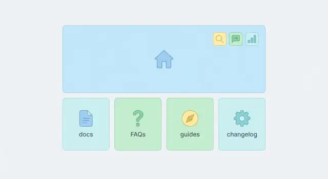
Don’t hide critical pages in odd places. Put the essentials in the top navigation (3–6 items), and use the footer for “proof and policy” (Security, Privacy, Terms, Contact, Changelog).
Once you have more than a handful of guides, browsing alone breaks down. Plan for site search up front so documentation and FAQs remain discoverable—especially from the header or help center index (e.g., /docs).
Your homepage isn’t a brochure—it’s a decision page.
For a knowledge-first product launch, the goal is to explain the value quickly, then help people self-select the next best step based on what they’re trying to do.
Open with a simple statement of what the product is and the outcome it creates. Then add a short “who it’s for” line so visitors can immediately recognize themselves.
A helpful pattern:
Different visitors arrive with different questions. Make the options visible and specific:
Use clear, descriptive links such as /docs, /guides, and /faq rather than vague “Learn more” buttons.
Pick a single proof block and make it credible: a short testimonial with context, a measurable result, or recognizable logos—only if they’re real and permissioned. One strong proof section beats five weak ones.
Write the “how it works” section to mirror the steps users will actually take after signing up. If onboarding starts with “Connect your data → Configure → Share,” reflect that sequence here so the homepage sets expectations and reduces drop-off.
Finally, link to launch-critical knowledge pages like /changelog so returning visitors can quickly see what’s new.
High-intent visitors don’t want a tour—they want confirmation that your product solves their exact problem, and they want a clear next step.
That’s why a knowledge-first launch site should include a small set of focused landing pages (typically 3–6) tied to specific roles or use cases.
Create one page per job to be done, not per feature.
Examples: “For Customer Support Teams,” “For Product Managers,” “Integrate with Slack,” or “Replace Spreadsheets for Onboarding.”
If you feel tempted to cover multiple audiences, split the page. Clarity beats completeness.
Consistency makes pages faster to ship and easier to scan. A simple structure that works well:
Use real screenshots and annotate them (labels, arrows, short captions). The goal is to answer “Where do I click?” and “What will I see?” without forcing readers to imagine your UI.
Add a “First 10 minutes” block: the minimum setup and action a new user should take to get a visible win. This lowers bounce rates and increases trial activation.
End each landing page with internal links to the most relevant resources, such as /docs/getting-started, /guides/use-case-name, and /faq—so motivated visitors can self-serve immediately.
Documentation is not “nice to have” at launch—it’s the product’s public instruction manual.
When it’s clear, searchable, and connected to next steps, it shortens time-to-value and reduces pre-sales hesitation.
(If you’re launching a developer tool or a build platform like Koder.ai, this matters even more: the docs are effectively the “UI” for how teams evaluate capabilities such as exporting source code, deploying/hosting, or rolling back changes.)
Make the difference obvious in your navigation:
This separation keeps /docs scannable and prevents long tutorials from burying the exact detail someone needs.
Before you publish everything, prioritize the minimum set that unblocks real usage:
Keep each doc page predictable:
Goal → Prerequisites → Steps → Expected result → Next steps
Add short “Common mistakes” callouts based on what typically goes wrong (missing permissions, wrong token, skipped step). These are often the difference between “worked instantly” and “gave up.”
Finally, every doc page should point to (1) a related guide for deeper context and (2) a clear next action such as “Try this workflow” or “Set up your integration.” If you want to formalize this, link to your /docs overview and a relevant /guides starting point.
A launch FAQ isn’t a “nice-to-have” page—it’s a conversion tool and a support filter.
The goal is simple: answer the questions people are already asking, in the order they tend to ask them, using plain language.
Before you write anything, collect 20–40 questions from sources that reflect real buying intent:
If a question shows up more than once, it belongs in your FAQ.
Avoid one long wall of Q&A. Instead, group FAQs into predictable themes such as:
Use short category headings so visitors can jump to what they care about without scrolling aimlessly.
Your first sentence should be a direct answer, not a marketing intro. Then add details, examples, and any conditions.
Bad: “We offer flexible plans for teams of any size…”
Better: “Yes—there’s a free plan for up to 3 users. Paid plans start at $29/month.” Then link to /pricing for the full breakdown.
Also include a few “Is it right for me?” questions. These reduce churn and refunds by setting expectations early—who the product is not for, what it doesn’t support yet, or what minimum setup is required.
Each answer should point to the next best page:
When FAQs route people to the right depth of information, you’ll see fewer repetitive tickets—and more confident sign-ups.
Your onboarding content is where “interest” becomes “I did it.”
For a knowledge-first launch, treat onboarding pages as product features: they should remove uncertainty, prevent mistakes, and get users to an early win without needing a call.
Start with 5–8 onboarding steps that match how people actually use your product (not how you built it). Each step should answer three things: what to do, what “done” looks like, and what to do if it doesn’t work.
A simple step sequence might look like: create account → connect X → configure Y → import/seed data → run first action → verify results → invite teammate → set ongoing routine.
Build a single Getting Started page that routes new users to:
Keep it scannable, and make the milestone unmistakable—users should know within minutes if they’re on track.
Include lightweight checklists inside each guide (and optionally a downloadable version). Checklists reduce back-and-forth because they tell users exactly what to gather and verify.
Use short videos or GIFs only when text isn’t enough—like showing where a setting lives, what a successful screen looks like, or how to interpret a chart. Don’t make them required to understand the steps.
Add a dedicated troubleshooting section with:
Link each guide to the relevant troubleshooting entries so users don’t have to search to unblock themselves.
SEO works best for a knowledge-first launch when you treat search as a distribution channel for answers—not as a last-minute traffic tactic.
Build your keyword list from the questions and decisions people are already making. Mix early-stage learning with late-stage evaluation:
If a query signals high intent, it deserves a dedicated page. If it’s broad, it might belong in a guide or glossary entry.
Use titles and headings that mirror how people phrase questions.
A page titled “Roles and Permissions” may underperform compared to “How roles and permissions work (and how to set them up).”
Keep paragraphs short, add clear subheads, and summarize the answer early—people often scan before they commit.
Search engines (and readers) understand your site faster when pages connect.
Link related pages in both directions:
For example, a “Getting started” guide can link to /docs/importing-data and /faq/billing, while those pages link back to /guides/getting-started.
Avoid overlapping pages that compete for the same query. Choose one “main” page per topic and let supporting pages handle specific sub-questions.
Use clean, readable URLs, and write meta titles/descriptions that match the query. Add descriptive image alt text (especially for UI screenshots) so your help content is accessible and discoverable.
A knowledge-first launch site isn’t only about explaining the product—it’s also about proving you’re a safe bet.
Visitors who are ready to try or buy often go looking for the “boring pages” to confirm you’re real, reachable, and responsible.
At launch, make sure these pages exist and are easy to find in the header or footer: /pricing, /about, /contact, /privacy, and /terms.
Keep them short and specific. For example, your /about page should answer “who’s behind this?” and “why now?” without turning into a brand essay. Your /pricing should state exactly what’s included, what’s not, and how billing works.
Give people a clear path to help: an email address, a simple form on /contact, and chat only if you can respond reliably.
If you offer multiple channels, set expectations in plain language (“We reply within 1 business day”). A fast, honest response beats a fancy widget that feels abandoned.
Many buyers scan for how you handle their data. Summarize the basics in human terms (what you store, why, and how long), then link to your official /privacy and /terms for the full details.
If you work with third parties (analytics, payment, email), mention categories rather than burying it.
If security matters for your audience, include a security overview page that states only what you can verify (authentication, encryption, backups, access controls). Avoid vague promises.
If uptime is critical, add a public /status page or publish incident notes in a consistent place so customers know where to look when something breaks.
A knowledge-first launch isn’t a single “big day”—it’s a sequence of small, understandable updates.
Plan how you’ll publish those updates so visitors can see momentum, find what changed, and decide when to check back.
Publish a simple /changelog page that answers three questions: What changed? Who is it for? What should I do next? Keep entries short, link to relevant docs, and avoid marketing language.
A lightweight template works well:
Link to /changelog from your header or footer so returning visitors can reliably find it.
Create a calendar for launch week and the following month. Include:
Treat each update like a knowledge asset: it should route users to answers, not just announce features.
Add a simple newsletter/update signup (e.g., “Get product updates”) on the homepage and at the end of your launch post. Set expectations on frequency (“Weekly during launch, then monthly”).
If you’re running a launch for a tool with tiered plans (like Koder.ai’s free/pro/business/enterprise model), your update cadence is also a good place to clarify what changes affect pricing, limits, or availability.
Decide up front how you’ll handle announcements: one primary channel (blog + changelog), one optional channel (email), and a clear rule for what qualifies as “news” so users aren’t overwhelmed.
A knowledge-first launch site isn’t “done” when it ships. The real win is learning which pages answer questions, which ones create confusion, and what information is missing.
Build lightweight feedback loops that turn user behavior and support signals into a steady stream of improvements.
Start on the pages that matter most—docs, onboarding, pricing, and high-intent landing pages:
Keep the prompt small and optional. The goal is to catch quick “this didn’t answer my question” moments while the context is fresh.
Traffic alone won’t tell you whether your content is working. Track actions that represent understanding and forward motion:
Also consider events like “copied code snippet,” “expanded FAQ,” or “visited onboarding after pricing.” These help you see which content paths reduce hesitation.
Two reports are consistently useful during launch:
High search volume with low click-through often means titles are unclear. High exits from key pages often mean a question wasn’t answered—or the next step wasn’t obvious.
Support tickets and sales calls are a goldmine for language and edge cases:
Treat the backlog like product work: include the user question, the ideal page to answer it, and a deadline. Over time, this process can lower support load and increase conversion without adding more pages—just better ones.
A knowledge-first launch website is designed to answer the most common buying, setup, and trust questions upfront—so visitors can evaluate and succeed without waiting for a call.
In practice, it emphasizes:
Aim for outcomes that reduce friction and workload, not vanity metrics. Common success signals include:
Pick 2–3 metrics you’ll review weekly so the site keeps improving.
Choose one primary audience you want to serve exceptionally well, plus one secondary audience you must satisfy (often security reviewers or technical evaluators).
If you try to speak to everyone on day one, your copy and navigation usually become vague—making it harder for any visitor to decide what to do next.
Start with a one-sentence positioning statement you can test:
For [who], [product] helps you [do what] by [how it’s different].
Then use it to write:
If you can’t write the sentence, your homepage can’t route people effectively.
Ship the pages that answer questions blocking purchase, setup, or trust:
Keep top navigation to 3–6 items that match intent (not internal org charts). A common, effective set:
Use the footer for policy and proof pages like , , , , and .
Treat the homepage as a decision page:
The goal is to help visitors self-select the next best step quickly.
Build 3–6 landing pages, each tied to one high-intent job-to-be-done (role, use case, or integration).
A repeatable template helps:
Each page should end with links to the next best resources (e.g., ).
Separate content by how people use it:
Start with the first 10 documents that unblock real use (setup, core workflow, top integrations, troubleshooting, billing basics).
Add search once content exceeds roughly 15 items (docs, guides, and FAQ entries combined). At that point, browsing alone becomes guessy.
Place search where intent is high:
Also review top search terms regularly to find missing or unclear pages.
Everything else can expand post-launch based on real usage and search data.