Sep 30, 2025·8 min
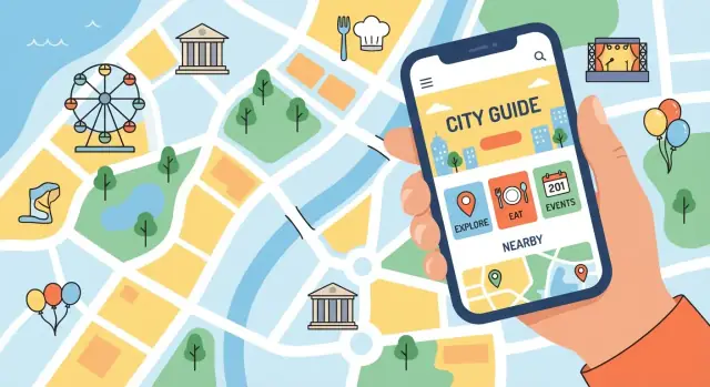
How to Build a Website for a Local Tourism & City Guide
Learn how to plan, design, and launch a local tourism or city guide website—content, maps, SEO, events, monetization, and maintenance tips.
Clarify Your Audience and Goals
A city guide can’t be everything to everyone. Before you choose a platform, write a single sentence that describes who you’re helping and what success looks like. This keeps your content focused and prevents the site from turning into a random list of places.
Decide who you serve
Start with your primary audience, then note any secondary group you’ll support.
- Visitors: weekenders, business travelers, families, students, international tourists
- Locals: new residents, “what’s on” seekers, people planning staycations
- Both: possible, but you’ll need clear navigation and tailored content paths
A quick test: if a visitor lands on your homepage, can they tell within 5 seconds whether the site is for them?
Pick the site’s main goals
Choose 1–3 primary goals and let them guide your page priorities and calls to action.
Examples:
- Inspire trips (beautiful guides, themed itineraries, seasonal highlights)
- Answer questions (transport, safety, costs, opening hours, local norms)
- Drive bookings (tours, hotels, attractions, restaurant reservations)
- Promote partners (sponsored listings that still feel useful and honest)
Set your geographic scope
Be explicit: is this the city center only, the wider metro area, or a whole region? Your scope affects everything—from categories and maps to how often you’ll need updates. If coverage is limited, say so clearly and consider an “Explore nearby” section later.
Choose a north star metric
Pick one metric that reflects real value, then track a few supporting signals.
- North star: bookings, email signups, itinerary saves, partner leads
- Supporting: returning visitors, time on key guides, clicks to “Get directions”
Once you’ve made these decisions, every new page idea should answer: does this help our audience and move our north star metric?
Plan Site Structure and Core Pages
A city guide lives or dies by how quickly visitors can answer simple questions: “What should I do today?”, “Where should I stay?”, “What’s nearby?”, and “Is this open and worth it?” Your site structure should mirror those questions—not your internal organization.
Start with a small set of core categories
Most local tourism sites need a clear top-level navigation that covers:
- Attractions (museums, parks, landmarks, tours)
- Food & drink (restaurants, cafés, bars, markets)
- Hotels (and other stays if relevant)
- Events (what’s on today/this weekend)
- Itineraries (1-day, 3-day, rainy day, with kids)
- Practical info (transport, safety, costs, accessibility, opening hours norms)
Keep these labels plain and familiar. “Experiences” may sound nice, but many visitors will search for “things to do.”
Decide what makes you different (and build around it)
Your “edge” should be obvious from the menu and homepage modules. Examples: curated picks (only the best), family-friendly, budget, accessible travel, outdoor-first, or a niche like architecture or food.
A simple rule: if you’re curated, show “Editor’s Picks” and “Top 10” hubs; if you’re family-focused, add “With kids” filters and itinerary pages.
Create a sitemap that matches real visitor intent
Plan for:
- Home (quick paths + seasonal highlights)
- Category hubs (Attractions/Food/Hotels/Events/Itineraries/Practical)
- Detail pages (one place or one event)
- Neighborhood landing pages (what to do, where to eat, how to get there)
- Theme landing pages (free things, rainy day, accessible routes, romantic, local markets)
Neighborhood and theme pages are often your strongest entry points from search and social. They also make navigation feel natural: people don’t think in “post types,” they think in “Downtown” and “this weekend.”
Build Your Content Model (Listings, Guides, Itineraries)
Before you write a single page, decide what “building blocks” your site will use. A clear content model keeps information consistent, makes your guide easier to update, and helps visitors compare places quickly.
Start with listings: define the required fields
Listings (attractions, restaurants, museums, hikes, hotels) are your foundation. Create a minimum set of fields that every listing must have so the directory doesn’t feel uneven.
Common required fields:
- Name (official name + common short name if different)
- Full address (including neighborhood/district)
- Opening hours (with notes like “kitchen closes at…”)
- Price range (pick a simple scale and stick to it)
- Booking link or official website
- Photos (with source/credit rules)
- Tags (family-friendly, wheelchair-accessible, vegan options, etc.)
Create naming rules and a taxonomy you can grow
Decide how you’ll categorize content so it stays tidy as you add more.
- Categories: “Food & Drink,” “Things to Do,” “Where to Stay,” “Day Trips”
- Neighborhoods/areas: use one canonical name per area (no “Downtown” vs “City Center” duplicates)
- Attributes: consistent tag list with clear definitions (what qualifies as “budget”?)
Write these rules down in a short internal style guide so contributors follow the same system.
Verification and seasonal-change workflow
Tourism info gets outdated fast. Set a process: how often you check listings, where updates come from (official sites, phone calls, partner submissions), and how you mark items you couldn’t verify.
Also plan for seasonality: separate “seasonal hours,” “winter closure,” and “limited dates” so you don’t have to rewrite whole pages.
Evergreen vs. time-sensitive content
Keep guides and itineraries mostly evergreen (best neighborhoods, walking routes, what to pack) and isolate time-sensitive details (event dates, temporary closures, pop-ups) into fields or modules you can update quickly without rewriting the core article.
Pick the Right Platform and Workflow
Your platform choice isn’t about what’s “best”—it’s about what you can keep updated without stress. A city guide lives and dies by freshness: opening hours change, trails close, festivals get canceled, and new spots appear every month.
Website builder, CMS, or custom build?
A website builder (like Squarespace/Wix) is often the fastest route if you have a small team, a tight budget, and mostly standard pages. It’s ideal when you don’t need advanced filtering (for example, “pet-friendly + open late + near downtown”).
A CMS (WordPress, Webflow CMS, or similar) is a strong middle ground when you plan to publish lots of listings, articles, and events. You’ll get better control over templates, SEO fields, and structured content.
A custom build makes sense if you need complex search, map-heavy experiences, multi-language workflows, or integrations with booking/ticketing systems—and you have budget for ongoing development.
If you want the flexibility of a custom build without a long traditional dev cycle, a vibe-coding platform like Koder.ai can be a practical option for city guides—especially when you need structured listings, filters, and map views. You can iterate through chat, keep a repeatable workflow for directories and events, and still export source code or deploy/host when you’re ready.
Editor-friendly setup (so updates actually happen)
Prioritize an experience that non-technical editors can handle:
- Fast mobile editing for urgent updates (closures, advisories)
- Backups and version history (so mistakes are reversible)
- Reliable forms for submissions (events, business updates)
- Clear SEO controls (titles, meta descriptions, URL slugs, redirects)
If your platform can’t easily support recurring content types (events, attractions directory, itineraries), you’ll end up with one-off pages that are hard to maintain.
Define the workflow before you design
Write down who updates what (events vs. listings vs. practical travel info), where sources come from, and how often each content type is reviewed. Even a simple rule like “events weekly, listings monthly, essentials quarterly” prevents outdated info—and protects trust.
Design for Visitors: Mobile, Navigation, and Trust
Most city-guide visitors are on their phones, often already out the door. Your design job is to help them decide quickly, then act without friction.
Mobile-first: the “right now” experience
Start with the smallest screen and the most urgent tasks: checking hours, finding the closest option, and getting directions.
Keep the top actions visible and thumb-friendly: Get directions, Call, Book, Save, Share. If a page is a dead end on mobile, it will feel broken even if it looks fine on desktop.
Speed matters here too: avoid heavy sliders, keep pages lightweight, and make critical info (hours, address, price range) readable without zooming.
Navigation that matches how people search
Organize content into clear categories (Eat & Drink, Things to Do, Where to Stay, Neighborhoods, Events). Category pages should be more than a grid—they’re decision tools.
Add filters that reflect real travel choices:
- Distance / neighborhood
- Price
- Kid-friendly / accessibility-friendly
- “Open now” and “Good for rainy day” (if relevant)
Use consistent labels across the site so visitors don’t have to re-learn your interface on each page. A simple sticky search bar can outperform fancy navigation.
Calls-to-action that are obvious (and honest)
CTAs should match intent:
- On listings: Get directions, Website, Reserve, Add to itinerary
- On guides: Save this list, See on map, Download/print (optional)
If a CTA is an affiliate or partner link, label it clearly—trust grows when you’re transparent.
Trust signals that reduce second-guessing
Local info gets outdated fast. Show visitors you maintain the guide:
- “Last updated” dates on guides and key listings
- Sources for sensitive details (fees, seasonal closures)
- Photo credits (and licensing notes if needed)
Also be consistent about what you verify (hours, accessibility notes, pet policy). A small “How we update listings” link (e.g., /about#updates) can quietly boost credibility.
Maps, Routes, and Location-Based Features
From sitemap to real pages
Turn your sitemap and content model into a working React site with structured pages.
Maps are where a city guide starts to feel “real.” A great map doesn’t just pin attractions—it helps visitors answer practical questions quickly: What’s nearby? How do I get there? Is this walkable? Can I fit this into my afternoon?
Build interactive maps that match how people explore
Create map views for major content types (attractions, restaurants, viewpoints, museums) and for neighborhood guides. Keep filters simple and human: “Free,” “Kid-friendly,” “Rainy-day,” “Open now,” and “Accessible entrance.” If you already have pages like /attractions or /neighborhoods, add a “View on map” toggle so users can switch between list and map without losing their place.
“Near me” and distance-based sorting (without being creepy)
Add a “Near me” button that uses the browser’s location permission only when a visitor asks for it. If they decline, fall back to a central point (city center) or a selected neighborhood.
Distance sorting is especially helpful for mobile users: show “0.4 km away” or “12 min walk” right in the results list. Pair it with a clear “Search this area” control so the map doesn’t jump around unexpectedly.
Put routes and transit tips where they matter
On each attraction page, include practical routing options: nearest transit stop, typical walk time from key hubs, parking notes, and any tricky details (“steep hill,” “cobblestones,” “last entrance at 17:30”). Keep it scannable, and tailor it by location rather than burying it in a general FAQ.
Offer printable/offline-friendly summaries
Visitors lose signal, battery, or patience. Provide a lightweight “Offline summary” (short directions, hours, address, and a small static map) and a printable neighborhood map for popular areas. These don’t need to be fancy—just reliable when the interactive map isn’t available.
Events Calendar and Community Submissions
An events calendar can be the most “alive” part of a city guide—people return weekly to see what’s on. It also solves a common visitor problem: turning “I’m here for two days” into a concrete plan.
Define your event types (so listings stay consistent)
Start with a small set of categories you can maintain, then expand. Typical city-guide staples include festivals, concerts, markets, tours, and exhibitions. If you cover seasonal happenings (holiday lights, summer outdoor cinema), make that a tag rather than a brand-new category.
Consistency matters more than volume. Agree on what makes an event eligible (publicly accessible, has a date/time, location, and organizer contact) and what doesn’t (recurring private meetups, unclear venues).
Build a calendar people can actually filter
A long list isn’t helpful when someone is choosing between neighborhoods. Add filters that match real planning decisions:
- Date (today/this weekend/custom range)
- Category (festival, concert, market, tour, exhibition)
- Neighborhood/area (or nearby)
Include a clear “Add to calendar” option and a shareable URL for each event page.
Community submissions: simple, guided, and reviewable
Let organizers submit events via a short form with required fields: title, dates/times, venue address, neighborhood, short description, ticket/registration link, and an image. Link your submission rules right above the form (e.g., /events/submit) and set expectations: review time, edits you may make, and how far in advance to submit.
Display essentials the same way every time
Show time zone (especially if you attract international visitors), ticket links, and accessibility info in a consistent block on every event: step-free access, accessible toilets, seating, sign language, and family-friendliness. A predictable layout builds trust—and reduces last-minute confusion.
Local SEO and Discoverability
Keep full code access
Export source code anytime so you can own, review, or extend it with your team.
Local SEO is how your guide shows up when someone searches “things to do in [city]” or “best cafes near [neighborhood].” The goal isn’t to trick search engines—it’s to match what visitors already want and make your pages easy to understand.
Start with real search intent
Before writing, scan what people actually type into Google, Maps, and social search. Common patterns for city guides include:
- “things to do” + season (“things to do in winter”)
- “best” + category (“best bakeries,” “best viewpoints”)
- “weekend itinerary” and “one day in…”
- qualifiers like “with kids,” “free,” “rainy day,” “accessible”
Turn those into dedicated pages instead of cramming everything into one mega list. A focused “Free things to do in Old Town” page tends to perform better than a generic “Attractions” page with one paragraph.
Write titles and meta descriptions that earn clicks
Use clear, specific titles that mirror the query: “Best Cafes in Riverside (Wi‑Fi, Brunch, Pastries)” beats “Riverside Cafes.” Meta descriptions should set expectations (price range, vibe, who it’s for) so the right people click.
Build internal links like a mini transit system
City-guide sites win when pages connect naturally:
- Neighborhood pages link to categories (cafes, museums) and to nearby neighborhoods.
- Listings link back to their neighborhood hub and to relevant itineraries.
- Itineraries link to each stop’s detail page.
This helps visitors explore and helps search engines understand your site structure. Add “Related” sections with 3–5 meaningful links rather than a long list.
Add structured data where it fits
Structured data can improve how your pages appear in results. Prioritize:
- Event markup for your /events pages
- LocalBusiness (or relevant types) for attraction/venue listings
Keep details consistent (name, address, hours), and only mark up content that’s visible on the page.
Practical Travel Info That Reduces Friction
A city guide wins loyalty when it answers the questions people ask right before (and during) a trip—quickly, clearly, and in one place. Beyond attractions, prioritize the “small but urgent” details that prevent confusion, wasted time, or unsafe situations.
Build a “Before You Go” essentials hub
Create a dedicated set of pages (or one well-structured hub) for core needs:
- Safety basics: neighborhoods to be mindful of, common tourist scams, night transit tips, and what to do if something feels wrong.
- Emergency contacts: local emergency numbers, nearest hospitals/clinics, pharmacy hours, and how to contact your tourist police (if applicable).
- Weather & what to pack: typical temperatures by month, rain/snow expectations, and quick packing guidance.
- Money & etiquette: tipping norms, payment methods, taxes/service charges, and local customs that visitors often miss.
- Transport primers: airport transfers, public transit passes, ride-hailing availability, and where to buy tickets.
Keep each page skimmable with short sections, bolded answers, and a “last updated” date.
Add seasonal advice people actually need
Visitors don’t plan around “seasons”—they plan around constraints. Include practical guidance such as:
- Peak times and reservation requirements (restaurants, museums, day trips)
- Closures (holidays, maintenance periods, winter schedules)
- Local events that affect access (marathons, parades, large festivals)
A simple “What changes this month?” block on your main travel info page can prevent disappointment.
Use FAQs to reduce repetitive inquiries
Create a living FAQ that mirrors real questions from email, social comments, and DMs:
- “Do I need cash?”
- “Is the city safe at night?”
- “Can I use contactless payment on transit?”
- “What time do things close?”
Write answers like you’re helping a friend: direct, specific, and free of jargon.
Capture emails without being pushy
Offer a lightweight email signup for useful updates—think weekend picks, event reminders, or seasonal alerts. Place it at the end of your Practical Info hub and on high-intent pages (like transport and weather). Link to /privacy so visitors understand what they’re subscribing to.
Monetization and Partner Promotions (Without Losing Trust)
A city guide can earn revenue without turning into a billboard. The goal is simple: help visitors first, and make any paid placement obvious and fair.
Monetization options that fit a local guide
A few models work especially well for tourism content:
- Affiliate links: ticketing platforms, tours, hotel booking, rail/bus passes, travel insurance, or local experiences. Use them sparingly and only where they genuinely help someone make a decision.
- Sponsorships: a seasonal sponsor for an “Events this weekend” page or a “Family-friendly” collection.
- Partner listings: paid inclusion in a “Where to stay” or “Top tours” directory, with clear criteria.
- Ads: lightweight, limited placements (avoid pop-ups that interrupt maps and reading).
- Lead forms: “Request a quote” for local guides, DMCs, photographers, or group travel—high intent, often better than banner ads.
Make disclosures unmissable
If a link or placement is paid, say so near it—not buried in a footer. Use plain language like “Sponsored” or “Affiliate link.” Add a short disclosure line at the top of relevant pages and a dedicated policy page (for example, /affiliate-disclosure).
Create partner-ready pages (so deals don’t derail your workflow)
Publish a simple media kit page (e.g., /media-kit) with:
- Audience overview (who visits, typical interests)
- Key stats (monthly visits, newsletter subscribers, social reach)
- Available placements and examples
- Clear contact path (a short form at /contact)
Paid upgrades without harming trust
Offer upgrades like Featured placement or Top of category in directories, but keep the ranking honest:
- Label featured cards clearly.
- Limit the number of featured spots per page.
- Keep editorial “Best of” lists separate from paid listings.
When visitors can tell what’s editorial vs. paid, they keep trusting your recommendations—and partners benefit from that trust.
Accessibility, Performance, and Privacy Basics
Deploy where your users are
Run your app on global AWS regions to support your data and privacy requirements.
A city guide is only useful if people can actually use it—on a sunny sidewalk, on a cracked phone screen, or on a slow connection after a long day of travel. Accessibility, speed, and privacy aren’t “nice-to-haves”; they directly affect trust and conversions.
Accessibility: make every page usable
Start with a few high-impact basics that cover most visitors’ needs:
- Readable typography: use clear fonts, comfortable line spacing, and avoid tiny text. Aim for a clean hierarchy (headings that look like headings).
- Good contrast: ensure text stands out from backgrounds (especially on buttons, map labels, and banners).
- Alt text for images: describe what matters (e.g., “Exterior of the City Museum entrance” rather than “museum”). For decorative images, use empty alt text.
- Keyboard navigation: menus, filters, and “Book now”/“Get directions” buttons should work without a mouse. Make focus states visible.
If you have forms (newsletter, submissions), label fields clearly and show errors in plain language.
Performance: fast on mobile and slow networks
Tourists often browse on mobile data. Prioritize the pages that get the most traffic (home, top attractions, event listings):
- Compress images and serve appropriately sized versions. Avoid uploading huge photos “as-is.”
- Lazy-load images below the fold, especially in listing grids.
- Keep scripts minimal: every widget and tracker adds weight. Only keep what you use.
Test on throttled mobile networks and older devices, not just your office Wi‑Fi.
Privacy: measure without creeping people out
Use privacy-friendly analytics (or configure your analytics to minimize data collection). Track what you need: top pages, searches, outbound clicks, and newsletter signups.
If your region requires it, add a cookie banner that’s easy to understand and doesn’t block content unnecessarily. Keep your privacy policy easy to find (e.g., in the footer) and written in plain language.
Launch, Measure, and Maintain the Guide
Launching a city guide isn’t a finish line—it’s the start of a repeating loop: publish, learn, improve. A clean launch helps people trust the site, and a simple measurement plan tells you what to build next.
Set analytics goals that match real visitor actions
Pageviews are nice, but they don’t tell you whether your guide is actually helping someone explore the city. Set up a few “success” actions that reflect intent:
- Booking/partner clicks (outbound clicks to ticketing, tours, hotel partners)
- Directions clicks (tap-to-open in Google/Apple Maps, or clicks on a “Get directions” button)
- Email signups (newsletter or weekend picks)
- Top pages by engagement (time on page and scroll depth can be more useful than raw traffic)
If you’re using GA4 or a similar tool, track outbound clicks and key button taps as events. Keep your goal list short (3–6 goals) so you can review it quickly every week.
Create a practical launch checklist
A launch checklist prevents the frustrating stuff—broken links, incorrect map pins, and forms that don’t send. Before you announce the site, verify:
- Broken links (run a quick crawl; manually test your most visited pages)
- Forms and confirmations (contact, submissions, newsletter; ensure users see a clear success message)
- SEO basics (titles, descriptions, index settings, sitemap, canonical URLs)
- Map accuracy (pins, addresses, opening hours, and “nearby” results)
Also test on a phone while on mobile data. City-guide visitors are often outside, impatient, and one weak page load away from leaving.
Plan maintenance so the guide stays trustworthy
Freshness is a core feature of a local tourism website. If listings or hours are wrong, people stop relying on you.
- Weekly: update events, highlight weekend picks, remove canceled items
- Monthly: audit top attractions/restaurant listings (hours, pricing, links, photos)
- Seasonally: refresh itineraries (“winter weekend,” “summer with kids”), add new openings, retire outdated tips
Use a content calendar and reuse formats
Consistency beats occasional bursts. Create a lightweight calendar with repeatable templates:
- Weekend picks (3–7 ideas, updated every Thursday)
- New openings (short write-ups, map pins, “who it’s for”)
- Itineraries (morning/afternoon/evening with walk times and backup options)
Reusing formats makes writing faster and helps visitors know what to expect—while giving your analytics a clear way to compare what actually performs.