Dec 05, 2025·8 min
Building a Website for a Long-Form Technical Explainer Series
Plan, design, and launch a site for long technical explainers: structure, navigation, performance, SEO, publishing workflow, and measurement.
Clarify Goals and Audience for the Series
Before you pick a CMS, design templates, or outline the first explainer, decide what the series is for. Long-form technical content is expensive to produce and maintain, so the website should be built around a clear outcome—not just “publish articles.”
Define the primary goal
Pick one primary goal and one secondary goal. Common options:
- Teach: help readers understand a complex topic step by step.
- Convert: move readers toward a signup, demo request, or purchase.
- Support: reduce support tickets by answering recurring questions.
- Build credibility: show expertise, research depth, and methodology.
Your goal will influence everything later: how prominent calls-to-action are, how much context you include, and whether you prioritize a beginner-friendly flow or quick reference.
Identify who you’re writing for (and what they already know)
Define a “target reader” in plain terms and write for them consistently:
- Beginner: needs definitions, examples, and reassurance.
- Practitioner: wants trade-offs, implementation details, and checklists.
- Decision-maker: cares about risk, cost, timelines, and outcomes.
A useful trick: list 5–10 terms your reader should understand before starting. If that list is long, you’ll need a gentler ramp, a glossary, or a dedicated “start here” page.
Choose 2–3 success metrics (and make them measurable)
Avoid vanity metrics alone. Pick metrics tied to your goal, such as:
- Time on page / scroll depth (teaching and credibility)
- Email signups or demo requests (conversion)
- Return visits to the series (retention)
- Shares or backlinks from peers (credibility)
Decide what “done” means for the first release
Define a realistic version 1: how many explainers, what level of polish, and what must be included (navigation, references, and a clear next step). A crisp “done” definition prevents endless rewrites and helps you ship, learn, and iterate.
Choose the Series Format and Content Scope
Before you design pages, decide what the series is. Format and scope determine your navigation, URL structure, and how readers progress.
Define the core topics (and what’s out of scope)
Start with a simple outline of the subject area: 6–12 core topics, each broken into a handful of subtopics. Write them in plain language (“How caching works”, “Cache invalidation patterns”), not internal team jargon.
Also write a short “not covered” list. Long-form series fail when they try to become a complete encyclopedia. A clear boundary helps you keep chapters focused and publish on schedule.
Pick a series structure that matches reader intent
Most explainer series fit one of these structures:
- Linear course: best when concepts build on each other (readers expect “next lesson”).
- Reference hub: best when readers search for answers and dip in/out (strong internal search and tagging matter).
- Themed seasons: best when you want coherent arcs without strict prerequisites (good for ongoing publishing).
You can combine them (for example, a reference hub with an optional “recommended path” page), but choose one primary mode so the site doesn’t feel inconsistent.
Create a content map for every explainer
For each planned article, define:
- Promise: what a reader will be able to do or understand by the end.
- Prerequisites: links to the concepts they should know first (or a short “read this first” callout).
- Depth level: beginner/intermediate/advanced—keep this consistent per “season” or track.
- Exit points: what to read next (application, deeper dive, or related topic).
This map becomes your editorial checklist and prevents duplicate articles that say the same thing.
Plan supporting assets early
Long explainers are clearer when assets are treated as first-class content:
- Diagrams (source files, versioning, and where they live in the repo)
- Code samples (runnable snippets, language versions, licensing)
- Datasets/downloads (file sizes, update frequency, checksums)
If downloads are involved, decide whether you’ll host them under a stable /downloads path and how you’ll handle updates without breaking old links.
Build the Information Architecture (IA)
Information architecture is the promise you make to readers: “If you invest time here, you won’t get lost.” For a technical explainer series, the IA should make the series feel like a book—easy to browse, easy to reference, and stable enough to share.
Start with a simple hierarchy
Use a clear, predictable structure:
Series page → Explainers → Sections
The series page is the front door: what the series covers, who it’s for, reading order, and “start here” guidance. Each explainer gets its own page, and each explainer is broken into sections with headings that match the table of contents.
Define page types (and what each one is for)
A long-form content website benefits from a few standard page types:
- Series index: overview, reading paths (beginner → advanced), and latest updates
- Article (explainer) page: the main reading experience, with a clear outline and references
- Author page: credibility, bio, and a list of contributions
- Tag/topic page: cross-cutting themes (e.g., “Caching”, “Security”)
- Glossary / Concepts hub: shared definitions for repeated terms
- Resources page: tools, external references, and “further reading” lists
Keeping these consistent reduces decision fatigue for both readers and editors.
Plan a URL structure that won’t break
Stable URLs prevent link rot and make the series easier to cite. Prefer readable, durable paths such as:
/series/your-series-name//series/your-series-name/explainer-title//glossary/term/
Avoid encoding dates or version numbers in URLs unless you truly need them. If content must change significantly over time, keep the URL stable and show “Last updated” on the page.
Add a glossary or “concepts” hub
If your series repeats core terms (APIs, queues, embeddings, rate limits), centralize definitions in a glossary and link to it from explainers. This improves comprehension, keeps explanations consistent, and prevents every article from re-teaching the same vocabulary.
Navigation That Works for Long Reads
Long technical explainers succeed when readers never feel lost. Good navigation answers three questions at any moment: “Where am I?”, “What’s next?”, and “What should I read first?”
Global navigation: orient people in seconds
Keep the top-level menu consistent across the site and limited to a few clear choices:
- Series (the canonical entry point)
- Topics (browse by theme)
- Resources (glossary, templates, tools)
- About (credibility and intent)
- Contact (questions, corrections, partnerships)
Use plain labels—avoid internal jargon. If you have multiple series, the Series page should act like a bookshelf with short descriptions and a clear “Start here” link for each.
Within-article navigation: support scanning and deep reading
For long pages, a sticky table of contents (TOC) is the difference between “I’ll come back later” and finishing the chapter. Build it from headings (H2/H3), and make each section link to a stable anchor.
Keep the TOC compact: show major sections by default, with optional expand/collapse for subsections. Also consider a small “Back to top” link near the end of big sections.
Series navigation: make progress feel effortless
Every article in the series should include:
- Previous / Next buttons
- A visible reading order indicator (e.g., “Part 3 of 8”)
- A prominent Start here link back to the series hub
This is easiest to manage if the series hub acts as the source of truth for order and status (published/draft).
Cross-links: guide readers to the right depth
Add contextual links for:
- Prerequisites (so newcomers can catch up)
- Deeper dives (so advanced readers can go further)
Keep these links purposeful and labeled (“If you’re new to X, read…”). You can centralize them on the series hub at /series and also place them inline where confusion typically starts.
Page Design Patterns for Technical Explainers
Long-form explainers succeed when the page itself “gets out of the way.” Readers should be able to scan, understand hierarchy, and return to a concept without re-reading the whole piece.
Typography that makes dense ideas feel lighter
Aim for a comfortable line length (roughly 60–80 characters per line on desktop) and give paragraphs room to breathe with generous line spacing.
Use a clear heading structure (H2/H3/H4) that mirrors the logic of the explanation, not just visual styling. Keep heading names specific (“Why this fails in production”) instead of vague (“Details”).
If your series uses equations, acronyms, or side notes, ensure these elements don’t disrupt the main reading flow—use consistent inline styling and spacing so they feel intentional.
Standard content blocks readers learn to trust
Repeatable blocks help people recognize intent instantly. Common patterns that work well in technical explainers:
- Definitions for terms introduced mid-article (especially if they reappear later)
- Tips for practical shortcuts or “if you only remember one thing…” guidance
- Warnings for pitfalls, foot-guns, or hidden assumptions
- Summaries at the end of major sections to reinforce the mental model
Keep each block type visually distinct, but not loud. Consistency matters more than decoration.
Code formatting that supports learning
Code should be easy to read, copy, and compare.
Use syntax highlighting with a restrained theme, and add a copy button for blocks readers are likely to reuse. Prefer horizontal scrolling over wrapping for code (wrapping can silently change meaning), but allow wrapping for short snippets when it improves readability.
Consider line highlighting and line numbers when you reference specific lines (“see line 12”).
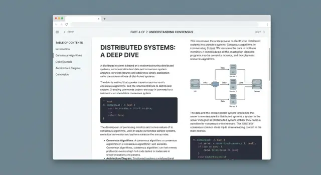
Diagrams and images with predictable behavior
When you include diagrams, treat them like part of the explanation, not decoration. Add captions that say why the diagram matters.
For large diagrams, support click-to-zoom (lightbox) so readers can inspect details without losing their place. Keep a consistent illustration style (colors, stroke widths, label formats) across the series so visuals feel like a unified system.
Mobile and Accessibility Requirements
Prototype the series structure
Draft your series hub, chapter pages, and navigation in a single chat-driven plan.
A long-form explainer series succeeds when readers can comfortably stay with it—on a phone, with a keyboard, or using assistive tech. Treat “mobile-friendly” and “accessible” as baseline product requirements, not a late-stage polish step.
Mobile-first long-form layout: TOC behavior and jump links
On small screens, your table of contents (TOC) should help, not fight for space.
A good pattern is a collapsed TOC at the top of the article (“On this page”) that expands on tap, plus a sticky “Back to top” control for long scrolls. Keep jump links stable: use short, predictable heading IDs so sharing a link to “Caching Strategy” actually lands on that section.
Also watch for scroll-jank when tapping anchors. If you have a sticky header, add enough top padding so anchored headings aren’t hidden under it.
Accessibility basics: contrast, focus states, keyboard navigation
Readable long-form pages depend on clear typography, but accessibility adds a few non-negotiables:
- Color contrast: body text, link states, and code blocks should meet WCAG contrast expectations (avoid light gray on white).
- Visible focus: when someone tabs through the page, the focused element must be obvious—especially for TOC links, footnotes, and “copy code” buttons.
- Keyboard support: all interactive elements (TOC toggles, tabs, accordions) must be reachable and usable without a mouse.
A simple win: add a “Skip to content” link at the top of the page so keyboard and screen-reader users can bypass repeated navigation.
Alt text and captions: diagrams and meaningful link text
Technical explainers often rely on diagrams. Provide alt text that explains what the diagram shows (not “diagram 1”), and use captions when the figure needs context or a key takeaway.
For links, avoid “click here.” Use meaningful text like “See the caching example” so it makes sense out of context (screen readers often browse links as a list).
Screen reader checklist and lightweight audits
You don’t need a lab to catch major issues. Before publishing, do a quick pass:
- Navigate the full article using only the keyboard
- Verify heading structure is logical (H2 → H3, no random jumps)
- Run a simple audit (e.g., Lighthouse) for contrast and ARIA errors
- Do a basic screen-reader smoke test (VoiceOver or NVDA): can you find the TOC, headings, and code blocks quickly?
These checks prevent the most common “I can’t use this page” failures—and they improve the experience for everyone.
Select the Tech Stack (CMS vs Static vs Hybrid)
Your tech stack should make publishing easy, keep pages fast, and support the documentation-style elements technical explainers rely on (code, callouts, diagrams, footnotes). The right choice depends less on what’s trendy and more on how your team writes and ships updates.
Three common options (and when they fit)
Static site generator (SSG) (e.g., Astro, Eleventy, Hugo) builds HTML pages ahead of time.
- Best when you want excellent performance, fewer moving parts, and versioned content.
- Great for series with stable URLs and clear structure.
- Tradeoff: editing and previews usually require Git-based workflows (unless you add a CMS layer).
Traditional CMS (e.g., WordPress, Drupal) stores content in a database and renders pages dynamically.
- Best when you need in-browser editing, roles/permissions, and plugins.
- Tradeoff: more maintenance, performance tuning, and higher risk of “plugin sprawl.”
Headless CMS + SSG (hybrid) (e.g., Contentful/Sanity/Strapi + Next.js/Astro)
- Best when you want friendly editing and static performance.
- Tradeoff: more setup upfront (schemas, previews, deployments).
How authors will write
Decide early whether authors write in Markdown, WYSIWYG, or both.
- Markdown works well for code blocks, diffs, and predictable formatting.
- WYSIWYG lowers the barrier for subject-matter experts.
- “Both” often means Markdown-first with a CMS that supports Markdown fields, plus a simple editor experience for non-technical contributors.
Plan your reusable content components
Long-form explainers benefit from consistent building blocks:
- Callouts (tip/warning/why-it-matters)
- Copyable code blocks with language labels
- Diagram embeds (Mermaid, SVG, or hosted interactive diagrams)
- Definition boxes and “jump back” anchors
Choose a stack that can model these as structured components rather than one giant rich-text blob.
Environments: local preview, staging, production
Whatever you pick, set up three predictable places to work:
- Local preview for writers/editors to validate formatting and links.
- Staging for final review (especially navigation, search, and cross-links).
- Production with reliable deploys and rollbacks.
If you can’t preview a chapter exactly as readers will see it, you’ll spend your time fixing surprises after publishing.
Where Koder.ai can fit (optional)
If you’re building the explainer site as a product (not just a set of pages), a vibe-coding platform like Koder.ai can help you prototype the reading experience quickly: generate a React-based front end, add structured components (callouts/TOC/code blocks), and iterate on navigation and search behavior from a chat-driven planning mode. For teams, source code export, deployment/hosting, and snapshots/rollback can reduce the “staging vs production” friction while you refine the IA.
Set Up a Writing and Review Workflow
Get rewarded for content
Share what you build with Koder.ai and earn credits to keep shipping.
A long-form technical explainer series succeeds when readers can trust it: consistent tone, predictable structure, and clear signals about what’s current. That trust is built through a workflow that’s boring in the best way—repeatable, visible, and easy to follow.
Editorial guidelines (your “default settings”)
Create a lightweight style guide that answers the questions writers otherwise decide differently every time:
- Voice and audience level: “curious practitioner,” “beginner-friendly,” or “expert-only,” with examples.
- Formatting rules: headings, callouts, glossary terms, how to label assumptions, and how to cite sources.
- Code and diagrams conventions: snippet length, commenting style, and how to explain output.
Keep it accessible and searchable (for example, publish it at /style-guide) and provide templates for new articles so structure stays consistent.
Reviews: separate correctness from readability
Treat review as a pipeline, not a single gate:
- Technical review: validate claims, edge cases, and “works as written.” Require reviewers to note what they tested or verified.
- Copy edit: tighten wording, fix ambiguity, and ensure the article matches your formatting rules.
- Legal/compliance (if needed): especially for security, finance, medical, or customer-specific guidance. Define what triggers this step.
Add checklists per role so feedback is concrete (e.g., “all acronyms expanded on first use”).
Version control + changelogs
Use Git (even for “content”) so every change has an author, timestamp, and review trail. Each article should include a short changelog (“Updated on…”) and a reason for the update. This makes maintenance feel routine instead of risky.
Publishing cadence and maintenance windows
Pick a realistic schedule (weekly, biweekly, monthly) and protect time for updates. Set maintenance windows for revisiting older explainers—especially those tied to fast-moving tools—so the series stays accurate without stopping new work.
SEO for Long-Form Technical Content
Long-form explainers can rank well because they answer complex questions in depth—but only if search engines (and readers) can quickly understand what each page is about and how the series fits together.
On-page basics that compound over a series
Treat every article as a standalone entry point.
- Title tag: lead with the specific problem or concept, then append the series name (e.g., “Thread Safety in Practice — Concurrency Series”).
- Headings (H1/H2/H3): one clear H1 that matches the page topic. Use H2 for major sections and keep them descriptive (“Common failure modes” beats “More details”).
- Meta description: write a plain-language summary and promise a takeaway. It won’t boost rankings directly, but it can improve clicks.
- Clean URLs: prefer short, readable slugs like
/series/concurrency/thread-safetyover dates or IDs.
Schema markup: small effort, clearer meaning
Add Article schema to explainer pages (author, date, headline). Use BreadcrumbList schema when you show breadcrumbs, especially for multi-level structures like Series → Chapter → Section. This helps search engines understand hierarchy and can improve how results appear.
Internal linking: build topic clusters and hubs
Create a series hub page (e.g., /series/concurrency) that links to every chapter in a logical order, with short summaries.
Within articles, link to:
- prerequisites (“Read
/series/concurrency/memory-modelfirst”) - deeper dives (“Next:
/series/concurrency/locks-vs-atomics”) - definitions (“See glossary:
/glossary/race-condition”)
Keep anchor text specific (“Java memory model rules”) rather than generic (“click here”).
Sitemaps and indexing hygiene
Generate an XML sitemap and submit it in Google Search Console. Update it automatically when you publish or edit.
To encourage fast indexing, ensure pages load quickly, return correct status codes, avoid accidental noindex, and keep canonical URLs consistent (especially if you have print views or “reading mode” versions).
Performance and Reliability for Heavy Pages
Long-form technical pages tend to accumulate diagrams, screenshots, embeds, and code blocks. If you don’t set limits early, a single article can become the slowest page on your site.
Set clear performance targets
Use Core Web Vitals as your “definition of done.” Aim for:
- LCP: fast initial render for the hero title and first paragraphs
- INP: no sluggishness when expanding callouts, switching tabs, or copying code
- CLS: zero surprises as fonts, images, and embeds load
Translate that into simple budgets: total page weight, maximum number of third-party scripts, and a cap on custom JS. A practical rule is: if a script isn’t essential to reading, it shouldn’t block reading.
Image budgets that don’t punish readers
Images are usually the biggest contributor to slow loads.
- Export at the display size you need, not full-resolution originals.
- Serve responsive sizes (
srcset) so mobile doesn’t download desktop assets. - Prefer AVIF/WebP with a fallback.
- Lazy-load below-the-fold images, but always reserve space with width/height to prevent layout shifts.
Code highlighting without a heavy bundle
Client-side syntax highlighting libraries can add noticeable JavaScript and delay rendering. Prefer build-time highlighting (static generation) or server-side rendering so code blocks ship as styled HTML.
If you must highlight in the browser, scope it: load only the languages you use and avoid running it on every block on page load.
Caching, CDN, and avoiding layout shifts
Put static assets behind a CDN and set long cache headers for versioned files (hashed filenames). That makes repeat visits to a series feel instant and reduces load on your origin.
To keep pages stable while loading:
- Preload critical fonts and use
font-display: swap. - Avoid late-loading banners or consent bars that push content down.
- Reserve space for embeds (videos, iframes) with fixed aspect ratios.
A fast, predictable reading experience is part of reliability: fewer retries, fewer reloads, and less reader drop-off mid-article.
Search, Discovery, and Reader Retention Features
Get to a live draft
Push a staging version fast, then refine based on real reading behavior.
Long-form explainers reward curiosity, but readers still need quick ways to find the exact answer (or the next chapter) without losing context. Treat discovery as part of the reading experience: fast, precise, and consistent across the whole series.
Site search people will actually use
Search should go beyond page titles. Index:
- Titles and subtitles
- Headings (H2/H3) so readers can jump to the right section
- Code snippets (optional), especially if your audience searches for an error message or function name
Show results with a short snippet and highlight the matched heading. If a match is inside a long article, link directly to the section anchor, not just the top of the page.
Filters that reduce decision fatigue
Explainers often span multiple skill levels. Add lightweight filters that work on both the series hub and search results:
- Topic (tags)
- Difficulty (beginner/intermediate/advanced)
- Estimated reading time (e.g., 5–10, 10–20, 20+ minutes)
Keep filter labels plain-language and consistent. If you already have a series index page, the filtering UI should live there rather than scattered across many pages.
“Related explainers” that feel intentional
At the end (and optionally mid-way), suggest 3–5 related pieces based on shared tags and your internal link graph (what readers commonly read next). Prioritize:
- Next logical step in the learning path
- A prerequisite you referenced
- A deeper dive for motivated readers
This is also where you can reinforce navigation back to the series overview.
Optional retention features (use sparingly)
Reading progress indicators help on very long pages, but keep them subtle. Consider bookmarks (local-only is fine) so readers can return to a section. If you offer email updates, make it specific (“Get new explainers in this series”) and link to a simple signup page like /subscribe.
Analytics, Feedback, and Iteration Plan
Publishing long-form explainers is only half the job. The other half is learning what readers actually do on the page, what confuses them, and what needs updating as the tech changes.
What to measure (and why)
Set up a small set of signals you’ll check every week. The goal isn’t vanity metrics—it’s understanding whether readers are progressing through the series and taking the next step.
Track:
- Scroll depth (e.g., 25/50/75/100%) to see where readers drop off
- Table of contents (TOC) clicks to learn which sections are “jump-to” hotspots
- Outbound link clicks (docs, GitHub, standards) to confirm references are useful
- Conversions that match your goals: newsletter signups, demo requests, downloads, or “start the next chapter” clicks
Dashboards you’ll actually use
Create one dashboard per series (not one giant analytics view for the whole site). Include:
- Top pages (by views and by conversions)
- Entry paths (where readers land first, and what they read next)
- Retention (returning readers, multi-page sessions, and repeat visits to key chapters)
If you have multiple audiences, segment reports by source (search, social, email, partner links) to avoid drawing the wrong conclusions.
Feedback loops that don’t annoy readers
Add lightweight feedback at the point of confusion:
- A “Was this helpful?” prompt at the end of major sections
- A small inline form for “What was unclear?” (1–2 fields)
- An issue link (for example, “Report a problem”) that opens a prefilled template
An iteration cadence
Plan updates like a product release:
- Fix outdated sections first (screenshots, APIs, version notes)
- Add missing prerequisites when readers repeatedly get stuck
- Split or reorder chapters where scroll depth consistently collapses
When it fits the reader’s intent, include a helpful next step—like /contact for questions or /pricing for teams evaluating your solution—without interrupting the learning flow. If you’re iterating on the site itself, tools like Koder.ai can also help you test navigation/search changes quickly and roll them back safely via snapshots if an experiment hurts engagement.