Mar 09, 2025·8 min
How to Build a Website for a Niche Technical Community
Learn how to plan, build, and grow a website for a niche technical community—features, content structure, onboarding, moderation, SEO, and metrics.
Learn how to plan, build, and grow a website for a niche technical community—features, content structure, onboarding, moderation, SEO, and metrics.
A niche technical community site succeeds when it’s clear who it serves and what “better” looks like. Before picking features or tools, define your community like a product: audience, problem, and measurable outcomes.
Start with a simple audience statement that includes roles, skill levels, and context.
For example:
This clarity prevents a common trap: building a site that tries to serve everyone and ends up feeling generic.
Keep these problem statements concrete and member-centered. Good examples:
If you can’t name the problems in plain language, the website will struggle to attract the right participation.
Pick one primary action you want most visitors to take on their first session:
Make this choice explicit because it drives copy, homepage layout, and what you measure.
Use a small scorecard you can review weekly:
These metrics keep decisions grounded in reality as you build and grow.
Once your purpose and metrics are clear, design the site around how real people arrive, learn, and participate. Member journeys—not feature checklists—should drive your structure.
Aim for 2–4 lightweight personas you can keep in mind during every decision:
Keep each persona anchored in motivations (“I need to fix this bug today”), constraints (time, confidence), and preferred formats (threads, docs, code snippets).
Sketch the path from first visit → first contribution → regular engagement:
Design each step so it feels obvious what to do next.
Common blockers include fear of asking “dumb” questions, concern about being judged, and privacy worries (work email, real name, public post history). Reduce friction with clear norms, beginner-friendly tags, anonymous/limited profiles if appropriate, and transparent moderation.
Make the decision intentionally. Public content boosts discovery and helps newcomers self-serve; members-only areas can protect sensitive discussions and encourage participation. A common split: read-mostly public, post/reply after sign-up, and private spaces for small groups or sensitive topics.
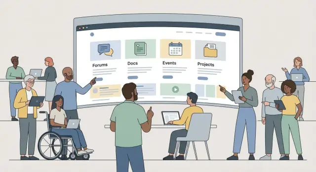
Information architecture is the difference between a community that “feels obvious” and one where members constantly ask where things are. Your goal is to make the first click easy, and the second click predictable.
Pick 3–5 primary content types that match how your members actually learn and contribute. Common building blocks for a technical community include:
Once you choose, design each type with a clear purpose. For example, Q&A should optimize for “best answer,” while projects should highlight outcomes, screenshots, repos, and learnings.
Aim for 5–7 top-level items, max. Too many choices slows people down and hides what you want them to do.
A practical approach is to name navigation items after user intents:
Create a lightweight taxonomy that works across content types:
Keep naming consistent and avoid near-duplicates. If two tags mean the same thing, merge them early.
Decide what must be searchable (posts, answers, docs, projects, events) and what the results page should show. Good results include:
This makes your community feel organized even as it grows.
Before you pick tools or start designing screens, decide what pages your community actually needs on day one. A niche technical community succeeds when people can (1) ask and answer questions, (2) find reliable reference material later, and (3) trust the space.
Start with the basics of participation:
Feature-wise, prioritize search, tagging, and notifications (at least email). Fancy elements like badges and complex reputation systems can wait until you know what behavior you want to encourage.
Technical communities quickly accumulate repeat questions. Give that knowledge a home:
A small but high-quality knowledge section reduces repetitive threads and makes the site more useful to newcomers.
Even early on, include:
These pages set expectations and prevent confusion when issues arise.
Add lightweight conversion points:
If you’re unsure about a feature, ask: will it help a first-time visitor find value within five minutes? If not, keep it for later.
A niche technical community succeeds when members can quickly find value and contribute. The fastest way to get there is to define a Minimum Viable Product (MVP) that proves engagement, then expand only after you’ve validated what people actually use.
Start by separating what you must have to support the first real conversations from what would be “nice.” A simple rule: if a feature doesn’t help a new member find an answer, ask a question, or share a solution, it’s probably not MVP.
MVP features (typical):
Phase 2 features (typical):
Hosted community tools get you to a working site quickly, with less maintenance. Custom development makes sense if your community needs a unique workflow (for example, integrating discussions tightly into product documentation or a specialized knowledge base).
Ask: will custom features meaningfully change participation, or just feel “cool”?
If you do decide to build something custom, consider using a vibe-coding platform like Koder.ai to prototype the MVP quickly: you can describe the community flows in chat (e.g., “Q&A with accepted answers + docs + events”), iterate in a planning mode, and then export source code when you’re ready to own the stack.
Even for an MVP, confirm requirements that are painful to change later:
Set a realistic plan with clear checkpoints:
Budget for ongoing costs (moderation time, hosting/software, content upkeep), not just the initial build.
A niche technical community site succeeds when it’s easy to run week after week—not when it uses the newest tools. Your best stack is the one your team can patch, back up, and extend without heroics.
1) CMS (like a documentation + blog hub).
Great when your community is content-led: guides, announcements, event pages, and a lightweight “start here.” You’ll rely on plugins for search, forms, and sometimes member features. Choose this if most value is reading and sharing.
2) Forum software (discussion-first).
Best for Q&A, threads, tagging, moderation tooling, and notifications. Many options give you user profiles, trust levels, spam protection, and decent search out of the box. Choose this if most value is conversation.
3) Custom app (build it yourself).
Only worth it when you have a very specific workflow (e.g., code reviews, challenge submissions, reputation systems tied to your product) and someone who can maintain it long-term. Otherwise, you’ll spend months recreating basics like auth, moderation, and search.
If you go down the custom path, be honest about your delivery constraints. Teams often use Koder.ai here to accelerate the “boring but necessary” surfaces (React front end, Go back end, PostgreSQL), then focus human time on the community-specific differentiators.
Plan for:
Aim for boring reliability: uptime monitoring, HTTPS, automated backups, and a staging environment so updates can be tested before they hit members. Also decide early how you’ll handle growth: can your database and search scale, and do you have a plan for media storage and email deliverability?
If data residency matters, confirm where your infrastructure runs and whether you can deploy in the regions your members require. (For example, Koder.ai runs on AWS globally and can deploy applications in different countries to support privacy and cross-border data requirements.)
Document who owns what:
When responsibilities are explicit, the platform stays healthy even when volunteers rotate.
Onboarding isn’t just “getting someone registered.” For a niche technical community, it’s the moment where a curious visitor turns into a participant who posts, replies, or shares something useful. Your goal is to remove uncertainty and make the next step obvious.
Start with the lightest friction that still protects the community.
After sign-up, don’t drop members onto a busy homepage. Show a short welcome message that sets expectations, then offer 1–3 starter tasks that take under two minutes.
Examples: “Introduce yourself in one sentence,” “Reply to a pinned question,” or “Post your current setup.” Use prompts that reduce fear of “posting wrong,” especially for newcomers.
Posting templates turn blank-page anxiety into a guided form. Provide a few high-signal formats such as:
Ask only for fields that improve recommendations and conversations: skills level, tools used, interests, time zone. Avoid clutter like long bios or too many badges early on. A clean profile makes it more likely members will follow up, collaborate, and contribute again.
A niche technical community grows faster when members feel safe, discussions stay on-topic, and decisions are predictable. That doesn’t happen by accident—you need lightweight governance from day one.
Start with a small set of moderation roles and make ownership explicit. Even if it’s just two people at first, write down who handles what and when.
Set escalation paths (what gets escalated, to whom) and response times (e.g., spam within hours, harassment reports within 24 hours). Consistency builds trust.
Rules should be short, concrete, and easy to reference during disagreements. Cover:
Also decide how you’ll treat common gray areas: AI-generated posts, recruiting posts, and vendor announcements.
Use layered defenses rather than one harsh gate:
Publish how decisions are made, how warnings work, and how appeals are handled. A simple appeal process (with timelines and a second reviewer when possible) reduces accusations of bias and helps moderators stay calm and consistent under pressure.
A technical community grows fastest when answers and docs stay easy to find, consistent in quality, and regularly maintained. If content creation depends on one heroic maintainer, it will stall. Treat content like a product: define standards, build a lightweight workflow, and make updates part of normal operations.
Write down a short style guide that contributors can actually follow. Keep it practical and visible.
Cover at least:
Use a simple path that matches the community’s capacity:
Draft → Review → Publish → Maintain
Define who can do each step, and what “review” means (accuracy, clarity, safety). Add an update cadence based on content type:
Repeated questions are a sign of demand, not failure—until they drown out deeper discussion. Build a “canonical answers” library:
Recognition helps retention, especially for documentation work.
Consider:
A niche technical community grows faster when the right people can find the right answers quickly—and when members can share pages without losing context. Treat discoverability as part of your community experience, not a marketing afterthought.
Start with simple, consistent basics that make every page easier for search engines (and humans) to understand.
/guides/testing-webhooks over long query strings. Once a URL is public, avoid changing it.Don’t rely on your homepage to do all the work. Create a few focused landing pages that match what people actually search:
Each landing page should point to the best threads, docs, and examples—so visitors can self-serve and then join the discussion.
When someone shares a link in chat or social platforms, the preview should communicate value instantly.
Use Open Graph and Twitter-style metadata for titles, summaries, and preview images. Add canonical URLs so duplicates (e.g., the same post reachable via multiple paths) don’t compete with each other.
If your community supports a product, keep paths predictable and relative (for example: /pricing or /docs) so navigation stays clear across environments.
A niche technical community succeeds when it’s comfortable to read, easy to post, and fast enough that people don’t think twice about using it. Small design choices here often beat big feature launches.
Reduce friction in the places members repeat: browsing categories, searching, reading long threads, and replying.
Keep navigation predictable (a clear home, categories, search, and profile), and make primary actions visible on every page: “Start a topic,” “Reply,” and “Ask a question.” When threads get long, add helpful affordances like a table of contents, “jump to newest,” and clear visual separation between posts.
Accessibility isn’t a separate mode; it’s good usability.
Use readable font sizes, comfortable line spacing, and strong contrast between text and background. Ensure the site works with keyboard navigation: users should be able to tab through menus, buttons, and forms in a logical order, with clear focus states.
If you host audio/video (meetups, demos, tutorials), provide captions or transcripts. For images in posts, encourage short, meaningful alt text—especially for screenshots of code or diagrams.
Community pages often include embeds, badges, analytics, and third-party scripts. Each one can slow down reading and posting.
Optimize images (right dimensions, modern formats where possible), cache assets, and remove scripts that don’t clearly earn their keep. Keep page templates lightweight—especially topic pages, search results, and category listings.
Many members will discover you on mobile, even if they contribute from desktop later.
Test mobile navigation, search, and posting flows end-to-end. Make sure composing a reply is comfortable, code blocks are scrollable, and long threads don’t feel endless (sticky navigation, “back to top,” and sensible pagination help).
Show clear ownership, a contact option, and transparent policies (moderation rules, privacy, and what happens to content). Even a simple footer with these details can increase confidence and reduce hesitation to join or contribute.
Launch is when you finally get real data—what people actually do, not what you hoped they’d do. Treat your first version as a baseline, then improve it with a steady cadence.
Track a small set of community essentials so you don’t drown in dashboards:
Pair numbers with a simple narrative: “People join, but don’t post” is more actionable than “sessions are up 12%.”
Add event tracking only when it answers a question you’ll act on. Common events: account created, onboarding completed, first post, first reply, search performed, doc page viewed, “helpful” vote clicked.
Avoid collecting unnecessary personal data. Prefer aggregated metrics, minimize identifiers, and document what you track so the team stays disciplined.
Quantitative data tells you what is happening; feedback helps explain why:
Set a monthly review cycle: prune dead pages, update docs that show high exits, refine onboarding steps with low completion, and fix the top 3 usability issues. Small, consistent improvements compound—and your community will feel the momentum.
If you’re building custom functionality, snapshots and rollback are also worth budgeting for from day one. Platforms like Koder.ai include these workflow conveniences (along with hosting, deployment, and custom domains) so you can iterate safely without turning every change into a risky release.
Define (1) the audience, (2) the top problems you solve, and (3) one primary first-session action (Join, Post, or Attend). Then track a small weekly scorecard:
Create 2–4 lightweight personas you’ll actually use in decisions:
Anchor each persona in motivations, constraints (time/confidence), and preferred formats (threads, docs, snippets).
Map first visit → first contribution → regular engagement and design each step to make “what to do next” obvious.
Practical tactics:
A common, effective split is:
Decide intentionally based on trust barriers (privacy, fear of judgment) and moderation capacity.
Keep top-level navigation to 5–7 items and name them by user intent. A simple structure:
Back it with a consistent taxonomy: categories for big buckets, tags for specifics, and curated “getting started” paths.
Pick 3–5 core content types that match how members learn and contribute, such as:
Design each type around its purpose (e.g., Q&A optimizes for “best answer,” not long debate).
MVP is whatever helps a new member quickly get value and contribute:
Delay reputation systems, complex gamification, deep analytics dashboards, and custom feeds until you’ve validated engagement.
Buy/hosted tools are usually best when you want speed and lower maintenance. Build custom only if you need a workflow you can’t get otherwise (e.g., discussions tightly integrated into product docs).
Non-negotiables to decide early:
Give new members a short first-run path and 1–3 starter tasks that take under two minutes.
To reduce “blank page” anxiety, add templates:
Keep profiles minimal: skill level, tools used, interests, time zone.
Start with clear roles and predictable response expectations:
Prevent spam with layered defenses (rate limits, first-post approval, link throttling) rather than harsh gates that punish legitimate newcomers. Publish a simple appeal process to keep governance transparent.