Apr 18, 2025·8 min
Build an Open-Source Project Website with Community Input
Learn how to plan, build, and maintain an open-source project website that welcomes community contributions with clear workflows, review steps, and reliable publishing.
Learn how to plan, build, and maintain an open-source project website that welcomes community contributions with clear workflows, review steps, and reliable publishing.
Before you pick a theme or wireframe a homepage, get specific about what the site is for. Open-source websites often try to be everything at once—docs portal, marketing page, community hub, blog, donation funnel—and end up doing none of it well.
Write down the top 1–3 jobs the website must accomplish. Common examples:
If you can’t explain the website’s purpose in one sentence, visitors won’t be able to either.
List your main audiences and the “first click” you want each group to take:
A useful exercise: for each audience, write the top 3 questions they arrive with (e.g., “How do I install?”, “Is this actively maintained?”, “Where do I report a bug?”).
Choose simple metrics that connect to your goals and are realistic to track:
Explicitly list what the site will not do (for now): custom web apps, complex account systems, heavy integrations, or bespoke CMS features. This protects maintainers’ time and keeps the project shippable.
Split content into two buckets:
This single decision will shape your tool choices, review workflow, and contributor experience later.
A community website gets messy fast if you don’t decide what “belongs” on the site versus what should stay in the repository. Before tools and themes, agree on a simple structure and a clear content model—so contributors know where to add things and maintainers know how to review them.
Keep the primary navigation boring on purpose. A good default sitemap for an open-source project website is:
If a page doesn’t fit one of these, it’s a signal you may be adding something internal (better suited for the repo) or something that needs its own content type.
Use the README for developer-facing essentials: build instructions, local dev setup, testing, and quick project status. Use the website for:
This separation prevents duplicated content that drifts out of sync.
Assign content owners by area (docs, blog/news, translations). Ownership can be a small group with clear review responsibility, not a single gatekeeper.
Write a short tone and style guide that’s friendly to a global community: plain language, consistent terminology, and guidance for non-native English writers.
If your project ships releases, plan for versioned docs early (for example: “latest” plus supported versions). It’s much easier to design the structure now than to retrofit it after multiple releases.
Your website stack should make it simple for someone to fix a typo, add a new page, or improve docs without becoming a build engineer. For most open-source projects, that means: Markdown-first content, quick local setup, and a smooth pull-request workflow with previews.
If you expect to iterate quickly on layout and navigation, consider prototyping the site experience before you commit to a long-lived stack. Platforms like Koder.ai can help you sketch a docs/marketing site via chat, generate a working React-based UI with a backend when needed, and then export the source code to maintain in your repo—useful for exploring information architecture and contribution flows without weeks of setup.
Here’s how common options stack up for contribution-friendly docs and project sites:
mkdocs.yml, and run one command. Search is typically strong and fast.Choose hosting that supports preview builds so contributors can see their changes live before publishing:
If you can, make the default path “open a PR, get a preview link, request review, merge.” That reduces maintainer back-and-forth and boosts contributor confidence.
Add a short docs/website-stack.md (or a section in README.md) explaining what you chose and why: how to run the site locally, where previews appear, and which kinds of changes belong in the website repo.
A welcoming repo makes the difference between “drive-by edits” and sustained community contributions. Aim for a structure that’s easy to navigate, predictable for reviewers, and simple to run locally.
Keep web-related files grouped and clearly named. One common approach is:
/
  /website        # marketing pages, landing, navigation
  /docs           # documentation source (reference, guides)
  /blog           # release notes, announcements, stories
  /static         # images, icons, downloadable assets
  /.github        # issue templates, workflows, CODEOWNERS
  README.md       # repo overview
If your project already has application code, consider placing the site in /website (or /site) so contributors don’t have to guess where to start.
/websiteCreate /website/README.md that answers: “How do I preview my change?” Keep it short and copy-paste friendly.
Example quickstart (adjust to your stack):
# Website quickstart

## Requirements
- Node.js 20+

## Install
npm install

## Run locally
npm run dev

## Build
npm run build

## Lint (optional)
npm run lint
Also include where key files live (navigation, footer, redirects) and how to add a new page.
Templates reduce formatting debates and speed up reviews. Add a /templates folder (or document templates in /docs/CONTRIBUTING.md).
/templates
  docs-page.md
  tutorial.md
  announcement.md
A minimal docs page template might look like:
---
title: "Page title"
description: "One-sentence summary"
---

## What you’ll learn

## Steps

## Troubleshooting
If you have maintainers for specific areas, add /.github/CODEOWNERS so the right people get requested automatically:
/docs/    @docs-team
/blog/    @community-team
/website/ @web-maintainers
Prefer one canonical config file per tool, and add brief comments explaining “why” (not every option). The goal is that a new contributor can confidently change a menu item or fix a typo without learning your entire build system.
A website attracts a different kind of contribution than the codebase: copy edits, new examples, screenshots, translations, and small UX tweaks. If your CONTRIBUTING.md is written only for developers, you’ll lose a lot of potential help.
Create (or split out) a CONTRIBUTING.md that focuses on website changes: where content lives, how pages are generated, and what “done” looks like. Add a short “common tasks” table (fix a typo, add a new page, update navigation, publish a blog post) so newcomers can start in minutes.
If you already have deeper guidance, link it clearly from CONTRIBUTING.md (for example, a walkthrough page under /docs).
Be explicit about when to open an issue first versus sending a direct PR:
Include a “good issue template” snippet: what page URL, what change, why it helps readers, and any sources.
Most frustration comes from silence, not feedback. Define:
A lightweight checklist prevents back-and-forth:
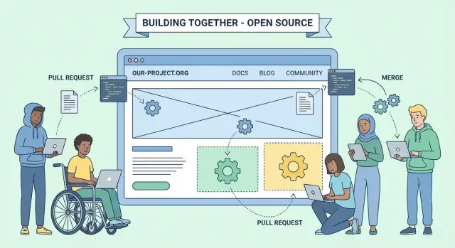
A community website stays healthy when contributors know exactly what happens after they open a pull request. The goal is a workflow that is predictable, low-friction, and safe to ship.
Add a pull request template (for example, .github/pull_request_template.md) that asks only what reviewers need:
This structure speeds reviews and teaches contributors what “good” looks like.
Enable preview deployments so reviewers can see the change running as a real site. This is especially helpful for navigation updates, styling, and broken layouts that don’t show up in a text diff.
Common pattern:
Use CI to run lightweight gates on every PR:
Fail fast, with clear error messages, so contributors can fix issues without maintainer intervention.
Document one rule: when a PR is approved and merged to main, the site deploys automatically. No manual steps, no secret commands. Put the exact behavior in /contributing so expectations are clear.
If you use a platform that supports snapshots/rollback (some hosts do, and so does Koder.ai when you deploy through it), document where to find the “last known good” build and how to restore it.
Deployments break sometimes. Document a short rollback playbook:
A community website stays welcoming when pages feel like they belong to the same place. A lightweight design system helps contributors move faster, reduces review nitpicks, and keeps readers oriented—even as the site grows.
Define a small set of page “types” and stick to them: docs page, blog/news post, landing page, and reference page. For each type, decide what always appears (title, summary, last updated, table of contents, footer links) and what never should.
Set navigation rules that protect clarity:
sidebar_position or weight).Instead of asking contributors to “make it look consistent,” give them building blocks:
Document these components in a short “Content UI Kit” page (for example, /docs/style-guide) with copy‑paste examples.
Define the minimum: logo usage (where it can’t be stretched or recolored), 2–3 core colors with accessible contrast, and one or two fonts. The goal is to make “good enough” easy, not to police creativity.
Agree on conventions: fixed widths, consistent padding, and naming like feature-name__settings-dialog.png. Prefer source files for diagrams (e.g., Mermaid or editable SVG) so updates don’t require a designer.
Add a simple checklist to PR templates: “Is there already a page for this?”, “Does the title match the section it’s in?”, and “Will this create a new top-level category?” This prevents content sprawl while still encouraging contributions.
A community website only works if people can actually use it—on assistive tech, on slow connections, and through search. Treat accessibility, performance, and SEO as defaults, not polish added at the end.
Start with semantic structure. Use headings in order (H1 on the page, then H2/H3), and don’t skip levels just to get a bigger font.
For non-text content, require meaningful alt text. A simple rule: if an image conveys information, describe it; if it’s purely decorative, use empty alt (alt="") so screen readers can skip it.
Check color contrast and focus states in your design tokens so contributors don’t have to guess. Make sure every interactive element is reachable by keyboard, and that focus doesn’t get trapped in menus, dialogs, or code examples.
Optimize images by default: resize to the maximum display size, compress, and prefer modern formats where your build supports them. Avoid loading large client-side bundles for pages that are mostly text.
Keep third‑party scripts to a minimum. Each extra widget adds weight and can slow down the site for everyone.
Lean on caching defaults provided by your host (for example, immutable assets with hashes). If your static site generator supports it, generate minified CSS/JS and inline only what’s truly critical.
Give every page a clear title and a short meta description that matches what the page delivers. Use clean, stable URLs (no dates unless they matter) and consistent canonical paths.
Generate a sitemap and a robots.txt that allows indexing of public docs. If you publish multiple versions of documentation, avoid duplicate content by making one version “current” and clearly linking to others.
Only add analytics if you will act on the data. If you do, explain what is collected, why, and how to opt out on a dedicated page (for example, /privacy).
Finally, include a clear license notice for the website content (separate from the code license if needed). Put it in the footer and in your repository README so contributors know how their text and images can be reused.
Your website’s core pages are the “front desk” for new contributors. If they answer the obvious questions quickly—what the project is, how to try it, and where help is needed—more people will move from curiosity to action.
Create a plain-language overview page that explains what the project does, who it’s for, and what success looks like. Include a few concrete examples and a short “Is this for you?” section.
Then add a Quickstart page that is optimized for momentum: one path to a first successful run, with copy‑paste commands and a short troubleshooting block. If setup differs by platform, keep the main path short and link out to detailed guides.
Suggested pages:
A single /contribute page should point to:
/docs/contributing)Keep it specific: name 3–5 tasks you actually want done this month, and link to the exact issue(s).
Publish the essentials as first-class pages, not buried in a repo:
/community/meetings)Add /changelog (or /releases) with a consistent format: date, highlights, upgrade notes, and links to PRs/issues. Templates reduce maintainer effort and make community-written notes easier to review.
A showcase page can motivate contributions, but stale lists hurt credibility. If you add /community/showcase, set a lightweight rule (e.g., “review quarterly”) and provide a small submission form or PR template.
A community site stays healthy when updates are easy, safe, and rewarding—even for first‑time contributors. Your goal is to reduce “where do I click?” friction and make small improvements feel worthwhile.
Add a clear “Edit this page” link on docs, guides, and even FAQs. Point it directly to the file in your repo so it opens a pull request (PR) flow with minimal steps.
Keep the link text friendly (for example: “Fix a typo” or “Improve this page”) and place it near the top or bottom of the content. If you have a contributing guide, link it right there too (e.g., /contributing).
Localization works best when the folder layout answers questions at a glance. A common approach is:
Document the review steps: who can approve translations, how you handle partial translations, and how you track what’s outdated. Consider adding a short note at the top of translated pages when they lag behind the source language.
If your project has releases, make it obvious what users should read:
Even without full docs versioning, a small banner or selector that explains the difference prevents confusion and reduces support load.
Put FAQs in the same content system as your docs (not buried in issue comments). Link to it prominently (e.g., /docs/faq) and encourage people to contribute fixes when they hit a problem.
Explicitly invite quick wins: typo fixes, clearer examples, updated screenshots, and “this worked for me” troubleshooting notes. These are often the best entry point for new contributors—and they steadily improve your open-source project website.
If you want to incentivize writing and maintenance work, be transparent about what you reward and why. For example, some teams offer small sponsorships or credits; Koder.ai has an “earn credits” program for creating content about the platform, which can be adapted as inspiration for lightweight, community-friendly recognition systems.
A community-driven site should feel welcoming—but not at the cost of a few people doing endless cleanup. The goal is to make maintenance predictable, lightweight, and shareable.
Pick a cadence people can remember and automate what you can.
If you document this schedule in /CONTRIBUTING.md (and keep it short), others can step in confidently.
Content disagreements are normal: tone, naming, what belongs on the homepage, or whether a blog post is “official.” Avoid drawn-out debates by writing down:
This is less about control and more about clarity.
A calendar doesn’t need to be fancy. Create a single issue (or a simple markdown file) listing upcoming:
Link to it from blog/news planning notes so contributors can self-assign.
Track recurring website issues (typos, outdated screenshots, missing links, accessibility fixes) and label them “good first issue.” Include clear acceptance criteria like “update one page + run formatter + screenshot the result.”
Put a short “Common local setup issues” section in your docs. Example:
# clean install
rm -rf node_modules
npm ci
npm run dev
Also mention the top 2–3 gotchas you see often (wrong Node version, missing Ruby/Python dependency, port already in use). This reduces back-and-forth and saves maintainer energy.
Write a one-sentence purpose statement, then list the top 1–3 jobs the site must do (for example: docs, downloads, community, updates). If a page or feature doesn’t support those jobs, treat it as a non-goal for now.
A simple check: if you can’t explain the site’s purpose in one sentence, visitors won’t be able to either.
List your main audiences and define the first click you want from each:
For each audience, write the top 3 questions they arrive with (e.g., “Is this maintained?”, “Where do I report a bug?”) and ensure your navigation answers them quickly.
Start with a “boring on purpose” sitemap that matches how people search:
If new content doesn’t fit, it’s a sign you either need a new content type (rare) or the information belongs in the repo instead of the website.
Keep developer workflow in the README and public onboarding on the website.
Use the repo README for:
Use the website for:
Pick a stack that supports “Markdown-first” edits and quick local preview.
Common choices:
Aim for a default path of PR → preview → review → merge.
Practical approach:
main deploys”)This reduces reviewer back-and-forth and gives contributors confidence their change looks right.
Use structure and templates to reduce formatting debates.
Helpful basics:
Make it “website-first” and specific.
Include:
Keep it short enough that people will actually read it—and link to deeper docs when needed.
Treat these as defaults, not optional polish:
Add automated checks where possible (link checker, Markdown lint, formatting) so reviewers aren’t doing it manually.
Make updates easy and maintenance predictable.
For community updates:
/docs/faq)/docs/en/..., /docs/es/...For maintainer sustainability:
This prevents duplicated content that slowly drifts out of sync.
Choose the simplest tool that meets your needs today, not the most flexible tool you might need later.
/website, /docs, /blog, /.github/website/README.md with copy-paste commands to run locally/templates folder (docs page, tutorial, announcement)CODEOWNERS to route reviews by areaThe goal is that someone can fix a typo or add a page without becoming a build expert.
/privacy page and explain what’s collected and why