May 22, 2025·8 min
How to Build a Website for Long-Form Educational Content
Plan, design, and launch a site that supports long lessons with clear structure, fast pages, readable typography, strong SEO, and easy updates.
Start With Your Content Strategy and Audience
A long-form educational site succeeds when it teaches a specific group of people something concrete. Before you pick a theme, CMS, or design system, decide who you’re building for and what “learning” should look like when they finish reading.
Define your audience and learning goals
Start by naming your primary reader level:
- Beginners: need plain language, definitions, and lots of examples.
- Intermediate: want frameworks, trade-offs, and “why this works.”
- Advanced: expect depth, edge cases, and references they can apply immediately.
Then write learning goals as outcomes, not topics. For example: “After this lesson, a reader can outline a study plan” or “apply a checklist to evaluate sources.” These goals will later guide page length, headings, exercises, and what to place in summaries.
Choose the content types you’ll publish
Long-form education usually needs more than one format. Pick a small set you can maintain:
- Lessons for step-by-step learning
- Guides for comprehensive overviews
- Tutorials for hands-on tasks
- Courses for a curated sequence
- References for quick lookups
Each type should have a clear purpose so readers know what they’re getting before they commit to a long read.
Decide how you’ll measure success
Choose metrics that match your goals: search traffic for discovery, sign-ups for audience building, completion rate (or scroll depth) for learning engagement, and shares for credibility and reach.
List constraints early
Be honest about constraints: budget, team size, publishing frequency, and needed integrations (email, payments, analytics, community tools). Constraints aren’t bad—they help you choose an approach you can sustain for months, not just launch week.
Design Information Architecture for Learning
Good information architecture turns a pile of articles into a course people can actually finish. The goal is to help readers answer three questions at any moment: Where am I? What should I learn next? How deep does this topic go?
Build a clear topic hierarchy
Start by sketching a simple ladder that matches how people learn:
- Subjects → modules → lessons
Keep each level focused: a subject is a broad theme, a module is a coherent unit, and a lesson solves one problem or teaches one concept.
When a lesson grows into multiple ideas, split it. Smaller lessons are easier to revisit and easier to recommend.
Standardize URLs and naming
Consistency reduces confusion for both readers and your team. Decide on URL patterns early and stick to them, for example:
/subject/module/lesson-name/
Use human-readable names (not IDs), avoid frequent renaming, and keep titles aligned with the lesson’s main outcome. This also makes internal navigation and future updates less risky.
Create hub pages that teach and direct
Plan “hub” pages at the subject and module level. A hub page should:
- Summarize what the learner will gain
- Explain prerequisites (what to read first)
- Link to the next lessons in a sensible order
Think of hubs as mini-syllabi: they reduce decision fatigue and make your site feel like a structured program, not a blog archive.
Use tags with restraint
Tags can help discovery, but only when they’re controlled. Define a small set of tags with clear definitions, and avoid dozens of near-duplicates (for example, “beginner,” “beginners,” “intro”). If a tag can’t collect enough meaningful lessons, it probably doesn’t deserve to exist.
Create a Repeatable Lesson Structure
A repeatable lesson structure makes long-form learning feel predictable in a good way. Readers know where to look for the “what,” the “why,” and the “how,” so they spend less energy orienting themselves and more energy learning.
Use a lesson template (and stick to it)
Choose a simple template you can apply to every lesson:
- Intro: what the learner will be able to do by the end
- Prerequisites: knowledge, tools, or time needed
- Steps: the main instruction, broken into clear chunks
- Examples: at least one realistic scenario that shows the steps in action
- Recap: a short review of what was covered and what’s next
This consistency also helps teams write faster and edit more reliably.
Put quick scanning first
Add a short Summary near the top (3–5 lines) and a Key takeaways block (3–6 bullets). Many learners skim before committing; these sections help them confirm they’re in the right place and understand the shape of the lesson.
Write headings that match learner intent
Use H2/H3 headings that sound like what someone would type into a search box or ask in plain language. Good headings are specific and action-oriented (for example, “Create your first outline” instead of “Overview”). Headings should also reflect the lesson flow, so readers can jump to the exact part they need.
Standardize callouts and practice blocks
Define a small set of callouts and use them consistently:
- Note: a helpful tip or shortcut
- Warning: a common mistake or risk
- Definition: a term explained in one or two sentences
- Exercise: a short task to confirm understanding
Keep the labels and styling consistent so learners recognize them instantly.
Navigation Patterns That Work for Long Reads
Long educational pages fail when readers feel lost. Good navigation keeps orientation clear, reduces scrolling fatigue, and makes it easy to return later.
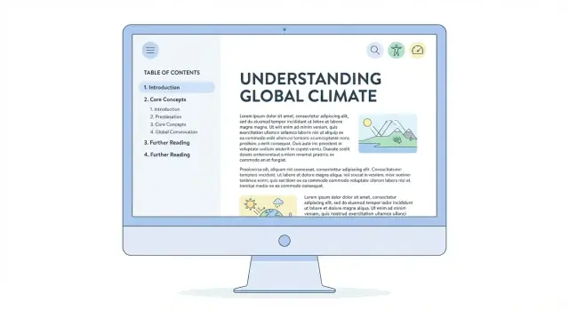
Sticky table of contents (TOC)
Add a sticky TOC that stays visible as the reader scrolls. Keep it compact: show the current section, nearby sections, and a “Back to top” control.
A few practical details make it feel polished:
- Highlight the active heading as the user reads
- Allow collapsing long TOCs (especially on mobile)
- Keep heading names short and consistent so the TOC is scannable
Deep links that people actually share
Support deep links (anchor links) to every major heading so learners can bookmark progress, instructors can assign specific sections, and support teams can answer questions precisely.
Use clear, stable anchors based on the heading text, and don’t change them casually—renaming anchors breaks old bookmarks and shared references.
Next/previous and “continue learning” blocks
At the end (and sometimes mid-page), add simple progression links:
- Previous / Next lesson for linear courses
- A Continue learning block that suggests the most logical follow-up (next unit, practice quiz, or recap)
This pattern reduces decision fatigue while still offering optional paths.
Search with filters for quick retrieval
Long-form libraries need search that narrows results fast. Add filters such as topic, level (beginner/intermediate/advanced), and format (lesson, exercise, checklist, transcript). Make filters available on mobile and keep the results page readable with short excerpts and clear titles.
Typography and Layout for Readability
Great educational writing can still feel exhausting if the page fights the reader. Typography and layout are the quiet “instructors” on your site: they set pace, reduce friction, and keep attention on the lesson.
Make text comfortable for long sessions
Aim for a readable measure (line length) so the eye doesn’t get lost when jumping to the next line. A practical range is roughly 60–80 characters per line on desktop, with generous line height (about 1.5–1.7) and clear paragraph spacing.
Use font sizes that don’t require zooming: many sites land around 16–18px for body text, with headings that clearly signal hierarchy. Prefer highly legible typefaces over “personality” fonts, and ensure strong contrast between text and background.
Use layout that keeps focus
Long-form lessons work best with a single dominant content column. If you use a sidebar, keep it minimal and avoid sticky blocks that compete with the text. Ads, popups, and “related content” widgets should never interrupt the reading flow mid-paragraph.
A table of contents can be helpful, but it should feel optional—readers should be able to ignore it and still have a clean page.
Handle code, diagrams, and screenshots well
For technical snippets, use clear code styling (monospace, good contrast, sensible syntax highlighting). Add a visible copy button so readers can reuse examples without fiddly selection.
Ensure diagrams and screenshots remain readable on mobile: allow pinch-zoom, avoid tiny text inside images, and don’t force wide content that breaks the layout. If you include tables, consider horizontal scroll with clear cues.
Small details that add up
Use consistent spacing, predictable heading styles, and generous margins. Remove visual noise so the lesson—not the interface—does the teaching.
Accessibility as a Core Requirement
Iterate without fear
Use snapshots and rollback to keep lesson templates stable while you improve them.
Accessibility isn’t a “nice extra” for an educational website—it’s part of teaching. If a learner can’t navigate your lessons, read the text comfortably, or understand a diagram, the content fails no matter how good it is.
Meet the WCAG basics (without getting overwhelmed)
Start with the fundamentals that improve usability for almost everyone:
- Color contrast: Body text and buttons should stand out clearly from the background. Don’t rely on color alone to signal meaning (for example, “items in red are required”).
- Keyboard navigation: A user should be able to tab through menus, table of contents, accordions, and form fields in a logical order.
- Visible focus states: When someone tabs, it must be obvious where they are on the page. Avoid removing focus outlines; style them to match your design.
Use semantic HTML to make content understandable
Long-form educational content depends on structure. Use proper HTML elements so screen readers and assistive tools can interpret your page:
- Headings in order (H2, H3, H4) to mirror your lesson hierarchy
- Real lists for steps and key points
- Tables only for data (with clear headers)
- Blockquotes for quoted material, not for styling
This also makes your content easier to scan and easier to maintain.
Write alt text for learning, not decoration
Alt text should explain the educational meaning of an image. Instead of “chart,” describe the takeaway: what the learner should notice, compare, or conclude. If the image is purely decorative, mark it as decorative so it doesn’t add noise.
Make video learning accessible
When possible, provide captions for all videos and a transcript for learners who prefer reading, can’t use audio, or need to search within the lesson. Transcripts also help you reuse content in summaries and practice materials.
Performance for Content-Heavy Pages
A long lesson can feel slow even when the server is fine. The usual culprits are oversized media, heavy fonts, and too much JavaScript running while someone is trying to read. Treat performance as a reading feature: fast loads, stable layout, and smooth scrolling.
Optimize Core Web Vitals (the practical way)
Start with the basics that most affect perceived speed and comfort:
- Images: compress aggressively, prefer modern formats, and set explicit width/height to prevent layout shifts.
- Fonts: use fewer families/weights, subset to needed characters, and preload only the primary text font. Avoid loading five weights “just in case.”
- Scripts: ship less JavaScript on lesson pages. If a feature isn’t needed for reading (pop-ups, sliders, experiments), don’t load it.
- Caching: set long cache headers for static assets (CSS/JS/fonts) and use a build process that fingerprints filenames so updates are safe.
Responsive images + lazy-loading (without breaking the lesson)
For below-the-fold media (diagrams, screenshots, videos), use responsive images so phones aren’t downloading desktop-sized files. Then lazy-load anything that isn’t immediately visible.
The key is to keep the page stable: reserve space for media and captions so the text doesn’t jump as assets load.
Reduce third-party weight on lesson pages
Third-party scripts are often the biggest slowdown. Keep lesson templates clean:
- Replace heavy embeds with lightweight previews (load the embed only on click).
- Limit analytics and tag managers to the minimum needed.
- Avoid adding multiple widgets that each inject their own libraries.
Test in real reading conditions
Don’t only test on a fast laptop. Check lessons on older phones and slow connections, and watch for delayed first render, janky scrolling, and layout shifts when ads, embeds, or fonts appear. If it disrupts reading, it’s a performance bug—not a “nice-to-have.”
SEO for Educational Long-Form Content
Launch under your brand
Put your course library on a custom domain without reworking your build.
SEO for learning content is less about “tricks” and more about making each lesson easy to understand, easy to navigate, and clearly differentiated from the rest of your site.
Nail the basics on every lesson page
Give each lesson a unique, specific title that matches the learner’s intent (what they’re trying to do). Pair it with a short meta description that previews the outcome and who it’s for.
Keep URLs clean and predictable. A good slug is readable, stable, and scoped to the topic (avoid dates, “final2,” or overly long strings). Consistency helps learners and search engines recognize your course structure.
Build internal linking like a curriculum
Treat your site like a set of learning paths:
- Link from hub pages (course overview, module index) to every lesson.
- Add next/previous links to encourage sequential reading.
- Cross-link between related lessons when it genuinely helps (“If you haven’t learned X yet, read Y first”).
This makes discovery easier, strengthens topical relevance, and keeps readers moving through long-form content.
Use structured data where it fits
Structured data can improve how pages are understood and displayed. Use it only when it accurately reflects the content:
- Article for individual lessons and guides
- Breadcrumb for clear course → module → lesson hierarchy
- FAQ for pages with real question-and-answer sections (not marketing filler)
Avoid thin pages—publish stronger guides
Educational sites often accumulate short posts that overlap. If a page can’t stand on its own, combine small pieces into a stronger, more complete guide. You’ll reduce duplication, improve depth, and make maintenance simpler.
As a final check, ensure headings follow a clear outline (H2/H3), key terms are used naturally, and the page delivers the promise made by its title—quickly, then thoroughly.
Pick the Right CMS and Publishing Workflow
Your CMS and workflow determine whether long lessons are easy to publish consistently—or a constant scramble. The “right” choice depends less on trendiness and more on your team size, skills, and how often you update content.
CMS vs. headless CMS vs. static site
A traditional CMS (like WordPress or similar) is usually best when editors need a friendly interface, built-in media management, and straightforward publishing.
A headless CMS is a good fit when you have a developer involved and want more control over the reading experience across web, mobile, and email. Editors still get a dashboard, but the site itself is built separately.
A static site approach works well for small teams that publish carefully reviewed material and want simple hosting and fewer moving parts. The tradeoff is that publishing often feels more developer-led unless you add extra tooling.
Build a workflow that protects quality
Long-form educational content benefits from process. At minimum, support:
- Drafts and private previews (so lessons can be reviewed end-to-end)
- Roles and approvals (writer → editor → subject reviewer)
- Versioning (so you can roll back mistakes and track what changed)
- Scheduled publishing (so updates ship at predictable times)
If your platform can’t handle these cleanly, consistency will suffer as your library grows.
If you’re building the site itself (not just the content), a vibe-coding platform like Koder.ai can also reduce workflow friction on the product side: you can prototype the reading experience (TOC behavior, lesson templates, search filters, “mark as complete”) through chat, iterate quickly, and export source code when you’re ready to take it further. That can be especially useful if you’re a small team trying to ship a stable long-form layout without a long traditional build cycle.
Reusable components save time
Choose a system that lets you reuse structured elements across lessons:
- Table of contents blocks that auto-update with headings
- Callouts for definitions, warnings, and key takeaway summaries
- Glossary terms that can be inserted consistently
- Quizzes or knowledge checks you can drop into any chapter
These components improve learning while keeping your authors from reinventing layouts every time.
Plan for migrations and redirects early
Even if you’re happy today, you may replatform later. Keep URLs stable, document your content model (lesson, chapter, quiz), and ensure your CMS supports exporting content. When moving systems, plan redirects so old lesson URLs still land on the right page—protecting bookmarks, shares, and search visibility.
Quality Control: Editing, Standards, and Updates
Great educational sites feel steady: the voice is consistent, explanations don’t contradict each other, and examples stay relevant over time. That stability doesn’t happen by accident—it comes from a lightweight quality-control system that’s easy to repeat.
Set editorial guidelines (tone, definitions, examples)
Start with a short editorial checklist that every lesson must follow. Define the tone (friendly, direct, no jargon without explanation) and decide how you’ll introduce new terms. For example: the first mention includes a plain-English definition, and later references assume the reader remembers.
Also standardize how examples work. Pick a rule like “examples must be realistic and show a complete outcome,” or “every concept needs one simple example and one practical scenario.” This keeps lessons from feeling uneven depending on who wrote them.
Create a simple style guide for consistency
A style guide prevents small differences from turning into a messy reading experience. Keep it practical and focused on what readers notice:
- Heading rules (what goes in H2 vs H3, sentence case vs title case)
- List conventions (when to use bullets, how long a bullet can be)
- Consistent terminology (one name per concept; avoid synonyms that confuse)
- Formatting patterns for notes, warnings, and key takeaways
This is less about being strict and more about reducing friction for readers who are moving through multiple lessons.
Fact-checking and link-checking before publishing
Build a pre-publish step that includes:
- Fact-checking claims, numbers, and definitions
- Verifying tools, steps, and screenshots match what users will see
- Link-checking (no broken links, correct destinations, no “click here” labels)
If you have multiple authors, assign a second set of eyes for factual accuracy—especially for anything that could affect decisions, safety, or cost.
A process for updates when tools or standards change
Long-form educational content ages. Plan for it. Tag each lesson with a “last reviewed” date and set review triggers (for example: a major tool update, a new standard, or a reader report).
Keep updates small and regular: replace outdated steps, refresh examples, and add brief notes explaining what changed when it matters to the learner. This protects trust and prevents old pages from quietly becoming wrong.
Analytics and Feedback Loops
Turn IA into real pages
Create subject-module-lesson pages in React with a workflow you can iterate in minutes.
Publishing long lessons is only half the job. The other half is learning how people actually use them—where they stay engaged, where they get stuck, and what they wish you had covered.
Measure engagement that matches learning
Pageviews alone won’t tell you if someone learned anything. Track signals that reflect progress:
- Reading depth and scroll: how far people get before leaving
- Time-on-section (not just time-on-page): where attention concentrates
- Table of contents clicks: which headings people jump to (and which they skip)
- Lesson completion: a simple “Mark as complete” button or end-of-lesson checkpoint
These metrics help you spot sections that are too long, unclear, or misplaced.
Use search data to find what’s missing
Your own site search and search engine queries are a goldmine for curriculum planning. Review:
- Common queries that return no results (missing lessons)
- Queries that land on the wrong lesson (unclear titles or weak introductions)
- High-impression, low-click topics (rewrite titles and meta descriptions, adjust headings)
If learners keep searching for the same term after landing on a page, it’s a sign the page didn’t answer the question.
Collect questions at the point of confusion
Add lightweight feedback options that don’t interrupt reading:
- A short “Was this clear?” prompt at the end of key sections
- A one-field question box: “What’s still confusing?”
- An error/report button for outdated screenshots or broken steps
Build a regular review rhythm
Set a recurring cadence (weekly or monthly) to review analytics and feedback. Prioritize changes by impact: fix the biggest drop-off points first, then clarify high-traffic lessons, then expand content based on repeated questions.
Retention, Community, and Monetization Options
Long lessons only work when readers can return easily, track progress, and feel like there’s a reason to keep going. Retention isn’t a growth hack—it’s the product experience for educational content.
Make it easy to come back
Offer lightweight reminders and personal organization tools:
- A newsletter that follows your curriculum (weekly “next lesson” emails work better than generic updates)
- Bookmarks and a “save for later” button on every article
- Reading progress indicators and a simple “continue where you left off” prompt (especially on multi-part guides)
Small touches matter: confirm saved items across devices if you support accounts, and keep sign-up optional so first-time visitors aren’t blocked.
Give readers something to do
Long-form education sticks when it turns into practice. Add related resources that match the lesson’s goal:
- Downloadable checklists (pre-flight steps, review prompts, templates)
- Short practice exercises with answer keys or self-check guidance
- A recap box: “Key ideas,” “Common mistakes,” and “Try this next”
These extras should be fast to consume and clearly labeled so they don’t interrupt the main reading flow.
Monetize without hurting readability
Plan monetization early so it doesn’t feel bolted on later. Ads can work, but keep placements predictable and avoid formats that push the text around. Memberships and courses often fit educational sites better: you can reserve premium exercises, certificates, or community access while keeping core articles readable and complete.
Clear next steps (without clutter)
End each piece with one primary action: continue to the next lesson, explore a related guide, join the newsletter, or view membership options. Consistency here improves retention more than adding multiple competing calls-to-action.
FAQ
What’s the first step to building a long-form educational website?
Start by defining who you teach (beginner/intermediate/advanced) and what they should be able to do after reading. Write learning goals as outcomes (e.g., “apply a checklist,” “create an outline”), then choose content types (lessons, guides, tutorials, courses, references) that consistently deliver those outcomes.
How should I structure information architecture for learning (not just browsing)?
Use a simple ladder like subjects → modules → lessons. Keep each lesson focused on one concept or problem; if it starts covering multiple ideas, split it. Add hub pages at the subject/module level that summarize outcomes, list prerequisites, and link to lessons in a recommended order.
What URL structure works best for courses and lesson libraries?
Pick one pattern and stick to it, such as /subject/module/lesson-name/. Use human-readable slugs, avoid frequent renames, and keep titles aligned with the lesson’s main outcome. Stability matters because URL and anchor changes break bookmarks, shares, and internal links.
What’s a good repeatable template for long-form lessons?
Use a consistent lesson template:
- Intro: what the learner can do by the end
- Prerequisites: required knowledge/tools/time
- Steps: chunked, sequential instruction
- Examples: at least one realistic scenario
- Recap: what was covered and what’s next
Which navigation patterns keep readers oriented in long articles?
Use navigation that reduces “lost” moments:
- A sticky table of contents with active-section highlighting
- Anchor links for major headings (stable, shareable deep links)
- Next/previous lesson links for linear paths
- A Continue learning block for the best follow-up
On mobile, allow collapsing long TOCs and keep labels short so the TOC remains scannable.
What typography and layout choices improve long-form readability?
Aim for comfortable reading defaults:
- Line length around 60–80 characters on desktop
- Line height around 1.5–1.7
- Clear paragraph spacing and strong contrast
Prefer a single dominant content column; avoid sidebars, popups, and widgets that interrupt the reading flow mid-lesson.
What are the most important accessibility requirements for educational content?
Start with practical WCAG fundamentals:
- Sufficient color contrast and don’t rely on color alone
- Full keyboard navigation with logical tab order
- Visible focus states (don’t remove outlines)
Use semantic HTML (proper heading order, real lists, tables only for data). Write alt text that explains the , and provide video plus a when possible.
How do I keep long lesson pages fast and stable?
Treat performance as part of readability:
- Compress images, use modern formats, and set width/height to prevent layout shifts
- Use fewer font weights, subset characters, and preload only primary fonts
- Ship less JavaScript on reading pages
- Lazy-load below-the-fold media while reserving space to keep the page stable
Also reduce third-party scripts and test on older phones and slower connections.
What SEO practices work best for long-form educational pages?
Focus on clarity and curriculum-style linking:
- Unique titles that match learner intent + outcome-based meta descriptions
- Clean, predictable URLs
- Hub pages that link to every lesson, plus next/previous navigation
- Cross-links only when they genuinely help prerequisites or next steps
Use structured data only when accurate (e.g., , , and for real Q&A sections).
How do I maintain quality and continuously improve long-form lessons over time?
Use lightweight quality control and feedback loops:
- Editorial checklist + style guide (headings, terminology, callouts)
- Fact-checking and link-checking before publish
- Versioning, previews, roles/approvals, and scheduled publishing in your workflow
- Track scroll depth, time-on-section, TOC clicks, and completion checkpoints
- Add “Was this clear?” prompts and an easy way to report outdated steps
Review analytics on a regular cadence and prioritize fixes at the biggest drop-off points.