Sep 07, 2025·8 min
How to Build a Website for a Product Onboarding Microsite
Learn how to plan, design, and launch a product onboarding microsite: structure, content, UX, analytics, SEO, and a practical launch checklist.
Learn how to plan, design, and launch a product onboarding microsite: structure, content, UX, analytics, SEO, and a practical launch checklist.
A product onboarding microsite is a small, focused website (often a handful of pages) designed to help new users reach a clear “first win” with your product—quickly. It’s not your full marketing site, and it’s not a sprawling documentation portal. Think of it as a guided path: short, task-based content that helps someone set up, try a key feature, and understand what to do next.
A microsite is:
A microsite is not:
Use a microsite when:
Prefer in-app onboarding when the user can complete everything while logged in and you can guide them with UI prompts, checklists, and tooltips.
Prefer a help center when your main goal is searchable reference content for ongoing use, not a short start-to-finish path.
A good onboarding microsite is fast to scan, opinionated, and action-oriented. It should answer: “What do I do first?” and “How do I know it worked?”
By the end of this guide, you’ll be able to:
Before you sketch pages or write copy, get clear on what this microsite is for and who it’s meant to help. A product onboarding microsite works best when it has one primary outcome and a simple way to measure progress.
Choose the main job the microsite must do. Common options:
If you try to do all four equally, the site becomes a dumping ground. Pick one primary goal and treat the others as secondary.
Onboarding content lands better when it matches the user’s role and context. Identify your main segments, for example:
Write down what each segment already has (account created? invite received?) and what they must accomplish next.
Tie metrics to your primary goal. Useful onboarding measures include activation rate, time-to-value, task completion rate (e.g., “created first project”), and signups (or upgrade clicks).
This sentence keeps the microsite focused and makes copy easier to approve.
Template:
“In under [time], [audience] will be able to [first-value outcome] using [product], without [common friction].”
Example: “In 10 minutes, new team admins can set up their workspace and invite teammates, without guessing which settings matter first.”
Your microsite is easiest to build when you’re clear on what “first value” looks like for a new user. That’s the moment they stop evaluating and start benefiting—sending the first invite, importing the first file, launching the first campaign, publishing the first page.
List the few tasks a user must complete on day one. Keep them action-based and measurable.
Examples:
Write the path as a simple story from the user’s perspective:
Arrive → Understand → Set up → Do the first meaningful action → See a result.
For each step, note:
Common friction points to document directly in the journey:
Convert the path into a short checklist that also becomes your microsite menu:
This keeps pages focused, prevents “nice-to-have” detours, and makes it obvious what to do next.
Your structure should make it easy for a new user to get from “I just signed up” to “I got it working” with as few clicks and decisions as possible. Before you write a single line of copy, lock in the page list and navigation rules—this prevents the microsite from slowly turning into a mini help center.
Pick the simplest option that still supports the way people learn and the way they search.
A practical rule: if your onboarding has more than ~7 distinct “jobs,” go multi-page.
Aim for no more than two levels in the navigation. Users should always know:
If you feel tempted to add a third level, it’s usually a sign you need to merge pages or move details into expandable sections.
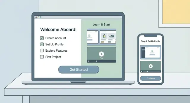
Start with a small, dependable set of pages:
If you already have support docs, link out sparingly (e.g., “More details in /help/integrations”)—don’t duplicate everything.
Every page needs a clear “next step” button above the fold and repeated near the end, such as:
Keep secondary actions (like “Read more” or “Contact support”) visually quieter so the path forward stays obvious.
If the microsite is blocking a launch, treat it like a product surface: start small, ship, then iterate. One approach is to generate a clean React-based microsite with a consistent component set (step cards, callouts, FAQ blocks), then add content in small releases.
If you want to compress the build timeline, a vibe-coding platform like Koder.ai can help you spin up a web app from a chat brief, keep the UX consistent via reusable components, and iterate safely with snapshots and rollback. This is especially useful when the microsite needs to evolve alongside the product without dragging engineering into a never-ending “docs site rebuild.”
Good onboarding copy is the kind users can scan, follow, and finish. Your job is to remove decisions: tell them exactly what to do next, why it matters, and how long it should take.
In the hero section, answer three questions in plain language:
Add one primary button that matches the first step (for example, “Start setup”), plus a secondary link for people who need context (“Read docs” → /docs).
Make the core path a short numbered sequence. Each step should have:
Example structure:
Use short paragraphs, specific headings (“Connect your account”), and small checklists at the end of each step:
Don’t overpromise—link to evidence:
These links reduce anxiety without interrupting the main flow.
Visuals are the fastest way to reduce “what do I click next?” anxiety—but too many can slow scanning and make onboarding feel longer than it is. The goal is to show only what helps a user complete the next action, not document every pixel.
Use a simple rule: the more motion or context a step needs, the richer the media.
Keep videos tightly scoped: one outcome per clip, with a clear title like “Invite a teammate (1 min).”
Create a screenshot standard before anyone starts capturing:
This makes your visuals reusable across pages and easier to maintain.
Readers learn faster when your pages feel predictable. Reuse small blocks such as:
Products evolve; your microsite should keep up. Maintain a lightweight update process: track visuals in a single folder, label them by feature, and add a “last verified” date per page. When UI changes, update the screenshot first, then adjust the caption and steps—your templates will keep the page structure stable.
Great onboarding design is mostly about removing decisions. Users should always know where they are, what to do next, and how long it will take.
Start with a simple wireframe and keep it strict: one idea per section, generous spacing, and reusable components (the same step cards, the same callout style, the same button placements). Consistency reduces “re-learning” as users move through the microsite.
A practical rule: if a section needs more than one scroll to explain, split it. Short sections also make it easier to maintain over time.
Accessibility improvements usually make onboarding faster for everyone:
Also, avoid relying on color alone to communicate status (“complete,” “error,” “required”). Pair it with icons and plain language.
Many users will open onboarding from email or a chat link on mobile. Design for small screens first:
Microcopy is part of UX. Every label should answer: “What happens when I click?”
Avoid vague buttons like “Submit” or “Next.” Prefer specific outcomes: “Send verification code,” “Save billing details,” “Run test import.” If there’s risk, say it (“Delete draft,” “Disconnect integration”) and provide a clear cancel path.
Keep error messages actionable: explain what went wrong and how to fix it in one sentence.
A product onboarding microsite only works if it helps people take the next step without thinking too hard. That’s the job of your calls to action (CTAs): reduce hesitation, clarify what happens next, and keep momentum.
Decide the single action that represents “progress” for most new users—then make it visually dominant and consistent across the microsite.
Common primary CTAs:
Choose one secondary CTA for edge cases, such as “Watch a 2‑minute demo” or “View pricing.” More than two choices tends to stall people.
Don’t wait until the end of a long page. Place a CTA immediately after you explain something a user can act on.
Example: after a short explanation of why a calendar connection is needed, add a button like “Connect Google Calendar”. After a permissions note, offer “Continue.”
This turns the microsite into a “read → do → confirm” flow, instead of a brochure.
Small details near the CTA can remove common fears:
Keep this as a short line under the button—visible at the decision point.
Some users won’t be ready to proceed. Make help easy to find without competing with your primary CTA.
Include a subtle link near CTAs like “Need help?” that points to /help, a support form, or chat. This prevents drop-offs while keeping the main path clear.
A product onboarding microsite isn’t “done” when it ships. The fastest way to improve activation is to watch what people actually do, then make small changes regularly (copy tweaks, clearer next steps, fewer distractions).
Start with a short list of events that map to real onboarding progress—not vanity metrics.
Keep event names consistent and readable (e.g., onboarding_cta_click, checklist_step_complete). If you’re using a tag manager, document the exact selectors or triggers so the setup doesn’t break during redesigns.
If you send onboarding emails or run ads, define a simple UTM standard and stick to it:
utm_source: where it came from (newsletter, lifecycle_email, linkedin)utm_medium: type (email, cpc)utm_campaign: onboarding sequence or launch nameutm_content: optional variation (button_a, hero_link)This lets you compare which channels bring users who actually reach “first value,” not just who visit.
You don’t need a complicated BI setup. Create a lightweight dashboard with:
If a page has high views but low next-step clicks, it’s a clear candidate for copy, layout, or CTA changes.
Add low-friction feedback tools:
Review feedback alongside analytics so you understand why users stall—not just where.
Onboarding content often gets written for existing users, but many people arrive from search when they’re trying to finish setup. If your microsite answers those “how do I…?” moments well, it reduces support tickets and gets users to first value faster.
Prioritize pages that map to what users type when they’re stuck:
Name pages and headings the same way users phrase the problem. A clear, specific H2 like “Connect Slack (2 minutes)” usually performs better than a vague “Integrations.”
Use a single, clear H1 per page, with scannable H2s for steps and edge cases. Keep URLs descriptive and stable (e.g., /onboarding/connect-slack rather than /page?id=12).
Add internal links where they remove friction, such as:
Write meta titles that mirror the task: “Connect Slack | Product Name Onboarding.”
Fast load matters for help content. Compress images (especially screenshots), avoid heavy scripts, and make sure pages render well on mobile. If you rename or reorganize pages, set up redirects so old links from docs, emails, and search results still work.
Add short FAQ sections for recurring questions (“Why can’t I see my data?”) and a small glossary for product-specific terms. This improves scanning, supports search snippets, and keeps definitions consistent across the microsite.
An onboarding microsite often feels “lightweight,” but it still needs the same fundamentals as any public-facing site: clear policies, safe examples, and a plan for who keeps it accurate as your product evolves.
Add visible links in the footer (and anywhere you collect information) to your /privacy and /terms pages. Keep the wording simple: what you collect, why, how long you keep it, and how users can contact you.
If you use cookies or analytics, make sure consent is handled according to your setup (for example: a consent banner, region-based rules, or an opt-out link). The key is consistency—don’t run tracking on onboarding pages if your consent flow says you won’t.
Onboarding content frequently includes screenshots, sample accounts, or “copy-paste” data. Treat all examples as public:
A quick rule: if an example would be risky in a marketing case study, it’s risky in onboarding too.
Microsites go stale when the product changes faster than the pages. Make ownership explicit:
If your onboarding flows depend on UI labels or steps (“Click Settings → Billing”), agree on a trigger: any UI change that affects onboarding must include updating the microsite as part of the release checklist.
A product onboarding microsite is never really “done.” Your goal at launch is to ship something correct, fast, and easy to improve—then keep it fresh as the product changes.
Before you announce anything, do a quick but thorough quality pass:
Fast onboarding pages reduce drop-off. Do these basics:
Publish, then immediately add distribution:
Treat maintenance like product work:
If you’re shipping the microsite as a small web app (rather than static pages), make sure your workflow supports safe iteration—versioned releases, quick rollback, and the ability to deploy changes without a long engineering queue. Platforms like Koder.ai bake in snapshots and rollback plus deployment/hosting, which can make ongoing microsite maintenance more predictable as onboarding steps change with the product.
A product onboarding microsite is a small, task-focused website that helps new users reach a clear “first win” quickly. It’s designed as a guided path (setup → first action → confirmation), not as a full marketing site or a complete documentation portal.
Use a microsite when onboarding includes steps outside the product (permissions, integrations, procurement), when multiple roles need shareable guidance (admin vs. end user), or when sales/support need a consistent “single source of truth” they can send via email, QR codes, or handoffs.
Start by choosing one primary goal—for example:
/pricing)Treat the other goals as secondary so the microsite doesn’t turn into a dumping ground.
Identify your main segments (e.g., new users, admins, invited teammates, trial evaluators) and write down:
Then tailor the navigation and CTAs so each role can quickly find the right path without reading everything.
Pick metrics that match your primary goal and can be tracked consistently, such as:
Avoid relying on pageviews alone; they don’t indicate progress.
Map a short “first session” journey (3–5 jobs max). For each step, define:
Then turn that path into navigation like: Start here → Connect/Install → Set up essentials → First success → Troubleshooting/FAQ.
Use single-page when onboarding is short, linear, and mostly driven by email/in-app traffic (fast to scan, harder to get lost). Use multi-page when setup branches by role/plan/integration or when you want search-friendly pages for tasks like “connect X” or “error Y.”
A practical guideline: if you have more than ~7 distinct onboarding “jobs,” go multi-page.
Start with a small default set and keep navigation shallow (no more than two levels):
Use a scannable, finishable structure:
Keep it opinionated: remove decisions by telling users exactly what to do next and how to know it worked.
Choose one primary CTA per page (consistent wording like “Start setup”) and add contextual CTAs directly after explanations (e.g., “Connect Google Calendar”). Track progress events such as:
/helpUse UTMs in campaigns so you can compare which sources lead to actual first-value outcomes.
This prevents the microsite from becoming a mini help center.