Dec 09, 2025·8 min
How to Build a Website for a Product Waitlist and Early Access
Step-by-step plan to build a waitlist website that captures signups, qualifies users, runs early access, and measures results with clear copy and simple tools.
Set goals and define your early access offer
A product waitlist website works best when it’s built around a single, clear outcome. Before you write copy or design anything, decide what you want the waitlist to do for you—and what people get in return.
Pick one primary goal (and a couple of supporting goals)
Different goals lead to different choices in messaging, signup fields, and follow-up emails.
- Validate demand: prove there’s real interest before you invest more time or money.
- Grow an audience: build a list you can launch to (even if the product isn’t ready).
- Recruit beta users: find people who will test, give feedback, and tolerate rough edges.
- Drive pre-orders: convert interest into early revenue (only if you’re ready to take money).
If you try to do all four at once, your landing page for a waitlist becomes vague. Choose a primary goal, then set 1–2 supporting goals (for example, “validate demand” + “recruit beta users”).
Define what “early access” actually means
“Early access” should feel concrete. Make it easy to explain in one sentence.
Common early access program offers include:
- Feature access: use specific features first (and help shape them).
- Discount or credit: early-bird pricing, a lifetime deal, or usage credits.
- Priority onboarding: faster setup, a concierge call, or guided migration.
- Invites: limited spots released in waves to keep quality high.
Whatever you choose, be explicit about limits (“first 200 people,” “invite waves every Friday”) so it feels real, not promotional.
Set a timeline people can understand
Even a rough schedule builds trust:
- Pre-launch: collecting signups and learning what resonates.
- Early access window: sending invites, onboarding, gathering feedback.
- Public launch: opening access to everyone.
If you don’t know exact dates, use ranges (“Q1,” “in the next 6–8 weeks”) and commit to updates.
Choose success metrics now
A waitlist signup form is only the start. Track a few numbers that match your goal:
- Signup rate: % of visitors who join the product waitlist website.
- Activation rate: % of invitees who actually start using the product.
- Referral rate: % who share and bring someone new (if you add referrals).
- Retention: % who come back after the first session/week.
These metrics will guide what you improve later—without guessing.
Know your audience and the problem you solve
Before you write copy or choose a template, get specific about who is joining your waitlist and why. A clear audience and problem statement makes every later decision easier: what to highlight, what to cut, and what objections you must address on the page.
Write 1–2 target personas (simple, not fictional novels)
Aim for two short personas max. If you try to speak to everyone, your landing page turns into a vague collection of claims.
Persona 1: The Busy Operator
They’re responsible for getting work done (ops manager, team lead, founder wearing too many hats). Their struggle is time and coordination: too many tools, too much manual follow-up, inconsistent outcomes. They value reliability, speed, and “set it and forget it.”
Persona 2: The Careful Buyer
They influence purchase decisions (head of department, finance-minded leader). Their struggle is risk: wasted spend, unclear ROI, vendor trust, adoption failure. They value proof, transparency, and low switching cost.
Keep these personas in front of you when writing your hero headline and the first three bullet points. If a sentence doesn’t fit either persona, it probably doesn’t belong on the waitlist page.
List the top 3 pains in plain language
Avoid internal jargon (“workflow optimization,” “synergy,” “AI-powered insights”). Instead, write pains the way someone would complain to a colleague:
- “We lose track of what’s been done and what’s overdue.”
- “It takes too long to get from idea to shipped result.”
- “I can’t tell what’s working without building spreadsheets.”
These pains should map directly to the first visible sections of your landing page for a product waitlist website. If visitors don’t feel understood quickly, they won’t sign up.
Pick one primary use case to keep the page focused
Early access is not the time to market every possible scenario. Choose one primary use case that best matches your ideal first users.
For example: “Collect and prioritize customer requests in one place” is clearer than “manage product feedback, roadmaps, support, and research.” You can still mention secondary use cases later, but your above-the-fold message should be about one thing.
Note the objections you must answer
Most people hesitate for predictable reasons. Write your top objections now so the landing page can address them without becoming defensive.
Common ones:
- Price: “Is this going to be expensive later?”
- Trust: “Are you legit? Will you spam me?”
- Effort: “Will setup be a headache?”
- Switching costs: “Do I have to replace my current tool?”
A good early access program doesn’t hide these concerns—it answers them simply, then invites the next step: joining the waitlist signup form.
Choose the simplest website setup that can scale later
A waitlist site is not your “real” product yet—so your goal is speed, clarity, and a setup you won’t regret when you grow. The simplest option that still supports clean analytics, email capture, and quick edits usually wins.
If your team is trying to move fast, one practical option is to build the waitlist site and the first version of your onboarding flow in a single place. For example, Koder.ai can generate a React-based landing page, connect a Go + PostgreSQL backend for signups, and help you iterate quickly via chat—while still letting you export source code later if you want to migrate to a more traditional pipeline.
One page vs. a few supporting pages
For most early access programs, a one-page site is enough: headline, short explanation, benefits, social proof (if you have it), and a signup form.
Add extra pages only if they reduce hesitation:
- FAQ when the product is new or confusing (pricing, timeline, who it’s for).
- Pricing teaser if you already know your model and want to qualify signups.
- Updates / changelog-style page if you plan to post progress and keep interest warm.
If you do add pages, keep navigation minimal so the signup call-to-action stays the main path.
Builder, CMS, or custom code: pick by constraints
- Website builder (fastest): great when you need something live this week and your team is small. Limited flexibility, but usually fine for waitlists.
- CMS (balanced): better if you’ll publish updates, FAQs, and SEO content over time. Slightly more setup, easier long-term content management.
- Custom code (most control): useful if you need advanced logic (referrals, segmentation, gated access). Costs more time and requires someone to maintain it.
A good rule: start with the simplest tool that lets you edit copy quickly and connect your form to your email system.
Hosting and domain basics that prevent headaches
Use a custom domain, enable SSL, and prioritize fast load times (a slow page kills signups). Choose a hosting option with a simple deploy process so updates don’t become an “engineering task.”
Plan the upgrade path from day one
Treat the waitlist site as version 1 of your marketing site. Keep your URL structure clean (e.g., /faq, /updates), store brand assets in one place, and pick a platform you can extend later rather than rebuild from scratch.
If you expect frequent changes during early access, prioritize tools that support safe iteration—features like snapshots and rollback (available in platforms like Koder.ai) can help you ship updates without worrying you’ll break the signup flow right before a launch.
Create a landing page that explains value in seconds
Your landing page has one job: help someone decide, quickly, whether joining the waitlist is worth it. If visitors need to “figure it out,” they’ll bounce—or worse, join with the wrong expectations.
Start with a one-sentence hero
Write a clear promise that includes who it’s for and the main outcome.
Example formula:
“Get early access to [product] that helps [audience] achieve [primary benefit]—without [common pain].”
Keep it specific. “All-in-one platform” is vague; “ship client reports in 5 minutes instead of 50” is concrete.
Add 3–5 outcome-focused benefits
Below the hero, use a short list of benefits that describe results, not features. Think:
- Save time, reduce errors, earn more, feel more in control
- Avoid frustration, stop switching tools, prevent missed deadlines
If you can’t explain a benefit without jargon, it’s not ready.
Use social proof only if it’s real
If you have credible proof—use it. If you don’t, skip it rather than forcing it.
Good options:
- A short quote from a tester
- A simple number (“1,200 teams on the waitlist”)
- A small “As seen in” row only if you truly were featured
Explain “How it works” in 3 steps
A tiny section reduces anxiety and support questions. Keep it simple:
- Join the waitlist
- Confirm your email
- Get an invite when a spot opens (plus occasional updates)
End with one clear call-to-action that matches the page’s promise: “Join the waitlist,” not “Submit.”
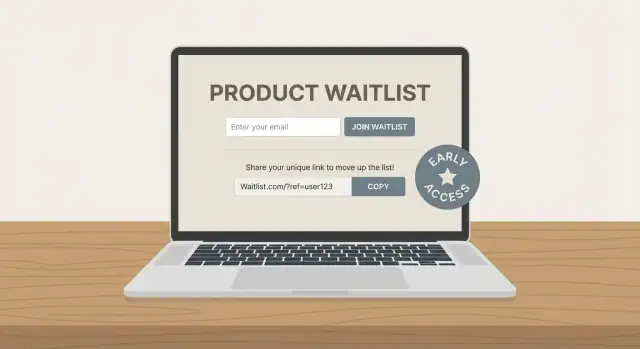
Design a signup form that converts and stays compliant
Your waitlist signup form is the make-or-break moment. If it feels long, unclear, or risky (“What will they do with my email?”), people bail.
Ask only for what you need
Start with email as the only required field. If you truly benefit from personalization, you can add name as optional.
If your product is B2B, consider an optional role or company field—but be strict about why it matters. Every extra input is another reason to quit.
Add one qualifier question for useful segmentation
A single optional qualifier helps you segment early access later without turning the form into a survey. Pick one that influences onboarding or eligibility, such as:
- Primary use case (e.g., “Personal”, “Team”, “Agency”)
- Team size (e.g., 1, 2–10, 11–50, 50+)
- Platform (e.g., iOS, Android, Web)
Keep it multiple choice when possible, and label it as optional so it doesn’t feel like a test.
Make consent clear (and human)
If you’re collecting emails, say exactly what you’ll send and how often. Add a short consent line right under the button and link to /privacy.
Example copy you can adapt:
By joining, you agree to receive early access and product update emails. You can unsubscribe anytime. See our /privacy.
Avoid hidden checkboxes or vague language. Clear consent builds trust and reduces spam complaints later.
Design for mobile first
Most waitlist signups happen on a phone. Use a single-column form, large input fields, and one obvious button.
A few small choices that improve completion rates:
- Use the right keyboard (email field type) so “@” is easy to reach
- Keep labels visible (don’t rely only on placeholder text)
- Remove nearby distractions (extra links, competing buttons) around the form area
A simple, readable form signals confidence—and makes it easy for the right people to raise their hand.
Structure calls-to-action and a smooth signup flow
Turn your offer into a page
Generate a React landing page and iterate on copy without touching boilerplate.
Your call-to-action (CTA) is the “moment of truth” on a waitlist page. If it’s unclear or inconsistent, even interested visitors hesitate. If it’s focused and the flow is frictionless, you’ll convert more of the right people.
Choose one primary CTA—and keep it consistent
Pick the single action you want most visitors to take and use the same wording everywhere.
- “Join the waitlist” works well when access is mostly first-come, first-served.
- “Request early access” fits when you’re selecting participants (by role, use case, or company size).
Once you choose, stick to it across buttons, headings, and confirmation messages. Mixing terms (“Join” in one spot, “Request” in another) creates uncertainty about what they’re agreeing to.
Add a secondary CTA only if it removes doubt
A second button can help, but only when it supports decision-making instead of distracting from signup. Common options:
- “See a demo” (short video or a quick product tour)
- “Get updates” (for visitors not ready to join the waitlist)
Visually de-emphasize the secondary CTA (outline style, lighter color) so the primary CTA stays the default.
Place CTAs where people naturally decide
You rarely need a CTA on every scroll. Aim for 2–3 placements:
- Above the fold: for decisive visitors
- Mid-page: right after key benefits or social proof
- Footer: for readers who want details first
Keep each CTA leading to the same simple path: click → signup → confirmation.
Use a thank-you page to prevent drop-off
After signup, redirect to a dedicated thank-you page that:
- Confirms they’re on the list
- Sets expectations (what happens next, typical timing)
- Offers one optional next step (e.g., share feedback or invite a teammate)
This reduces “Did it work?” anxiety and cuts support requests, while keeping momentum after the click.
Set up email automation for onboarding and updates
A waitlist without email automation quickly turns into a spreadsheet and a pile of “we’ll get back to you” messages. A simple, pre-written sequence keeps people warm, reduces support load, and gives you a reliable way to learn what your future customers actually need.
Start with an immediate confirmation email
Send a confirmation email the moment someone joins. Keep it short and specific:
- Confirm they’re on the waitlist (and the email was received)
- Restate the one-sentence value proposition
- Explain what happens next (e.g., “We’re inviting new users weekly”)
- Set expectations for how often you’ll email (e.g., “1–2 updates per month”)
This single email prevents confusion, lowers spam complaints, and reduces “did it work?” follow-ups.
Build a short onboarding sequence (3 emails is plenty)
A lightweight sequence can run over 5–10 days and still feel personal.
Email 1: Welcome + what to expect
Reconfirm the problem you solve and the timeline for early access invites.
Email 2: Problem/solution + how it works
Explain the core workflow in plain language. Link to one helpful resource (FAQ or a short page) rather than a long pitch.
Email 3: Proof + invite a reply
Add a credible signal (a short quote, a metric, or a quick story) and explicitly ask them to reply with their needs. Replies are gold: they improve your roadmap and help you write better copy later.
Segment so updates feel relevant
Even basic qualifiers (role, company size, use case, current tool) let you send updates that match their situation. That makes your emails feel useful instead of promotional—and it helps you prioritize who to invite first.
A practical approach: keep one “general updates” list, and tag subscribers with 2–4 qualifiers from your signup form.
Keep frequency predictable
Tell people how often you’ll email, then stick to it. If you need to send more during rollout, warn them first (“Next two weeks: a couple of setup emails as we onboard new early access users”). Predictability builds trust and keeps unsubscribe rates low.
Automation should feel like good service: clear, timely, and focused on the next step.
Plan your early access selection and rollout
Set up early access clearly
Prototype your early access program and adjust it as your goals change.
A waitlist only feels “fair” if people understand how you’ll pick users and what happens next. Before you open signups, decide how early access works in practice—then write it down in plain language (even if it’s just a short note in your internal doc).
Define who gets in (and why)
Start with eligibility rules that match your product’s reality. Common filters include:
- Use case fit (the problem you solve, not job titles)
- Capacity limits (how many accounts you can safely support)
- Geography (shipping, time zones, legal constraints)
- Platform (iOS/Android/Web, browser requirements, integrations)
Being specific reduces frustration and improves feedback quality, because the people you accept are the ones you can actually help.
Pick an access model that matches your goals
Choose one primary model and communicate it consistently:
- First-come-first-served: best when demand is modest and onboarding is simple.
- Scored: best when you need a mix (e.g., different industries) or high-signal testers.
- Invite-only cohorts: best for higher-touch onboarding and controlled rollout.
Plan weekly onboarding capacity
Work backwards from your support reality. If you can onboard 20 users per week, set expectations accordingly (e.g., “We release new invites every Tuesday”). This prevents a “silent backlog” where thousands wait with no updates.
Send clear emails that protect trust
Prepare two templates so every applicant gets a timely, respectful response.
Accepted (short): confirm access, next steps, and what you expect from them (feedback, usage, call).
Not yet (short): thank them, explain the queue/criteria at a high level, and tell them when they’ll hear from you next.
If you want to be extra transparent, add a small FAQ link on your waitlist page (e.g., /early-access) describing the selection method without overpromising dates.
Add a referral loop (optional) without creating chaos
Referrals can help a waitlist grow faster, but only if the rules are easy to understand and the rewards are realistic. If you’re still validating demand, it’s fine to skip referrals and focus on collecting high-quality signups.
Pick one simple referral mechanic
Choose a single, clear outcome for sharing:
- Move up the list (most common): “Invite 3 friends to jump ahead.”
- Unlock a perk: early access to a feature, a badge, or bonus templates.
- Earn invites: get an extra invite to share once you’re admitted.
Avoid stacking multiple rewards at once. People should understand the benefit in one sentence.
Keep incentives honest
Don’t promise things you might not deliver (big discounts, guaranteed access dates, lifetime deals). A good rule: if you can’t fulfill it even with 10× more signups than expected, don’t offer it.
Add a share screen immediately after signup
Right after the form submission, show a “You’re on the list” confirmation plus a unique referral link. Pre-fill share buttons (copy link, email, X/LinkedIn) so users can share in one click.
If you can, show progress: “You have 1 referral. Get 2 more to move up.” This keeps motivation high without more emails.
If you’re building this yourself, keep the referral logic simple (unique codes, verified emails, basic duplicate detection). If you’re using an app-building platform like Koder.ai, you can prototype the referral waitlist flow quickly, then refine rules once you see real behavior.
Prevent basic abuse (without overengineering)
Referral systems attract gaming. Start with lightweight protection:
- One waitlist spot per verified email (double opt-in helps).
- Rate limits on signups from the same IP/device.
- Detect obvious duplicates (same domain patterns, repeated names).
- Cap rewards (e.g., max 20 positions boosted) to limit damage.
If referrals start to dominate your acquisition, review weekly to make sure they’re bringing your ideal users—not just the most aggressive sharers.
Measure performance with analytics and small experiments
You don’t need a complicated setup to understand whether your waitlist page is working—you need consistent tracking and a habit of reviewing it. The goal is to learn what’s blocking signups and fix it with small, low-risk changes.
Track a few key events (not everything)
Start with events that map directly to your signup flow:
- Page view (people reached the landing page)
- Form start (they engaged, but may still drop off)
- Signup (form submitted)
- Email confirm (if you use double opt-in)
- Referral share (clicked share buttons or copied a referral link)
These events let you distinguish “traffic problem” from “message problem” from “form friction.” For example, lots of page views but few form starts usually means the value isn’t clear; lots of form starts but few signups often means the form feels too long or too personal.
Set a baseline conversion funnel and review weekly
Define your basic funnel once, then keep it stable:
Landing page view → Form start → Signup → Email confirm
Track conversion rates between each step, and review them on a simple weekly cadence. Weekly is frequent enough to catch issues (like a broken button) but not so frequent that you overreact to normal day-to-day variation.
Run small A/B tests that you can actually learn from
Keep tests simple and focused on one change at a time:
- Headline: clarity beats cleverness
- CTA text: “Join the waitlist” vs “Get early access”
- Form fields: remove one field and measure lift
- Hero image: product UI vs outcome-focused photo/illustration
Let a test run until you have enough visits to see a directional result. If traffic is low, run sequential tests (change one thing this week, measure next week) instead of formal A/B testing.
Create one small dashboard to avoid “data everywhere”
Put the core numbers in a single place: total visits, signups, confirmation rate, and referrals. When everyone looks at the same dashboard, decisions get faster—and you’ll spend less time debating which tool is “right” and more time improving the page.
Manage the waitlist and feedback without losing people
Deploy without extra tooling
Host your waitlist site and push updates without making it an engineering task.
A waitlist only works if people feel progress. If weeks go by with silence, they forget why they signed up—and you lose your best potential customers.
Track people like a pipeline (not a pile)
Keep it simple: a lightweight CRM (Airtable, Notion, HubSpot free) or even a spreadsheet is enough early on. What matters is having clear statuses so you can act consistently.
Common columns to track:
- Status: Waiting → Invited → Active (and optionally Paused / Not a fit)
- Signup date and source (where they came from)
- Notes: what problem they mentioned, company size, use case
This makes it easy to answer questions like “Who’s been waiting the longest?” and “Which segment is most engaged?”—without overbuilding a system.
Collect feedback without making it feel like homework
When someone joins, ask for one small piece of context that helps you help them. Use a short survey (3–5 questions) or a single open question in the confirmation email.
Also, make it easy to reply: use a monitored reply-to email address (not “no-reply”). Some of the most valuable insights arrive as quick replies, not form submissions.
Show momentum publicly
Create a simple updates page or changelog at /blog and link to it from your emails. You don’t need long posts—just steady proof the product is moving:
- What shipped
- What you’re testing
- What’s next (1–2 items)
This keeps waitlisters warm and reduces “Any updates?” support.
Define “graduation” so early access doesn’t drag on
Early access should have a clear finish line. Decide what it means for someone to “graduate” to paid or public release (for example: feature readiness, stability targets, onboarding completed, or a date-based cutoff).
When people know what happens next, they’re more patient—and more likely to stick around until you invite them.
Cover legal, privacy, and launch readiness essentials
A waitlist site is a promise: “trust us with your email and we’ll keep you informed.” Legal and privacy basics aren’t just paperwork—they’re part of that trust. Handle them early so you don’t scramble the day you start getting traffic.
Core pages you should publish
At minimum, link these in your footer:
- /privacy: explain what you collect (usually email + optional name), why you collect it (early access updates), how long you keep it, and how people can request deletion.
- /terms (as appropriate): clarify early access expectations (e.g., “features may change,” “limited spots,” “no guarantee of access”). If you’re not selling anything yet, keep it simple.
If you use third-party tools (email provider, analytics), mention them in /privacy so people know where data goes.
Collect less data than you think
Avoid collecting sensitive data unless it’s truly necessary. For most early access programs, an email address is enough. If you add questions (company size, role, use case), keep them optional and clearly tied to your early access criteria.
Also add a clear consent line near the form (e.g., “By signing up, you agree to receive emails about early access. Unsubscribe anytime.”). This helps with privacy and consent for email expectations.
Security basics for forms
Even simple waitlist pages need protection:
- HTTPS enabled everywhere.
- Spam protection (honeypot field, CAPTCHA if needed).
- Rate limiting on form submissions to reduce abuse.
Launch-day readiness checklist
Before you announce, plan what happens when the waitlist turns into a real launch:
- A redirect plan (e.g., keep the landing page but update the CTA from “Join waitlist” to “Get started,” or redirect to a new /signup).
- An updated homepage that matches your announcement.
- A prepared announcement email to the list with a clear next step and a fallback path if capacity fills.
If you’re moving from waitlist to a working app quickly, consider your deployment and hosting workflow upfront. Platforms like Koder.ai can host what you build, connect custom domains, and support export later—useful when you want to ship faster now but keep long-term flexibility.