Apr 05, 2025·8 min
How to Build a SaaS Comparison and Alternatives Hub Website
Learn how to plan, build, and grow a SaaS comparison and alternatives hub: site structure, templates, SEO, data sourcing, UX, and monetization.
Learn how to plan, build, and grow a SaaS comparison and alternatives hub: site structure, templates, SEO, data sourcing, UX, and monetization.
Before you pick tools or start publishing pages, get painfully clear about what your hub is for. SaaS comparison sites fail most often because they try to be everything to everyone—then end up with thin pages, unclear positioning, and metrics that don’t map to business value.
Decide what your default page type will be:
You can support all three, but choose a primary focus first. It influences your data fields, templates, and editorial workload.
A clear niche makes your content more specific, your recommendations more credible, and your SEO easier.
Pick one axis (or two at most):
A practical test: can you name the top 15 products in your niche without research? If not, narrow down.
Avoid vanity metrics as your primary KPI. Choose a small set you’ll track weekly:
Also define a baseline for quality, such as “pages ranking in top 10 for at least 20 target queries” or “CTR from tables above 8%.”
Write your “no list” early to prevent scope creep. Examples:
Publishing these boundaries can even build trust—consider a short “What we cover” note on /about.
A SaaS comparison hub lives or dies by how quickly people can orient themselves: “Where am I, what can I compare next, and how do I get to the answer?” Your information architecture (IA) should mirror real user intent and keep URLs predictable for both readers and search engines.
Start with a small set of scalable page types and design templates around them:
A common path is: search → category → comparison → product → outbound click.
Build templates that make each step effortless:
Use a simple, repeatable URL system:
/category/email-marketing//product/mailchimp//compare/mailchimp-vs-convertkit//alternatives/mailchimp//blog/how-to-choose-email-marketing-software/Avoid changing URL patterns later—it creates redirect work and can dilute link equity.
To make your hub feel connected, standardize internal link modules across templates:
/category/… → /product/…)These repeated blocks improve navigation, distribute authority, and ensure every new page you publish immediately joins the wider system.
Before you write content or design templates, decide what “things” your site will store and how they relate. A clear data model lets you publish consistent product pages, generate comparison pages quickly, and avoid messy one-off fields that break later.
A Product is the SaaS tool a reader is evaluating. Keep it opinion-light in the core fields, and store judgments (scores, pros/cons) in the Comparison model.
Helpful Product fields:
Also consider “meta” fields that support publishing: logo, launch year, company size fit (SMB/mid-market/enterprise), and last-verified date.
Comparisons are where your criteria scores and editorial notes live. This can represent “Product A vs Product B” or “Product X in category Y.”
Include:
This keeps one Product record reusable across many pages without rewriting the same judgments.
Vendors change names, URLs, and policies over time, so separate the company from the product where it helps.
Store:
Decide upfront what’s required to publish a page (e.g., name, category, tagline, pricing summary, vendor website) versus optional “nice-to-have” fields. This protects quality: your templates stay complete even when some data is missing, and your team knows what “done” means.
Your platform choice determines how fast you can publish, how easily you can maintain hundreds (or thousands) of similar pages, and whether advanced search/filter experiences will feel smooth or frustrating.
No-code (e.g., Webflow) is great if you want to ship quickly, control design tightly, and keep the setup simple. It works well for smaller hubs or curated lists, but can get tricky when you need complex filtering, heavy programmatic page generation, or deep editorial workflows.
CMS (e.g., WordPress) is a solid middle ground when you need familiar content editing, roles/permissions, and lots of plugins. It can scale, but you’ll want to be disciplined about performance (plugin bloat is real) and plan how you’ll model comparisons so you’re not hand-building tables on every page.
Framework (e.g., Next.js) is best when your hub depends on:
This route needs more engineering upfront, but usually pays off once you’re publishing at volume.
If you want the flexibility of a custom stack without committing to a long legacy build, a vibe-coding platform like Koder.ai can be a practical middle path: you can describe your page types, data entities (products, categories, comparisons), and filters in chat, then generate a working React-based front end with a Go + PostgreSQL backend. That’s especially useful for comparison hubs because so much of the work is repeatable (templates, table components, internal link modules), and you’ll likely iterate quickly as you learn what converts.
Comparison hubs win on usability: pages must load fast, tables should render instantly, and filtering should feel responsive.
On the content side, ensure editors can update pricing, features, and notes without touching layout. Look for a CMS (or headless CMS) that supports structured fields and repeatable components, so your content template stays consistent.
Even if you start small, assume you’ll manage many similar pages. Choose a system that can handle structured entities (products, categories, criteria, pros/cons) and relationships between them—without copy-paste.
Set up analytics and consent/cookie tools at the beginning so you don’t retrofit tracking later. Decide what matters (table interactions, filter usage, outbound clicks) and document events from day one. Centralize this in your template layer and refine it later in /analytics and /privacy.
Templates are what turn a “nice site” into a scalable hub. If every new product or “X vs Y” page requires bespoke layout decisions, you’ll slow down, introduce inconsistencies, and make SEO and conversion testing harder.
Your Product template should be stable enough to support hundreds of tools without edits. A practical structure:
Include reusable CTAs like “Visit website” and “See alternatives,” linking to /alternatives/<product>.
Alternatives pages should satisfy “I’m switching” intent quickly:
Keep the page consistent so users can compare across different products without re-learning the layout.
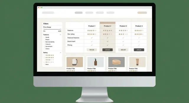
For “X vs Y” and multi-product comparisons, standardize:
Create components you can drop into any template: badges (“Best Value”), score cards, feature lists, and consistent CTAs. This makes future redesigns easier and enables clean A/B tests on the same modules across many pages.
A comparison hub only works if readers believe the rankings reflect reality—not who paid most. Your methodology should be simple enough to scan, consistent across pages, and specific enough that two editors would score the same product similarly.
Pick 8–15 criteria per category so tables stay readable while still covering what matters. For a helpdesk category, “ticket automation” and “SLA tools” make sense; for email marketing, they don’t.
Common criteria that translate well across many SaaS categories:
Avoid “vibes-based” ratings. Define what earns each score or tier, and base it on evidence you can cite internally (docs, demo accounts, pricing pages, release notes, user feedback).
Methodology (example block to place on every page):
How we score products
- Each product is evaluated on 10 criteria relevant to this category.
- Each criterion is scored 0–5 using a written rubric (0 = not supported, 3 = standard, 5 = best-in-class).
- The overall score is a weighted average (weights are the same across all products on this page).
- Notes and sources are recorded for every score so we can update quickly when products change.
When data is uncertain (or varies by plan), don’t publish overly specific numbers. Use ranges or tiers such as:
This reads more honest and reduces maintenance churn.
Trust increases when readers can see freshness. Include a Last updated date on every comparison page and a short changelog (even 2–4 bullets):
If you want a consistent layout, bake the methodology block, last updated, and changelog into your page template so it ships everywhere by default.
A comparison hub is only as useful as its accuracy. Treat data collection like an ongoing product, not a one-time writing task. The goal is simple: every claim on a page should be traceable to a source you can re-check quickly.
Start with primary sources whenever possible:
When you use user feedback, summarize patterns rather than quoting isolated opinions, and avoid presenting sentiment as fact.
Create a lightweight cadence that matches how fast vendors change:
A simple internal tracker (spreadsheet or database) should store: page URL, last verified date, next check date, and responsible owner.
For each product claim, store the source link and a short note (e.g., “Pricing verified on 2025-12-10; Pro plan includes SSO”). This lets writers and editors validate updates without re-researching from scratch.
If you can’t confirm a detail, label it clearly as “Not disclosed” or “Unknown” and, if helpful, add a note like “Vendor does not publish this publicly.” Being explicit builds trust—and prevents quiet inaccuracies that hurt credibility.
A comparison hub succeeds when people can answer one question quickly: “Which option fits me?” Your UX should reduce scanning effort, make tradeoffs obvious, and keep the next step clear.
Design your comparison tables for fast reading:
When you use icons (checkmarks, dots), pair them with text for clarity and accessibility. A small “Notes” cell can explain nuances like “Available on enterprise plan only.”
Filters should reflect the decisions users actually make—not your internal data model. Start with:
Show the number of matches and keep filter state visible. If someone shares a URL, preserve filters via query params so the page is still useful.
Give users multiple “next steps” based on intent:
Keep CTAs consistent in wording and placement. If you use affiliate links, label them plainly and link to your disclosure (e.g., /disclosure).
On mobile, replace wide tables with summary cards per product, a quick verdict (“Best for teams under 50,” “Best budget pick”), and collapsible sections for criteria groups. Add jump links to “Key differences,” “Pricing,” and “FAQ” so users can move without endless scrolling.
Search is usually the main acquisition channel for a SaaS comparison site, so your SEO plan should start with query intent, not just product lists. Alternatives and “X vs Y” pages work because they map to high-intent research moments—your job is to publish pages that match those moments with clarity and originality.
Build keyword clusters around:
Prioritize terms where you can offer real differentiation: pricing breakdowns, feature coverage, integrations, and constraints (e.g., “best CRM for nonprofits”).
It’s fine to use templates, but avoid copy-pasting intros, pros/cons, and conclusions across pages. Write:
Even small original details (pricing caveats, setup time, support quality) help pages stand on their own.
Add schema only when the content truly matches:
Product for product entitiesReview when you provide an actual rating and editorial evaluationFAQPage only for real Q&A on the pageUse internal linking rules to create a crawlable, logical path:
Category pages → product pages → “X vs Y” comparisons → deeper guides.
For example: /category/email-marketing → /product/mailchimp → /compare/mailchimp-vs-klaviyo → /blog/how-to-choose-email-marketing-software.
A comparison hub lives or dies on trust. Readers are making purchase decisions, vendors are watching your claims, and search engines increasingly reward transparency. The goal is simple: make it obvious how you evaluate tools, where your data comes from, and how you handle conflicts of interest.
Create a short internal style guide and enforce it across every “Alternatives” and “X vs Y” page.
A lightweight workflow reduces errors and makes updates routine:
Draft → Fact check → Publish → Scheduled update
These pages act as your public operating manual and reduce reader skepticism:
Link to these from your footer and (briefly) from high-intent comparison pages.
If you monetize with affiliate links, be direct and consistent. Add a short disclosure near the first outbound link and/or near the comparison table CTA (not buried only in the footer). Keep the language plain: you may earn a commission, it doesn’t affect your rankings (only say this if it’s true), and you aim for editorial independence.
Also ensure tracked outbound links are labeled clearly (e.g., “Visit site”), and maintain a record of affiliate relationships so your fact-checker knows where bias could slip in.
A comparison hub succeeds when visitors actually use it: they filter, scan tables, and click through to try a product. Analytics helps you see where people hesitate, what they trust, and which pages quietly underperform.
Start with a small set of events that map to real decisions, not vanity metrics. In addition to pageviews, track:
If you can, add a simple dimension like page type and device so you can compare performance consistently.
Comparison hubs behave differently depending on the page:
Keeping dashboards separated by page type prevents misleading averages and makes it obvious where to focus.
Prioritize tests that reduce effort for the reader:
Run one meaningful change at a time, and define success upfront (e.g., outbound click rate, not just clicks).
Search Console is a goldmine for quick wins. Look for pages with high impressions but low CTR and improve titles/meta descriptions to better match intent (e.g., “Best alternatives to X” vs “X competitors”), and ensure the first screen shows a clear summary and a visible table.
Optimization is a loop: measure → learn → adjust → repeat. Over time, small improvements compound into higher trust and more conversions.
A comparison hub can earn well, but only if monetization is planned early and kept aligned with reader trust. The goal is simple: make money without turning every page into an ad.
Affiliate programs are usually the starting point. Use them where you can track conversions reliably and where the offer is relevant to the page (e.g., an “Alternatives to X” page linking to tools that actually fit that buyer intent). Keep affiliate disclosures clear and consistent.
Add sponsorship slots as your traffic grows. Instead of selling “anything anywhere,” package predictable placements like:
For B2B categories, lead gen can outperform affiliate revenue. Consider a “Request quotes” or “Get matched” CTA only where it makes sense (high-value categories, longer sales cycles). Keep it optional and transparent: users should know they’re submitting details to be contacted.
Set up a simple vendor intake form for updates and corrections. Ask for:
Route submissions to a dedicated inbox and publish an “Update policy” page (e.g., what you verify, how quickly you review). This reduces stale pages and gives vendors a structured way to help you stay accurate.
Scale by expanding useful site areas:
Support these hubs with practical guides on /blog—setup checklists, migration guides, “how to choose” explainers, and buyer’s guides. These articles build trust, attract links, and feed internal linking back to your comparison pages.
If you want sponsors, publish a simple media kit page and keep your pricing and placement rules consistent—brands pay more when the inventory is clear and the audience is well-defined.
Start by choosing a primary page type—comparisons, alternatives, or reviews—and tie it to one business goal (affiliate revenue, lead gen, newsletter growth, or brand authority). Then pick 2–4 weekly KPIs that map to that goal, such as:
Pick one clear niche axis (or two max): role, industry, or software category. A quick test: if you can’t name ~15 relevant products without researching, the niche is still too broad.
Narrow niches make your criteria more specific, your recommendations more credible, and your SEO easier.
Use predictable, repeatable URL patterns so pages are easy to understand and scale:
/category/email-marketing//product/mailchimp//compare/mailchimp-vs-convertkit/Model your site like a small database with three core entities:
This prevents rewriting the same judgments on every product page and keeps updates manageable.
Define “required” fields so templates never look empty. For example:
Publish only when required fields are complete, and explicitly label unknowns as “Unknown” or “Not disclosed.”
Choose based on how much structure and scale you need:
If you plan hundreds+ pages with heavy filtering, a framework + structured CMS usually wins long-term.
Build stable templates for the main page types:
Add reusable modules (breadcrumbs, related comparisons, alternatives list) so every new page immediately connects into the hub.
Use 8–15 category-specific criteria and define a rubric for each score (e.g., 0–5). Keep scoring evidence-based (docs, demo accounts, pricing pages, release notes), and store notes/sources per criterion.
Avoid fake precision by using tiers or ranges when details vary by plan (e.g., “50+ integrations” or “From $29–$99/mo”).
Set an update cadence and track it like a product:
Maintain an internal tracker with URL, last verified date, next check date, and an owner. Store source links for every key claim so re-checking is fast.
Track intent actions and optimize by page type:
Use Search Console to find pages with high impressions but low CTR and improve titles/meta + above-the-fold clarity.
/alternatives/mailchimp//blog/how-to-choose-email-marketing-software/Avoid changing patterns later—redirects add work and can dilute SEO value.