Jul 13, 2025·8 min
How to Build a Website for SaaS Marketing Pages & Docs
Learn how to plan, build, and launch a SaaS website that supports marketing pages and documentation with clear structure, SEO, fast performance, and easy updates.
Goals and Audience: Marketing + Docs in One Site
A SaaS website that combines marketing pages and documentation has two jobs: convince new visitors to start, and help existing users succeed. If you treat it as “one site with one purpose,” you’ll usually optimize for only one side—and the other will quietly underperform.
Define the primary goal
Marketing pages should move a visitor toward a clear next step: start a trial, book a demo, or view pricing. Documentation should reduce friction after sign-up: answer questions quickly, guide setup, and unblock integration work.
Write a one-sentence goal you can repeat in every planning meeting, for example:
“Convert qualified prospects while enabling customers to self-serve support.”
Decide who the site serves
Most SaaS sites serve multiple audiences, each with different intent:
- Prospects looking for fit, proof, and pricing
- Trial users trying to reach their first success moment
- Customers needing reliable how-tos and troubleshooting
- Developers evaluating APIs, SDKs, and implementation details
If you can’t name the audience for a page, that page will drift into vague copy.
List core outcomes (what “success” looks like)
Outcomes keep your team focused on behavior, not page counts:
- More sign-ups or demo requests
- Higher trial-to-paid conversion
- Faster time-to-value (setup completed, first project created)
- More self-serve help, fewer support tickets
Set success metrics
Pick a small set of metrics you’ll check monthly: marketing conversion rate, activation rate, docs search usage, top failed searches, and support ticket volume by topic.
Confirm ownership early
Decide who writes, reviews, and publishes marketing and docs content. Clear ownership prevents stale docs and inconsistent product messaging—and makes launches smoother when multiple teams need updates at once.
Information Architecture and URL Structure
Information architecture is how you make both journeys feel obvious—without turning your header nav into a junk drawer.
Start with a small set of primary sections
Most teams can cover “marketing + docs” with a handful of top-level areas:
- / (homepage)
- /product (or /features)
- /pricing
- /customers (case studies, testimonials)
- /blog
- /docs
Keep global navigation focused on what a first-time visitor expects to find. Everything else (security, status, changelog, partners, legal) can live in the footer or within the relevant section.
Decide where docs should live: /docs vs a separate subdomain
For most SaaS products, hosting documentation under /docs is the simplest choice.
Docs under /docs (same domain)
- Pros: one brand experience, easier cross-linking, SEO benefits from one domain, simpler analytics
- Cons: you must coordinate design and navigation so docs don’t feel like “another site”
Docs on a subdomain (for example, docs.[your-domain])
- Pros: clearer separation for tooling, permissions, or different build systems
- Cons: can feel disjointed, harder to share SEO authority, analytics may require extra setup
If you already know your docs will be extensive and maintained by a separate team/tooling, a subdomain can be reasonable. Otherwise, /docs is usually the stable default.
Map user journeys before you lock the menu
Think in terms of common paths, then ensure the URLs and navigation support them.
Marketing journey example:
- / → /pricing → signup
Support journey example:
- /docs → specific article → related troubleshooting → contact support (only when needed)
Navigation roles matter:
- Global navigation should serve marketing discovery (Product, Pricing, Customers, Blog, Docs).
- Docs sidebar navigation should serve task completion (Getting started, Guides, API, Troubleshooting).
Create a URL plan that stays stable
URLs are promises. Changing them later breaks bookmarks, inbound links, and trust.
A practical approach:
- Use short, human-readable slugs: /docs/sso, not /docs/2025/07/sso-guide-final
- Avoid nesting too deeply unless it reflects how people think: /docs/integrations/slack is fine; five levels deep is not
- Pick one style (kebab-case is common): /docs/api-authentication
- Keep “versioning” decisions intentional (if you’ll version docs, decide early)
When you do need to restructure, plan redirects from day one. A clean architecture plus stable URLs makes your SaaS website easier to navigate, easier to maintain, and easier to grow.
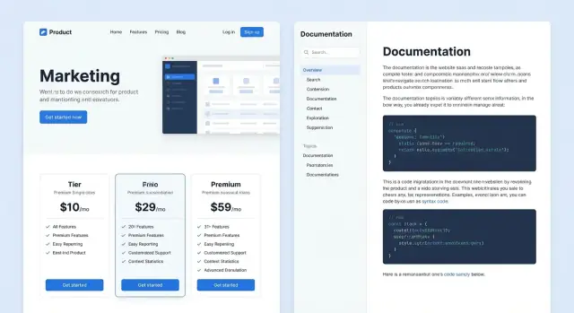
Core Page Types to Include (What to Build First)
When you’re building a SaaS site that needs to sell and support users, the fastest path is to ship a small set of pages that answer three questions: What is it? Can I trust it? What do I do next?
Must-have marketing pages (ship these first)
Start with the essentials that visitors expect and that your team will reference constantly:
- Homepage: one clear value proposition, primary CTA (trial or demo), and a quick “how it works.”
- Features (or Use Cases): explain outcomes in plain language; link each feature to relevant docs.
- Pricing: pricing tiers, what’s included, FAQ, and procurement-friendly details (billing, invoicing, taxes).
- Security (or Trust): security overview, data handling, compliance claims (only if true), and a way to request documentation.
- Contact: sales/support contact options, plus a simple form.
Keep each page focused on a single decision. You can always expand later.
Trust builders that reduce hesitation
Before users start a trial, they look for proof. Add lightweight credibility signals early:
- Customer logos and short testimonials (even 2–3 strong ones help)
- Case studies if you have them (one solid story beats five vague quotes)
- Integrations page (or a section) so people can quickly confirm compatibility
- A link to your status page (for example, /status) if you run one
Conversion-focused pages (add as needed)
Once the core pages exist, add pages that match your sales motion:
- Request a demo for higher-touch sales
- Start trial for self-serve onboarding
- Compare pages (only if you can be fair and specific)
These pages should remove friction: clear form fields, expectations (“we reply in 1 business day”), and next steps.
Docs essentials (support the first “aha”)
Your documentation should help a new user succeed quickly:
- Getting started: installation/setup, first project, and basic concepts
- Guides: common workflows and best practices
- API reference: if you have an API, keep it complete and searchable
- Troubleshooting: known errors, fixes, and how to contact support
Supporting pages that round out the site
Add these once the basics are stable: changelog (/changelog), optional roadmap, about, and careers. They help with transparency, hiring, and user confidence—without blocking your initial launch.
Choosing the Right Tech Stack (Simple Options)
Your tech stack should match how often content changes, who publishes it, and whether the site needs app-like behavior. For most SaaS teams, the sweet spot is a marketing site + docs that feels fast, is easy to update, and doesn’t require engineers for every copy tweak.
Option 1: Static Site Generator (SSG)
An SSG (like Next.js static export, Astro, Docusaurus, Hugo) builds pages ahead of time. This is a great fit when your marketing pages and docs are mostly predictable.
Use a static approach when you want:
- Excellent speed and SEO by default
- Simple hosting (CDN + object storage)
- Low-risk updates (content changes don’t usually break runtime)
It’s also a clean way to keep docs in Markdown while still supporting search and versioned content.
Option 2: Server-rendered site or full web app
A server-rendered setup (or a full app) is worth it when the website must behave like a product experience.
Choose this when you need:
- Personalized pages (different content per account)
- Authenticated docs (internal/private knowledge bases)
- Complex search, permissions, or dynamic content rules
You can still statically generate most marketing pages while rendering only the truly dynamic parts.
Option 3: CMS templates (traditional or headless)
A CMS-driven site works well if non-technical teams publish frequently and need structured content (pricing tiers, customer stories, comparison tables) with consistency.
Content storage: Markdown/MDX vs CMS fields
Markdown/MDX is ideal for docs: fast to write, easy to review in Git, and friendly for versioning. CMS fields shine for structured marketing content where consistency matters.
Environments: local, preview, production
Set up three environments from day one:
- Local: fast iteration
- Preview: per-branch or per-PR previews for review
- Production: locked-down deployments with rollback support
That workflow keeps publishing safe even when marketing and docs ship changes weekly.
If you want to move even faster early on, platforms like Koder.ai can help you prototype the initial marketing + docs experience from a simple chat—then export the source code for a traditional pipeline once your structure, navigation, and core pages are validated.
Design and UX for Marketing Pages and Docs
Good design for a SaaS site has a split personality: marketing pages should persuade and guide people to a next step, while docs should reduce friction and help users succeed quickly. The trick is to make both feel like one product.
Start with a lightweight design system
Before you build pages, define a small design system: typography scale, color palette, spacing rules, and a handful of core components (buttons, alerts, cards, tabs). This prevents your marketing pages from feeling “designed” while your docs feel “default.”
A practical approach: choose 2–3 font sizes for body + headings, one primary brand color, and a neutral scale for borders and backgrounds. Then standardize spacing (e.g., 8px steps) so layouts stay consistent across landing pages and docs.
Reusable sections = faster pages (and better consistency)
Create reusable page sections you can assemble like building blocks:
- Hero (value prop + primary CTA)
- Feature grid (3–6 benefits)
- FAQ (reduces support load)
- Comparison table (helps evaluation)
- Final CTA (trial, demo, or pricing)
When these sections share spacing, typography, and button styles, your site feels cohesive even as content grows.
Make docs easy to read (especially code)
Docs UX is mostly readability. Use clear heading hierarchy, generous line height, and a content width that supports long sentences and wide code blocks. Allow code blocks to scroll horizontally rather than wrapping into unreadable lines. Keep pages scannable with short intros, “before you start” notes, and callouts for warnings.
Accessibility and mobile-first checks
Treat accessibility as a baseline:
- Sufficient contrast for text and buttons
- Visible focus states and full keyboard navigation
- Alt text for meaningful images (and omit for decorative ones)
On mobile, test two things early: the top navigation menu and the docs sidebar. If either one is hard to open, close, or understand, users will bounce—especially when they’re trying to solve a problem fast.
Messaging, Copy, and Conversion Paths
Prototype the whole structure
Prototype your homepage, pricing, and docs structure in minutes, then refine as you go.
Good SaaS sites don’t just “describe” a product—they guide a reader from curiosity to confidence. That path is built with clear messaging, simple copy, and intentional calls to action (CTAs) that match what someone is trying to do on each page.
Define the job of each page (and its CTAs)
Before writing, decide what success looks like per page. Give every key page a primary CTA (the main thing you want) and a secondary CTA (a lower-commitment next step).
Examples:
- Homepage: Primary Start free trial; Secondary See a demo
- Features page: Primary View pricing; Secondary Read how it works
- Pricing page: Primary Choose a plan; Secondary Talk to sales
Keep CTAs consistent in wording and placement so visitors don’t have to re-learn your site on every page.
Write benefit-focused copy that stays specific
Lead with outcomes the customer cares about, then explain how you deliver them. Replace vague claims (“streamline your workflow”) with concrete results (“reduce onboarding time from days to hours”).
Avoid jargon when possible. If you must use industry terms, define them in plain language. Short sentences win—especially for headings, subheads, and button text.
Use proof people can trust
Add proof near key decisions (features, pricing, signup). Use numbers only if you can verify them, and show context:
- “Trusted by 2,400 teams” (if true)
- “Cut processing time by 32%” (with a short explanation of who/when)
Balance metrics with human proof: quotes, mini case studies, and real examples of workflows.
Make pricing clarity a conversion feature
Confusing pricing blocks signups. List plan names, core limits, add-ons, and what happens when a user exceeds a limit. Include an FAQ that answers objections (security, billing, cancellation, support).
Connect marketing to docs (without dumping people into a maze)
Where you describe a feature, link directly to the most relevant guide: “See how it works” → /docs/getting-started or /docs/integrations/slack. This builds confidence and reduces pre-sales questions—while keeping the reader moving forward.
Documentation Structure and Navigation That Works
Good docs feel “obvious” to use. The secret is a predictable structure and navigation that answers two questions on every page: Where am I? and What should I read next?
Start with a sidebar that matches user intent
Build a docs sidebar with a small number of categories, labeled in plain language. Organize by tasks and outcomes rather than internal team names.
Common top-level categories:
- Getting Started (setup, first success)
- Tutorials (end-to-end walkthroughs)
- How-to Guides (specific tasks like “Invite teammates”)
- Reference (API, configuration options)
- Explanations (concepts, decision guides, “how it works”)
Keep labels consistent with what your product calls things. If your UI says “Workspaces,” don’t call them “Projects” in docs.
Add on-page navigation that reduces scrolling
On longer pages, include an on-page table of contents near the top so readers can jump to the right section. Add Next/Previous links at the bottom to encourage a smooth reading path—especially through setup and onboarding sequences.
Use templates so every guide is familiar
Consistency is a feature. Use a single guide template like:
Problem → Steps → Expected result → Troubleshooting
That pattern helps readers scan quickly and makes it easier for your team to write new articles without reinventing structure.
Make it easy to improve docs continuously
Add lightweight feedback options on every page: a “Was this helpful?” control and a clear link to contact support (for example, /contact or /support). Feedback keeps the docs aligned with real questions, and it gives frustrated readers a fast escape hatch without hunting for help.
Content Workflow: Updating Without Breaking Things
Edit with confidence
Take snapshots before big edits so you can rollback quickly if something breaks.
A SaaS site changes constantly: pricing tweaks, new features, docs fixes, and product announcements. The goal is to make updates easy for humans while keeping the site predictable for everything else—navigation, search, and SEO.
Set a simple content model
Treat every page type as structured content. If you use Markdown/MDX, define consistent front matter so pages can be listed, searched, and displayed correctly.
Common fields to standardize:
title(what shows in the page header)description(meta + cards)tagsorcategory(grouping and filtering)last_updated(trust signal for docs)sidebar_position(docs ordering)
Consistency here prevents “mystery pages” that don’t appear in menus or render wrong in listings.
Use an editorial workflow everyone can follow
A lightweight pipeline reduces mistakes:
Draft → Review → Publish
Drafts can be created in a branch (Git) or in a headless CMS. Reviews should check clarity, correctness, and whether links/CTAs still point to the right places (e.g., /pricing or /docs).
Review with preview links, not screenshots
Avoid approving changes from pasted text or screenshots. Use preview links so reviewers see the page in context (navigation, mobile layout, and cross-links).
Typical options:
- Pull request previews (automatic deploy per PR)
- A staging site that mirrors production data
Style guidelines that keep things consistent
Write down decisions once: voice, heading structure, code/example conventions, and how screenshots should be captured and updated. This makes docs feel cohesive even when multiple people contribute.
Clear ownership (and escalation)
Define who owns what:
- Marketing owns marketing pages
- Product/support owns docs
Also pick a tie-breaker for shared pages (homepage, navigation labels) so changes don’t stall.
SEO for SaaS Sites with Marketing + Documentation
SEO gets easier when your marketing pages and docs live on one site: you can build authority, share internal links, and avoid splitting signals across subdomains.
On-page basics that pay off
Start with fundamentals on every indexable page:
- Unique titles and meta descriptions that match intent (feature pages sell; docs explain).
- One clear H1, then structured H2/H3 headings that mirror how people scan.
- Descriptive internal links (avoid “click here”). For example, link from a feature page to setup docs like /docs/getting-started, and back to conversion pages like /pricing.
Create a simple rule for URLs and links: always use relative paths (e.g., /pricing, /docs/api/auth). This keeps environments (staging, production) consistent and reduces accidental broken links.
Prevent duplicate content between marketing and docs
The biggest risk with combined sites is repeating the same explanation in multiple places (e.g., “How SSO works” on a feature page and in docs).
When overlap is unavoidable:
- Make one page the “source of truth” and link to it from the other.
- If two pages must exist, use canonical tags to point search engines to the preferred version.
Structured data (schema) that’s worth using
Add schema only when it’s accurate:
- SoftwareApplication on key product pages.
- FAQPage on genuine FAQ sections (not marketing fluff).
- Article on blog posts and long-form guides.
Topic clusters that connect content to revenue
Build clusters where blog posts answer broad questions and guide readers toward the next step:
- Blog: “How to set up SSO for a SaaS app” → /features/sso and /docs/sso/setup
- Blog: “Webhook security checklist” → /docs/webhooks/security and /features/webhooks
This structure helps both rankings and conversions—without forcing docs to sound like sales copy.
Performance, Security, and Privacy Basics
A SaaS site that mixes marketing pages and docs needs to feel instant and dependable. Small regressions (a heavy script, a new font, an oversized screenshot) add up quickly.
Performance targets that actually matter
Set a few measurable goals and check them on every release:
- Fast load: aim for an LCP (Largest Contentful Paint) around ~2–2.5s on a mid-range mobile device.
- Stable layout: keep CLS (Cumulative Layout Shift) low by reserving space for images, embeds, and banners.
- Smooth interaction: avoid long main-thread tasks—docs pages often include code highlighting and search widgets that can block rendering.
Practical optimizations (high impact, low drama)
Optimize what users download first:
- Images: use modern formats (WebP/AVIF), responsive sizes, and lazy-load below-the-fold images—especially in docs where screenshots multiply.
- Fonts: limit font families/weights, use
font-display: swap, and consider self-hosting to reduce third-party requests. - Scripts: defer non-critical scripts (analytics, chat, A/B tests). Treat every new tag as a performance budget request.
Also consider caching and delivery: serve static assets with long cache headers, and use a CDN if your hosting doesn’t already.
Security basics you shouldn’t skip
- HTTPS everywhere and redirect HTTP → HTTPS.
- Add common security headers (HSTS, X-Content-Type-Options, Referrer-Policy; and a CSP if you can maintain it).
- Keep dependencies updated, especially for docs tooling, search, and build pipelines.
- Don’t expose private build logs or preview URLs; protect staging with auth.
Privacy: minimize trackers, minimize headaches
Collect only what you need. If you can answer questions with fewer tools, do it.
- Use a cookie banner only if required (jurisdiction + tracking behavior).
- Prefer privacy-friendly analytics and avoid loading marketing pixels on docs unless there’s a clear reason.
Availability and trust signals
Add lightweight monitoring and link to a status page if you have one (for example, /status). If not, at least provide an incident update path (footer link to your support page) so users know where to check when something breaks.
Search, Analytics, and Continuous Improvement
Make docs easy to use
Create a clean /docs layout with predictable navigation for getting started and guides.
A SaaS site with marketing pages and docs is never “done.” The fastest way to improve it is to watch how people actually use it: what they search for, where they get stuck, and which pages drive signups.
Add site search (start simple)
Start with a basic site-wide search that covers both marketing pages and documentation. Even a straightforward solution is better than none—especially for docs-heavy products.
Once it’s live, review search behavior regularly and tune based on evidence. The biggest early win is fixing “no results” queries by adding missing pages, synonyms, or better headings.
Docs-specific search features that help real users
Docs search is different from marketing search. People are task-driven and impatient, so small UX features matter:
- Filters (version, product area, language, “API” vs “guides”)
- Keyboard shortcut to focus search (for example, / or Cmd/Ctrl+K)
- Result highlighting (show the matched words inside headings and snippets)
Track the events that answer business questions
Pageviews alone won’t tell you what’s working. Track events that map to decisions:
- CTA clicks on marketing pages
- Signup starts and completions
- Docs searches (query + selected result)
- “No results” searches and exits after search
Make sure marketing and support can trust the data. Keep naming consistent and document it in a simple internal page (for example, /docs/analytics-events).
Dashboards and feedback loops
Set up lightweight dashboards for two audiences:
- Marketing: top landing pages → CTA clicks → signup starts
- Support: top docs pages, top searches, “no results,” and pages with high bounce
Then close the loop: turn recurring support tickets and common searches into doc updates, new examples, or improved troubleshooting sections. Over time, your docs becomes a self-healing system that reduces support load and increases conversions.
Launch Checklist and Maintenance Plan
A good SaaS website launch isn’t “publish and hope.” It’s a controlled release with checks that catch embarrassing issues (broken pages, missing metadata, dead signup links) before customers do—and a maintenance rhythm that keeps marketing pages and docs from drifting out of date.
Pre-launch checklist (the unglamorous stuff that saves you)
Before you announce anything, do one full pass that focuses on integrity and indexing:
- Broken links: crawl the site and fix 404s, especially from docs to docs and docs to marketing pages.
- Redirects: set up 301 redirects for any changed or removed URLs. Don’t rely on “we’ll fix it later”—old links will live in bookmarks, emails, and search results.
- Sitemap: confirm /sitemap.xml exists and includes both marketing and docs pages you want indexed.
- robots.txt: confirm /robots.txt allows indexing where appropriate, and blocks private or duplicate areas (for example, internal previews).
If you’re migrating from an old site, make a simple spreadsheet mapping old URL → new URL, then store it alongside your repo so future changes don’t overwrite the original plan.
Test the flows customers actually use
Don’t just click around randomly. Test “jobs” that connect marketing and docs:
- Pricing → signup: pricing page loads fast, CTA works, signup completes, confirmation emails fire.
- Docs → contact support: a reader can’t solve an issue, finds help options quickly, and the form or email route works.
- Search → article: search returns relevant results, titles are readable, and the selected article matches intent.
Treat these as release blockers. If any flow fails, you’ll feel it immediately in conversions and support volume.
Redirect strategy (now and for future changes)
Redirects aren’t only for migrations. SaaS sites evolve constantly: you rename features, restructure docs, and rewrite product pages.
Create one rule: never delete a URL without either (a) redirecting it or (b) intentionally returning 410 for content you truly want gone. For docs, redirects are almost always the right choice.
Also agree on a forward-looking URL policy (for example, avoid version numbers in URLs unless you truly version docs). That keeps future refactors smaller.
Release plan: announce, monitor, fix fast
Launch day should have a lightweight plan:
- Announce (email, social, in-app) once the site is verified live.
- Monitor: watch analytics, signup funnel drop-offs, 404s, and search console coverage.
- Fix fast: prioritize anything that breaks signups, key docs, or top landing pages.
If possible, keep a “hotfix window” open with the team for the first 24–48 hours.
Post-launch maintenance cadence
A simple cadence prevents slow decay:
- Monthly SEO review: check search console for indexing errors, queries that are slipping, and pages with high impressions but low clicks (often a title/meta issue).
- Quarterly docs cleanup: remove outdated screenshots, confirm setup steps still match the product, and review top visited docs for clarity.
A website is a product surface. Treat it like one: ship improvements continuously, and measure the impact.
FAQ
How do I set a clear goal for a combined SaaS marketing site and documentation?
Start by writing a one-sentence goal that includes both outcomes, like: “Convert qualified prospects while enabling customers to self-serve support.” Then assign each page a primary job:
- Marketing pages: drive a next step (trial, demo, pricing).
- Docs: reduce friction after signup (setup, integration, troubleshooting).
Which audiences should a SaaS marketing + docs site serve?
Most combined SaaS sites serve at least four groups:
- Prospects evaluating fit, proof, and pricing
- Trial users trying to reach their first “aha”
- Customers needing how-tos and troubleshooting
- Developers evaluating APIs/SDKs and implementation
If you can’t name the audience for a page, rewrite the page scope until you can.
What’s a simple information architecture that works for both marketing and docs?
Use a small set of top-level sections, then keep the rest in the footer:
- / (homepage)
- /product (or /features)
- /pricing
- /customers
- /blog
- /docs
Global nav should stay marketing-focused; docs navigation belongs in the docs sidebar (Getting started, Guides, API, Troubleshooting).
Should documentation live at /docs or on a subdomain like docs.example.com?
For most SaaS products, hosting docs under /docs is the best default:
- Easier cross-linking and consistent brand experience
- Shared SEO and simpler analytics
Choose a separate subdomain only if your docs need different tooling, permissions, or a separate maintenance workflow that would otherwise slow everyone down.
How do I plan URLs so they don’t break later?
Treat URLs as promises:
- Use short, human-readable slugs (e.g.,
/docs/sso) - Avoid deep nesting unless it matches user mental models (e.g.,
/docs/integrations/slack) - Pick one slug style and stick with it (kebab-case is common)
- If you restructure, ship 301 redirects on day one
Plan URL conventions early, especially if you might version docs later.
What pages should I build first for a SaaS website that includes docs?
Ship the pages that answer: What is it? Can I trust it? What do I do next?
Minimum marketing set:
- Homepage
- Features/Use cases
- Pricing
- Security/Trust
- Contact
Minimum docs set:
What tech stack is best for a marketing site plus documentation?
Pick based on who updates content and how often:
- SSG (Astro/Docusaurus/Hugo/Next static): fast, simple hosting, great for Markdown docs
- Server-rendered/app: personalization, authenticated docs, complex permissions/search
- CMS (traditional/headless): best when non-engineers publish frequently and need structured fields
A common hybrid: Markdown/MDX for docs + CMS fields for structured marketing content.
How should I structure CTAs and conversion paths across marketing pages?
Give each key page a primary and secondary CTA, and keep wording consistent:
- Homepage: Primary Start free trial; Secondary See a demo
- Features: Primary View pricing; Secondary Read how it works
- Pricing: Primary Choose a plan; Secondary Talk to sales
How do I make documentation navigation and structure “obvious” to users?
Use a predictable docs structure and templates:
- Sidebar categories based on intent (Getting Started, Tutorials, How-to, Reference, Explanations)
- On-page table of contents for long pages
- Next/Previous links for guided flows
Standardize a template such as Problem → Steps → Expected result → Troubleshooting so every page feels familiar.
What metrics should I track to continuously improve a combined marketing + docs site?
Track behavior that maps to outcomes, not just pageviews:
- CTA clicks and signup starts/completions
- Docs searches (query + clicked result)
- “No results” searches
- 404s and top exits after search
Review monthly, then turn recurring searches and tickets into doc updates, new troubleshooting entries, and better internal links (e.g., from features to /docs/getting-started and back to ).