Apr 10, 2025·8 min
How to Build a Website for a Technical Decision Framework
Learn how to plan, design, and build a clear website for a technical decision framework, from content structure and UI patterns to SEO, analytics, and maintenance.
Clarify Goals, Audience, and Scope
Before you sketch pages or pick tools, get clear on why this framework site exists—and what decisions it must improve. A technical decision framework website isn’t just “documentation”; it’s decision support. If you define the wrong goal, you’ll end up with a library people browse but don’t use when it matters.
Start with the purpose
Write a one-sentence purpose statement that the whole team can repeat. Common purposes include:
- Standardize choices across teams (so decisions are comparable)
- Speed up reviews and approvals (so work doesn’t stall)
- Reduce risk (security, reliability, cost surprises)
If you can’t say which of these you’re optimizing for, your decision framework documentation will likely be inconsistent.
Identify audiences and moments of use
List your primary audiences and what they need in the moment:
- Engineers: actionable criteria, examples, and trade-offs
- Product: time/cost implications and constraints
- Security: required controls, exceptions, and evidence
- Leadership: visibility, consistency, and risk posture
This helps you decide what belongs on the main path versus “learn more” content.
Define the decisions the site must support
Be specific: “buy vs build,” “tool selection,” “architecture pattern choice,” “data storage option,” etc. Each decision type should map to a clear flow (for example, a decision matrix UI, a decision tree, or a checklist) rather than a long narrative page.
Choose success metrics and constraints
Pick a few measurable outcomes: adoption (unique users or referenced in PRDs), time-to-decision, fewer repeated debates, fewer late-stage reversals.
Then document constraints early: compliance requirements, internal-only vs. public access, and the approval workflow for changes. This will shape governance and framework versioning later—and prevent costly redesigns.
Create a Content Model for the Framework
Once the goals are clear, define the “parts list” of your technical decision framework and how those parts show up on the website. A content model keeps the site consistent, searchable, and easy to maintain as decisions and standards evolve.
Inventory the framework components
Start by listing every building block you expect to publish:
- Principles (what you value and why)
- Criteria (what to evaluate)
- Exceptions (when the rule doesn’t apply)
- Examples (real decisions and outcomes)
- Templates (PRDs, checklists, RFC shells)
Keep the inventory concrete: if someone could copy/paste it into a decision doc, it’s a component.
Decide how each component is represented
Assign each component a default format so readers always know what to expect. For example: principles as short pages, criteria as reusable “cards,” exceptions as callout blocks, examples as case-study pages, and templates as downloads or copyable snippets. This prevents the common drift where similar items end up as a mix of wiki pages, PDFs, and random tables.
Define required metadata
Metadata is what makes filtering, ownership, and lifecycle management work. At minimum, require:
- Owner
- Last updated date
- Version
- Tags
- Status (draft/active/deprecated)
Make these fields visible on the page so readers can judge freshness quickly.
Plan reusable blocks
Identify repeatable UI/content blocks (even if you haven’t designed them yet): criteria cards, trade-off tables, glossary terms, “when to use / when not to use” sections, and decision records. Reuse creates a familiar reading rhythm and makes future updates faster.
Document what’s out of scope
Write a short “not included” note (e.g., vendor comparisons, team-specific runbooks, deep tutorials). Clear boundaries keep the framework site focused and prevent it from turning into a general knowledge base.
Plan Information Architecture and Navigation
A technical decision framework succeeds when people can quickly find the right guidance for their situation. Information architecture (IA) is where you turn “smart content” into a path that feels obvious—especially for readers who arrive mid-project and want an answer fast.
Start with top-level navigation that matches intent
Use a small set of predictable entry points. A solid default is:
- Start here (orientation, who it’s for, how to use it)
- Framework (the end-to-end process or flow)
- Criteria (definitions, trade-offs, how to evaluate)
- Examples (real scenarios, case studies, worked comparisons)
- FAQs (common confusions, edge cases)
- About (ownership, update policy, contact)
Keep labels plain. “Criteria” usually beats “Dimensions” unless your audience already uses that word.
Design a “getting started” path for first-time readers
First-time visitors need momentum. Make Start here short and action-oriented: a 2–5 minute overview, then clear next steps (e.g., “Pick a scenario” or “Run the quick decision”). Link to the canonical framework page and one or two example walkthroughs.
Support both quick decisions and deep research
Many readers just need a recommended default; others need evidence. Provide two parallel paths:
- Quick path: a decision tree or short questionnaire that ends with a suggested option and “why.”
- Deep path: criterion-by-criterion guidance, expanded examples, and references.
Make it easy to switch paths with consistent calls to action (“Need the full comparison? See /criteria”).
Define taxonomy people will understand
Create categories, tags, and filters based on how teams talk: use product names, constraints (“regulated,” “low-latency”), team context (“small team,” “platform team”), and maturity (“prototype,” “enterprise”). Avoid internal org jargon.
Add search early if content will grow
If you expect more than a handful of pages, treat search as a primary navigation tool. Put it in the header, tune results to prioritize “Framework,” “Criteria,” and “Examples,” and add synonyms (e.g., “SLA” ↔ “uptime”).
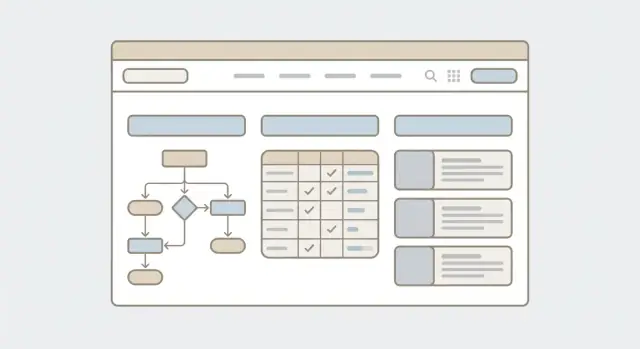
Choose Decision Support UI Patterns
A technical decision framework site shouldn’t feel like a long document with a “good luck” message at the top. On the key pages, be explicit about what the user can do: compare options side-by-side, record constraints, see a recommendation, and export a summary for review.
Match the pattern to the decision
Different decisions need different interaction models. Pick one primary pattern per decision type, then support it with simple “helper” components.
- Decision tree: best when one answer eliminates many paths (“If you must support offline mode, go to X”). Keep steps short and show progress.
- Decision matrix: best for comparing multiple options against the same criteria. Let users adjust weights and see how rankings change.
- Scorecard: best when you want a clear pass/conditional pass/fail with reasons. Good for governance-heavy decisions.
- Checklist: best for readiness and compliance (“Have we confirmed data residency?”). Use it to drive consistent reviews.
Define inputs, outputs, and edge cases
Before designing UI, write down what the user will provide (inputs) and what they should get back (outputs). Inputs might include constraints, priority weights, or “must-have” requirements. Outputs should be concrete: a ranked list, a recommended option, and a short explanation.
Plan for edge cases so the UI doesn’t break trust:
- Missing data: show “unknown” explicitly and explain how it affects the result.
- Ties: present tied options with “why tied” notes and suggested tie-breakers.
- Uncertainty: allow ranges (e.g., cost estimate) and show confidence or sensitivity (“If weight on latency increases, Option B wins”).
Guidance vs. justification
Decide when the system should suggest guidance (“Most teams choose…”) versus when it should require justification text (e.g., security exceptions, unusual trade-offs). A good rule: require justification when the choice impacts risk, cost, or long-term ownership.
Make outcomes easy to share
Include a dedicated outcome page that’s printable and shareable for reviews: selected option, top criteria, key assumptions, and captured justification. Add actions like Export to PDF, Copy summary, or Share link (with appropriate access controls). This outcome page becomes the artifact people bring to meetings—and the proof your framework actually helps decisions.
Design Page Templates and Wireframes
Templates turn your framework from a pile of pages into a predictable decision tool. Before choosing colors or polishing copy, sketch a small set of core page types and the reusable blocks they share.
Start with four core templates
Most technical decision framework sites can be covered by these templates:
- Overview page: what the framework is, who it’s for, and how to use it end-to-end.
- Criterion page: one criterion per page (e.g., cost, latency, team skill), with clear scoring guidance.
- Comparison page: a side-by-side view (often a decision matrix UI) that helps users weigh options.
- Outcome page: “If you chose X, here’s what to do next,” including trade-offs and implementation notes.
Keep each template intentionally simple: the goal is to reduce cognitive load while someone is under pressure to choose.
Set hierarchy rules that never change
Consistency matters more than creativity here. Define a fixed order for key elements and enforce it on every page type:
- Page title (specific and scannable)
- One-paragraph summary (what this page helps you decide)
- When to use / When not to use (two short sections that prevent misuse)
- Steps (numbered actions, not prose)
When users learn the “shape” of a page once, they move faster everywhere else.
Use visual cues with strict meaning
Introduce visual cues only if they’re applied consistently. Common examples:
- Risk level (e.g., Low/Medium/High) shown the same way on criteria, comparisons, and outcomes
- Required vs. optional criteria with distinct labels (and never mixing the meanings)
Document these rules in your component notes so they survive design iterations.
Design an “example” component that teaches by showing
Examples are where frameworks become believable. Create a repeatable block with:
- Context (what’s happening)
- Constraints (budget, compliance, timeline)
- Decision (what was chosen)
- Rationale (why)
- Results (what changed after)
Validate with real decisions before building
Test wireframes against 3–5 real decisions your audience actually makes. Ask a few users to complete a decision using only the wireframes: where do they hesitate, misread labels, or need “one more detail”? Fix structure first; visual polish can wait.
Select the Tech Stack and Hosting
Create Your Core Templates
Generate consistent Overview, Criterion, Comparison, and Outcome pages you can refine later.
Your tech choices should make the framework easy to read, update, and trust—not just “look modern.” Start by mapping how often content changes, who edits it, and how you approve updates.
Static vs. dynamic: pick the simplest tool that fits
A static site (built from files into HTML) is often ideal for decision framework documentation: it’s fast, cheap to host, and easy to version.
If you need frequent edits from non-technical contributors, a dynamic approach can reduce friction.
- Static site generator (SSG): great for Markdown-first workflows and predictable releases.
- CMS or headless CMS: good when editors need a UI, drafts, and approvals.
- Custom app: only when you truly need user accounts, saved decisions, or advanced personalization.
If you want the flexibility of a custom app without a long build cycle, consider prototyping the interactive parts (like a decision matrix UI or decision-tree flow) with a vibe-coding platform such as Koder.ai. It can generate a React-based web app from a chat-driven spec, and you can export the source code when you’re ready to bring it into your normal review, security, and deployment process.
Match the stack to your editing workflow
Choose based on who edits and how you review:
- Markdown + Git: best for technical teams, strong review history, easy rollbacks.
- Headless CMS + SSG: best when editors need forms, previews, and scheduling.
- Wiki-like tools: quick to start, but be careful with navigation, SEO, and long-term structure.
Hosting, deployments, and safety nets
Plan for confidence during updates:
- Preview environments for every change (so reviewers can click through before publishing).
- One-click rollback (or redeploy the last known good build).
- CDN-backed hosting for speed and reliability.
UI tooling without overengineering
Use a small design system or component library only if it helps consistency (tables, callouts, accordions, decision trees). Prefer boring, well-supported tools over heavy customization.
Write down the “why”
Add a short “Architecture & Maintenance” page that documents: the stack, how edits flow to production, where versions live, and who owns what. Future maintainers will thank you.
Handle Governance, Ownership, and Versioning
A decision framework site only stays useful if people trust it’s current, reviewed, and owned. Governance doesn’t need committees and heavy process—but it does need clear rules that everyone can follow.
Define how updates happen
Pick one predictable update path and publish it (for example on /contributing). A common, low-friction flow is:
- Someone proposes a change (issue or short request form)
- A draft is created via pull request or an editor makes the edit
- Editorial review checks clarity, consistency, and terminology
- A designated approver signs off (often the domain owner)
- The change is merged and released with a note in the change log
Even if your team isn’t technical, you can mirror the same steps in a CMS: submit → review → approve → publish.
Create a lightweight governance model
Make roles explicit so decisions don’t stall:
- Owner (decider): accountable for the guidance being correct
- Editors (doers): maintain pages, apply the content style, keep links working
- Approvers (gatekeepers): ensure risk, security, or compliance requirements are met when relevant
Keep it small: one owner per major topic is usually enough.
Versioning rules your readers can understand
Treat the framework like a product. Use semantic versions (e.g., 2.1.0) when changes affect decisions, and use dated releases when you publish on a cadence (e.g., 2025-03). Maintain a simple /changelog that answers: what changed, why, and who approved it.
On every important page, display Last updated and Owner near the top or in the sidebar. This builds confidence and tells readers who to contact when something seems off.
Deprecation without breaking trust
Plan how to retire guidance:
- Mark older pages as Deprecated with a short reason
- Link to the replacement page (or the new recommended option)
- Add a sunset date when the old guidance should no longer be used
Deprecation is not failure—it’s a visible promise that the framework evolves responsibly.
Use Clear UX Writing and Terminology
Start with Clear Scope
Use planning mode to define goals, audiences, and decision types before building UI.
A decision framework is only as useful as the words people read while they’re under pressure. Treat UX writing as part of the system design: it reduces misinterpretation, speeds up decisions, and makes outcomes easier to defend later.
Write like you’re reducing risk
Use short sentences. Prefer common words over “internal” vocabulary. If a page introduces a new idea, define it once, then reuse the same phrase everywhere.
Aim for:
- One idea per paragraph
- Direct instructions (“Choose one option”) instead of indirect hints (“It may be helpful to…”)
- Minimal jargon; when jargon is unavoidable, define it on first use
Create a glossary (and link to it)
Some terms and acronyms are unavoidable: API, PII, SLO, “availability zone,” etc. Put them in a glossary and link the term inline the first time it appears on a page.
A glossary works best when it’s short, searchable, and written in plain language. Keep it as a single page like /glossary, and treat it as part of the framework content (versioned and reviewed).
Standardize criteria wording
Inconsistent criteria phrasing leads to inconsistent decisions. Pick a small set of labels and stick to them across matrices, checklists, and decision trees.
A common, easy-to-scan pattern is:
- Must: required; decision should not proceed if unmet
- Should: strongly preferred; justify when unmet
- Nice to have: beneficial but optional
Also keep the verb form consistent. For example, start each criterion with an action: “Encrypt data at rest,” “Provide an audit log,” “Support role-based access.”
Handle exceptions and escalation without sounding punitive
Exceptions happen. Your wording should make that path feel normal and safe, while still requiring accountability.
Good patterns include:
- “If you can’t meet a Must, stop and use the exception path.”
- “If time is limited, document the trade-off and set a follow-up date.”
- “Escalate to [Owner/Team] when the decision affects multiple teams or production risk.”
Avoid language that implies blame (“failure,” “violation”) unless you’re describing a true compliance requirement.
Provide copy users can reuse in decision records
Make it easy for people to document decisions consistently by offering “copy-friendly” rationale templates.
Decision: We chose [Option] for [Context].

Rationale: It meets all Must criteria and satisfies these Should criteria: [list].
Trade-offs: We accept [cost/limitation] because [reason].
Risks and mitigations: [risk] → [mitigation].
Exception (if any): We are not meeting [criterion]. Approval: [name/date].
Review date: [date].
Place this near the decision output (e.g., after a decision matrix result) so users don’t have to hunt for it.
Accessibility, Mobile, and Print-Friendly Design
A technical decision framework is only useful if people can actually read it, navigate it, and use the decision tools in the moments that matter—on a laptop in a meeting, on a phone between incidents, or printed for approvals.
Meet WCAG basics (without turning it into a project)
Start with fundamentals that prevent the most common failures:
- Use real heading structure (H2/H3/H4) so sections and steps are skimmable and screen-reader friendly.
- Ensure sufficient color contrast for text, links, and status labels (for example, “Recommended” vs. “Not recommended”). Don’t rely on color alone.
- Provide visible focus states for links, buttons, filters, and tabs.
- Make every interactive element reachable and usable with a keyboard (Tab/Shift+Tab, Enter/Space).
If you have “decision status” chips, severity colors, or score bars, add text equivalents (icons with labels or visually-hidden text) so meaning survives different contexts.
Make decision tools work with screen readers and keyboards
Decision matrices and trees often fail accessibility because they’re highly interactive.
- For matrices, prefer a real HTML table when it is truly tabular. Add clear column/row headers and keep cell content short.
- For filters, use native form controls where possible (selects, checkboxes). Announce changes (e.g., “3 options match your filters”) using an aria-live region if results update without a page load.
- For decision trees, ensure each step has a clear question, a single “current step” heading, and buttons/links that can be activated without drag, hover, or a mouse.
Mobile-first readability for complex content
Mobile is where wide tables and long comparisons break down. Common fixes:
- Convert wide tables into stacked “cards” per option, with key attributes shown first.
- Use collapsible sections for details (keep the summary visible).
- Add a sticky summary (your current choices, constraints, and recommended path) so users don’t lose context while scrolling.
Print/PDF output for approvals and meetings
Many decisions need sign-off. Provide a print stylesheet that:
- Removes navigation chrome, expands collapsed content, and prints full URLs for references.
- Formats tables to avoid cut-off columns and page-breaks in the middle of a criterion.
- Includes a concise “Decision Summary” block at the top (context, constraints, recommendation, date, version).
Basic testing that catches most issues
Test with keyboard-only navigation, a screen reader (NVDA/VoiceOver), and at least one mobile browser. Treat it as a release gate, not a nice-to-have.
Performance and SEO Basics
A technical decision framework site only works if people can find the right guidance quickly—and if the pages load fast enough that they don’t give up. Performance and SEO are tightly linked: faster pages are easier to crawl, easier to use, and more likely to rank.
Make pages fast (without heroics)
Start with the obvious wins:
- Optimize images: use modern formats (WebP/AVIF), scale images to the maximum display size, and lazy-load below-the-fold assets.
- Minimize scripts: avoid heavy client-side apps for mostly-text documentation; ship as little JavaScript as possible.
- Cache aggressively: enable browser caching for static assets and add a CDN when you have a global audience.
A practical target is “text renders immediately, interactions don’t lag.” Framework sites are mostly reading and comparing—prioritize fast first render over fancy transitions.
On-page SEO that matches how people search
Decision-framework queries are often specific (“choose database for analytics”, “API auth options”). Help search engines understand each page:
- Use clean, stable URLs (e.g.,
/frameworks/api-auth/options), and avoid changing slugs across versions. - Write descriptive titles that include the decision context (problem + scope).
- Add a clear meta description that describes what the reader will decide by the end of the page.
Also ensure headings are meaningful (H2/H3 structure) so both readers and crawlers can scan the logic.
Structured content: FAQ, glossary, and internal links
Frameworks have recurring terms and “people also ask” questions. Treat them as first-class content:
- Add FAQ blocks on high-intent pages (e.g., “When should we avoid option X?”).
- Maintain a glossary with consistent terminology, and link terms inline.
- Use purposeful internal linking: “Prerequisites,” “Alternatives,” and “Related decisions” sections prevent dead ends.
Keep internal links relative (e.g., /glossary, /frameworks/decision-trees).
Sitemaps, robots, and discoverability
Create a sitemap that reflects what you actually want indexed. For mixed-access sites, index only public content and block private areas in robots.txt (and behind auth).
Finally, plan for discoverability inside the site: good search, tags that reflect real decision criteria, and a small “Related” module that connects adjacent decisions rather than dumping generic recommendations.
Analytics, Feedback, and Continuous Improvement
Prototype a Decision Matrix
Prototype a weighted comparison UI in React without starting from a blank repo.
A technical decision framework only works if people actually use it—and if it stays accurate as your tools and standards change. Analytics and feedback give you a lightweight way to see what’s happening, then improve the content without turning the site into a surveillance project.
Track usage without over-collecting
Start with a few signals that answer practical questions:
- Page views and entry pages: Which decision guides are most visited, and where do people start?
- On-site search terms: What are people trying to find but not seeing in navigation?
- Downloads/exports: Are people grabbing PDFs, CSVs, or “share this decision” summaries?
Keep analytics privacy-friendly: minimize identifiers, avoid collecting sensitive inputs, and document what you track in a short privacy note (link to /privacy).
Measure decision-tool interactions
If you have interactive tools (a decision matrix UI, comparison table, or decision tree), add simple event tracking such as:
- Matrix selections (which criteria get used)
- Filter usage and “reset” actions
- Outcome exports (copy/share/download)
- Drop-off points (where people abandon the flow)
This reveals whether users reach outcomes or get stuck. It also shows which criteria might need clearer explanations.
Dashboards for adoption (by team/topic)
Set up dashboards that summarize adoption while respecting privacy:
- Usage by topic area (e.g., databases, CI/CD, observability)
- Usage by team only if it’s aggregated and non-identifying
- Trends over time after launches, trainings, or policy changes
Feedback loops that lead to action
Add a small “Was this helpful?” prompt and a short request form (e.g., /request) with optional fields. Make it easy to report:
- Missing options in the decision matrix
- Confusing terminology
- Outdated recommendations
Define triggers for updates: high exit rates on a guide, low completion in a decision flow, repeated search terms, or recurring feedback themes. Treat each trigger as a ticket with an owner, due date, and a clear “done” definition—so improvement becomes routine, not heroic.
Security, Privacy, and Launch Checklist
A technical decision framework site earns trust when it’s safe by default and predictable to run. Treat security and privacy as product features, not “ops work.”
Baseline security
Use HTTPS everywhere (including your docs subdomain) and enable HSTS. Add standard secure headers (CSP, X-Content-Type-Options, X-Frame-Options or frame-ancestors, Referrer-Policy) to reduce common browser-based risks.
Keep editor access least-privilege: separate roles for writers, reviewers, and admins; use SSO or strong MFA; and remove accounts promptly when someone changes teams. If your framework is stored in a repo, limit who can merge to main and require reviews.
Privacy and data handling
Decide what can be public and what should be behind authentication (for example: internal vendor evaluations, cost models, or incident postmortems). If parts are gated, make it clear what users will gain by signing in—without forcing login for basic reading.
Avoid collecting sensitive data in forms. If you need feedback forms, ask for the minimum (e.g., “Was this helpful?” plus optional email). Add guidance near inputs like: “Don’t paste secrets, tokens, or customer data.”
Operational readiness
Plan backups (content store, database, and file assets), and test restores. Have a lightweight incident plan: who to contact, how to disable editing, and where status updates live.
Schedule dependency updates (CMS/plugins, static site generator, hosting runtime) and subscribe to security advisories.
Pre-launch checklist
Before you announce, run a final sweep:
- Broken links, missing pages, and search indexing rules
- Redirects from old URLs (avoid 404s on shared docs)
- Permissions: who can view, edit, publish
- Analytics and consent banner behavior (if used)
- Robots.txt, sitemap.xml, and canonical URLs
If you maintain a checklist page, link it from /about or /contributing so it stays part of the workflow.
FAQ
What’s the first step before designing a technical decision framework website?
Start by writing a one-sentence purpose statement (e.g., standardize choices, speed approvals, reduce risk). Then list the exact decision types the site must support (buy vs build, tool selection, architecture patterns) and design each as a clear flow (tree/matrix/checklist), not a long narrative.
How do I know if the framework site is “working” after launch?
Define success metrics tied to behavior and outcomes, such as:
- Adoption (referenced in PRDs/RFCs, unique users)
- Time-to-decision (from kickoff to approval)
- Fewer repeated debates and late-stage reversals
Document constraints early (compliance, internal-only vs public, approval workflow), because they directly affect IA, tooling, and versioning.
What content should a decision framework site include (beyond “documentation”)?
Create a content model with consistent components, such as:
- Principles
- Criteria
- Exceptions
- Examples (case studies)
- Templates (RFC shells, checklists)
Make each component copy/pasteable into real decision docs, and standardize how each appears on the site (e.g., criteria as reusable cards, examples as case-study pages).
What metadata should every framework page have?
Require visible metadata on key pages so readers can judge freshness and ownership:
- Owner
- Last updated date
- Version
- Tags
- Status (draft/active/deprecated)
This enables filtering, governance, deprecation, and “who to contact” without forcing people to hunt through an About page.
How should I structure navigation so people can find answers fast?
Use a small set of entry points that match user intent:
- Start here
- Framework
- Criteria
- Examples
- FAQs
- About
Then support both a (tree/questionnaire → recommendation) and a (criterion-by-criterion guidance + expanded examples), with consistent calls to action between them (e.g., “Need the full comparison? See /criteria”).
Which UI patterns work best for decision support (trees, matrices, checklists)?
Pick the pattern that fits the decision:
- Decision tree for branching eliminations (“If offline is required, go to X”)
- Decision matrix for comparing options against shared criteria (with weights)
- Scorecard for pass/conditional pass/fail governance
- Checklist for readiness/compliance consistency
For every tool, define inputs (constraints, weights) and outputs (ranked options + short “why”), and handle edge cases like ties, missing data, and uncertainty.
What page templates should I create to keep the site consistent?
Standardize a small set of templates to reduce cognitive load:
- Overview page
- Criterion page
- Comparison page
- Outcome page
Enforce a fixed hierarchy (title → one-paragraph summary → when to use/when not to use → numbered steps). Validate templates using 3–5 real decisions before building to catch missing details and confusing labels early.
Should I use a static site generator, a CMS, or a custom app?
A static site is often best when the content is Markdown-first and changes are reviewed (fast, cheap, versionable). Consider a CMS/headless CMS when non-technical contributors need a UI, drafts, and approvals. Only build a custom app if you truly need accounts, saved decisions, or advanced personalization.
Match the stack to your editing workflow (Markdown + Git vs CMS-based review), and plan previews and rollback as non-negotiables.
How do I handle governance and versioning without slowing teams down?
Publish a simple update flow and lightweight roles:
- Propose change → draft → editorial review → designated approval → release notes
- Roles: owner (decider), editors (doers), approvers (gatekeepers)
Use versioning readers understand (semantic or dated releases), show Owner and Last updated on important pages, and deprecate responsibly (deprecated label + reason + replacement link + sunset date).
What accessibility and print-friendly features should the site support?
Treat accessibility as a release requirement, especially for interactive tools:
- Use real heading structure and sufficient contrast; don’t rely on color alone
- Ensure keyboard navigation and visible focus states
- Prefer native controls for filters; use real HTML tables for true matrices
- Provide print/PDF output with a concise decision summary, expanded content, and table-friendly formatting
Test with keyboard-only, a screen reader (NVDA/VoiceOver), and at least one mobile browser.