Aug 18, 2025·8 min
How to Build a Website That Works Like a Sales Funnel
Learn how to design a website that guides visitors from first click to purchase with clear pages, CTAs, lead capture, email follow-up, and tracking.
Learn how to design a website that guides visitors from first click to purchase with clear pages, CTAs, lead capture, email follow-up, and tracking.
A “website as a funnel” isn’t a site with lots of pages—it’s a site with a clear path. Every important page answers two questions for the visitor: Where am I right now? and What should I do next? Instead of hoping people explore, you guide them step-by-step from first visit to a meaningful action.
Think of your website sales funnel as a sequence of small commitments. The goal isn’t to push everyone to “Buy now” immediately—it’s to match the next step to the visitor’s readiness and reduce confusion.
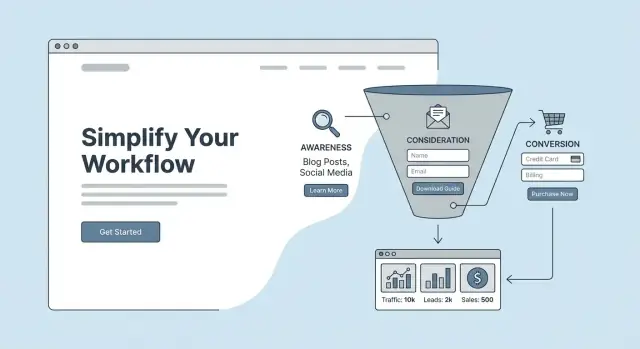
A typical funnel looks like this:
Many sites add more menus, more services, more buttons, and more widgets—then wonder why conversions stall. Extra features often create extra decisions, and extra decisions create drop-offs. A funnel-style site is the opposite: fewer competing options, clearer messaging, and stronger calls to action that move people forward.
A funnel site isn’t something you “finish” once. You build a first version, watch what happens (clicks, form starts, drop-offs), and improve one step at a time. Small changes—like tightening a headline, simplifying a form, or aligning a page to a specific traffic source—can steadily raise your website conversion rate over weeks and months.
If speed is your bottleneck, consider building and iterating funnel pages with a rapid workflow. For example, Koder.ai lets you create and refine web applications (including landing-page flows) through a chat interface, then export source code, deploy, and use snapshots/rollback to safely test changes without derailing your live funnel.
A website can’t guide people confidently if it’s trying to speak to everyone at once. The fastest way to make your site feel like a funnel is to pick one specific audience and one primary action you want them to take.
Keep this simple enough that a teammate could repeat it without notes:
If you can’t describe them in one sentence, your homepage and offers will usually drift into vague claims.
Decide the top outcome for the site. Common primary goals:
You can support secondary actions (like “subscribe” or “follow”), but don’t give them equal visual weight. If everything is important, nothing is.
Write down the top 3–5 reasons they hesitate, such as:
These objections should directly shape your copy, FAQs, proof, and guarantees.
Pick one main offer that matches the audience and goal (for example, “Free 20-minute audit” or “Starter plan”). Avoid bundling every service on one page. Clarity beats variety when you’re trying to move someone forward.
Before you design pages or write copy, sketch the path you want a visitor to take. A simple funnel map keeps your website focused and prevents “wandering” pages that look nice but don’t move people forward.
Start with three or four steps. For most small businesses, this is enough:
Write it as a simple chain, for example:
SEO blog post → service page → booking page → confirmation + email reminders
Not all visitors arrive with the same mindset, so don’t send every traffic source to the same page.
Your email list can sit:
Keep measurement simple at first. Track:
Once you have this map, every new page should have a job: move someone one step closer to the conversion.
Your homepage shouldn’t try to be a brochure for everything you do. Its job is to quickly answer “Is this for me?” and then guide the right visitor to the next best step.
In the first screen (before scrolling), spell out:
For example: “For independent financial coaches who want more qualified discovery calls—without spending hours on social media.” That’s much more directional than a generic “We help you grow.”
Once you’ve made a claim, support it with evidence visitors can scan in seconds. Depending on what you truly have, that might include:
Keep proof close to the top so people don’t have to hunt for reassurance.
A quick “How it works” block reduces uncertainty and prevents people from bouncing to figure it out elsewhere. Aim for three steps that match your funnel path, such as:
This also sets expectations—an underrated conversion lever.
If your homepage offers five equally loud options, it forces visitors to decide—and many won’t. Instead:
A good test: if someone reads the headline and looks at the buttons, it should be obvious what to do next.
As visitors scroll, each section should either build confidence (proof, benefits, FAQs) or push toward the same next step (CTA). Repeat that primary CTA at natural decision points so the homepage behaves like the top of your website sales funnel—not a dead end.
A homepage has to serve many visitors. A landing page can do one job extremely well: convert someone with a specific intent into the next step of your funnel.
If your visitor clicked an ad for “Book a demo,” don’t send them to a generic page that also promotes your newsletter, free trial, and webinar. Create a dedicated page that answers one question: “Should I take this exact action right now?”
Common pairs that deserve their own landing pages:
Most effective landing pages follow a familiar flow:
Use short-form when the offer is low-friction (newsletter, simple signup) or your audience already trusts you (warm email list, strong referral).
Use long-form when the offer is expensive, complex, or unfamiliar (consulting package, high-ticket service, switching providers). More context reduces hesitation and improves your website conversion rate.
Make the first screen feel like a continuation of what they just saw:
This consistency improves sales funnel website design because visitors don’t have to re-figure out whether they’re in the right place—and they’re more likely to follow your calls to action.
A call to action (CTA) isn’t just a button—it’s a decision prompt. The best CTAs match what a visitor is ready to do right now, instead of forcing a “Buy” moment too early.
Think in stages and write CTAs that feel like the next logical step:
If someone is still exploring, “Book a call” can feel like pressure. If they’re already convinced, “Read more” can feel like a dead end.
Clarity beats cleverness. Use action + outcome: “Get my quote” is stronger than “Submit.” Keep the primary CTA visually dominant (color, size, whitespace) and ensure it reads well on mobile.
Also remove doubt inside the CTA when relevant: “Start free trial (no card)” can outperform “Start free trial” if payment anxiety is a common blocker.
Put CTAs at natural decision points: near the top for confident visitors, after benefits and proof in the middle, and again at the end once objections are handled. For long pages, a sticky CTA can help—only if it doesn’t cover content or distract.
Each page should have one primary action. Secondary links are fine, but they should visually step back. Two equally loud CTAs split attention and reduce clicks on both.
Most visitors aren’t ready to buy on the first visit. Lead capture gives you a “yes” that’s smaller than a purchase—so you can keep the conversation going.
A strong lead magnet solves a small, real problem fast. Think “one clear win,” not a full course.
Examples:
The best test: could someone use it within 5–10 minutes of downloading?
Every extra field lowers sign-ups. Ask only what you will actually use right away.
A good default is:
If you truly need more (like phone), say why. Otherwise, save it for later steps.
Reduce hesitation at the exact decision point. Add a simple privacy note and set expectations:
If relevant, include one small proof point near the form (a testimonial snippet, client logos, or a “used by 2,000+ teams” line).
A confirmation message is good; a next step is better. Your thank-you page should continue the funnel with one clear CTA, such as:
Keep it focused: one next action, no distractions.
Great funnel copy doesn’t just “describe your business.” It guides a visitor through a simple mental journey: “This is my problem → this is the outcome I want → I believe you can get me there.”
Start with the visitor’s situation, not your features.
Example structure for a hero section:
Most visitors scan first, then read.
Use short paragraphs (1–3 lines), clear headings, and a few tight bullet lists to summarize key points (what’s included, who it’s for, what happens next). If a page looks dense, trust drops—even if the content is good.
A helpful pattern:
Trust rises when proof is specific and believable. Use:
Avoid exaggerated claims. If you offer a guarantee, state the exact terms—and only if you can honor them.
On key pages (especially landing pages and pricing), include 4–6 FAQs that address real hesitation:
The goal isn’t to win an argument—it’s to remove uncertainty so the next step feels safe.
Even the best landing page can stall if visitors can’t quickly answer basic questions: “What do you offer?”, “How much is it?”, “Will this work for me?”, and “What happens next?” Supporting pages exist to remove that hesitation—so the main funnel pages don’t have to carry the entire burden.
At minimum, make these pages easy to find and easy to scan:
Pricing confusion kills momentum. Instead of one long list of features, use packages and label them by fit (e.g., “Best for new businesses” vs. “Best for growing teams”). For each option, include:
Don’t make visitors hunt. Use “Start here” blocks and comparison sections that point people to the right path:
The goal is simple: every supporting page should answer a question and gently route the visitor back toward a decision.
Most visitors won’t buy on their first visit—even if they like what you offer. Email follow-up is how your website keeps the conversation going after someone downloads a lead magnet, requests a quote, or starts a trial.
Automate emails that are time-sensitive or easy to forget:
Automation doesn’t mean “spam.” It means fast, consistent follow-up that matches what your website promised.
Here’s a basic sequence that fits most funnels:
Email 1: Deliver the lead magnet (immediate)
Email 2: Educate (Day 1–2)
Email 3: Build trust (Day 3–4)
Email 4: Invite action (Day 5–7)
Your emails should mirror your on-site promise: same offer name, same benefits, and the same primary CTA. If your landing page pushes “Book a call,” don’t switch to “Buy now” in email unless you explain the shift. Every email should have one clear next step and link back to the most relevant page (not your homepage).
Checkout (or a booking flow) is where interested visitors become customers—and where many abandon. The goal is to make the final steps feel fast, obvious, and safe.
Every extra field and click creates doubt or friction. Keep the flow tight:
People hesitate right before paying. Add small reassurance near the “Pay” or “Book” button—where eyes naturally pause.
Include only what’s relevant:
Microcopy reduces form mistakes and keeps momentum.
Examples that work well:
After payment or booking, your confirmation page should do more than say “Thanks.”
A funnel-style website is never “done.” The difference between an average site and a high-converting one is simple: the best sites measure what happens, then make small improvements consistently.
Start by tracking a few actions that show intent—not just traffic.
At minimum, measure:
If you can, add event tracking for scroll depth or button clicks on your main CTA. This helps you spot where people lose interest.
Keep reporting focused on the path that matters:
Traffic source → landing page → conversion
For example: “Google Ads → /landing/free-estimate → form submit rate.” When you view results this way, you’ll quickly see which sources bring serious leads and which pages need work.
Avoid big redesigns based on opinions. Test small elements that affect decisions:
Let each test run long enough to collect meaningful data, then keep the winner.
If you’re iterating quickly, tooling matters. With Koder.ai, teams can prototype alternative funnel steps (new landing page variants, pricing-page layouts, onboarding flows), deploy them fast, and roll back instantly if a test underperforms—useful when you’re optimizing a high-traffic funnel and want speed without risky “big bang” changes.
Once a month, review your key pages, conversion rates, and drop-off points. Make one or two changes based on what the numbers say, document the result, and repeat. Over a few months, these small iterations compound into a much stronger funnel.
A website acts like a sales funnel when each important page has a single job: clarify where the visitor is and guide them to the next step.
Practically, that means fewer competing options, clear CTAs, and a mapped path like entry → nurture → conversion → follow-up.
A funnel site reduces decisions. When you add more menus, offers, and buttons, you often add more hesitation.
Aim for:
Pick:
Then write your homepage and key pages as if you’re talking to that audience only. You can add secondary audiences later, but start narrow for faster improvements.
List the top 3–5 reasons people hesitate, such as:
Then address them directly with proof, clear terms, short FAQs, and process details near the CTA.
Use a simple chain like:
Traffic source → entry page → nurture page(s) → conversion page → thank-you + email follow-up
Example:
This map keeps every page accountable: it either builds confidence or moves the visitor forward.
Because intent differs by source.
Avoid sending everything to the homepage by default.
Do three things above the fold:
Then drive one next step with a primary CTA (e.g., “Book a call”) and repeat it at natural decision points as visitors scroll.
Use landing pages when you have a specific offer + a specific traffic source (ads, email campaigns, partner referrals).
A practical structure:
Match the CTA to readiness:
On any single page, keep one primary action and make secondary links visually quieter.
Start simple with 2–3 metrics:
Then improve one step at a time (headline clarity, fewer form fields, better message match, tighter CTA). Small changes compound over weeks and months.