Dec 14, 2025·8 min
How to Build a Website for a Vertical-Specific Software Guide
Learn how to plan, design, and launch a vertical-specific software guide website—taxonomy, listings, SEO, reviews, and monetization steps.
Learn how to plan, design, and launch a vertical-specific software guide website—taxonomy, listings, SEO, reviews, and monetization steps.
A vertical-specific software guide only works when it’s truly “about one thing.” Before you think about a niche software directory layout, decide the exact industry slice (and the boundaries) you will cover. “Healthcare software” is too broad; “software for private physical therapy clinics in the US” is a usable starting point. A tight definition makes your software listings more comparable and your categories more consistent.
Write a one-sentence positioning statement that includes the vertical and the main audience role:
A B2B buyer guide should pick a primary role to speak to, then support the others with specific page sections (for example, “Security & Admin” blocks on each listing).
Most successful software comparison website experiences focus on one main intent. Choose the dominant action your visitors want to complete:
This decision influences everything: page types, filters, review prompts, and what “good” content looks like.
Avoid measuring ten things at once. Select a small set of core outcomes and define how you’ll track them.
Write down the metric, the target, and the time window (e.g., “500 organic visits/day within 6 months”).
Constraints are not negatives—they decide what’s realistic.
A clear scope prevents a vertical software guide from becoming a sprawling “everything directory” that’s hard to keep accurate.
Before you create pages or write reviews, get clear on what buyers are trying to accomplish—and what they type (or ask) while doing it. A vertical-specific software guide wins by matching real intent: not “software exists,” but “I need the right tool for my situation, constraints, and timeline.”
Start by listing 2–4 common personas in your vertical (for example: an operator, a finance approver, an IT/security reviewer, and an executive sponsor). For each persona, capture what they care about at each stage:
This prevents you from writing content for the wrong reader (or the wrong moment).
Don’t guess. Pull questions from:
Capture the exact wording people use. You’ll often find high-intent queries like “Does it support X compliance?” or “How long does implementation take?”—these translate directly into page sections, filters, and comparison points.
Turn raw questions into tasks your site must support, such as:
Finally, create a simple backlog: the top comparisons, top category pages, must-have filters, and FAQ-style pages that answer decision-critical questions. Prioritize what helps someone move from “shortlist” to “confident choice,” and you’ll have a content plan that’s grounded in buyer intent—not assumptions.
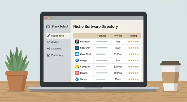
A vertical software guide lives or dies by how quickly a buyer can narrow from “I need a tool” to “these 5 options fit me.” That speed depends on your taxonomy: categories for structure, tags for nuance, and filters for decision-making.
Pick a small set of top-level categories that describe the primary job the software does in your vertical. Then add subcategories only when they represent clearly different use cases.
A simple test: if a product could reasonably belong to two categories, your categories are too fuzzy. Keep categories mutually clear, and use tags to capture secondary themes.
Tags should be optional descriptors that cut across categories—things like “AI-assisted,” “HIPAA-ready,” or “field teams.” Avoid turning tags into a second category tree.
Keep a short, controlled list. If you allow unlimited tags, you’ll end up with near-duplicates (“HIPAA,” “HIPAA compliant,” “HIPAA-compliance”).
Define a consistent attribute set across all listings so comparisons feel fair:
Filters should match real buying constraints, such as company size, region, deployment, and industry segment within the vertical. Limit early filters to the most common 6–10; too many makes the page feel complicated.
Decide up front how you’ll format vendor names, acronyms, and product lines (e.g., “Acme CRM” vs “Acme Sales Suite”). Maintain a single “preferred label” and store aliases so search still finds the right page.
A vertical-specific software guide works best when every page has a clear job: help a buyer answer one question and take one reasonable next step. Start by deciding a small set of page types you can repeat consistently, then design navigation and internal links so people never hit a dead end.
Category pages are the primary entry points (for example: “Scheduling Software for Dental Clinics”). They should explain who the category is for, highlight key evaluation criteria, and surface a curated set of listings.
Vendor profile pages (software listings) are decision-support pages: overview, use cases, pricing approach, integrations, pros/cons, and trust signals.
Comparison pages (A vs B) are high-intent: focus on differences that matter in this vertical—workflow fit, compliance needs, onboarding time, and total cost.
Alternatives pages (“Alternatives to X”) capture switchers. Keep the tone fair and map alternatives to specific reasons someone might leave.
Guides and explainers answer broader questions (buying checklists, implementation timelines, “how to choose” frameworks).
Use predictable URLs so your content scales cleanly:
Link between these page types intentionally: category → vendor profiles; vendor profiles → comparisons and alternatives; guides → relevant categories; comparisons → both vendor pages.
Keep the top menu simple (Categories, Comparisons, Guides, About). Add breadcrumbs on category and vendor pages. On-page “related” modules (Similar tools, Common comparisons, Popular in this category) keep users moving without feeling pushed.
Match CTAs to readiness: on guides, offer a downloadable checklist; on comparisons and vendor pages, offer “Request a demo,” “Get pricing,” or “Shortlist this tool.” Keep CTAs specific to the vertical and avoid generic buttons that don’t answer what happens next.
A vertical-specific software guide succeeds when every listing feels comparable, current, and transparent. That starts with a content model: a consistent set of fields you collect for each product, plus rules for how you gather and maintain the data.
At minimum, standardize these required fields so buyers can scan and compare quickly:
Use a tiered approach:
Label anything you can’t verify as “vendor-provided” and avoid presenting it as fact.
If you score products or write summaries, define a rubric with fixed criteria (for example: usability, vertical fit, integrations, reporting, support). Require a short justification per criterion and avoid unsupported superlatives (“best,” “fastest”) unless you can substantiate them.
Set an update cadence by volatility (pricing and integrations monthly/quarterly; descriptions and positioning quarterly; deep reviews biannually). Display a “Last updated” date and define what qualifies as an update (data change, feature verification, pricing refresh), so readers trust the timestamp.
High-intent pages are where visitors decide whether to keep researching—or take action. Wireframes help you prioritize what matters: clarity, scannability, and a path to the next step.
Start with a clear page purpose: “Help me find the best software for X.” Place the most-used filters near the top (price range, deployment, company size, key features). Keep filters collapsible so the page doesn’t feel crowded.
Add a short “Top Picks” strip above the full list to satisfy visitors who want a quick answer. Then follow with a sortable table or card list that shows the minimum decision-making info: best-for, standout feature, starting price (or “pricing available on request”), and a primary action such as “Compare” or “See details.”
Close the page with FAQs that match buyer concerns (implementation time, data security, switching costs). This keeps people engaged without forcing them to pogo-stick back to search.
A vendor page should read like a decision brief:
Design a consistent comparison pattern: limit the table to 4–6 columns, freeze the first column (criteria), and allow horizontal swipe. Provide a “show differences only” toggle and a stacked “card comparison” fallback for smaller screens.
Include a short methodology box (how you select and rank tools), clear disclosure (affiliate and advertising policies), and easy contact options for corrections or questions. These small blocks often make the difference between “I’m not sure” and “I trust this guide.”
A vertical software guide wins when pages load fast, get indexed cleanly, and make it easy for search engines to understand each listing, category, and comparison.
Start with performance fundamentals that don’t require advanced engineering:
Add schema to increase clarity and eligibility for rich results:
Keep the markup consistent with what users can actually see on the page.
Directories create many near-duplicate URLs, especially from filters.
Track intent signals, not just pageviews:
These events will tell you where buyers hesitate and which categories deserve deeper content.
Consistency is what turns a vertical software guide into a trustworthy niche software directory. When every page follows the same structure, visitors can compare software listings quickly, and your team can publish at a steady pace without reinventing the wheel.
Create a small set of page templates and treat them like product specs: stable, documented, and easy to reuse. Keep the tone factual and buyer-focused—this is a B2B buyer guide, not a press release.
Category hub template (e.g., “Scheduling Software for Clinics”)
Vendor listing template
Comparison page template (software comparison website core)
To support programmatic SEO without publishing thin pages, prioritize by conversion intent:
Category hubs first (they define your category taxonomy and internal pathways)
Top vendors next (the listings people search for by name)
High-demand comparisons (“X vs Y” and “Best for [use case]”)
Add a simple rule: every new listing should roll up to at least one category hub, and every category hub should link to a short list of the most helpful comparisons.
A glossary is an easy way to capture informational searches while educating buyers. Keep entries short, practical, and tied back to buying decisions (e.g., what the term means, why it matters, and which features to look for in a vertical software guide).
Use a lightweight checklist before publishing:
This QA discipline is what makes your software listings scalable—and credible—over time.
Reviews are where your directory either earns trust or loses it. For a vertical-specific guide, buyers want to know: “Will this work for a company like mine, with my constraints?” Your review system should make that easy to answer—without turning into a free-for-all.
Different sources serve different needs, but they shouldn’t be mixed without clear labels.
Define what you won’t publish upfront: spam, undisclosed incentives, personal data, hate/harassment, competitor takedowns, or anything that can’t be tied to real product usage. Keep moderation consistent, and document edge cases so your team makes the same call every time.
Star ratings alone are vague. Add guided fields such as role, company size, industry segment, use case, time using the product, plus pros/cons and “best for / not for.” This creates comparable reviews that help buyers self-qualify.
Add rate limits, detect duplicates, and require basic verification signals (work email, LinkedIn match, invoice screenshot optional). Show transparency notes like “Verified user” and disclose how ratings are calculated. Finally, display a mix of positive and critical feedback—nothing builds trust faster than balanced detail.
A vertical-specific software guide can stay useful to buyers and still generate revenue—if you separate “helpful” from “paid,” and label everything clearly. Start by deciding what a conversion means for your site: an email signup, a demo request, or a qualified lead handed to a vendor.
Offer multiple, low-friction ways to capture intent at different stages:
Place these CTAs where they match the user’s mindset: after a comparison table, on “best for X” pages, and near pricing or implementation details.
Make it easy for vendors to keep information accurate. A simple path:
Even if you review edits before publishing, keep the workflow fast and predictable.
Common options include sponsorships, featured placements, and affiliate/referral fees. The rule: buyers should always know what’s paid.
Create disclosure pages and use consistent labels such as “Sponsored,” “Featured,” or “Partner.” Keep paid placements visually distinct but not deceptive, and never let payment override your inclusion criteria or rating methodology.
Your tech choices should make it easy to publish, update, and compare listings—without turning every change into a developer ticket. Start with your team: if you have strong WordPress experience, a well-structured setup can work; if you have developers who prefer modern frameworks, a headless CMS plus a frontend app may fit better. The “best” stack is the one you can operate weekly.
If you want to ship faster without building every piece from scratch, a vibe-coding platform like Koder.ai can help you prototype (and iterate on) a vertical software guide via chat—especially for structured directory features like listing pages, filters, vendor submission forms, and admin workflows. Because Koder.ai supports full source code export and deployment/hosting, teams can start on a lightweight version, then harden it as the directory grows.
A vertical software guide needs structured fields (pricing model, deployment type, integrations, target company size) more than fancy page layouts. Choose a CMS that supports custom content types and validation so editors can’t accidentally break comparability.
Good signs you’ve picked well: editors can add a listing in minutes, required fields are enforced, and you can export/import data cleanly.
Comparison sites live or die by findability. Plan filtering early: categories, tags, and “facets” like industry sub-niche, compliance, budget range, and feature checkboxes.
For search and filtering, you generally have two paths:
Whichever you choose, ensure filters are consistent across listing pages, category pages, and comparison views.
If you’re building a custom app, a common, scalable pattern is a React frontend with a Go backend and PostgreSQL (plus a search layer when needed). That same approach is also a natural fit when generating or scaffolding the app through Koder.ai, then iterating with snapshots/rollback and planning mode as requirements change.
Define who can publish, who can edit, and who can approve. Many guides also let vendors suggest updates; set this up as a restricted role or a submission workflow so claims don’t overwrite editorial content.
You’ll regularly import software listings, update pricing fields, and normalize tags. Plan a lightweight admin experience for bulk edits (CSV import/export, mass tag updates, field-level validation) so scaling the directory doesn’t mean scaling headcount.
A vertical-specific software guide feels “real” to buyers when it’s curated, current, and easy to navigate. Your launch should prioritize usefulness over size: a tight set of categories, a consistent listing format, and a handful of best-in-class tools per category.
Start with a minimum viable set of categories and top tools (quality over volume). Aim for coverage that matches how buyers search: a few core categories, plus 10–30 high-confidence listings with clear positioning, pricing notes, and who the tool is (and isn’t) for.
Before you announce anything, sanity-check:
Create a simple promotion plan across a few dependable channels:
If you build in public, consider creating a “how we built this directory” post and inviting feedback. Some platforms (including Koder.ai) run programs where creators can earn credits for publishing content or referring other users—useful if you’re keeping early-stage costs low while you validate demand.
Track KPIs weekly and iterate on templates based on behavior. Watch which pages attract qualified traffic, where people scroll, and which CTAs get clicks. If visitors bounce, improve intros, add “best for” guidance, and tighten your category filters.
A software guide goes stale fast. Set a recurring checklist:
Treat maintenance as product work: small, frequent improvements keep trust high and rankings stable.
Start with a one-sentence positioning statement that names:
If a product could “fit” almost any industry, your vertical is still too broad.
Pick one primary role and write for their decision lens:
Then add dedicated sections (e.g., “Security & Admin”) to still serve secondary roles without diluting the page.
Choose 1–3 outcomes and define them precisely, for example:
Document the target and time window (e.g., “500 organic visits/day in 6 months”), then track events that indicate intent (filters used, outbound clicks, form starts vs. submits).
Start by collecting the exact phrasing from:
Convert repeated questions into site requirements: page sections, filters, comparison criteria, and an initial backlog of category + comparison pages.
Use categories for the primary job the product does in your vertical, and keep them mutually exclusive.
Then use tags for cross-cutting descriptors like compliance readiness, team type, or “AI-assisted.” If a product could reasonably belong to two categories, tighten category definitions and push nuance into tags.
Standardize a fixed attribute set for every listing, such as:
This consistency is what makes side-by-side comparisons feel fair and trustworthy.
Start with repeatable page types and predictable URLs:
/category/{vertical-category}/software/{vendor}/compare/{a}-vs-{b}Prioritize scannability and “next step” clarity:
Match CTAs to intent (checklist on guides; “Compare,” “Get pricing,” or “Request a demo” on high-intent pages).
Focus on fundamentals that prevent thin/duplicate pages:
SoftwareApplication on listings, FAQPage where Q&A is visible, Organization site-wideSeparate sources and label them clearly:
Use structured prompts (role, company size, use case, time using product), moderate consistently, and add anti-gaming checks (rate limits, duplicate detection, basic verification signals).
/alternatives/{vendor}/guides/{topic}Then design internal links intentionally (category → listings → comparisons/alternatives; guides → relevant categories) so users always have a clear next step.
Ensure markup matches what users can see on the page.