Jul 14, 2025·8 min
Bumble’s Differentiation: Positioning and Trust by Design
Learn how Bumble’s positioning and trust-first features helped it stand out among crowded consumer apps—and how to apply these lessons to your product.
Learn how Bumble’s positioning and trust-first features helped it stand out among crowded consumer apps—and how to apply these lessons to your product.
Most consumer apps don’t lose because they’re missing features. They lose because users can’t tell—quickly and confidently—why this app is meaningfully different from the next one.
In crowded categories, feature sets converge fast: messaging, recommendations, notifications, profiles, payments, and “premium” tiers start to look interchangeable. When everything feels similar, acquisition gets expensive, churn rises, and growth depends on ever-louder marketing instead of product pull.
Two forces make crowded apps especially hard to win:
A winning strategy usually requires a clear point of view: a promise users can repeat to a friend, reinforced by product rules and experience design.
Bumble is a clean example of differentiation built from two layers working together:
You don’t need to be building a dating app to learn from it. The same dynamics show up in marketplaces, social apps, creator platforms, and any product where people interact with other people.
This is not a founder profile and not a prediction piece. It focuses on observable product choices and category dynamics—how positioning becomes real through UX, policy, and system design. It won’t rely on speculation about internal metrics, motives, or behind-the-scenes decisions.
You should leave with practical ways to:
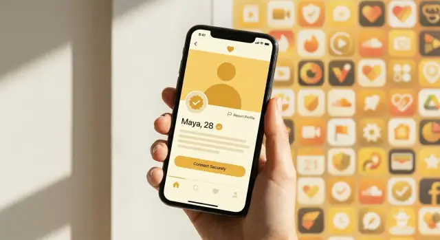
Bumble was founded in 2014 by Whitney Wolfe Herd, who had previously been a co-founder at Tinder before leaving the company. She launched Bumble into a dating app category that was already crowded with recognizable brands and entrenched user habits—meaning “another app with profiles and swipes” wasn’t going to be enough.
Bumble’s early wedge was simple to explain and easy to remember: in heterosexual matches, women message first. That wasn’t just a slogan—it was a clear point of view about how dating should feel, and it gave users a one-sentence answer to “Why Bumble?”
In saturated consumer categories, this kind of repeatable promise matters because it travels through word of mouth. People don’t recommend feature checklists; they recommend a feeling and a rule.
Launching late means you face two hard problems at once:
So differentiation has to be deeper than UI tweaks or a new onboarding flow—it has to anchor to a specific belief about the experience you’re creating.
Many companies stop at marketing positioning: taglines, brand videos, and influencer campaigns that describe an intended experience.
Bumble pushed further into product-enforced positioning: the core rule shaped user behavior inside the app. When the product mechanics enforce the promise, the positioning isn’t just claimed—it’s lived, every time a match happens.
Product positioning is the simple, memorable promise that helps someone decide: “Is this for me?” In plain language, it answers four questions: who it’s for, what it’s for, why it matters, and why it’s different.
In crowded consumer apps, the best positioning is repeatable. If users can’t explain your app in one sentence, they won’t recommend it—and they won’t know how to behave inside it.
Positioning isn’t only a tagline. A small set of intentional choices can communicate your values and the “rules of the room.” For example, you can signal what you prioritize by:
These choices teach users what “good” looks like—often more clearly than marketing copy.
The fastest way to become forgettable is to sound like everyone else. Watch for:
Use this to draft a one-sentence promise:
For [specific audience], [product name] is the [category/alternative] that helps you [primary job] by [unique mechanism], so you get [clear outcome] without [key pain you remove].
If you can’t fill this in without vague words, your positioning likely needs sharpening.
A brand promise isn’t what you say in a campaign—it’s what users repeatedly experience. In crowded apps, the fastest way to make that promise real is to turn it into a rule that shapes behavior, not just a screen.
UI can encourage certain actions, but rules create consequences. They define who can initiate, how long someone has to respond, what “good participation” looks like, and what happens when people ignore the norm. Over time, these constraints become culture: users self-select into the environment and adapt their behavior to avoid friction.
Bumble’s signature mechanic wasn’t merely a feature—it enforced a clear social contract: women have control over starting the conversation. That turns “women-first messaging” from branding into an interaction default.
The outcome is predictable: men can’t rely on spamming openers as a volume strategy, and women are given a stronger sense of agency at the decisive moment. Whether every conversation becomes better is secondary; the rule makes the app feel meaningfully different within minutes.
Rules attract the people who want the promise and repel those who don’t. That can be a strength.
Some users will love the clarity and reduced unwanted outreach. Others may feel constrained (e.g., women who don’t want the burden of initiating, or men who prefer more proactive control). The “repel” effect is part of the moat: it reduces mixed expectations and helps the community converge on a consistent norm.
Start small and measurable:
The goal isn’t restriction for its own sake—it’s making your positioning impossible to ignore.
Trust design is the intentional shaping of features and user flows to reduce fear, harm, and uncertainty—before they become reasons to bounce. It’s not a single “Safety” tab or a policy page. It’s how your app behaves at the moments when users silently ask: Is this real? Am I safe? Will I regret this?
Most teams treat trust and safety as risk management: necessary, expensive, and separate from growth. But in consumer apps—especially ones involving strangers—trust is a direct driver of conversion.
If users hesitate, they don’t:
Good trust design removes friction that doesn’t add confidence (confusing reporting, unclear controls) while adding friction that does (verification, consent-forward defaults, clear boundaries). The result is more first actions and better retention because users feel in control.
Trust is built (or lost) in specific moments:
Treat trust like a product surface with measurable outcomes. Track:
When trust design is core, safety stops being “extra”—it becomes part of what users come back for.
Trust isn’t a single feature you “add.” It’s a sequence of small signals and protections that show up at the moments users feel most vulnerable. A useful way to plan it is to map a simple trust journey end-to-end, then decide what the product should promise at each step.
Onboarding → matching → messaging → meeting → post-interaction. For each stage, ask: what could go wrong, what would a safe user expect, and what should be prevented vs. merely discouraged?
A few patterns show up in successful consumer apps:
The key is timing: add friction when risk spikes, and keep low-risk moments fast.
Trust measures can reduce short-term conversion (e.g., fewer sign-ups if verification is required). If you only optimize for activation, you’ll be tempted to remove safeguards. Balance it by tracking trust-aligned metrics alongside growth:
Design trust around those moments first—and make the product’s safety promise easy to feel, not just easy to describe.
Two-sided consumer apps (like dating, rides, or marketplaces) don’t grow in a straight line. They grow through network effects: when the app feels valuable, people invite more people, which makes it even more valuable. But in the earliest stages, the “network” is fragile—one bad first impression can stop the loop before it starts.
When there are fewer users, each interaction represents a larger share of the overall experience. A handful of spammy profiles or aggressive messages can dominate the vibe and convince new users the app “isn’t for them.” That’s a compounding problem: fewer good users show up, so the pool gets worse, which then repels even more good users.
Trust and safety isn’t just risk management—it’s marketplace hygiene. Product choices like verification, clearer reporting flows, friction for repeat offenders, and limits on low-intent behavior reduce negative interactions that push people away.
The result is not only fewer incidents, but a higher willingness to participate. More people feel comfortable matching, messaging, and returning—creating the kind of activity that actually attracts others.
It’s tempting to optimize purely for volume: maximize sign-ups, matches, and messages. But if you increase liquidity by lowering standards (letting in bots, enabling harassment, encouraging spammy outreach), you may boost top-line activity while silently killing retention—especially for the users you most need to keep.
Sustainable liquidity is when users feel safe enough to engage repeatedly.
To balance growth with experience quality, track:
If messages rise but repeat sessions fall—or report rates climb—you’re not building liquidity; you’re accelerating churn.
Trust features shouldn’t live in a hidden “Safety” menu that only anxious users find. When safety is part of the brand promise, it can be visible, legible, and easy to talk about—something users can point to when recommending the app.
The fastest way for trust to become brand equity is to turn it into proof users can see in the flow:
These elements work like marketing because they reduce uncertainty at the exact moment users decide whether to engage.
If the product says “we keep you safe,” but support replies slowly or uses canned responses, users experience the promise as theater. Alignment looks like:
A common failure mode is running growth experiments that contradict the trust promise. Examples include loosening moderation to boost messaging volume, spamming re-engagement notifications to people who just reported someone, or optimizing “time to first message” in ways that pressure users into unwanted interactions.
Brand equity is built when trust constraints are treated as non-negotiable product rules—not temporary settings that get overridden for metrics.
Features get copied quickly. Positioning—what users believe you stand for—is harder to steal because it lives in expectations, habits, and the way a community behaves over time.
A competitor can ship “verification,” “women message first,” or “reporting tools.” But copying positioning means convincing users to re-learn what the product is for and who it protects.
If your promise is simple enough to repeat (“this is the app where…”), then every screen, rule, and support interaction reinforces it. A clone can mimic UI, but it can’t instantly replicate years of consistent outcomes.
Defensibility comes from the system behind the interface:
When these pieces align, trust isn’t a feature category; it becomes the reason people stay.
Consumer apps rarely lock users in with contracts. They retain people through:
The stronger your trust system, the more valuable that reputation becomes.
You can expand positioning without abandoning it. Keep the core promise stable, then widen the circle with adjacent benefits (e.g., from “safer” to “more intentional,” from “respectful” to “higher quality”). Change the message in layers, test it in one surface (like onboarding), and only then let it spread across the product.
Differentiation isn’t a slogan—it’s a set of product decisions you can enforce. Use this short playbook to translate “positioning + trust by design” into weekly execution.
Write one sentence that names who you serve and what success feels like.
Example template: “For [specific group], our app helps them [complete one meaningful outcome] without [the main anxiety or friction].” If you can swap in “everyone” or list three outcomes, it’s still too broad.
Pick a rule you can implement in code—not just in guidelines. The best rules are simple, visible, and hard to misinterpret.
Ask: What single constraint would make your app feel different in the first 60 seconds? (Examples: who can initiate, when messaging unlocks, what must be completed before posting, what content is disallowed by default.)
Map your top risks across the journey: onboarding, first interaction, ongoing engagement, and exits.
Then place “trust moments” where they change behavior:
If you’re moving fast and want to prototype these flows without a long build cycle, tools like Koder.ai can help teams spin up and iterate on consumer app experiences via chat—useful for quickly testing onboarding copy, verification gates, reporting UX, and admin workflows before hardening them.
Treat trust as a core product metric, not a support backlog.
Track a small set: report rate, time-to-resolution, repeat-offender rate, verified-to-unverified conversion, block/mute usage, and retention segmented by “safe interactions” vs. “risky interactions.” Review them weekly with product, design, and ops in the room.
One or two lines your team can quote when debating growth ideas.
Example: “We prioritize [user group] feeling [safe outcome] over maximizing [engagement metric]. If an experiment improves clicks but increases [harm signal], we don’t ship it.”
Trust features can turn into empty marketing if they aren’t specific, visible, and consistently enforced. The fastest way to lose credibility is to promise “safety” while letting bad behavior slide—or making controls so buried that only power users find them.
A frequent mistake is vague safety messaging (“we take safety seriously”) with no clear user-facing proof: verification rates, reporting expectations, or what happens after a report.
Inconsistent enforcement is worse than no enforcement. If two users report the same behavior and get different outcomes, people assume the system is arbitrary—or biased.
Hidden controls are another failure mode: blocking, reporting, and message filters should be reachable in the exact moment a user needs them, not tucked behind multiple menus.
Some growth tactics are trust-negative by design. Examples include rewarding mass messaging, pushing aggressive re-engagement notifications that ignore prior blocks, or using referral bonuses that attract disposable accounts.
If your metrics celebrate “messages sent” without weighting for positive outcomes, you’ll accidentally subsidize spam and harassment. A healthier north star is “meaningful conversations” or “safe matches,” measured with quality signals.
Experimentation is still possible, but safety needs guardrails:
Automation can catch obvious patterns (duplicate spam, known bad links), but nuanced situations need people. Start small with a lightweight human review queue for high-severity reports and repeat offenders, then automate the repetitive steps (triage, prioritization) as volume grows.
If you want a framework for prioritizing, see /blog/trust-by-design.
Bumble’s enduring lesson isn’t “add more features.” It’s that positioning plus trust design can be the product. A clear promise users can repeat (“women make the first move”) only works when the experience consistently reinforces it—through rules, UX patterns, and safety choices that remove doubt and reduce bad outcomes.
If you want this kind of differentiation, start with what people experience before they ever “activate” your value:
Small changes here often outperform big roadmap bets, because they affect every new user, every day.
If you want practical frameworks to apply this beyond dating apps, continue with:
Differentiation sticks when your point of view is clear—and your UX makes people feel safe enough to act on it.
In crowded consumer categories, competitors can copy visible features quickly, so apps often lose because users can’t immediately understand what makes the experience meaningfully different. When everything looks the same, acquisition costs rise and retention falls because there’s no clear reason to choose (or stick with) one product.
Positioning is a simple, repeatable promise that helps a user decide “Is this for me?” It should be explainable in one sentence and clarify:
A rule-based differentiator is a product mechanic that enforces the promise, not just describes it in marketing. Bumble’s “women message first” is effective because users feel the difference at the moment that matters (first contact), and the rule changes incentives and behavior—not just UI.
Write a draft like:
For [specific audience], [product] is the [category/alternative] that helps you [primary job] by [unique mechanism], so you get [outcome] without [key anxiety/friction].
If you can swap in “everyone,” or you need vague words like “better” or “smarter,” narrow the audience, job, or mechanism until the sentence becomes concrete.
Trust design is shaping flows and product choices to reduce fear and uncertainty at the moments users feel vulnerable. It’s not just a policy page; it shows up in:
Map “trust moments” across the journey and design for each stage:
Prioritize the steps where personal risk spikes (identity, location, off-platform contact).
Track both harm signals and participation signals, for example:
Pair these with retention (D7/D30) so you don’t “grow” activity that actually increases churn.
Because early interactions represent a larger share of the total experience when the network is small. A few spammy or unsafe experiences can “poison” the marketplace, driving away the very users you need for healthy network effects. Trust and quality controls protect the loop by making people willing to participate repeatedly.
Start with one high-stakes moment (first message, first transaction, first collaboration) and ship a small rule with a clear hypothesis. Then:
Avoid tests that remove baseline protections; test enhancements, not core safety.
Common pitfalls include:
A practical guardrail is a short “trust promise” that can veto experiments that improve clicks but increase harm signals.