Dec 15, 2025·8 min
Claude Code for Flutter UI iteration: a practical workflow
Claude Code for Flutter UI iteration: a practical loop to turn user stories into widget trees, state, and navigation while keeping changes modular and easy to review.
Claude Code for Flutter UI iteration: a practical loop to turn user stories into widget trees, state, and navigation while keeping changes modular and easy to review.
Fast Flutter UI work often starts well. You tweak a layout, add a button, move a field, and the screen gets better quickly. The trouble shows up after a few rounds, when speed turns into a pile of changes nobody wants to review.
Teams usually run into the same failures:
A big cause is the "one big prompt" approach: describe the whole feature, ask for the full set of screens, and accept a large output. The assistant tries to help, but it touches too many parts of the code at once. That makes changes messy, hard to review, and risky to merge.
A repeatable loop fixes this by forcing clarity and limiting blast radius. Instead of "build the feature," do this repeatedly: pick one user story, generate the smallest UI slice that proves it, add only the state needed for that slice, then wire navigation for one path. Each pass stays small enough to review, and mistakes are easy to roll back.
The goal here is a practical workflow for turning user stories into concrete screens, state handling, and navigation flows without losing control. Done well, you end up with modular UI pieces, smaller diffs, and fewer surprises when requirements change.
User stories are written for humans, not widget trees. Before you generate anything, convert the story into a small UI spec that describes visible behavior. "Done" should be testable: what the user can see, tap, and confirm, not whether the design "feels modern."
A simple way to keep scope concrete is to break the story into four buckets:
If the story still feels fuzzy, answer these questions in plain language:
Add constraints early because they guide every layout choice: theme basics (colors, spacing, typography), responsiveness (phone portrait first, then tablet widths), and accessibility minimums like tap target size, readable text scaling, and meaningful labels for icons.
Finally, decide what is stable versus flexible so you do not churn the codebase. Stable items are things other features depend on, like route names, data models, and existing APIs. Flexible items are safer to iterate on, like layout structure, microcopy, and the exact widget composition.
Example: "As a user, I can save an item to Favorites from the detail screen." A buildable UI spec could be:
That is enough to build, review, and iterate without guessing.
Small diffs are not about working slower. They make each UI change easy to review, easy to undo, and hard to break. The simplest rule: one screen or one interaction per iteration.
Pick a tight slice before you start. "Add an empty state to the Orders screen" is a good slice. "Rework the whole Orders flow" is not. Aim for a diff a teammate can understand in a minute.
A stable folder structure also helps you keep changes contained. A simple, feature-first layout prevents you from scattering widgets and routes across the app:
lib/
  features/
    orders/
      screens/
      widgets/
      state/
      routes.dart
Keep widgets small and composed. When a widget has clear inputs and outputs, you can change layout without touching state logic, and change state without rewriting UI. Prefer widgets that take plain values and callbacks, not global state.
A loop that stays reviewable:
Set a hard rule: every change must be easy to revert or isolate. Avoid drive-by refactors while you are iterating on a screen. If you notice unrelated problems, write them down and fix them in a separate commit.
If your tool supports snapshots and rollback, use each slice as a snapshot point. Some vibe-coding platforms like Koder.ai include snapshots and rollback, which can make experimentation safer when you're trying a bold UI change.
One more habit that keeps early iterations calm: prefer adding new widgets over editing shared ones. Shared components are where small changes turn into big diffs.
Fast UI work stays safe when you separate thinking from typing. Start by getting a clear widget tree plan before generating code.
Ask for a widget tree outline only. You want widget names, hierarchy, and what each part shows. No code yet. This is where you catch missing states, empty screens, and odd layout choices while everything is still cheap to change.
Ask for a component breakdown with responsibilities. Keep each widget focused: one widget renders the header, another renders the list, another handles empty/error UI. If something needs state later, note it now but do not implement it yet.
Generate the screen scaffold and stateless widgets. Start with a single screen file with placeholder content and clear TODOs. Keep inputs explicit (constructor params) so you can plug in real state later without rewriting the tree.
Do a separate pass for styling and layout details: spacing, typography, theming, and responsive behavior. Treat styling as its own diff so reviews stay simple.
Put constraints up front so the assistant does not invent UI you cannot ship:
Concrete example: the user story is "As a user, I can review my saved items and remove one." Ask for a widget tree that includes an app bar, a list with item rows, and an empty state. Then request a breakdown like SavedItemsScreen, SavedItemTile, EmptySavedItems. Only after that, generate the scaffold with stateless widgets and fake data, and finally add styling (divider, padding, and a clear remove button) in a separate pass.
UI iteration falls apart when every widget starts making decisions. Keep the widget tree dumb: it should read state and render, not contain business rules.
Start by naming the states in plain words. Most features need more than "loading" and "done":
Then list events that can change the state: taps, form submit, pull-to-refresh, back navigation, retry, and "user edited a field." Doing this upfront prevents guesswork later.
Pick one state approach for the feature and stick to it. The goal is not "the best pattern," it is consistent diffs.
For a small screen, a simple controller (like a ChangeNotifier or ValueNotifier) is often enough. Put the logic in one place:
Before you add code, write the state transitions in plain English. Example for a login screen:
"When the user taps Sign in: set Loading. If the email is invalid: stay in Partial input and show an inline message. If the password is wrong: set Error with a message and enable Retry. If success: set Success and navigate to Home."
Then generate the minimal Dart code that matches those sentences. Reviews stay simple because you can compare the diff to the rules.
Make validation explicit. Decide what happens when inputs are invalid:
When those answers are written down, your UI stays clean and the state code stays small.
Good navigation starts as a tiny map, not a pile of routes. For each user story, write down four moments: where the user enters, the most likely next step, how they cancel, and what "back" means (back to the previous screen, or back to a safe home state).
A simple route map should answer the questions that usually cause rework:
Then define the parameters passed between screens. Be explicit: IDs (productId, orderId), filters (date range, status), and draft data (a partially filled form). If you skip this, you'll end up stuffing state into global singletons or rebuilding screens to "find" context.
Deep links matter even if you do not ship them on day one. Decide what happens when a user lands mid-flow: can you load missing data, or should you redirect to a safe entry screen?
Also decide which screens should return results. Example: a "Select Address" screen returns an addressId, and the checkout screen updates without a full refresh. Keep the return shape small and typed so changes stay easy to review.
Before coding, call out edge cases: unsaved changes (show a confirm dialog), auth required (pause and resume after login), and missing or deleted data (show an error and a clear way out).
When you iterate fast, the real risk is not "wrong UI." It is unreviewable UI. If a teammate cannot tell what changed, why it changed, and what stayed stable, every next iteration gets slower.
A rule that helps: lock the interfaces first, then allow the internals to move. Stabilize public widget props (inputs), small UI models, and route arguments. Once those are named and typed, you can reshape the widget tree without breaking the rest of the app.
Ask for a diff-friendly plan before generating code. You want a plan that says which files will change and which must remain untouched. That keeps reviews focused and prevents accidental refactors that change behavior.
Patterns that keep diffs small:
Say the user story is "As a shopper, I can edit my shipping address from checkout." Lock route args first: CheckoutArgs(cartId, shippingAddressId) stays stable. Then iterate inside the screen. Once the layout settles, split it into AddressForm, AddressSummary, and SaveBar.
If state handling changes (for example, validation moves from the widget into a CheckoutController), the review stays readable: UI files mostly change rendering, while the controller shows the logic change in one place.
The fastest way to slow down is to ask the assistant to change everything at once. If one commit touches layout, state, and navigation, reviewers cannot tell what broke, and rolling back gets messy.
A safer habit is one intent per iteration: shape the widget tree, then wire state, then connect navigation.
One common problem is letting generated code invent a new pattern on every screen. If one page uses Provider, the next uses setState, and the third introduces a custom controller class, the app becomes inconsistent quickly. Pick a small set of patterns and enforce them.
Another mistake is putting async work directly inside build(). It may look fine in a quick demo, but it triggers repeated calls on rebuilds, flicker, and hard-to-track bugs. Move the call into initState(), a view model, or a dedicated controller, and keep build() focused on rendering.
Naming is a quiet trap. Code that compiles but reads like Widget1, data2, or temp makes future refactors painful. Clear names also help the assistant produce better follow-up changes because intent is obvious.
Guardrails that prevent the worst outcomes:
build()A classic visual-bug fix is adding another Container, Padding, Align, and SizedBox until it looks right. After a few passes, the tree becomes unreadable.
If a button is misaligned, first try removing wrappers, using a single parent layout widget, or extracting a small widget with its own constraints.
Example: a checkout screen where the total price jumps when loading. An assistant might wrap the price row in more widgets to "stabilize" it. A cleaner fix is reserving space with a simple loading placeholder while keeping the row structure unchanged.
Before you commit, do a two-minute pass that checks user value and protects you from surprise regressions. The goal is not perfection. It is making sure this iteration is easy to review, easy to test, and easy to undo.
Read the user story once, then verify these items against the running app (or at least against a simple widget test):
A quick reality check: if you added a new Order details screen, you should be able to (1) open it from the list, (2) see a loading spinner, (3) simulate an error, (4) see an empty order, and (5) press back to return to the list without weird jumps.
If your workflow supports snapshots and rollback, take a snapshot before bigger UI changes. Some platforms like Koder.ai support this, and it can help you iterate faster without putting the main branch at risk.
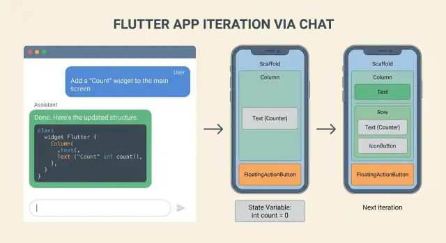
User story: "As a shopper, I can browse items, open a details page, save an item to favorites, and later view my favorites." The goal is to move from words to screens in three small, reviewable steps.
Iteration 1: focus only on the browse list screen. Create a widget tree complete enough to render but not tied to real data: a Scaffold with an AppBar, a ListView of placeholder rows, and clear UI for loading and empty states. Keep state simple: loading (shows a CircularProgressIndicator), empty (shows a short message and maybe a Try again button), and ready (shows the list).
Iteration 2: add the details screen and navigation. Keep it explicit: onTap pushes a route and passes a small parameter object (for example: item id, title). Start the details page as read-only with a title, a description placeholder, and a Favorite action button. The point is to match the story: list -> details -> back, without extra flows.
Iteration 3: introduce favorites state updates and UI feedback. Add a single source of truth for favorites (even if it is still in-memory), and wire it into both screens. Tapping Favorite updates the icon immediately and shows a small confirmation (like a SnackBar). Then add a Favorites screen that reads the same state and handles the empty state.
A reviewable diff typically looks like this:
browse_list_screen.dart: widget tree plus loading/empty/ready UIitem_details_screen.dart: UI layout and accepts navigation paramsfavorites_store.dart: minimal state holder and update methodsapp_routes.dart: routes and typed navigation helpersfavorites_screen.dart: reads state and shows empty/list UIIf any one file becomes "the place where everything happens," split it before moving on. Small files with clear names keep the next iteration fast and safe.
If the workflow only works when you are "in the zone," it will break the moment you switch screens or a teammate touches the feature. Make the loop a habit by writing it down and putting guardrails around change size.
Use one team template so every iteration starts with the same inputs and produces the same kind of output. Keep it short but specific:
This reduces the odds of the assistant inventing new patterns mid-feature.
Pick a definition of small that is easy to enforce in code review. For example, cap each iteration to a limited number of files, and separate UI refactors from behavior changes.
A simple set of rules:
Add checkpoints so you can undo a bad step quickly. At minimum, tag commits or keep local checkpoints before major refactors. If your workflow supports snapshots and rollback, use them aggressively.
If you want a chat-based workflow that can generate and refine Flutter apps end to end, Koder.ai includes a planning mode that helps you review a plan and expected file changes before applying them.
Use a small, testable UI spec first. Write 3–6 lines that cover:
Then build only that slice (often one screen + 1–2 widgets).
Convert the story into four buckets:
If you can’t describe the acceptance check quickly, the story is still too fuzzy for a clean UI diff.
Start by generating only a widget tree outline (names + hierarchy + what each part shows). No code.
Then request a component responsibility breakdown (what each widget owns).
Only after that, generate the stateless scaffold with explicit inputs (values + callbacks), and do styling in a separate pass.
Treat it as a hard rule: one intent per iteration.
If a single commit changes layout, state, and routes together, reviewers won’t know what caused a bug, and rollback gets messy.
Keep widgets “dumb”: they should render state, not decide business rules.
A practical default:
Avoid putting async calls in —it leads to repeated calls on rebuild.
Define states and transitions in plain English before coding.
Example pattern:
Then list events that move between them (refresh, retry, submit, edit). Code becomes easier to compare against the written rules.
Write a tiny “flow map” for the story:
Default to feature-first folders so changes stay contained. For example:
lib/features/<feature>/screens/lib/features/<feature>/widgets/lib/features/<feature>/state/lib/features/<feature>/routes.dartThen keep each iteration focused on one feature folder and avoid drive-by refactors elsewhere.
A simple rule: stabilize interfaces, not internals.
Reviewers care most that inputs/outputs stayed stable even if the layout moved around.
Do a two-minute pass:
If your workflow supports it (for example snapshots/rollback), take a snapshot before a bigger layout refactor so you can revert safely.
build()Also lock down what travels between screens (IDs, filters, draft data) so you don’t end up hiding context in globals.