Jul 25, 2025·8 min
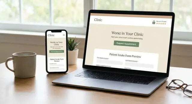
Clinic Websites That Build Trust and Capture Appointments
Learn how clinic websites can increase appointment requests with simple forms, clear trust signals, and privacy-first UX—without adding patient friction.
Learn how clinic websites can increase appointment requests with simple forms, clear trust signals, and privacy-first UX—without adding patient friction.
Most people arrive on a clinic website with a short list of goals. They want to book an appointment, ask a quick question, and confirm the basics—location, hours, parking, insurance, and how to reach you.
If they can’t do those things in under a minute, they often leave and try the next clinic.
Patients typically scan (not read) to find:
When these items are buried, inconsistent across pages, or missing after-hours guidance, confidence drops fast.
Drop-offs usually happen for predictable reasons:
Small friction points add up—especially for anxious or time-constrained patients.
Trust is mostly about clarity and reassurance. Patients look for:
Say what happens after they reach out. For example: “We respond within 1 business day,” “Urgent symptoms? Call 911,” and “For same-day requests, call.” This reduces hesitation and prevents frustration after the click.
Patients don’t “explore” a clinic website the way they might browse a store. Most arrive with a single goal: confirm you can help and take the next step quickly. A clear appointment request workflow removes friction and reduces the most common drop-off point: uncertainty about what to do next.
Make one primary action obvious on key pages: the homepage, service pages, and provider pages. Use a consistent label (for example, Request an Appointment) and keep placement predictable—top navigation plus a visible button in the first screen on mobile.
Avoid competing CTAs that feel equally “primary.” If everything is highlighted, nothing is.
Some patients want to call, others prefer a form, and some want a quick message first. You can support all three as long as you keep the hierarchy clear:
Make sure “message” doesn’t look like a booking method unless it truly is. If messaging is only for questions, say so.
A simple sequence works well:
Service → provider (optional) → time preference → contact details
Don’t force provider selection if many patients don’t know names yet. Similarly, ask for a time preference (morning/afternoon, a few date options) rather than trying to replicate a full scheduling system if you’re not showing real availability.
Small, specific text reduces hesitation. Add one or two lines near the submit button:
That clarity builds confidence and prevents duplicate submissions.
Right beside (or directly below) the form, include your phone number and hours. If the form feels too slow or a patient is in a hurry, they shouldn’t have to hunt for a way to reach you.
Patient forms are where good intent turns into drop-offs. The goal isn’t to “collect everything”—it’s to help someone successfully request an appointment with minimal effort, especially on a phone.
For the first step, collect only what’s needed to schedule:
Save detailed medical history, insurance, and long questionnaires for after the appointment is confirmed (or as a separate pre-visit intake). This staged approach reduces abandonment and lowers stress.
Small UX upgrades can dramatically improve completion rates:
If you ask for something sensitive (like insurance ID), explain why and offer an alternative path (e.g., “You can provide this during your visit”).
People hesitate when they’re unsure what to write. Add short helper text and examples right where they’re needed:
This is especially important for mental health, sensitive services, or first-time patients.
When a form fails, say exactly what happened and how to fix it. Avoid vague messages like “Invalid input.” Instead:
If you offer HIPAA-friendly web forms or similar secure contact forms for healthcare visitors, say so plainly near the submit button and link to your /privacy page—confidence reduces hesitation.
Patients will share personal details only if they feel safe—and if you explain what you’re doing with their information. Privacy isn’t just a compliance box to tick; it’s part of the user experience.
Keep your form copy plain and specific. Right next to the fields, explain what’s needed for the appointment request.
For example: “We use your phone number to confirm your preferred appointment time.” This small line reduces anxiety and lowers form abandonment.
Make your privacy notice easy to find at the point of data entry, not buried in the footer.
Include a clear link such as: “Read our Privacy Notice: /privacy”. If you have multiple locations or services, keep the notice consistent and easy to understand.
Consent works best when it’s specific. If you send newsletters or promotions, don’t bundle that consent into an appointment request.
A common approach is:
This helps patients feel in control—and helps your clinic keep records clean.
Don’t ask for sensitive information unless it’s required for the next step. For many clinics, an appointment request can be handled with basic contact details, a reason for visit, and preferred times.
If you truly need more (e.g., insurance details, medications), consider collecting it in a follow-up step or a secure intake workflow after the appointment is confirmed.
Patients don’t need technical details, but they do notice signals:
Even a short reassurance like “Only our clinic staff can access this request” can reduce hesitation and improve completion rates.
Patients don’t just decide whether to book—they decide whether they feel safe reaching out at all. Good medical practice website design makes reassurance obvious, especially near appointment requests and any secure contact forms healthcare visitors might use.
Show clinician credentials in plain language: degrees, specialties, board certifications, and licenses (where relevant). Add affiliations with hospitals, professional bodies, and training institutions—ideally with a short “What this means for patients” line.
A simple “Meet the team” page linked from your header (/about) removes doubt faster than a long homepage paragraph.
Use genuine clinic photos: exterior signage (so patients know they’ve found the right place), reception, and treatment rooms. This is an underrated patient trust website factor because it reduces uncertainty about cleanliness, professionalism, and accessibility.
Display reviews thoughtfully:
A small note like “Individual experiences vary” helps keep expectations realistic.
Make pricing ranges, billing policies, and insurance information easy to find—linked from your main navigation (e.g., /pricing, /insurance). Even a short “What to bring / what it may cost” section reduces drop-offs before an appointment request workflow begins.
Use the same clinic name everywhere (header, footer, contact page) and include clear contact details: phone, address, hours, and parking/transit notes. Place this near online patient forms so patients feel confident they’re contacting the right organization.
Patients visit a clinic website with a specific goal: confirm you treat their problem and understand what happens next. The fastest way to increase clinic website appointment requests is to make key answers visible within a few seconds—before someone has to call.
Create one focused page per service or condition area, written in plain language. Match patient search intent (“back pain physiotherapy,” “pediatric allergy testing,” “same-day urgent visit”), then answer the next questions immediately: who it’s for, what a visit includes, typical duration, and how to request an appointment.
Avoid vague marketing copy. A clear service page supports website conversion for clinics because it reduces uncertainty.
Provider bios should help patients choose confidently. Include:
Keep credentials, but prioritize clarity over acronyms.
A short FAQ lowers drop-off on online patient forms and the appointment request workflow. Cover practical topics like referrals, first visit steps, cancellations, payment/insurance, and parking.
Link to deeper pages where needed (for example, /patient-forms or /billing), but keep the essentials on service and contact pages.
Patients often abandon when they can’t picture getting there. Include a map embed, transit options, entrance notes, and accessibility details (elevator, step-free access, accessible parking).
Be specific about your process and timelines, but avoid unverifiable claims (“guaranteed results,” “no wait times”). Clear, honest policies build patient trust website credibility—and help patients decide faster.
Most patients will find you on a phone, often while stressed, tired, or in a hurry. If your appointment request and forms are hard to read or tap, they won’t “try again later”—they’ll pick another clinic.
Design your most important actions for one-thumb use:
Patients shouldn’t have to zoom. Use readable typography and strong color contrast so text and form fields are easy to scan in bright light.
Write like you speak at the front desk:
Accessibility improvements also reduce drop-offs for everyone:
If you serve multilingual communities, offer a clear language switch on key pages (home, location, appointment request). Even partial translation of the appointment flow is better than none.
Also include an “Accessibility & accommodations” note with simple instructions: how to request an interpreter, wheelchair access details, and the best way to ask for help (phone and email). Link it from the footer and contact page (e.g., /accessibility).
A clinic website can look great and still lose appointment requests if it feels slow or unreliable. When a patient is filling out an online form, every delay increases the chance they abandon it—or assume it didn’t work.
Fast page loads matter most on high-intent pages: appointment requests, contact, and patient intake. A few practical fixes usually deliver the biggest gains:
Patients rarely retry a form if something goes wrong. Build confidence with visible proof that the request was received:
On the clinic side, make sure submissions reliably reach staff inboxes or your system.
Choose hosting that prioritizes uptime and support. Add automated backups (daily is a good baseline) and basic uptime monitoring so you’re alerted quickly if the site is down—especially during business hours.
Healthcare contact forms attract spam, but aggressive filters can also reject legitimate patients. Prefer low-friction protection (honeypot fields, rate limiting, lightweight challenges) and test regularly to confirm real submissions still go through on mobile networks.
Integrations can make appointment requests smoother—or they can create new failure points. The goal isn’t “connect everything.” It’s to reduce staff work and patient confusion without sacrificing reliability.
If your schedule changes frequently, you triage patients, or you have multiple providers with complex rules, a request flow is often safer. Patients submit preferred times, reason for visit, and basic details; your team confirms.
Instant booking can be great when availability is stable and appointment types are standardized. If you can’t reliably honor self-booked slots, patients lose trust quickly.
Scheduling tools and EHR integrations are worth it when they:
If an integration is fragile, slow, or hard to support, a simpler setup—secure form + internal workflow—can outperform it.
Use clear logic to send requests to the right destination: location selected, service line, insurance type, or “urgent vs. routine” (with appropriate disclaimers). Patients should see the same clarity: the correct phone number, address, and what happens next.
For anything that could include sensitive health details, prefer HIPAA-friendly web forms or a secure patient portal message flow instead of plain email. When in doubt, limit free-text fields and guide patients with structured options.
Write down what happens when scheduling systems are down: a fallback form, a phone option, and a clear confirmation message. Even a short note like “If you don’t hear from us within 1 business day, call…” protects conversions and reduces frustration.
A patient’s confidence often rises (or drops) in the minutes after they click “Send.” A smooth confirmation and reminder system reassures them that their request went through, tells them what happens next, and reduces no-shows—without creating extra phone work for your team.
After an appointment request is submitted, don’t send patients back to a generic page. Show a dedicated success screen that includes:
If you can’t guarantee a specific time slot yet, say so plainly to avoid misunderstandings.
Your confirmation email (or text, if supported) should help patients show up prepared:
Keep it skimmable. Patients are often reading on their phone, in a hurry.
Use one or two reminders at sensible intervals (for example: 48 hours and 2–4 hours before). If SMS is available, offer it as an opt-in choice rather than assuming consent. Make reminders actionable: include the key details and one tap to confirm.
Every confirmation and reminder should include simple instructions to reschedule or cancel—preferably a direct link to /reschedule or a phone number with office hours. Removing friction here protects your schedule and reduces last-minute ghosting.
This is valuable marketing data, but don’t turn it into another required field. Use a single optional dropdown (Google, friend/family, insurance directory, doctor referral, other) and keep it at the end of the flow so it never blocks the request.
You can’t improve what you don’t measure—but clinic measurement should stay simple, respectful, and focused on patient experience. The goal isn’t “more data.” It’s fewer abandoned requests and faster paths to care.
Start by logging the moments that show intent and friction:
If you use analytics, configure it to avoid collecting sensitive health information. Keep event names generic (e.g., “appointment_form_submit”) and don’t pass free-text fields into tracking.
A lightweight dashboard can answer practical questions in minutes:
Even basic funnels (Start → Step 1 → Step 2 → Submit) can reveal if your online patient forms are too long, confusing, or error-prone.
A/B test small, specific improvements:
Change only one element per test so you can trust the result.
Track how long it takes to reply to a request, and compare it to outcomes (scheduled vs. lost). Faster responses often improve clinic website appointment requests conversion.
Add a single optional question after submission: “Was anything confusing?” A few real comments can outperform hours of guessing.
A good clinic website doesn’t need to be complicated—it needs to be clear, consistent, and safe. Use the quick checklists below to spot gaps that quietly reduce appointment requests.
Pick one high-impact improvement for this week: simplify the appointment request form, add a consistent CTA sitewide, or tighten the “what happens next” messaging.
If you want to move faster without rebuilding everything from scratch, platforms like Koder.ai can help teams prototype and ship a cleaner appointment request workflow through a chat-based build process—then iterate with snapshots and rollback when you test changes. For a structured review of your current setup and options, see /pricing or reach out at /contact.
Patients usually try to complete three tasks fast: request an appointment, tap to call, and confirm logistics (address, hours, parking, directions).
Make those items visible within the first screen on mobile, and keep them consistent across your homepage, service pages, and provider pages.
Use one clear primary action (for example, Request an Appointment) and place it consistently in the top navigation and near the top of key pages.
Limit competing “primary” buttons. If everything is highlighted, patients hesitate instead of choosing.
Keep the first step minimal:
Collect medical history, detailed insurance info, and long questionnaires after the appointment is confirmed (or as separate pre-visit intake).
Add short “what happens next” text near the submit button, such as:
This reduces anxiety and prevents duplicate submissions.
Use form patterns that prevent guessing:
Vague errors like “Invalid input” are a common reason people abandon.
Explain what you collect and why, and link to your privacy notice where patients enter data.
For example: “We use your phone number to confirm your preferred appointment time.” Include a clear link like “Read our Privacy Notice: /privacy”.
Separate care coordination consent from marketing consent:
Bundling marketing into an appointment request can reduce trust and increase abandonment.
Meet baseline accessibility that also improves conversions:
Also consider an accommodations note and link it from /accessibility and the contact page.
Choose request if you triage, schedules change often, or rules are complex (patients submit preferences and you confirm).
Choose instant booking if availability is stable and appointment types are standardized.
If you can’t reliably honor self-booked slots, a request flow usually protects trust.
After submission, show a dedicated success page and send a receipt that sets expectations.
Include: