Aug 02, 2025·8 min
Coaching Websites: Sell Packages, Book Clients, Capture Leads
Learn how to structure coaching packages, build high-converting pages, and use forms, booking, and email follow-up to collect leads and sales.
Learn how to structure coaching packages, build high-converting pages, and use forms, booking, and email follow-up to collect leads and sales.
A coaching website isn’t a brochure—it’s a decision-making tool. Before you pick a template or write a single line of copy, define what “success” means for your site. Otherwise, you’ll end up with pages that look nice but don’t produce leads, calls, or sales.
Pick the main action you want visitors to take:
Trying to push all three equally on the homepage usually lowers conversions. Choose one primary call-to-action (CTA) and make everything else secondary.
People don’t hire “a coach.” They hire someone who helps them get a specific outcome.
Write a plain-English statement that answers:
If a visitor can’t self-identify within 5–10 seconds, they’ll bounce—even if you’re great.
At minimum, you need:
If you already have these pages but they feel messy, simplify the navigation and remove “extra” pages that don’t support the primary goal.
Common conversion killers: unclear CTAs (“Learn more”), long autobiographies, confusing package names, and asking people to book without explaining what happens next.
At a minimum, track: form submits, booked calls, and purchases. If you can’t measure those, you can’t improve them.
Your homepage has one job: help the right visitor quickly understand what you do, trust you, and take a next step. If people have to “figure out” whether you’re for them, they’ll bounce.
Above the fold, say who you help + the outcome (and optionally a timeframe). Keep it specific enough that your ideal client feels seen.
Examples:
Follow the headline with one short supporting line that clarifies your method or niche (e.g., “1:1 coaching + practical weekly plans”).
Pick a single primary action for most visitors:
Make that button visually dominant and repeat it later on the page. Keep other links (like “About” or “Blog”) in the header, but don’t let them steal attention from the main CTA.
People decide fast whether you’re credible. Include a small row of proof points that are specific and honest—only use what you can verify:
This is not the place for a long bio—just enough to reduce doubt.
A short “How it works” section lowers friction by showing what happens next. Three steps is usually perfect:
Keep it skimmable and focused on what the client experiences.
Not everyone will book on the first visit. Add a simple lead form (name + email) or link to a lead magnet that matches your niche (e.g., a checklist, mini training, or quick assessment).
Place it mid-page or near the end with a clear promise, then send people to a dedicated thank-you page that offers the next step (like /book).
If visitors can’t quickly see what you offer and why it matters, they won’t book—no matter how good your coaching is. Your goal is to make the choice feel obvious.
Aim for a simple set like Starter / Core / Premium. Too many packages create decision fatigue and invite “I’ll come back later.” If you have niche variations, handle them in a short “Add-ons” section or during the discovery call, not as 10 different tiles.
Most people don’t wake up wanting “6 calls.” They want the result: confidence in interviews, a calmer relationship with food, a clearer business plan. Lead with outcomes and transformation, then support it with what’s included.
Good package descriptions usually cover:
Clear expectations reduce refunds and frustration. Add a short “Not a fit if…” line, define time commitment, and note any requirements (e.g., weekly practice, tracking, attending sessions).
A table helps buyers self-select without reading every word.
| Package | Best for | Outcome focus | Support |
|---|---|---|---|
| Starter | Quick wins | Clarity + plan | Sessions only |
| Core | Real change | Consistent progress | Sessions + light check-ins |
| Premium | Fast + supported | Deep transformation | Priority support + resources |
Create a focused /pricing page (or a dedicated package landing page) with one clear primary CTA per package (e.g., “Book a call” or “Start now”). Keep it scannable, confident, and specific—your best-fit clients will thank you.
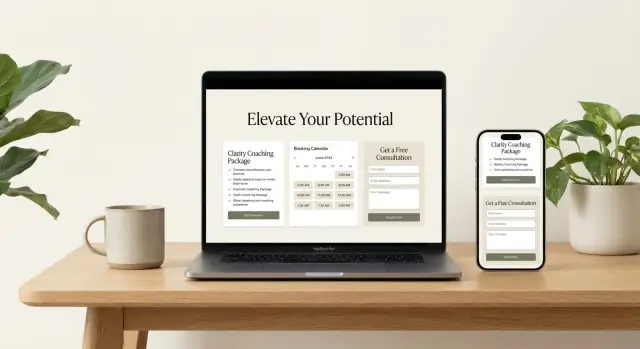
A package sales page should help someone decide quickly: “Is this for me, and what do I do next?” The best pages remove guesswork with clear naming, scannable sections, and repeated calls to action.
Use simple, outcome-based names and add a one-line promise under each. Think: “Career Clarity Intensive — leave with a 90‑day plan you can actually follow.” Avoid clever titles that require explanation.
Most visitors skim. A clean three-part structure works well:
Add “Best for” tags like “Best for first-time clients,” “Best for busy schedules,” or “Best for ongoing support.” This reduces back-and-forth and helps clients choose confidently.
Under each package, spell out what’s included in plain language—sessions, duration, support between calls, tools/templates, access to recordings, and any community elements. Then clearly list what’s excluded (e.g., “doesn’t include emergency support” or “doesn’t include done-for-you work”). Clarity here prevents refunds and resentment.
Place a small “Before you decide” section near the price to answer the questions people hesitate on:
Include CTA buttons after each package and again in a final “Ready?” section at the bottom. Match the CTA to the next step: “Buy the Intensive,” “Start the 3‑Month Program,” or “Book a Fit Call.” If you offer both, make one primary and the other secondary to avoid choice paralysis.
A coaching website shouldn’t rely on “Contact me” as the only option. Lead capture gives visitors a low-commitment way to raise their hand—so you can follow up, build trust, and guide them toward your paid packages.
The best lead magnets are a natural first step toward your core package. If your signature program is about career change, a “Career Clarity Checklist” fits better than a generic productivity PDF.
Good formats for coaches:
Match the lead magnet to the problem your package solves, and name it in plain language (outcome-first, not clever).
Every extra field costs sign-ups. Start with:
Add only one optional qualifying question if it helps you segment follow-ups (example: “What are you working on right now?”). If you need more details, collect them later—after trust is earned.
Don’t bury lead magnets on a busy homepage. Create one focused page per offer (e.g., /lead-magnet-career-clarity) with:
This also makes it easier to share on social, in your bio, or inside relevant blog posts.
A thank-you page is more than confirmation—it’s a moment of attention. After the download/signup, offer a logical next action:
Keep it one step. Don’t overwhelm.
Add lead magnet links to your navigation (e.g., “Free Resources”) and place contextual sign-up boxes inside key blog posts. When the topic and the opt-in match, conversions rise without needing more traffic.
Your booking flow should feel effortless for the right prospects—and politely filter out the wrong ones. A good calendar setup turns “Sounds great, how do I book?” into a confirmed time, with clear expectations and fewer missed calls.
Start by deciding what the call is for.
Whichever you choose, explain the purpose in one sentence on the scheduling page: “We’ll confirm fit, pick the right package, and decide next steps.”
Use a dedicated scheduling page (not just a tiny button buried on the homepage). It should show real availability, support time zones automatically, and make rescheduling straightforward.
Include:
A few questions help you prepare and reduce awkward calls. Keep them short and specific:
Right on the booking confirmation, spell out:
Finally, reduce no-shows with automated reminders: one email immediately, one 24 hours before, and one 1–2 hours before. If SMS is available, add it—especially for first-time calls.
If your checkout feels confusing, most people won’t “think it through”—they’ll leave. The goal is to make paying feel as straightforward as booking a haircut: clear price, clear deliverable, clear next step.
Different clients have different comfort levels with commitment and cash flow. Your checkout should support the way you actually sell.
Keep the options limited. Two choices is often enough: “Pay in full” and “Monthly plan.” Too many buttons create hesitation.
A high-converting coaching checkout is basically a clean receipt plus reassurance.
Include:
Avoid dumping your entire sales page into checkout. At this point, people are trying to complete a task.
Policies can reduce anxiety, but only if they’re real. If you can support them operationally, add short, plain-language notes on:
Link to a fuller policy page if needed, but don’t force a long read to pay.
At the point of payment, trust matters more than persuasion. Add:
Your confirmation email should reduce post-purchase uncertainty and prevent back-and-forth.
Include:
If you nail checkout clarity and the first email, you’ll see fewer refunds, fewer “what happens now?” messages, and more clients who arrive ready to start.
A smooth onboarding process is where you turn a “new buyer” into an engaged client. If people feel unsure about next steps, they delay, lose momentum, and sometimes ask for refunds. Your website should make the first week feel guided and simple.
Keep it tight and predictable:
If you offer multiple packages, create a dedicated “Start Here” page per package tier so instructions match what they purchased.
If you use a client agreement, make it easy to find and re-check. Link it from the welcome email and the client area (and keep it consistent with your /privacy page).
For resources, you don’t need a complicated portal. A simple client page with buttons like “Session Notes,” “Worksheets,” and “Recordings” works well—or a shared folder structure with clear naming (e.g., 01-Getting Started, 02-Exercises, 03-Recaps).
State your norms in plain language:
End every package with a brief results recap, a few “what changed” bullets, and a clear next option: renew, upgrade, or a maintenance plan. This closes the loop and keeps progress from fading after the last call.
Most visitors aren’t asking, “Is this coach good?” They’re asking, “Will this work for someone like me?” Trust builders answer that question quickly—especially on a coaching website where results can feel personal and hard to measure.
Collect testimonials with clear permission. A simple email is enough: what you’ll publish, where it will appear, and whether you’ll use their name/photo. If someone prefers privacy, use first name + industry (“Maya, HR Manager”) or “Client, NYC” rather than inventing details.
The most persuasive testimonials are specific. Encourage clients to share a short story:
Avoid exaggeration or “guaranteed” language. If results vary, let them vary—specific honesty converts better than big claims.
When you can share real context, case studies outperform generic praise because they show decision-making and tradeoffs. A good case study reads like a mini before-and-after:
If your coaching includes sensitive topics, consider anonymized case studies with clear disclosure: “Details changed for privacy.” Keep the core situation truthful.
A standalone testimonials page can help, but don’t make people hunt. Place social proof near key decision points:
Include certifications, licenses, press, podcasts, and logos only if they’re accurate and current. Link to the source when possible (e.g., a relative link to /about with details), and keep it relevant to your offer—trust builds fastest when proof supports the exact promise of the package.
SEO for a coaching website isn’t about chasing traffic—it’s about attracting the right people: those actively looking for help with the problems you solve and ready to consider paid support.
Start with a small set of themes that match what qualified prospects search when they’re close to taking action. These should mirror the outcomes your packages deliver, not just general inspiration.
For example, if you help with career confidence, your topics might include:
Keep it to 3–5 core topics so your site feels focused, not scattered.
A pillar page is the main “best answer” page for a specific offer. Build one strong page per package (or service area), then link to it from related blog posts.
Your pillar pages should clearly explain:
Then support each pillar page with a few blog posts that tackle related questions and objections, and link back to the pillar page naturally.
You don’t need advanced tactics to win early. The basics done well are enough for most coaching niches:
Write like you speak to clients—clear, specific, and practical.
Don’t make readers hunt for the next step. Add internal links from blog posts and informational pages to:
A simple line like “If you want help applying this, see my [package name] program” can do more than a pushy banner.
Every page should offer a low-friction next step in the footer: a short CTA to book, inquire, or view packages. This prevents “dead ends” where someone likes your content but doesn’t know how to reach you.
A good footer CTA can be as simple as: “Ready to talk? Book a call” linking to your booking page—or “Compare options” linking to /pricing.
If you can’t see what’s happening on your coaching website, you’ll end up “improving” things based on guesswork. A simple measurement setup helps you double down on what’s working and fix what’s quietly leaking leads.
Track the actions that matter to revenue, not vanity metrics.
If possible, pull these into one dashboard so you’re not bouncing between tools. Many coaches do fine with one analytics tool + their booking system + payment provider, as long as the key events are visible in one place.
Once a month, look at:
A quick rule: if a page gets traffic but doesn’t move people to the next step, it’s a candidate for improvement.
Keep tests focused and easy to implement. Good starting tests include:
Let the test run long enough to get meaningful results—avoid calling it after a day or two.
If you have access to heatmaps or session recordings, use them to find where visitors hesitate: repeated scrolling, rage clicks, abandoned forms, or people missing the booking button.
Add one question to your form or thank-you page: “What were you hoping to find today?” New leads will tell you what’s unclear, what they expected, and which words they use—fuel for better headlines and offers.
A coaching website can convert well and still create risk if it ignores privacy, consent, and accessibility. The good news: most “basics” are straightforward, and they also build trust.
If you collect any personal data (contact forms, newsletter signups, analytics, embedded calendars), publish a clear Privacy Policy and link it in the footer and near key forms. If your site uses cookies or tracking tools, add a cookie notice where required and make it easy for visitors to manage preferences.
Link to /privacy and (if applicable) /cookies so people can find the details without hunting.
If you’re doing email marketing, be explicit. Next to the signup checkbox, state what they’re subscribing to (“weekly tips,” “workshop invites,” etc.). Don’t pre-check consent boxes.
For some regions and email platforms, double opt-in is recommended or required—especially when you’re offering a lead magnet and want clean lists. It reduces spam complaints and improves deliverability.
Accessibility improves conversions for everyone. Focus on the essentials:
Also, keep error messages specific (“Please enter a valid email”) and place them near the field.
Don’t promise medical, financial, or guaranteed outcomes (“cure,” “heal,” “6-figures in 30 days”) unless you can substantiate them and you’re qualified to provide regulated services. Use responsible language: what you help with, your process, and the kinds of results clients often experience.
Add an easy way to contact you for support questions—email, a simple form, or a dedicated page like /contact. Include response times and what to do for urgent issues (even if that’s simply “this inbox isn’t monitored 24/7”).
Most coaches don’t fail because they lack ideas—they get stuck in slow implementation. If you want to launch or iterate quickly (new landing pages, package updates, thank-you pages, or simple client portals), a vibe-coding platform like Koder.ai can help you move from a chat-based plan to a working web app without the usual back-and-forth.
Koder.ai is especially useful when you want to:
The goal isn’t “more tech.” It’s getting to a clean, measurable funnel faster—so you can spend your time coaching, not wrestling with site rebuilds.
Choose the one action that most directly drives revenue right now, then make everything else secondary.
You can still include the other two—just don’t give them equal visual weight on the homepage.
Aim for a plain-English statement that answers three things in one breath:
Example: “I help first-time managers handle difficult conversations and lead calmly in 90 days.” If visitors can’t self-identify quickly, they won’t keep reading.
Start with the pages that do the “heavy lifting,” then expand only if it supports your primary CTA:
If your navigation feels crowded, remove pages that don’t move someone toward booking, opting in, or buying.
Use a simple, repeatable structure:
Keep “About” and “Blog” available, but don’t let them compete with the main CTA.
Keep it to 2–4 options so the decision feels obvious.
If you have variations, handle them as add-ons or during the call, not as 10 separate packages.
Make pricing easy to scan and hard to misunderstand:
A dedicated page like /pricing works best when you want a focused decision environment.
Choose a lead magnet that’s a natural first step toward your paid offer.
Good fits for coaching:
Keep the form short (name + email). Put the opt-in on a dedicated landing page, and use the thank-you page to offer one next step (like /book or /pricing).
Yes—if you’re clear about the purpose and set expectations.
Use 3–6 pre-call questions, list your reschedule policy, and send automated reminders (immediate, 24 hours, and 1–2 hours before).
Remove uncertainty at the moment of payment.
Your checkout should include:
Then send a confirmation email that starts onboarding (intake + scheduling link).
Start with a small, reliable measurement setup:
Track these outcomes:
Also cover the basics:
If you can’t measure the key actions and keep trust high, optimization won’t stick.