

Confirmation page after form submission: clear next steps
Use a confirmation page after form submission to confirm receipt, explain what happens next, and reduce “Did you get it?” follow-up messages.
What a confirmation page is really for
A confirmation page isn’t just a polite “thanks.” It’s proof the form worked and the next step is already in motion. When people don’t get that proof, they do what feels safe: they ask “Did you get it?” or they submit again.
Most follow-ups happen for three reasons: the page looks like a dead end, it doesn’t show what was captured, or it doesn’t explain what happens next. Even a short delay (or a slow email receipt) can create doubt, especially after a long form or one that asks for sensitive details.
A thank-you message is emotional. A real confirmation is practical. It answers: “Was my request received, and what should I do now?” The best pages do both, but they prioritize certainty.
Unclear timelines trigger extra emails and chats. If you say “We’ll be in touch soon,” users translate “soon” into their own schedule. When reality doesn’t match their guess, they reach out.
From the user’s point of view, “success” usually means they can clearly see the request was received, they know when and how you’ll respond, they know whether they need to do anything else, and they have a reference detail they can use later. If something went wrong, they also need a clear way to recover (edit, resubmit, or contact support).
Whether you’re coding by hand or building flows in a tool like Koder.ai, the goal is the same: remove doubt.
The must-have parts of a good confirmation page
A good confirmation page does two jobs: it proves the message arrived, and it tells the person what to do next. If either part is fuzzy, people refresh, submit again, or contact support to check.
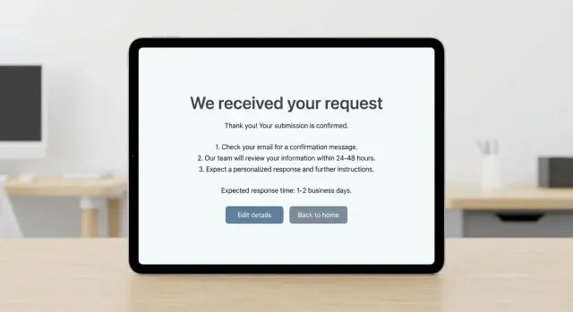
Start with a headline that says exactly what happened. “Thanks” is nice, but it’s not enough. Name the action: “We received your request” or “Your support ticket was submitted.” That one line prevents most of the uncertainty.
Then add a small, safe summary so people can confirm they sent the right thing. A reference number (ticket ID, request ID) is ideal. If you don’t have IDs, show a short summary like the subject, selected category, and the email address you’ll reply to. Avoid displaying sensitive details like full addresses, ID numbers, or private notes.
Keep the rest simple:
- What happens next (1-3 steps)
- A clear response-time window (best case and latest)
- One obvious next action (return, edit, view status, submit another)
Response time is where many pages fall apart. “We’ll get back to you soon” creates anxiety. Give a window people can plan around, like “within 1 business day” or “within 24-48 hours,” and add one short note if weekends or holidays affect it.
Write next steps people can act on
After submitting, users usually have one question first: “Did it go through?” Answer that plainly, then spell out what happens next, the timing, and what to do if it’s urgent.
Use language that matches the tone of your site. A few simple starters:
- “Thanks, we received your message. We’ll reply by email.”
- “Submission confirmed. Next: our team will review it.”
- “You’re all set. Check your inbox for a copy of your answers.”
Timelines reduce repeat messages only when they’re specific and realistic. Prefer a range and the unit people plan in (hours or business days). “Within 24 hours” sounds strong, but it backfires if you often miss it.
If you operate on business hours, say it directly: “We respond Monday to Friday. Messages sent after 5pm are handled the next business day.” That single line prevents weekend follow-ups.
Be clear about what’s automated vs. manual. If a confirmation email should arrive quickly, say when and what to do if it doesn’t (check spam, wait a few minutes, then try again or contact support). If review is manual, say so and define what “no response” means: “If you don’t hear back in 2 business days, reply to the confirmation email and we’ll take another look.”
Urgent cases need an escape hatch, but don’t hint at support you don’t actually provide. State the normal path, then offer the urgent option only if it’s real.
Reduce follow-up messages with smart details
Most “Did you get my message?” follow-ups happen because people feel unsure. A good confirmation page answers the next questions before they’re asked.
Add a tiny FAQ (only if it’s truly helpful)
A short FAQ works best when it’s specific to the form they just submitted. Keep it tight and write it like you’re replying to a real person:
- Didn’t get a confirmation email? Check spam, then wait a few minutes.
- Need to add details? Reply to the confirmation email to keep it in one thread.
- Submitted the wrong info? Send a new form and start with “Correction.”
Then add one clear follow-up rule: “If you don’t hear from us within 2 business days, contact support with your reference number.”
Set expectations for extra info, attachments, and delays
If you often need more context, say so. A simple prompt helps: “If you have screenshots, order numbers, or a short timeline, keep them handy. We may ask for them.”
If attachments aren’t accepted through the form, say it plainly and tell people what to do instead.
You can also name common delay reasons without sounding defensive: “Response times may be longer on weekends and public holidays.” Keep it to one sentence.
Design and accessibility basics that prevent confusion
Make the confirmation impossible to miss. Use a clear heading (“We received your request”), a simple success icon, and a success color cue (often green). Don’t rely on color alone.
Keep the page scannable. Put the essentials near the top: what happened, what happens next, and how long it usually takes.
Accessibility prevents quiet failures that look like “user impatience.” Use real headings so screen readers can jump to the main message. After submission, move keyboard focus to the confirmation heading so assistive tech announces the success state. If you show an on-page message (instead of a new page), announce it properly so it’s not silent.
On mobile, avoid tiny buttons and heavy text blocks. Make the primary next step thumb-friendly. If you include a reference number, make it easy to copy.
A quick sanity check:
- Can you spot the success message in 1 second?
- Does it still make sense with no color?
- Can you reach everything with a keyboard in a logical order?
- Is the main button easy to tap on a phone?
- Is the “what happens next” line visible without scrolling on common screens?
Step-by-step: build the confirmation flow
A confirmation flow is more than a “thanks” screen. It’s where you prevent repeat submissions and guide people to the next useful action.
Start by mapping what happens right after the click. Where do people expect to land, and what might they do next (close the tab, refresh, take a screenshot, forward it)? This helps you spot where confusion turns into follow-up messages.
Decide what to show without exposing sensitive details. A safe default is a short summary (name, subject, selected options) plus a reference number. Avoid showing full free-text messages if they might include private info. If you do show a preview, keep it short and consider masking.
Pick one primary action that matches the most common next task, and make it obvious. Add one secondary option for edge cases, like “Submit another request” or “Edit my details” (only if you truly support edits).
If you send an automated email or SMS, say so clearly on the page: who it comes from, when it should arrive, and what to do if it doesn’t.
Finally, test the messy realities:
- Success path: page loads fast, message is clear, primary action works
- Error path: errors are readable and don’t erase entered data
- Slow network: a progress state prevents double-clicking
- Double-submit: refresh/back doesn’t create duplicates
- Email/SMS delays: expectations match what actually happens
A realistic example: service inquiry form
Imagine a small services company with a simple inquiry form: name, email, phone (optional), company, and a short “What do you need help with?” message. Someone fills it out because they want pricing and a timeline.
Right after they click Submit, the confirmation should remove doubt and answer the next questions: “Did it work?”, “When will I hear back?”, and “What if I forgot something?”
Above the fold, show:
- “We received your request”
- “Thanks, Maya. Your inquiry was submitted successfully.”
- “Request ID: 48321 (saved in your email, too)”
- “We’ll reply within 1-2 business days.”
- One button: “Add details or fix a mistake”
Under that, include a short timeline:
“Next steps:
- We’ll review your message and match it to the right specialist.
- If we need one more detail, we’ll email you.
- You’ll get a reply within 1-2 business days with recommended options and a rough estimate.”
To reduce back-and-forth, add a “Quick check” block that repeats only the key info you captured (email, company, and a short preview of the message). If something looks wrong, the edit path should reopen the form with entries prefilled.
Outside business hours, adjust the timing message to match reality:
“Thanks, we got it. Our team is currently offline (Mon-Fri, 9am-6pm). Requests sent after hours are reviewed the next business day. You’ll hear back within 1-2 business days.”
Common mistakes that increase support load
Most follow-up emails aren’t about impatience. They happen because the confirmation page leaves gaps, and people try to fill them by asking support.
A confirmation page should answer three questions fast: Did it work? What happens next? What should I do now (if anything)? When it misses any of these, support pays the price.
Common patterns that trigger “just checking” messages:
- A page that only says “Thanks,” with no summary, destination, or next step
- No timeline, or a promise you can’t keep
- Surprise requirements after submission (create an account, verify email, extra steps not mentioned earlier)
- Sensitive details shown on-screen or exposed in the address bar
- No way to fix a typo or add missing info
To prevent this without adding friction, keep the page calm and specific. Use a realistic time window and define what “reply” means (email, phone, or both). If more steps are required, mention them before the form, not after.
If your tool supports it, add a clear “Need to update something?” path that uses a confirmation number and a safe way to add a note. Platforms like Koder.ai can also handle this by creating a small follow-up form tied to the original submission, instead of forcing the user to start over.
Privacy is part of UX. Show only what the person needs, and keep sensitive values out of URLs and shareable screenshots.
Quick checklist before you ship
Do a fast pass with real eyes, not just your own:
- Is the confirmation specific (not just “Thanks”) and does it say what was received?
- Are the next steps short and scannable (2-3 steps in plain words)?
- Is the response time stated clearly (“within 1 business day,” not “shortly”)?
- Is there one clear primary action (back to dashboard, book a time, submit another)?
- Is there a clear follow-up rule (and a reference number to include)?
Then reality-check on devices and accessibility:
- On mobile, is the key message visible without hunting?
- With a screen reader, does the main confirmation line announce clearly and does focus land on it?
- If there’s a reference number, is it labeled and easy to copy?
A simple test: ask someone to submit the form and answer, without scrolling, “Did it work?” and “What happens next?” If they hesitate, adjust the wording or layout.
Next steps: make it consistent and easy to maintain
Confirmation pages work best when they feel familiar. If every form ends with a different tone, different promises, and different timelines, people ask the same questions again and again.
Pick one improvement you can ship this week and apply it to your highest-traffic forms. Small changes add up quickly when they’re based on the real questions you keep seeing.
A few high-impact upgrades:
- Add a clear timeline (for example, “We reply within 1 business day”)
- Show a short submission summary (name, email, topic)
- Add one obvious next action (check email, save the reference number, return to dashboard)
- State “No need to submit again” when appropriate
Track follow-up rate: how many people resubmit, reply to the confirmation email with “Did you get it?”, or contact support to check. Review it weekly and update your copy based on the top questions.
To keep things maintainable, create one confirmation page template and reuse it. Keep the structure the same (headline, what happens next, timeline, one action), then swap only the form-specific details.
If you want to build or update forms and confirmation pages faster, Koder.ai can generate the UI and flow from a short chat and help you iterate safely using snapshots and rollback. That makes it easier to test wording changes, ship them, and undo them if they create new confusion.
Plan for ongoing updates, too. A simple routine (like weekly copy tweaks) keeps timelines and instructions from drifting out of date.
FAQ
What’s the real job of a confirmation page after a form submission?
A confirmation page should prove the submission worked and tell the user what happens next. A simple “Thanks” is nice, but it doesn’t reduce doubt unless it also confirms receipt and sets expectations.
What should I include on a good confirmation page?
Use a clear headline like “We received your request”, show a safe summary (such as the email you’ll reply to and the chosen topic), and include a realistic response-time window. Add one obvious next action so the page doesn’t feel like a dead end.
Do I really need a ticket ID or reference number?
A reference number gives users a concrete proof they can quote later, and it helps your team find the submission fast. If you can’t generate an ID, show a short summary that uniquely identifies the request without exposing private details.
How do I handle “I didn’t get the confirmation email”?
State when the email should arrive and what to do if it doesn’t, such as waiting a few minutes and checking spam. If delays happen sometimes, set that expectation on the page so people don’t resubmit or contact support immediately.
What’s the best way to write response-time expectations?
Give a specific window people can plan around, like “within 24–48 hours” or “within 1–2 business days”, and mention weekends if they affect replies. Avoid “soon” because users will invent their own deadline and follow up when it’s missed.
What information should I avoid showing on the confirmation page?
Show only what the user needs to confirm they submitted the right thing, like name, email, selected options, and maybe a short preview. Avoid displaying sensitive fields, long free-text messages, or anything a user might not want visible in a screenshot.
How do I stop people from submitting the form twice?
Prevent double submits by showing a clear progress state after the click and making success unmistakable once it completes. Also make sure refresh/back actions don’t create duplicates, or at least detect repeats and warn the user clearly.
What accessibility details matter most on confirmation pages?
Put the success message at the top with a real heading, and move keyboard focus to it so screen readers announce it. Don’t rely on color alone to signal success, and make the primary button easy to reach and tap on mobile.
How should I let users fix a mistake or add missing details?
Only offer an edit path if you can actually support it, and make it clear how corrections are handled. A common approach is letting users reply to the confirmation email with the reference number so the update stays tied to the original request.
How can Koder.ai help me build or improve a confirmation flow faster?
In Koder.ai, you can describe the confirmation page behavior in plain language and generate the UI and flow quickly, including the success message, safe summary, and response-time copy. If a wording change causes confusion, snapshots and rollback make it easy to test and revert without a long rebuild.