Dec 11, 2025·6 min
Consistent UI in React apps with design tokens and rules
Learn prompting for consistent UI in React apps using design tokens and component rules so AI generated screens match spacing, typography, and forms.
Learn prompting for consistent UI in React apps using design tokens and component rules so AI generated screens match spacing, typography, and forms.
UI inconsistency usually shows up in small details that feel off as you click around. One page has generous padding, another feels cramped. Headings jump between sizes, buttons change shape and color, and the same input behaves differently depending on the screen.
Most of the time, the drift comes from a few basics:
This is common when screens are generated from separate prompts. Each prompt is effectively a fresh start, so the model fills in missing decisions by guessing. Even “use modern styling” still leaves hundreds of tiny choices: 8px vs 12px gaps, 14px vs 16px body text, when to show errors, what a primary button looks like.
You can manually clean up two or three pages, but it doesn’t scale. You end up chasing one-off CSS tweaks, copying styles between files, and re-fixing forms. The rules are in your head, not in the project.
Picture generating a login screen today and a profile screen tomorrow. If one shows errors only on submit but the other shows errors on blur, users notice. If the primary button height changes between screens, the app feels stitched together.
Consistency becomes the default when every screen follows the same shared system: design tokens (spacing, type, color) plus a small set of component and form rules.
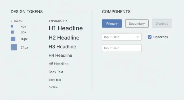
Design tokens are simple named values you reuse across the UI. Instead of asking for “comfortable padding” on every screen, you use a token like space-4. Instead of “slightly rounded,” you use radius-md. The name stays stable even if you later change what it maps to.
Tokens are the set of decisions you want every screen to share. They remove taste and guesswork, which is exactly what causes drift when you generate or build new pages.
Typical tokens cover spacing, typography, colors, shape, and a small amount of elevation. The win is practical: a header always uses the same size, a card always uses the same padding, and a primary button keeps the same color and radius.
Tokenize the things that affect the overall feel across the product: spacing scale, font sizes and line heights, core colors (text, background, primary, danger, border), and a small set of border radii.
Keep content-driven choices flexible, like copy length, which icon to use, or whether a section needs two or three cards.
When you generate screens (including with tools like Koder.ai), giving a small token set up front reduces the amount of guessing and makes the output noticeably more consistent.
A token set is just a short menu of allowed values. Smaller is better because it leaves less room for random choices, but it still needs to cover the basics that make screens feel off.
Start with spacing. Pick one scale and use it everywhere for padding, gaps, and layout. A set like 4, 8, 12, 16, 24, 32 covers most UI. If a design calls for 10px or 18px, round to the nearest token instead of introducing new numbers.
Then define typography defaults so headings and body text stop drifting. You don’t need a huge type system. You do need clear, repeatable steps.
A compact set that stays usable without getting bloated:
Accessibility belongs in the system too. Define a focus outline style (color, thickness, offset) so keyboard users get consistent focus states. Set a minimum tap target (like 44x44) for mobile. Limit text colors to a small, trusted set to keep contrast predictable.
If buttons sometimes look cramped, it’s often because one screen used padding 10 and another used 12. With tokens, you can say: “Buttons use paddingY=8, paddingX=16, radius=12, focus outline token, min height 44.” Once those numbers are fixed, the generator stops improvising.
Tokens set the numbers. Component rules set the habits.
Pick a small set of core components and treat them as the only building blocks for screens. Keep them boring and reusable: Button, Input, Select, Checkbox, Card. You can add TextArea and Modal, but they should follow the same system (labels, spacing, states).
Next, limit variants and define when they’re allowed. For example: Button has primary, secondary, and danger. Primary is for the main action on the screen (usually one). Secondary is for cancel or low-priority actions. Danger is only for destructive actions like delete. If the variant can’t be justified, default to secondary.
Spacing rules prevent subtle drift. Define defaults inside components: Button padding, Input height, label-to-field gap, the standard gap between stacked fields. Add a few layout rules too: Cards have fixed internal padding and consistent header/body spacing; Modals use the same width steps and footer alignment.
Finally, make states non-negotiable because this is where UIs often start to look random:
When you generate a form-heavy screen like “Create project,” these rules prevent mixed button sizes, shifting label positions, or a one-off “special” card that appears on only one page.
Even with stable visuals, many “this feels off” complaints come from form behavior. If each screen handles labels, errors, and focus differently, users experience it as inconsistency.
Pick one form pattern and use it everywhere: label, optional/required marker, helper text, then error text. Keep wording consistent too (for example, sentence case labels, short helper text, and error messages that start with a verb).
The rules that prevent most drift:
Lock in sizing and layout so screens don’t “breathe” differently. Define one input height, one button height, and a default field width. On desktop, align fields to a consistent grid and stack labels above inputs. On mobile, make fields full width and avoid two-column forms unless it’s truly necessary.
A simple example: a “Create project” screen might have Name, Region, and Description. Even if Region is a select, treat it like any other field: same height, same label position, same error line. If the user submits with an empty Name, focus moves to Name, the error appears under it, and the layout stays steady.
If you generate screens in Koder.ai, put these form rules in your prompt once and reuse them across features so every new form behaves the same without repeated cleanup.
Treat your prompt like a small UI contract. Keep it short, specific, and reusable so each new screen snaps to the same spacing, typography, components, and behaviors.
A practical pattern is to paste a compact UI spec at the top of your request, then describe the screen in plain language.
UI SPEC (apply to every screen)
Tokens:
- Spacing: 4, 8, 12, 16, 24, 32
- Radius: 8
- Typography: H1 24/32, H2 18/26, Body 14/20
- Colors: text, muted, bg, primary, danger (no custom hex)

Components (must use): PageShell, Section, Card, Button, Input, Select, TextArea, FormRow, HelperText, Toast

Layout rules:
- Page padding: 24 desktop, 16 mobile
- Section spacing: 24
- Card padding: 16
- Grid: 12 cols desktop, 4 cols mobile, gap 16

Do:
- Reuse components and tokens only
- Keep labels above inputs, helper text below

Do not:
- Invent new spacing values, font sizes, or one-off CSS
- Mix different button heights or input styles

If a new component is needed:
- Extend an existing component pattern and document it in the output
- Do not create new visual styles outside tokens
After the spec, add a few acceptance checks that catch drift early:
If you’re using a chat-based generator, keep this spec stable across requests. Changing it every time defeats the point.
Write the UI contract before generating anything: a small token set (spacing, type, colors, radius, shadows) plus a short component inventory (Button, Input, Select, Card, Modal, Table, Toast). If a token or component is missing, the model will invent one and your UI will drift.
Then create one reference screen that exercises the rules. A form-heavy page is a good stress test because it includes headers, helper text, validation errors, primary and secondary buttons, and a success toast. Treat that screen as the baseline.
From there, build new screens by composing what you already defined. Don’t ask for “fresh styling.” Ask for the same Card, the same spacing scale, the same typography steps, and the same field pattern.
A simple workflow:
If a “Search users” screen ends up with tighter spacing than the reference, don’t manually tweak margins. Update the spacing tokens or the Card padding rule once, then regenerate.
If you’re working in Koder.ai, snapshots and rollback can help here: lock a baseline, experiment safely, and revert quickly if a change starts introducing drift.
The fastest way to lose consistency is to treat tokens and rules like suggestions. Small exceptions multiply across new screens.
One common trap is changing the spacing scale mid-project. Early screens use 8, 16, 24. A new screen introduces 10 and 18 “because it looks right.” Now drift is allowed, and old screens never get updated.
Another drift source is letting the generator invent new component styles. If you don’t say “only these button variants exist,” it may create a new radius or a different input padding on one screen.
States are another frequent miss. Loading, empty, and error states often change spacing and behavior. If you tack them on at the end, you usually get rushed patterns that don’t match the rest.
Also watch for the wrong kind of specificity: “make it modern with soft shadows” is vague, while behavior rules like “errors show under the field,” “disabled buttons keep focus styles,” and “Enter submits only on the last field” are concrete and repeatable.
If you want a lightweight guardrail block to paste into prompts, keep it short:
Before you merge a generated screen, do a two-minute scan.
Start with spacing. Look for random values like 13px or one-off margins added “just to make it fit.” If you’re using tokens, every gap should come from the approved set, including gutters, card padding, and spacing between form fields.
Then check typography against your type scale. Headings should step down predictably. Body text shouldn’t switch sizes between similar sections. Line height matters too, especially on dense screens like settings pages.
Scan buttons next. Variants and sizes should follow your rules: primary for the main action, secondary for less important actions, danger only when it truly deletes. Button height, icon placement, and label style should match.
For forms, consistency is mostly about structure. Labels stay in one place, required indicators follow one rule, helper text and errors don’t compete, and errors appear in a consistent spot.
A short checklist:
Finally, do a quick mobile pass. Shrink the width and confirm the layout adapts without inventing new font sizes or spacing.
Imagine a simple onboarding flow: three screens (Profile, Preferences, Confirm), plus a Settings page later. You want each screen to feel like it came from the same designer, even if it was generated in separate runs.
Before generating anything, provide a small token set and a few component rules:
TOKENS
- spacing: xs=4, sm=8, md=12, lg=16, xl=24
- radius: sm=8, md=12
- type: body=14/20, title=20/28, label=12/16
- layout: pageMax=960, sectionGap=24, fieldGap=12

COMPONENT RULES
- Page: max width=pageMax, padding=xl, sectionGap between blocks
- Card: padding=lg, radius=md
- Field: label above, helper below, fieldGap between fields
- Button row: primary on right, gap=sm
- Errors: shown under field, same copy style, no alerts
Now generate “Profile” and “Preferences” separately. Because both screens must use Page, Card, Field, and Button row as defined, they land with the same margins, label spacing, and button placement. The Confirm step still fits, even though it has more read-only text.
Form behavior is where drift often sneaks in, so define it once and reuse it: submit disabled until valid, inline errors only after blur or submit, Enter submits only on the last step, and the Back button never clears already-entered values.
When you need a new UI piece, don’t let the model improvise. Add one rule, then regenerate with reuse in mind:
Turn tokens and rules into a reusable spec you actually use. If it’s too long to paste, it won’t get followed.
A practical spec usually includes: your token table (spacing, type, radii, colors), a short component rule set (buttons, inputs, cards, headings), form behavior rules (validation timing, errors, disabled/loading), layout defaults (page padding, max width, section spacing), and a short “never do this” list (random margins, ad-hoc font sizes).
Then make one habit: update the spec first, not individual pixels.
If you’re using Koder.ai (koder.ai), planning mode is a good place to restate and confirm the spec before generating UI. When you want to try alternatives, snapshots and rollback help you explore without losing a stable baseline.
Because each screen request is a fresh start. If you don’t provide a shared system, the generator fills in missing details by guessing—spacing, font sizes, button padding, shadows, and form behavior—so small differences pile up across pages.
Design tokens are named, reusable values for things like spacing, type sizes, colors, and radius.
Instead of “comfortable padding,” you use something like space-md. The name stays stable, and every screen reuses the same decisions so the UI stops drifting.
Start small and cover only what causes visible drift:
If you need a “new” value, round to the nearest token instead of inventing 10px or 18px.
Put a compact UI spec block at the top of every request and treat it like a contract:
Then describe the screen below it. The key is to keep the spec unchanged across screens.
Tokens define the numbers; component rules define the habits. Useful rules include:
Default rule: if a variant can’t be justified, fall back to the standard one.
Pick one pattern and never break it:
This avoids the common “one screen validates on blur, another only on submit” inconsistency users notice.
Define a few non-negotiable state rules:
If you don’t specify states, each screen tends to invent its own patterns.
Don’t let it improvise styling. Add it as a documented extension of an existing pattern:
If you can’t describe it with tokens, it’s usually too custom and will cause drift.
Create one “reference” screen that stresses the system (a form-heavy page works well), then reuse the same spec for every new screen.
In Koder.ai, you can use planning mode to restate and confirm the spec before generating, and use snapshots and rollback to keep a stable baseline while you experiment.
Use a quick scan before you accept the screen:
If something is off, update the spec/tokens and regenerate—don’t patch one-off margins.