Sep 25, 2025·8 min
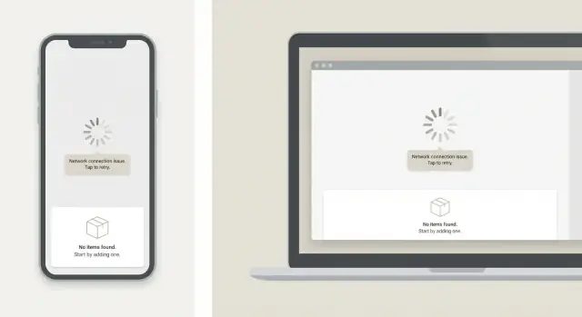
Consistent loading, error, and empty states across web and mobile
Learn a simple system for consistent loading, error, and empty states across web and mobile, so AI-generated UI stays coherent and needs less late polish.
Why these states get messy so quickly
Loading, error, and empty states are the screens (or small UI blocks) people see when the app is waiting, something failed, or there is simply nothing to show. They are normal: networks are slow, permissions get denied, and new accounts start with zero data.
They get messy because they’re usually added late and fast. Teams build the happy path first, then patch in a spinner, a red message, and a “no items” placeholder wherever the UI breaks. Do that across dozens of screens and you end up with a pile of one-offs.
Fast iteration makes it worse. When UI is produced quickly (including AI-generated UI), the main layout can appear in minutes, but these states are easy to skip. Each new screen ends up with a different spinner style, different wording (“Try again” vs “Retry”), and different button placement. The speed you gained up front turns into polish work right before launch.
Mismatched states confuse users and cost teams time. People can’t tell whether an empty list means “no results,” “not loaded yet,” or “you don’t have access.” QA has to test a long tail of tiny variations, and bugs slip through because behavior differs between web and mobile.
“Messy” often looks like this:
- Loading hides actions on one screen but not another.
- Errors sometimes block the page, sometimes appear as tiny text.
- Empty states use different tone, icons, and next steps.
- Web and mobile use different labels for the same action.
The goal is simple: one shared approach across web and mobile. If your team generates features quickly (for example, using a platform like Koder.ai), having a shared state pattern matters even more because every new screen starts coherent by default.
The 5 state types worth standardizing first
Most apps repeat the same pressure points: lists, detail pages, forms, dashboards. These are where spinners, banners, and “nothing here” messages multiply.
Start by naming and standardizing five state types:
- Initial loading: the first time a screen opens, before you have any data.
- Refreshing / updating: the screen already has data, but you’re fetching newer data.
- Empty baseline: there is truly nothing yet (new account, new workspace, no items created).
- Zero results: data exists, but filters or search return nothing.
- Error: requests fail, permissions block access, or something breaks.
Two special cases deserve their own rules because they behave differently:
- Offline: show cached content when possible and say “You’re offline” plainly.
- Slow network: avoid quick error flashes; after a short delay, switch to “Still loading…” (or similar).
Across screens and platforms, keep the structure consistent: where the state appears, the icon style, the tone, and the default actions (Retry, Refresh, Clear filters, Create). What can vary is the context: the screen name and a sentence that uses the user’s words.
Example: if you generate both a web list and a mobile list for “Projects,” they should share the same zero-results pattern. The action label can still match the platform (“Clear filters” vs “Reset”).
Build a tiny state kit instead of one-offs
If every screen invents its own spinner, error card, and empty message, you’ll end up with a dozen slightly different versions. The fastest fix is a tiny “state kit” that any feature can drop in.
Start with three reusable components that work everywhere: Loading, Error, and Empty. Keep them boring on purpose. They should be easy to recognize and not compete with the main UI.
Make the components predictable by defining a small set of inputs:
- Title (short and specific)
- Message (one or two sentences)
- Primary action label
- Primary action handler (retry, refresh, or next step)
- Optional details (error code, secondary action)
Then lock down the look. Decide once on spacing, typography, icon size, and button style, and treat it as a rule. When the icon size and button type stay the same, users stop noticing the state UI and start trusting it.
Keep variants limited so the kit doesn’t turn into a second design system. Three sizes usually cover it: small (inline), default (section), and full-page (blocking).
If you generate screens in Koder.ai, a simple instruction like “use the app StateKit for loading/error/empty with default variant” prevents drift. It also reduces late-cycle cleanup across React web and Flutter mobile.
Write state copy that stays consistent
Copy is part of the system, not decoration. Even when layout is consistent, ad hoc phrasing makes screens feel different.
Pick a shared voice: short, specific, calm. Say what happened in plain terms, then tell the user what to do next. Most screens only need one clear title, one short explanation, and one obvious action.
Use templates so teams stop improvising
A few message patterns cover most situations. Keep them short so they fit on small screens:
- Network: “Can’t connect” + “Check your internet and try again.” + Action: “Retry”
- Timeout: “Taking longer than expected” + “The request timed out.” + Action: “Try again”
- Permission: “Permission needed” + “Allow access to continue.” + Action: “Open settings”
- Not found: “Nothing here” + “This item may have been removed.” + Action: “Back”
- Validation: “Fix one thing” + “Add a valid email address.” + Action: “Save”
Avoid vague text like “Something went wrong” on its own. If you truly don’t know the cause, say what you do know and what the user can do now. “We couldn’t load your projects” is better than “Error.”
Make the next action predictable
Set one rule: every error and empty state offers a next step.
- If the user can recover, offer “Retry” or “Refresh.”
- If the state is empty because of filters, suggest “Clear filters.”
- If the user is blocked (permission), tell them exactly where to change it.
This matters even more with AI-generated UI, where screens appear fast. Templates keep copy consistent so you’re not rewriting dozens of one-off messages during final polish.
Make actions predictable: retry, refresh, and next steps
Build a StateKit fast
Generate a shared StateKit in Koder.ai so every new screen ships with consistent loading, empty, and error states.
When state screens suggest different actions from one page to the next, users hesitate. Teams then end up tweaking buttons and copy right before launch.
Decide what action belongs to each state, and keep the placement and label consistent. Most screens should have one primary action. If you add a second, it should support the main path, not compete with it.
A small action map that scales
Keep the allowed actions tight:
- Loading: usually no action (optionally “Cancel” for long, user-started tasks).
- Empty: “Create” when the user can add something; “Adjust filters” when filters caused the empty result.
- Error: “Retry” for temporary failures; “Refresh” for stale data; “Contact support” only for blocked workflows.
- Success with no data change: “Back” or “Done.”
Boring buttons are a feature. They make the UI familiar and help generated screens stay coherent.
Retry and error details rules
Show “Retry” only when retry can realistically work (timeouts, flaky network, 5xx). Add a short debounce so repeated taps don’t spam requests, and switch the button to a loading state while retrying.
After repeated failure, keep the same primary button and improve the secondary help (for example, a “Check connection” tip or “Try again later”). Avoid introducing new layouts just because something failed twice.
For error details, show a plain reason users can act on (“Your session expired. Sign in again.”). Hide technical details by default. If you need them, tuck them behind a consistent “Details” affordance across platforms.
Example: a “Projects” list fails to load on mobile. Both platforms show the same primary “Retry” action, disable it while retrying, and after two failures add a small connection hint instead of changing the entire button layout.
Roll out the system without slowing teams down
Treat state consistency like a small product change, not a redesign. Go incremental, and make adoption easy.
Start with a quick snapshot of what you already have. Don’t aim for perfection. Capture the common variations: spinners vs skeletons, full-page errors vs banners, “no results” screens with different tone.
A rollout plan that stays practical:
- Inventory 15 to 30 key screens across web and mobile and group the patterns you see most.
- Pick 3 to 4 canonical placements you’ll support first (full page, section, inline, toast).
- Build matching components for web and mobile that share the same props and names.
- Write short usage rules so new screens pick from the kit instead of inventing a new version.
- Replace one product area at a time (search, inbox, billing) so releases stay safe.
Once the components exist, the real time-saver is a short rule set that removes debate: when a state blocks the whole page vs only a card, and which actions must be present.
Keep the rules short:
- Every error shows one clear next step (retry, refresh, or contact support).
- Empty states offer one primary action (create, import, or explore).
- Loading states don’t jump layout when data arrives.
If you use an AI UI generator like Koder.ai, these rules pay off fast. You can prompt for “use the state kit components” and get screens that match your system on both React web and Flutter mobile with less cleanup.
Common mistakes that create late polish work
Late polish work usually happens because state handling was built as one-offs. A screen “works,” but the experience feels different every time something takes time, fails, or has no data.
Loading that feels stuck
Skeletons help, but leaving them on screen too long makes people think the app froze. A common cause is showing a full skeleton on a slow call with no signal that things are still moving.
Time-box it: after a short delay, switch to a lighter “Still loading…” message or show progress when you can.
Copy drift across screens
Teams often write a new message each time, even when the issue is the same. “Something went wrong,” “Unable to fetch,” and “Network error” may describe one case, but they feel inconsistent and make support harder.
Pick one label per error type and reuse it on web and mobile, with the same tone and level of detail.
Empty vs error vs not loaded yet
Another classic mistake is showing an empty state before data finishes loading, or showing “No items” when the real problem is a failed request. The user takes the wrong action (like adding content when they should retry).
Make the decision order explicit: loading first, then error if it failed, then empty only when you know the request succeeded.
Actions that are missing, or overloaded
An error with no recovery action creates dead ends. The opposite is also common: three buttons that compete for attention.
Keep it tight:
- For errors, default to one primary action (usually “Retry”).
- For empty states, offer one clear next step.
- Use secondary actions only when truly needed.
Visual mismatches between platforms
Small differences add up: icon styles, padding, button shapes. This is also where AI-generated UI can drift if prompts vary by screen.
Lock spacing, icon set, and layout for state components so each new screen inherits the same structure.
Practical rules for loading behavior and accessibility
Test states in production-like
Deploy your app and verify state behavior in a real environment, not just local mocks.
If you want consistent state handling across web and mobile, make the “boring” rules explicit. Most late polish happens because each screen invents its own loading behavior, timeouts, and labels.
Loading rules that feel fast (even when they’re not)
For a full page load, pick one default: skeletons for content-heavy screens (lists, cards, dashboards) and a spinner only for short waits where layout is unknown.
Add a timeout threshold so the UI doesn’t hang silently. If loading takes longer than about 8 to 10 seconds, switch to a clear message and a visible action like “Retry.”
For partial loads, don’t blank the screen. Keep existing content visible and show a small progress indicator near the section that’s updating (for example, a thin bar in the header or an inline spinner).
For cached data, prefer “stale but usable.” Show cached content immediately and add a subtle “Refreshing…” indicator so people understand why data may change.
Offline is its own state. Say it plainly, and say what still works. Example: “You’re offline. You can view saved projects, but syncing is paused.” Offer a single next step like “Try again” or “Open saved items.”
Accessibility basics you can apply everywhere
Keep these consistent across platforms:
- Focus order: move focus to the state message and primary action when the state appears.
- Screen reader labels: announce loading and errors with clear, short text.
- Tap targets: make buttons easy to hit on mobile, avoid tiny inline links.
- Motion: keep spinners subtle and don’t rely on animation alone.
- Color: never use color as the only signal (pair it with text and icons).
If you generate UI with a tool like Koder.ai, baking these rules into a shared state kit helps keep every new screen consistent by default.
Example: one feature, three states, two platforms
Imagine a simple CRM with a Contacts list screen and a Contact details screen. If you treat loading, error, and empty states as one-offs, web and mobile drift fast. A small system keeps things aligned even when UI is produced quickly.
First-time empty state (Contacts list): the user opens Contacts and sees nothing yet. On both web and mobile, the title stays the same (“Contacts”), the empty message explains why (“No contacts yet”), and one clear next step is offered (“Add your first contact”). If setup is required (like connecting an inbox or importing a CSV), the empty state points to that exact step.
Slow network loading: the user opens a Contact details page. Both platforms show a predictable skeleton layout that matches the final page structure (header, key fields, notes). The back button still works, the page title is visible, and you avoid random spinners in different places.
Server error: the details request fails. The same pattern appears on web and mobile: a short headline, one sentence, and a primary action (“Retry”). If retry fails again, offer a second option like “Go back to Contacts,” so the user isn’t stuck.
What stays consistent is simple:
- Placement: message in the content area, actions in one obvious spot.
- Copy: one tone, same button labels (Retry, Add contact).
- Behavior: same triggers for skeletons, same retry rules.
- Safety: disable duplicate actions while loading.
Quick checklist before you ship
Stop one-off spinners
Turn your state templates into real UI components and reuse them across lists, forms, and details.
A release can look “done” until someone hits a slow connection, a fresh account, or a flaky API. This checklist helps you spot last-mile gaps without turning QA into a scavenger hunt.
UI consistency checks
Start with list screens, because they multiply. Pick three common lists (search results, saved items, recent activity) and verify they all use the same empty-state structure: a clear title, one helpful sentence, and one primary action.
Make sure empty states never appear while data is still loading. If you flash “Nothing here yet” for a split second and then replace it with content, trust drops fast.
Check loading indicators for consistency: size, placement, and a sensible minimum duration so they don’t flicker. If web shows a top bar spinner but mobile shows a full-screen skeleton for the same screen, it feels like two different products.
Error and QA checks
Errors should always answer “what now?” Every error needs a next step: retry, refresh, change filters, sign in again, or contact support.
A quick pass before you mark the build ready:
- Empty states: same layout, icon style, and tone across list screens.
- Loading: never replaced by empty too early; indicators match across web and mobile.
- Errors: one clear next action on every error screen or toast.
- Copy rules: consistent wording patterns across platforms (titles, punctuation, button verbs).
- QA script: a short, repeatable set of steps that triggers loading, empty, and error states.
If you use an AI builder like Koder.ai, these checks matter even more because screens can be generated fast, but consistency still depends on a shared kit and shared copy rules.
Next steps: keep it consistent as the app grows
Consistency is easiest when it’s part of everyday work, not a one-time cleanup. Every new screen should use the same patterns without someone remembering to “make it match” at the end.
Make state behavior part of your definition of done. A screen isn’t finished until it has a loading state, an empty state (when applicable), and an error state with a clear action.
Keep the rules lightweight, but write them down. A short doc with a few screenshots and the exact copy patterns you want is usually enough. Treat new variants as exceptions. When someone proposes a new state design, ask whether it’s truly a new case or whether it fits the kit.
If you’re refactoring many screens, reduce risk by doing it in controlled steps: update one flow at a time, verify it on web and mobile, then continue. In Koder.ai, snapshots and rollback can make larger changes safer, and planning mode can help define the shared state kit so newly generated screens follow your defaults from day one.
A practical way to move this forward
Pick one area this week where state issues cause late fixes (often search results, onboarding, or an activity feed). Then:
- Add state requirements to the acceptance checklist for that area.
- Replace one-off states with your shared components.
- Record 2 to 3 examples (good and bad) in the doc.
- Do a quick cross-platform review (same meaning, same actions, similar layout).
- Track how many UI polish fixes you file next sprint and compare.
A concrete sign it’s working: fewer “small” tickets like “add retry,” “empty state looks weird,” or “loading spinner blocks the page.”
Keep ownership clear
Assign a single owner for state standards (a designer, a tech lead, or both). They don’t need to approve everything, but they should protect the kit from slowly splitting into new variants that look similar, behave differently, and cost time later.
FAQ
What state types should we standardize first?
Start by naming a small set of states you’ll use everywhere: initial loading, refreshing, empty baseline, zero results, and error. Add explicit rules for offline and slow network so they don’t get treated as random errors. Once the team agrees on names and triggers, the UI becomes predictable across screens and platforms.
How do we avoid dozens of one-off spinners and empty screens?
Build a tiny StateKit with three reusable pieces: Loading, Error, and Empty. Keep each one driven by the same inputs (title, short message, one primary action, and optional details) so any screen can drop it in without inventing new UI. Make the default variant the easiest to use so teams stop creating one-offs.
How do we stop empty states from showing before data is actually loaded?
Use a simple decision order: show loading until the request finishes, then show error if it failed, and only show empty after a successful response with no data. This prevents the common bug where “No items” flashes briefly before content appears. It also helps QA because the behavior is consistent everywhere.
What should the primary action be on loading, error, and empty states?
Pick one default action per state and reuse the same label and placement across screens. Errors usually get “Retry,” empty baselines get “Create” (or the next setup step), and zero results get “Clear filters.” When the primary action is predictable, users move faster and teams spend less time debating button wording.
How do we keep loading/error/empty copy consistent across the app?
Write copy in a shared template: a short title that names the situation, one sentence that explains it in plain language, and one clear next step. Prefer specific messages like “We couldn’t load your projects” over vague ones like “Something went wrong.” Keep the tone calm and consistent so web and mobile feel like one product.
What’s the right way to handle offline mode?
Treat offline as its own state, not a generic error. Show cached content if you have it, say “You’re offline” plainly, and explain what still works right now. Offer a single next step like “Try again” so the user isn’t stuck guessing.
How should we handle slow networks without making the app feel broken?
Avoid quick error flashes on slow connections by waiting briefly before changing the UI. If loading crosses a threshold, switch to a clear “Still loading…” style message and provide a visible action like “Retry.” This makes the app feel responsive even when the network isn’t.
Where should state UI appear: inline, section, or full-page?
Use three size variants: small inline (inside a card or section), default section, and full-page blocking. Define when each is allowed so teams don’t improvise per screen. Keeping the same spacing, icon style, and button style across variants is what makes the experience feel consistent.
What are the must-have accessibility rules for these states?
Bake in a few rules: move focus to the message and primary action when the state appears, announce loading and errors with clear labels, and ensure buttons are easy to tap. Don’t rely on color or animation alone to communicate status. If these are part of the StateKit, every new screen inherits them automatically.
How can we roll this out without slowing down feature delivery?
Roll it out in one product area at a time, starting with high-traffic lists and detail screens. Inventory what you have, choose a few canonical placements, then replace one-off states with the shared components as you touch each screen. If you generate UI in Koder.ai, add a standing instruction to use the StateKit by default so new screens don’t drift.