Dec 09, 2025·6 min
Constraint-driven product design: build less users value more
Constraint-driven product design helps teams build less and deliver more value. Learn practical scoping tactics for AI-built apps that stay small and repeatable.
Constraint-driven product design helps teams build less and deliver more value. Learn practical scoping tactics for AI-built apps that stay small and repeatable.
Most products don’t fail because they lack features. They fail because they feel busy: too many buttons, too many settings, too many side paths that don’t help someone finish the one thing they came for.
AI makes that problem worse because it makes overbuilding easy. When a chat-based builder can generate a dashboard, roles, notifications, analytics, and extra pages in minutes, it feels irresponsible not to add them. But speed doesn’t equal usefulness. It just means you can create clutter faster.
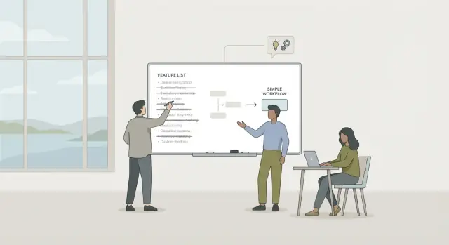
Constraint-driven product design is a simple counterweight. Decide what you will not build so the part you do build stays clear. “Build less” isn’t a slogan. In a real product, it looks like choosing one workflow, one audience, and one success moment, then cutting anything that doesn’t support that.
A good test is repeatable value: does this help someone get a result they need again and again, on a normal week?
Repeatable value often shows up in familiar rhythms. It helps with daily tasks (send, schedule, approve, reply), weekly routines (review, reconcile, plan, publish), or per-task friction (copying, formatting, chasing status). If the value is repeatable, users return without reminders. If it isn’t, they forget the app exists.
Small workflows beat big platforms because they’re easier to learn, easier to trust, and easier to keep calm. Even if you can build a full web app quickly, the winning move is usually to ship the smallest workflow someone can repeat, then expand only when that workflow is already loved.
Constraint-driven product design means treating limits as ingredients, not obstacles. You decide up front what the product will not be, so what you do build feels obvious, calm, and easy to repeat.
Jason Fried’s “calm software” idea fits here: software should earn attention, not demand it. That usually means fewer screens, fewer alerts, and fewer settings. When the app stays quiet unless it truly needs you, people trust it more and keep using it.
Constraints also reduce decision fatigue. The team stops debating endless options because the rules are clear. Users stop guessing because there are fewer paths and fewer “maybe this works” moments.
A practical set of constraints is specific. For example: one primary workflow (not three competing ones), one default way to do it with only a couple of choices, no notifications unless a user asks for them, and no advanced configuration until there’s proof it’s necessary.
The hardest part is the tradeoff: what you intentionally do not support (for now). Maybe you support “create and approve a request” but not “custom approval chains.” Maybe you support “track one project” but not “portfolio dashboards.” These aren’t forever no’s. They’re “not yet, because focus wins.”
A simple honesty check: can a brand-new user succeed in 10 minutes? If they need a walkthrough, a settings tour, or three choices before they can do anything, your constraints are too loose. Tighten the scope until the first win is fast, clear, and repeatable.
The fastest way to keep a product calm is to name one job the user is hiring it to do. Not a vague outcome like “be productive,” but a single, repeatable task that shows up often.
Pick one user type and one situation. “Small business owners” is still too broad. “A cafe owner, on a phone, between customers” is specific enough to design for. A clear context creates natural limits on features.
Define success in one sentence, with a number if you can. For example: “A support lead can turn 20 messy chat messages into a one-page summary in under 10 minutes.” If you can’t measure it, you can’t tell whether the app is helping or just adding work.
Then choose the first moment of value: the earliest point a user feels a win. It should happen in minutes, not days. In constraint-driven product design, that first win is your anchor. Everything else waits.
If you want to capture it on one page, keep it simple:
Finally, write a non-goals list. This isn’t pessimism. It’s protection. For that support-summary app, non-goals might include team permissions, custom dashboards, and a full CRM.
This step matters even more when AI can generate features instantly. “Just one more thing” is how calm tools turn into control panels.
Once you know the job, turn it into a small, repeatable sequence someone can finish without thinking too hard. This is where constraints become real: you limit the path on purpose so the product feels steady.
Name the workflow as simple verbs. If you can’t describe it in five steps, you’re either mixing multiple jobs or you don’t understand the job yet.
A useful pattern:
Then separate what’s essential from what’s optional. Essential steps happen every time for most users. Optional steps are extras you can add later without breaking the core loop. A common mistake is shipping optional steps first because they look impressive (templates, integrations, dashboards) while the basic loop is still shaky.
Cut steps that exist only for edge cases. Don’t design version one around the one customer who needs 12 approval stages. Handle the normal case well, then add escape hatches later, like a manual override or a single free-text field.
Also decide what the app should remember so users do less work next time. Keep it to a few things that reduce repeat effort: the last chosen output format, a short style preference, common inputs (company name, product names), and a default export destination.
Finally, make each step produce something the user can keep or share. If a step doesn’t create a real output, question why it exists.
Constraint-driven product design works best when you can turn a fuzzy idea into a tight, testable slice of work. This approach forces clarity before AI-generated code makes scope feel cheap.
Start by grounding everything in reality. Collect a few real inputs: screenshots of how people do it today, messy notes, sample files, or even a photo of a paper checklist. If you can’t find real inputs, you probably don’t understand the job yet.
Then run a short loop:
Make one “manual on purpose” decision: choose at least one part you won’t automate yet (imports, notifications, roles, analytics). Write it down. That’s your boundary.
Build a thin version, test with three real users, and cut again. Ask only: did they finish the job faster, with fewer mistakes, and would they use it next week? If not, remove features until the minimum lovable workflow is obvious.
A product feels calm when it makes fewer choices for the user, not more. The goal is a small surface area that stays understandable on day 2, not just day 200.
Treat defaults as real design work. Pick the most common, safest option and explain it where it matters. If the user should rarely change it, don’t turn it into a setting.
Anchor the app around one primary view that answers: “What should I do next?” If you need a second view, make it clearly secondary (history, details, receipts). More views usually mean more navigation and fewer returns.
Notifications are where “helpful” turns into noise. Stay quiet by default. Only interrupt when something is blocked, and prefer digests over constant pings.
Design for returning use, not first use. The first run is curiosity. The second and third runs are trust.
One quick check: write the “second time” path. Can someone open the app, see one obvious next step, finish in under a minute, and feel confident nothing else needs attention?
Microcopy should reduce decisions. Replace vague labels like “Submit” with “Save for later” or “Send to client.” After an action, say what happens next in plain words.
AI makes it easy to add “just one more” feature because models can generate screens, text, and logic fast. The fix isn’t avoiding AI. The fix is boundaries: let the model do the boring parts while you keep the important decisions and the product limits.
Start with one place where people lose time, but not judgment. Good targets are drafting, summarizing, formatting, and turning messy input into a clean first pass. Keep the decision in the user’s hands: what to send, what to save, what to ignore.
Keep AI outputs on a leash. Don’t ask for open-ended magic. Ask for a fixed format that matches the workflow, like: “Return 3 subject lines, 1 paragraph summary, and a 5-bullet action list.” Predictable templates are easier to trust and easier to edit.
To prevent scope creep, make every AI step end in a clear user action: approve and send, approve and save, edit and retry, archive, or do it manually.
Traceability matters when users come back later. Store the sources (notes, emails, form inputs) alongside the generated output so someone can understand why a result looks the way it does and fix it without guessing.
Heavy products usually start with good intentions. You add “one more thing” to help users, but the main path gets harder to see, harder to finish, and harder to repeat.
A classic trap is building a dashboard before the workflow works. Dashboards feel like progress, but they’re often a summary of work your product still doesn’t make easy. If a user can’t complete the core job in a few clean steps, charts and activity feeds become decoration.
Another weight gain comes from roles, permissions, and teams too early. It feels responsible to add “admin vs member” and approval chains, but it forces every screen and action to answer extra questions. Most early products need one owner and a simple share step.
Edge cases also steal attention. When you spend days handling the 3 percent path, the 97 percent path stays rough. Users experience that as friction, not thoroughness.
Settings are a sneaky way to turn “nice to have” into a requirement. Every toggle creates two worlds you now have to support forever. Add enough toggles and the product becomes a control panel.
Five warning signs your product is getting heavy:
A new feature can sound small in a meeting. It rarely stays small once it touches settings, permissions, onboarding, support, and edge cases. Before you add anything, ask: will this make the product calmer, or heavier?
Keep the check short:
If adding reactions, threads, and file sharing makes the first status update take longer, the new work isn’t helping the main job.
Constraint-driven product design isn’t about being cheap or lazy. It’s about protecting the smallest workflow people will repeat day after day because it stays fast, obvious, and dependable.
Picture a small ops team that sends weekly vendor status updates to leadership. Today it’s a messy thread: notes in chat, someone copies into a doc, a manager rewrites it, and the email goes out late.
A constraint-driven approach asks for one repeatable win: make the weekly update easy to produce, approve, and find later. Nothing else.
Keep the app focused on one loop that happens every week: collect short notes per vendor (one text box and a simple status), generate a clean draft update in the same structure every time, approve with one click and optional edits, send to a fixed list and save a copy, then archive by week so it’s searchable later.
If the team can do this in 10 minutes instead of 45, they’ll return next week.
Scope discipline shows up in what you skip: dashboards, deep analytics, complex integrations, complicated roles, custom report builders, and endless templates. You also avoid “nice to have” vendor profiles that quietly turn into a mini CRM.
The output is predictable, the cadence is fixed, and effort drops. People trust the app because it does the same job every week without surprises.
After launch, measure a few simple signals: completion rate (did the update get sent), time from first note to sent email, and edits per draft (are people rewriting everything or just polishing). If edits are high, tighten the structure and prompts, not the feature list.
Write a one-page scope doc today. Keep it plain and specific so you can say “no” without guilt tomorrow. Protect the smallest workflow that creates repeatable value.
Include four parts: the job (what the user wants done in one sitting), the minimum lovable workflow (the few steps that must work end to end), the outputs (what they walk away with), and non-goals (what you won’t build yet).
Then ship one workflow in 1 to 2 weeks. Not a platform. One flow a real person can use twice without you in the room.
After your first user test, do a cut-list review: what did nobody touch, what confused people, and what felt like work before the value showed up? Remove or hide those pieces before you add anything new.
If you’re building with a chat-based platform like Koder.ai (koder.ai), keep the constraints visible. Use its Planning Mode to lock the workflow and non-goals before generating anything, and lean on snapshots and rollback to cut safely as you iterate.
Start by naming one repeatable job the user hires the app to do, then cut everything that doesn’t support that job.
A good target is something people do weekly or daily (approve, reconcile, publish, summarize), where finishing the task creates an output they can keep or send.
Because AI makes it cheap to add screens, settings, roles, dashboards, and notifications—even when the core workflow isn’t proven.
The risk isn’t slow shipping; it’s shipping a confusing product that users try once and don’t return to.
Use the “repeatable value” test: Will this help someone get a result they need again next week, without you reminding them?
If the feature only helps in rare situations or mainly looks impressive in a demo, it’s probably not part of the first version.
Constraint-driven design means deciding up front what the product will not be, so what you do build stays obvious.
Practical constraints look like:
Aim for a first win in under 10 minutes for a brand-new user.
If they need a tour, a settings decision, or an onboarding guide before they can complete the main job, tighten scope until the first success is fast and clear.
Write the workflow as simple verbs. If it can’t fit in about five steps, you’re probably mixing multiple jobs.
A common minimum lovable sequence is:
Do a 1-page scope that forces decisions before code:
Add a short non-goals list to protect focus.
Keep AI on a “fixed format” leash. Ask for predictable outputs that match the workflow (for example: summary + action list + draft message).
Also make every AI step end in a user decision:
The most common early mistakes are:
If users ask “Where do I start?” you likely have too many paths.
Use Planning Mode to lock in:
Then generate only what supports that slice. Use snapshots and rollback to cut features safely when tests show they’re not helping the core loop.
If you need it later, expand after the main workflow is already loved.