Oct 09, 2025·8 min
Create a Simple Mobile App for Short Personal Updates
Learn how to plan, design, and build a mobile app for quick personal updates—text, voice, or photo—with reminders, search, and privacy basics.
Learn how to plan, design, and build a mobile app for quick personal updates—text, voice, or photo—with reminders, search, and privacy basics.
Before you think about features, get painfully clear on what problem your app solves in one sentence. A good goal for a personal update app sounds like: “Help me capture tiny moments without breaking my day.” If you can’t say it simply, the app will likely feel complicated to use.
“Short personal updates” can mean several things. Choose one primary use case and treat everything else as optional:
When you choose the main use case, you also choose what “done” looks like for each entry.
Your audience changes the whole design.
If it’s for one person, you can focus on speed, privacy, and offline reliability.
If it’s for family sharing, you’ll need identities, permissions, and a clear “who can see what” model.
If it’s for a private group, you’re closer to a communication tool, which can expand scope fast.
For an MVP, single-user is the simplest—and often the most useful—starting point.
Set a small number of success criteria you can actually test:
These become your product guardrails: if a feature slows entry or makes retrieval harder, it doesn’t belong in the first version.
Write down what you are not building yet. Common non-goals:
A focused MVP isn’t a “small app.” It’s an app with a clear promise that it keeps every time.
Before you draw screens or write code, define what a single “update” actually is. This one decision shapes everything else: the UI, the database, search, notifications, and even how people feel using the app.
A simple personal update app can support several lightweight formats. You don’t need all of them on day one—decide what your MVP treats as “first-class” updates.
Common options:
Shortness is a feature. Clear limits reduce decision fatigue and encourage frequent use.
Examples:
Make the limits visible in the UI (character counter, recording timer) so users don’t feel “cut off” unexpectedly.
Even tiny updates benefit from metadata that makes them searchable and meaningful:
Keep the model flexible, especially if you mix media types.
If you can describe an update in one sentence, you’re ready to design the rest of the app around it.
Your app will feel “simple” or “fiddly” mostly because of its flow. Before you write code, sketch how a person moves through the app when they’re tired, busy, or in a hurry.
Start with the shortest possible path:
Open app → record → save → view timeline.
If anything interrupts that path (extra menus, slow loading, multiple confirmation steps), the app won’t get used. Sketch this flow as a straight line first, then add optional branches (edit, delete, attach media, tag, share/export).
Keep the first version to a handful of screens that cover the entire experience:
As you sketch, label what’s visible by default versus hidden behind a secondary action. Default views should prioritize reading and adding.
The first minute decides whether someone trusts the app. Sketch a lightweight onboarding that answers two questions: “What can I do here?” and “Is my data safe?”
Include only essential prompts:
Avoid long intro slides. A single screen with a quick explanation and a “Start” button is often enough.
Pick navigation that matches your core flow:
When sketching, draw one “happy path” (add an update in under 10 seconds) and one “recovery path” (undo/delete/edit). If both look clean on paper, you’re set up for a smooth build.
Before you write code, decide where this personal update app will live and how you’ll build it. These choices affect cost, schedule, and how “right” the app feels on a phone.
You have three practical options:
A common approach is launch on one platform, learn what people actually use (text updates, voice notes, reminders), then expand.
Native (Swift for iOS, Kotlin for Android)
Cross-platform (one codebase for both)
For a micro journaling app MVP, cross-platform is often enough—especially if the main actions are “record, save, review.”
If you want to move even faster, a vibe-coding platform like Koder.ai can help you prototype the core flow via chat and generate a solid starting codebase (React for web, Go + PostgreSQL for backend, Flutter for mobile), with features like planning mode, snapshots/rollback, deployment, hosting, and source code export when you’re ready to own the repo.
Match your plan to your guide-level scope: define a small MVP you can build in 4–8 weeks, then reserve 2–4 weeks for testing, polish, and store submission. Keep the first release focused: quick entry, simple browsing/search, and basic backups—everything else can wait.
Storage decisions shape speed, reliability, privacy, and how hard it will be to add features later. For a personal update app, aim for simple, boring, and dependable.
A great MVP can work fully offline. Store each update in a small local database and treat the phone as the source of truth.
Options that stay reliable and straightforward:
Keep the “update” record compact: an ID, timestamp, text, optional mood/tags, and references to any media.
Photos and audio can bloat a database quickly. A common approach is:
For photos, compress before saving (for example, resize to a reasonable max dimension and use JPEG/HEIC compression). For audio, pick a sensible format and bitrate so voice notes remain clear without becoming huge.
Also plan for cleanup: if an update is deleted, delete its media files too.
Cloud sync is valuable, but it adds complexity: conflict resolution, account systems, encryption choices, and support burden.
A practical path is:
If you do add sync, design your data model now to support it later (stable IDs, updated-at timestamps, and a “deleted” marker instead of hard deletes).
Settings are usually best stored separately from the main updates database using simple key-value storage. Keep it to essentials:
With these choices, the app stays fast and private by default, while leaving room for sync when users actually ask for it.
Speed is your product here. If adding an update takes more than a few seconds to start, people will skip it. Design the recording screen so it feels “instant,” even if saving and syncing happen later.
Make the default action obvious: a large record (or type) button centered on the screen. Keep required input to the minimum—ideally just the content (text, audio, or photo). Everything else should be optional and tucked behind a small “More” drawer.
A good pattern is:
Micro journaling works when people don’t have to decide much. Add quick actions near the bottom as single taps:
Keep these actions editable after saving, so users can capture first and organize later.
Permissions can break flow if they appear too early. Request access at the moment it becomes relevant:
Use friendly, plain language explaining the benefit (“So you can record voice updates”) and provide a clear fallback (“Not now”).
Recording is vulnerable to real-world interruptions. Handle problems without losing the user’s trust:
The goal: no surprises, no lost entries, and a fast return to “ready to record.”
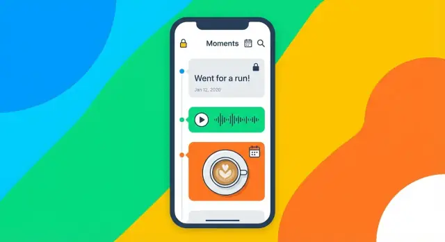
Recording a quick update is only half the value. The other half is being able to look back and answer questions like “When did I last feel like this?” or “What changed over the last month?” Your review experience should feel effortless, even when the user has hundreds of entries.
Start with one primary view, then add a secondary view only if it genuinely helps.
Whichever you choose, make each entry scannable: show the date/time, a short preview line, and small indicators for attachments (photo, voice, location) without overwhelming the screen.
Search is not a “power user” feature in journaling—it’s a relief valve when memory fails.
Include:
Keep it forgiving: users expect partial matches, typos to be tolerated, and results to update as they type.
Small tools go a long way:
Avoid forcing structure upfront. Let people add tags when it helps, not as a gate to saving.
Your empty state should feel calm and obvious: a short sentence explaining what the app is for, and one primary button like “Add your first update.” If you include examples, keep them subtle and dismissible. The goal is to get the first entry created in seconds, not to explain every feature.
Reminders are where a micro-journaling app either becomes a calm habit or an annoyance. The goal isn’t to “drive engagement”—it’s to help someone remember to capture a thought when it matters, without guilt or pressure.
Offer a few simple options rather than a complicated scheduler.
Make the default easy: one toggle for daily reminders, with an optional time picker.
Notifications can accidentally reveal sensitive information on a lock screen. A good rule is: never show the user’s actual update text in a notification unless they explicitly opt in.
Use neutral copy like:
If you want personalization, keep it non-sensitive (e.g., the app name or a generic prompt), and provide a clear setting: “Show notification previews.” Default it to off.
If the reminder is a moment of motivation, your app should meet it with speed.
Consider:
Keep quick entry consistent with your MVP: if the app is primarily text, open to text; if it’s a voice note app, open to record.
People resent reminders they can’t control. Add:
The best reminder system is one users can trust: it nudges, it respects privacy, and it never makes them feel behind.
A personal update app holds intimate details, so privacy can’t be an afterthought. Make clear choices early, write them down as product rules, and reflect them in the UI so people understand what’s happening with their data.
Start by deciding what “normal” looks like:
If you support sync, be explicit about what gets uploaded (text, tags, media, mood, location) and give granular toggles. Avoid surprise collection.
Many users will open the app in public spaces. Provide an app lock that works even if the phone is unlocked:
Also think through edge cases: what happens after a few failed attempts, after a reboot, or when biometrics aren’t available.
At minimum, protect data at rest. If you store entries in a local database, use OS-level secure storage for keys. For backups and sync, treat encryption as a core feature:
People should be able to leave without losing their history. Plan exports that are practical, not just “technically possible”:
Support import of your own formats so users can restore or move between devices. Include a preview and warnings before overwriting existing data.
Finally, present these controls in plain language: “Stored on this device,” “Backed up,” “Synced,” and “Exported.” Clarity builds trust.
Testing a personal update app is mostly about protecting the core loop: capture a thought quickly, trust that it saved, and find it later without friction. Treat every tap or delay as a reason someone will stop using the app.
Create a simple checklist you can run on every build, on at least two different devices (and ideally one older phone):
Add a timing note: how long does “record to saved” feel? Even half a second matters for micro journaling.
These are the moments that break trust if they fail:
Recruit a few people who didn’t watch you build it. Give them realistic tasks like “record a 10-second voice update” or “find what you noted last Tuesday.” Stay quiet and watch where they hesitate.
Write down:
Then make one or two changes and test again. Small iterations beat big redesigns.
Set up crash/error monitoring so you learn about failures before users complain. Add a simple feedback channel inside the app (e.g., “Send feedback” with a short form) and include basic context like app version and device type. Keep it optional and respectful—your goal is clarity, not surveillance.
Launching a personal update app isn’t only about getting approved in the app stores—it’s about setting expectations, learning quickly, and keeping the experience stable as phones and operating systems change.
Your store listing should make the value obvious: record fast, find later.
Prepare store assets that show the core loop clearly:
Write a clear privacy policy and describe data handling honestly. If you store content on-device only, say so. If you sync, explain what’s uploaded, whether it’s encrypted, and what happens if a user deletes an entry or closes their account.
Also decide how you’ll handle support requests related to privacy (export, deletion, lost device). Clear answers reduce churn and increase trust.
Plan phased rollout: beta testing, soft launch, then full release.
Track a small set of app health and usefulness signals: crash rate, time-to-first-update, and whether users return to add another update within a few days. Prefer aggregated, minimal analytics—especially for a journal-style product.
Create a maintenance plan: bug fixes, OS updates, and small feature iterations.
Set a cadence (monthly or quarterly) to review:
If you’re iterating quickly, tools like Koder.ai can also help you ship small improvements safely using planning mode, one-click deployments, and snapshots/rollback—useful when you want to move fast without risking the core loop.
Consistency beats big rewrites—especially for an app that holds personal memories. "}
Start with a one-sentence promise and an MVP you can test. Good MVP targets include:
If a feature slows capture or makes retrieval harder, keep it out of v1.
Pick one primary use case and treat everything else as optional. Common “main loops” are:
Choosing the main use case defines what “done” looks like for each entry.
Single-user is the simplest and often the most useful for an MVP: faster design decisions, fewer permissions/identity problems, and easier privacy.
Family or group sharing adds accounts, roles, permissions, and moderation-like edge cases—great later, risky early.
Make an “update” a small, consistent object. A practical starter definition is:
This single decision shapes your UI, storage, search, and reminders.
Limits reduce decision fatigue and encourage frequent use. Typical constraints:
Make limits visible (counter/timer) so users don’t feel surprised.
Keep the core flow a straight line:
Open app → record/type → save → view timeline.
Aim for 4–5 screens max in v1:
Ask only at the moment it’s needed:
Always offer a clear “Not now” path and a usable fallback (e.g., text-only if mic is denied).
Local-first keeps the app fast and reliable, especially for micro journaling.
If you plan sync later, use stable IDs and updatedAt timestamps now.
Keep reminders supportive and private:
For speed, let tapping a reminder open straight into the add-update screen.
Design privacy as product rules:
Use plain labels in settings: “Stored on this device,” “Backed up,” “Synced,” “Exported.”