Jul 24, 2025·8 min
How to Create a Customer Self‑Service Hub Website (Step‑by‑Step)
Learn how to plan, build, and launch a customer self‑service hub website with FAQs, a knowledge base, strong search, and analytics to reduce support load.
Learn how to plan, build, and launch a customer self‑service hub website with FAQs, a knowledge base, strong search, and analytics to reduce support load.
A customer self‑service hub is a single place where people can get answers and take actions without contacting support. Think of it as your support “front desk”: clear, searchable, and built around common customer goals.
A good hub usually combines three things:
Start with the issues that create the most friction:
If the hub can’t solve these reliably, adding more content won’t help.
A self‑service hub is not a dumping ground for every internal document, and it’s not a marketing page dressed up as support. It also shouldn’t force customers to read multiple articles before they can contact a human.
Pick a few simple metrics you can track over time: ticket reduction (deflection), time to answer, and CSAT for customers who used the hub.
Write for distinct groups:
A self‑service hub succeeds or fails based on whether it answers the questions customers actually ask. Before choosing features or writing new articles, spend a short sprint on research. The goal isn’t a perfect spreadsheet—it’s a clear, ranked list of problems to solve.
Most teams already maintain “shadow support content” across tools and file types. Gather it in one place so you can reuse and standardize it later.
Make a quick inventory of:
Tickets and chats are your best source of truth. Pull the top themes from the last 30–90 days:
If possible, tag each question with an example ticket link and a plain‑language “customer phrasing.” That phrasing later improves help center search and article titles.
Group questions by when they happen:
This keeps your knowledge base organized around customer intent, not internal teams.
Rank items using three signals:
Your first release should target the highest‑scoring issues to drive support ticket deflection quickly and build confidence in the support portal.
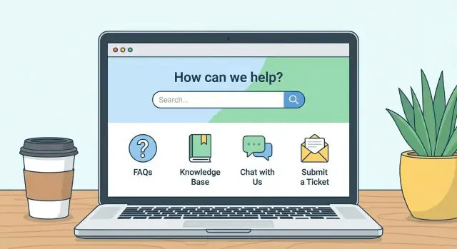
A customer self‑service hub isn’t one thing—it’s a set of components. The best mix depends on what your customers are trying to do without contacting support. Start small, choose features that reduce the most friction, then expand based on usage.
Most teams get value fastest from a few foundational pieces:
If you already have content scattered across docs, old FAQs, and onboarding emails, prioritize consolidation over creating everything from scratch.
Keep public content public whenever possible: setup guides, feature explanations, billing basics, and troubleshooting. Require sign‑in only for account‑specific actions and data, such as:
This split improves SEO for your help center website and reduces friction for new customers evaluating your product.
Even a great support portal won’t cover every case. Add clear next steps at the end of key articles:
Make escalation contextual (from the article) and set expectations (response times, required info).
For an MVP, ship: FAQ + knowledge base + help center search + contact. Add later: tutorials library, community, in‑product widgets, and deeper customer support automation once you’ve confirmed what actually drives deflection.
If you want to build and iterate on the hub quickly, a vibe‑coding platform like Koder.ai can help you prototype the hub UI (React), the backend workflows (Go), and a PostgreSQL knowledge base through a chat interface—useful when you want to ship an MVP, collect real search queries, then refine. Features like snapshots/rollback also make it safer to update navigation, templates, or forms without worrying about breaking production.
A self‑service hub succeeds or fails on how quickly people can find the right answer. The goal of information architecture (IA) is simple: help customers recognize where to go, even when they don’t know the “official” name of a feature.
Organize categories around what customers are trying to do (tasks), not how your company is structured (teams, departments, or internal product names). Customers rarely think in “Billing Ops” or “Platform Team”—they think “change my plan,” “reset my password,” or “connect an integration.”
If you already have a help center, scan it for categories that sound internal and rewrite them as outcomes or actions.
A practical pattern is a three‑level taxonomy:
Product area → task → article
For example: Integrations → Connect Slack → How to connect Slack to notifications. This keeps browsing predictable and prevents “misc” categories from growing forever.
Use tags as a secondary tool (filters and related content), not as your main navigation. Tags work best for cross‑cutting concepts like “mobile,” “security,” “admins,” or “troubleshooting.”
Create a clear “Start here” page that routes new customers to the first steps: setup, account basics, and key workflows. On the hub homepage, add shortcuts to your top tasks (based on ticket volume), such as “Update payment method” or “Invite teammates.”
If you offer different plans or roles, include small “I am a…” links that narrow the path (e.g., Admin vs. Member).
Duplicate categories confuse customers and split content maintenance. If two categories could both contain the same article, they’re not distinct enough—merge or rename.
Write category labels like buttons: short, concrete, and scannable. Avoid jargon, clever names, and overlapping terms (e.g., “Account,” “Profile,” “User Settings”) unless you clearly define what goes where.
A quick rule: if a new support agent can’t place an article within 5 seconds, your categories need simplification.
Good self‑service content isn’t “more content.” It’s content customers can scan, trust, and finish without opening a ticket.
Consistency reduces reading effort and makes articles easier to maintain. A simple template that works across products and topics:
If you have an internal style guide, link it from your hub’s contributor page (for example: /help-center/contribute).
Use short sentences and familiar words. Replace “authenticate” with “sign in,” “terminate” with “cancel,” and “utilize” with “use.”
For procedures, always use numbered steps. Keep each step to one action. If a step has options, use sub‑bullets.
Screenshots can help, but only when they clarify a decision (“click the blue Save button”) or confirm the correct page. Pair every screenshot reference with text so the article still works without it.
Most tickets happen when reality doesn’t match the happy path. Add a small section near the end:
Every article needs an owner (team or person) and a review date. Put it at the bottom so it’s visible to editors and prevents outdated instructions from quietly hurting trust.
If customers can’t find the right answer in seconds, they won’t keep browsing—they’ll open a ticket. Your help center’s search experience is often more important than its homepage.
Make the search bar the most visible element on key pages: the hub home, category pages, and article pages. A customer who lands deep from Google should still be one search away from the next answer.
Tip: keep the placeholder text action‑oriented (“Search for billing, login, refunds…”), and allow searching from the keyboard (Enter to search).
Customers rarely use your internal product terms. Build a small synonym list based on real tickets and chat logs: “invoice” vs “receipt,” “2FA” vs “authentication code,” “cancel” vs “close account.”
Also include common misspellings and spacing variations (“log in” vs “login”). Many help center platforms support synonyms directly; if not, add them naturally in summaries or FAQ callouts.
Search results depend heavily on structure. Use:
This improves both on‑site search and organic discovery.
Add a simple “Did this help?” control at the end of every article. If someone clicks “No,” offer a short prompt (“What were you trying to do?”) to capture keywords your search missed.
On each article, show 3–5 related articles based on the same intent (not just the same category). This keeps customers in self‑service and reduces support ticket deflection gaps.
Self‑service should reduce effort, not block customers. A good hub makes “contact support” easy to find, and even easier to complete—without forcing people to retype what they already did.
Place a consistent Contact support entry point on article pages and in the hub navigation. When someone clicks it, carry over helpful context such as:
This context speeds resolution and prevents “Can you send screenshots?” back‑and‑forth.
One generic form creates messy queues. Instead, offer a small set of issue types (billing, login, bug, feature request, data export, etc.) and tailor required fields per type.
For example, “Bug” can require steps to reproduce and timestamps, while “Billing” can require invoice number. Keep forms short, but specific.
Right before the final submit step, show 2–5 highly relevant articles based on the chosen issue type and keywords from the subject line. Don’t hide the form; make suggestions a helpful detour.
If you have a support portal, link it as a fallback (e.g., /support) and clearly explain what happens next.
Customers feel calmer when they know the rules:
A simple “You’ll hear back within X business hours” plus a checklist of needed info turns escalation into a predictable, trustworthy experience.
A self‑service hub only reduces support load if customers can scan, tap, and understand it quickly—on any device, in any situation.
Treat your homepage like a decision screen, not a brochure. Put the most common actions first:
Keep the first screen focused. If everything is highlighted, nothing is.
Many customers will arrive from email, social, or an in‑app webview. Design for thumbs and small screens:
If an article requires horizontal scrolling or tiny text, customers will abandon and open a ticket.
Standardize how information is presented across articles so customers don’t have to re‑learn your layout each time:
Consistency also helps your team publish faster with fewer formatting mistakes.
Accessibility improvements usually improve UX for everyone:
When in doubt, test a few key pages using only a keyboard and a phone on low brightness—you’ll spot friction quickly.
A self‑service hub is public‑facing support, which means it can accidentally become a public record of things you never intended to share: customer data, internal processes, or even security weaknesses. Treat your help center website like product content—owned, reviewed, and controlled.
Set clear permissions for editors, approvers, and viewers. Most teams work best with:
Keep an audit trail (who changed what, and when). If your platform supports it, require approval for changes to high‑risk areas like billing, account access, or security.
Make “privacy‑safe examples” a writing rule. Remove sensitive data from public pages and examples, including:
If you need to illustrate a workflow, use fake data that can’t be mistaken for real accounts.
Add a security/contact page and safe reporting method so researchers and customers know where to report issues. Include:
Link it from your footer and “Account & Security” category, e.g. /security.
Product updates can make articles wrong overnight. Plan versioning for product changes and legacy features by defining:
When in doubt, prefer fewer public details about internal controls while still giving customers actionable steps to stay safe.
A customer self‑service hub isn’t “set and forget.” Analytics tell you whether people are actually finding answers—and what to fix next. The goal is simple: reduce effort for customers and reduce repetitive tickets for your team.
Start with a small set of metrics you can act on:
Treat analytics like a recurring maintenance task, not a quarterly project.
Each week, review:
Make small edits fast (titles, first paragraph, steps, screenshots) and log what changed so you can see impact the following week.
After product changes, support volume often spikes before anyone updates documentation. A simple dashboard can highlight emerging issues within hours:
When you connect releases to self‑service metrics, the help center becomes part of your product feedback loop—not just a place to park FAQs.
Launching a self‑service hub is less about “finishing everything” and more about proving the core experience works: customers can find answers fast, and the right issues still reach your team.
Start with a controlled beta: a few internal teammates (support, sales, success) plus a handful of real customers. Give them realistic scenarios, not a tour. Ask them to narrate what they expect to happen, where they’d click next, and what wording feels unclear.
Keep a simple feedback channel (a form or a dedicated email) and capture three things for every report: what they tried to do, what they saw, and what they expected instead.
Pick the most common, highest‑impact journeys and test them like a customer would:
For each task, verify the full path: search → article → next step (link, button, or contact option). You’re looking for dead ends, circular links, or advice that doesn’t match the product UI.
Before you open it to everyone, check for:
Create a short launch checklist and assign owners. Include: who approves edits, how fast urgent fixes ship, and how often you review top articles. An MVP succeeds when updates are routine—not heroic.
If you’re building the hub as a standalone app (not just a hosted help center), it helps to choose tooling that supports quick iteration and safe releases. For example, Koder.ai supports deployment/hosting, custom domains, and source code export, which can be useful when you want to start lightweight (free/pro tiers) and later move to a more controlled setup (business/enterprise) without rebuilding from scratch.
A self‑service hub only pays off once customers can actually find it—and once your team uses it as the default way to answer repeat questions. Adoption is a mix of placement, habits, and feedback loops.
Don’t rely on a tiny “Help” link in the footer. Surface the hub in the moments customers need it:
If you have a marketing site, add the hub to your top navigation and link it from high‑intent pages like /pricing and your signup flow.
Adoption rises when support agents treat the hub as the source of truth. Train the team to:
Create a lightweight internal rule: if an answer is reused more than a few times, it becomes an article.
If you support multiple languages, decide what gets translated first (top traffic articles, onboarding flows, billing/security pages). Use consistent terminology and keep UI labels in sync so translated content matches what users see.
Add “Was this helpful?” prompts, make it easy to request an article update, and periodically share “top searched / no results” terms with the team. That closes the loop—and keeps customers coming back to the hub instead of opening a ticket.
A customer self‑service hub is a single place where customers can find answers and complete common tasks (like resetting a password or downloading an invoice) without contacting support.
It typically combines help content (FAQ/knowledge base), self‑serve actions (account/billing flows), and clear escalation paths when help is still needed.
Start with the problems that create the most friction and tickets:
If the hub can’t solve these reliably, adding more articles usually won’t improve outcomes.
A hub isn’t a dumping ground for internal docs or a marketing page disguised as support.
It also shouldn’t block customers from reaching a human—avoid forcing people to read multiple articles before they can contact support.
Do a short research sprint using real customer data:
A practical MVP is:
Add tutorials, community, in‑product widgets, and automation after you confirm what customers actually use.
Keep content public whenever it isn’t account‑specific (setup guides, billing basics, troubleshooting). Require sign‑in only for actions and private data, such as:
Organize around customer tasks, not internal teams. A simple taxonomy that stays scalable is:
Use tags as secondary filters (e.g., “admins,” “security,” “mobile”), and avoid duplicate or overlapping category labels that make articles hard to place.
Use a consistent template so articles are easy to scan and maintain:
Add a short “What to do if…” troubleshooting section near the end to prevent repeat contacts.
Make search highly visible on the hub home, category pages, and article pages. Improve findability by:
Track “no results” searches to spot missing content quickly.
Use simple metrics you can act on:
Run a weekly review loop to update titles, first paragraphs, steps, and missing articles based on what customers are doing now.