Apr 09, 2025·8 min
Create a Digital Product Website With Education-First Content
Step-by-step guide to build a digital product website that teaches first: messaging, structure, content plan, SEO basics, and conversion-focused pages.
Step-by-step guide to build a digital product website that teaches first: messaging, structure, content plan, SEO basics, and conversion-focused pages.
Before you write a single page, define what you’re actually selling and who it’s for. Education-first websites convert better when the content is built around a real “before → after” transformation—not a list of features.
Write a one-sentence definition a non-expert would understand:
Example: “A set of Notion templates delivered instantly that helps freelance designers run projects without missed deadlines.”
Clarify the situation your buyer is in right now and what they want to achieve.
This before/after becomes the backbone of your headlines, navigation labels, and tutorial topics.
Pick the single action your website should optimize for on first launch:
You can support secondary actions, but one goal should clearly “win” on the homepage and product pages. If you try to optimize for everything, your education content won’t have a clear next step.
List the top questions people ask before buying. If you don’t have customers yet, pull questions from support threads, competitors’ reviews, Reddit, YouTube comments, and sales calls.
Common categories:
Each question can become a tutorial, guide, or FAQ section that educates and gently leads toward your primary goal.
For your flagship guide (the one you’ll reference across the site), aim for ~3,000 words—long enough to teach, structured enough to skim.
Plan a timeline you can actually finish: for example, 1–2 weeks for outline + first draft, and another week for editing, screenshots/examples, and linking it from key pages.
Education-first messaging is less about “convincing” and more about making the product easy to understand. When visitors learn quickly, they trust you more—and buying becomes the natural next step.
Write a one-sentence value proposition a beginner could repeat to a friend. Avoid jargon and cleverness.
Example template:
“[Product] helps [who] achieve [outcome] by [how it works], without [common pain].”
People buy outcomes; features support them. Keep both, but don’t mix them.
A quick rule: if a sentence answers “So what?”, it’s a feature. Add the outcome right after.
Pick a small set of messages you’ll repeat across your homepage, product page, pricing page, and key tutorials. These should teach the buyer what matters.
Good key messages often include:
Collect the objections you hear (or expect): price, time, trust, complexity. Then answer them with specifics: a short explanation, an example, and a next step (like a tutorial or FAQ).
Write like you’re guiding someone through a decision. Replace hype with clarity: definitions, examples, trade-offs, and what to do next.
Education-first sites work best when visitors can quickly answer three questions: What is this? Is it for me? What should I do next? Your structure and navigation should guide those answers with minimal friction.
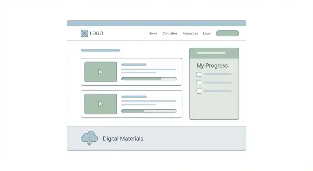
Start with a small, predictable set of pages that cover 90% of intent:
If you already have more pages, keep them—but make these the “spine” of your site.
Different visitors arrive with different levels of certainty. Design your navigation around these paths:
Create a single hub like /start-here or /learn that curates your best educational content in a recommended order. Think: “If you read only these 5 things, you’ll make a confident decision.” Link to it from the main menu.
If you want to ship this fast, consider building the initial site (Home, Product, Pricing, and /learn) as a single cohesive app first—then expand. For example, with Koder.ai, you can describe your sitemap and education flow in chat, generate a React-based front end with a Go + PostgreSQL backend when needed, and iterate safely using snapshots and rollback.
Each page should have one primary action:
Limit the top navigation to 4–6 items (e.g., Product, Pricing, Learn, FAQ, Contact). Put secondary links—terms, privacy, changelog, affiliate info—in the footer so the header stays focused on learning and decision-making.
An education-first site wins when your content answers the same questions buyers ask while they’re deciding: “Will this work for me?”, “How hard is setup?”, “What results can I expect?”, and “What if something breaks?” A simple strategy keeps you consistent and makes every piece of content point somewhere useful.
Choose pillars that mirror the journey from curiosity to confident purchase. Common pillars that work for most digital products:
Mix a few formats instead of forcing everything into blog posts:
Every pillar should reinforce one core product benefit and lead to one next step.
Example mapping:
Plan weekly or biweekly. Aim for one “pillar” piece per month (bigger guide) and 1–3 supporting pieces (tutorials, FAQs) that link back to it.
Before publishing, ensure each piece includes: a concrete example, numbered steps, the exact expected outcome, screenshots where helpful, internal links to relevant pages, and one honest CTA (trial, demo, or “read next”).
Tutorials don’t just “teach”—they remove buying friction. When readers can picture themselves succeeding (and copy your steps), your product feels safer, clearer, and easier to choose.
Keep every guide predictable:
Problem → Prerequisites → Steps → Examples → Next step
That pattern lets someone skim, decide it’s relevant, then follow it without surprises.
Add a 60–90 second section near the top:
Quick start: Do steps 2, 4, and 6 to get a working result. Then come back for best practices.
This helps busy buyers experience progress before they commit to “full learning.”
Write from a specific situation your customer recognizes. For example:
Scenario: “You sell a template pack and want customers to publish their first version today.”
Then provide sample outputs they can paste:
Launch checklist (copy/paste)
- Pick one goal for v1
- Customize the header + one core section
- Publish a draft URL
- Ask 3 people for feedback
- Fix top 2 issues and ship
Or include mini “before/after” snippets (a rewritten headline, a simplified onboarding email, a cleaned-up pricing explanation).
At the end of each guide, add 2–3 internal links:
This turns your content into a learning journey that naturally leads to product understanding.
Close each tutorial with a calm next step, not a hard sell:
If you want this done faster, see /pricing.
Built for people who want to [audience] and achieve [main outcome]—without guessing what to do next.
A good education-first homepage answers three questions in under a minute: What is this? Who is it for? Where do I start learning? If visitors need to scroll, click around, and decode your offer, they’ll leave before they trust you.
Keep the top of the page simple:
This makes “learn vs. buy” explicit, and it respects that many visitors aren’t ready to purchase yet.
A short step-by-step block reduces uncertainty and sets expectations. For example:
Keep each step to one line. Link steps 1–2 to /learn and steps 4–5 to /product and /pricing.
Right after “How it works,” showcase what people can learn today:
Then, introduce the product as the fast path to applying those lessons—avoid leading with feature lists.
Create a dedicated block (mid-page or just before the footer) that says what’s inside your education hub and where to begin:
This turns your homepage into a map, not a brochure.
A strong product page doesn’t just describe features—it helps visitors understand what they can do with your product, and it points them to the right learning resources so they feel confident buying.
Start with the real-world “job” someone is hiring your product for. This keeps the page practical and reduces vague claims.
For example:
Then connect each job to a specific outcome and the part of your product that supports it.
People hesitate when they can’t picture what they’re actually getting. Include a straightforward “What’s inside” block:
Be specific (numbers, file types, access length) and avoid overpromising results.
Include a short section that matches your education-first content topics. If your blog has tutorials on setup, workflows, or best practices, reflect the same categories here—so visitors see a learning path, not just a product pitch.
If helpful, link to 1–3 relevant guides (keep it selective), and make the product feel like the “next step” after learning.
Add screenshots, sample pages, short clips, or a simple diagram that shows how the product works. Caption each visual with what the visitor should notice.
Close the page with one primary action: Buy, Start trial, or View pricing. If pricing varies, point to /pricing so visitors can self-qualify quickly.
A pricing page is a decision page, not a puzzle. Education-first pricing helps people understand what they’re buying, what it will take to succeed, and whether it fits their situation—without pressure or vague promises.
If you can, offer one main plan. It reduces decision fatigue and keeps focus on outcomes. If you need multiple tiers, limit them and compare only what truly changes (support level, seats, advanced features). Keep the table short, and put the “what you actually get” details right below it.
For every plan, add two plain-language sentences:
This frames pricing as fit, not persuasion.
If your product has multiple tiers, name them in a way that teaches. For example, Koder.ai uses four tiers (Free, Pro, Business, Enterprise), which makes it easy to pair each plan with a “Best for” line and a simple success condition.
People hesitate when they can’t predict effort or value. Address the most common questions on the page:
If you offer guarantees, state the terms clearly and link to the full policy.
Place a short FAQ section below the plans. Prioritize:
When answers require more nuance, link out—without forcing people to hunt. Useful destinations include /faq, /support, and specific explainers like /blog/how-updates-work or /blog/choose-the-right-plan.
A clear pricing page doesn’t just improve conversions—it reduces refunds, mismatched expectations, and support load.
Trust is easier to earn when your site shows evidence instead of adjectives. Rather than claiming your product is “the best,” help visitors verify that it’s real, supported, and likely to work for their situation.
If you include testimonials or case studies, only publish what you can verify (real names, roles, company sites, or permission to share). If you can’t verify a quote, don’t use it—swap in something more concrete:
This keeps the tone grounded and avoids the “marketing voice” that makes people skeptical.
Add a small “Why we built this” or “Who it’s for” block that explains your background and approach:
Keep it specific and practical—two or three sentences can do the job.
A simple FAQ can remove the fear of buying the wrong thing. Include answers to:
If you already have these answers elsewhere, link to a single, skimmable FAQ section on the page.
Education-first trust is earned by letting people “try before they buy.” Add one or more:
The goal is to demonstrate the experience, not just describe features.
Some visitors need one human answer before they commit. Make it obvious how to reach you for pre-sales questions—link to /contact and mention what you can help with (fit, requirements, billing, onboarding).
Education-first content can rank and convert well—if you give it a clear topic focus and a simple way for people (and search engines) to navigate it.
Pick one primary keyword theme that matches the job your product helps people do (e.g., “digital product website” or “education-first content”). Then choose 5–10 supporting topics that a beginner would naturally look up on the way to buying: setup, comparisons, templates, common mistakes, and “how-to” workflows.
This keeps your /blog from becoming a random pile of posts and makes internal linking obvious.
Keep the on-page fundamentals simple and consistent:
Create a “Start Here” page that acts like a mini-course syllabus. Link to it from your header or footer, and route people to your best beginner guides and key pages like /pricing and /product.
Within educational posts, add small CTAs only where the product genuinely helps the step being taught:
Aim for one strong CTA per post, not five weak ones.
SEO is slow; distribution creates momentum. Build a repeatable plan:
Education-first sites get better over time—if you treat measurement as a learning loop, not a report card. Start with a few signals that tell you whether visitors are getting unstuck and moving forward.
Set up a simple analytics stack (even basic GA4 or Plausible is fine) and track a small set of key events:
Keep event names consistent so you can compare week to week.
For education-first content, “Did it help?” matters as much as “Did it rank?” Review these metrics monthly:
If a tutorial gets lots of entrances but few next-step clicks, your internal links and CTAs may be unclear.
Instead of big redesigns, do lightweight experiments:
Add a one-click prompt at the end of guides: “Was this helpful?” with an optional textbox. Review responses weekly and turn repeated questions into:
Create a short checklist you reuse for new pages: tracking added, internal links included, CTA tested, screenshots current, and “last updated” date set. After launch, schedule small updates (monthly) and a deeper refresh (quarterly) for your top 5 pages.
Start by defining one primary goal for v1 (e.g., Buy, Start trial, Email signup, or Book a demo) and make every core page support that action. Use education content to reduce uncertainty, then point to the next step with a single clear CTA.
Write a plain-language one-liner that a beginner can repeat:
Then validate it by checking whether it matches your buyer’s before → after transformation (not your feature list).
Define it in one sentence with three parts:
If a non-expert can’t tell what they’re getting, revise until they can.
Describe both states with specifics:
Use that language in headlines, navigation labels, and tutorial topics so the site feels like a guided path—not a brochure.
Start with a small, predictable spine:
Then add a or hub that curates your best content in order and links directly to and when readers are ready.
Build for three common journeys:
Make the next step obvious on each page with one primary CTA.
Turn real buyer questions into topics, especially:
Each piece should end with 2–3 internal links and one relevant CTA (e.g., “See /pricing”).
Use a consistent pattern:
Add a short Quick start near the top and include copy-ready outputs (checklists, scripts, templates) so readers can succeed fast and connect that success to your product.
Keep it clear and fair by minimizing decision fatigue:
Put a short FAQ directly below the plans and link to deeper policies like or .
Track both learning and decision signals:
If a post gets traffic but few next-step clicks, tighten internal links, clarify the CTA, or rewrite the intro to better match the reader’s question.