Apr 12, 2025·8 min
Create a Law Firm Website With Practice Areas and Contact Forms
Learn how to build a law firm website with clear practice area pages and secure contact forms, including structure, copy, SEO, and launch checklist.
Learn how to build a law firm website with clear practice area pages and secure contact forms, including structure, copy, SEO, and launch checklist.
Before you think about colors, fonts, or even which pages to build first, get clear on what the website is supposed to do for your firm. That decision shapes everything—from the practice areas you feature to the fields you put in your contact form.
Most law firm sites succeed when they prioritize a single action:
Choose your primary goal, then one secondary goal (for example, calls first, form submissions second). If you try to optimize for everything, you’ll usually optimize for nothing.
Write down who you’re trying to serve and what they care about. Typical groups include:
If your firm serves multiple client types, decide which one you want the homepage to speak to first.
Start with the practice areas that bring the best mix of revenue, volume, and fit for your team. You can always add more later, but early focus helps you:
Be specific and measurable. Common conversions include:
Assign one person to “own” updates (even if a vendor builds the site). Set a realistic timeline, a budget range, and a monthly plan for small improvements—because the firms that win treat the website as an active business tool, not a one-time project.
A clear structure helps visitors quickly answer two questions: “Do you handle my problem?” and “How do I talk to you?” Before writing copy or choosing design details, sketch a simple sitemap and decide what must be reachable in one or two clicks.
For most firms, a straightforward set of core pages works best:
Add “trust” pages that support decision-making without cluttering the main navigation:
Avoid internal jargon. Visitors shouldn’t need to decode menu items. Good, plain-language labels include:
If you serve multiple regions, consider a top-level “Locations” or “Areas We Serve” link—especially when local search matters.
Make it easy to reach you from every page:
On long pages (like practice areas), repeat the CTA mid-page and at the end so visitors don’t have to scroll back up.
Map the pages that reduce friction and pre-qualify leads:
Once this structure is set, it becomes much easier to build consistent practice area pages and contact flows without creating a confusing menu.
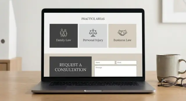
Practice area pages often decide whether a visitor contacts you or keeps searching. Treat them as “decision pages”: clear, specific, and easy to act on.
Create a main Practice Areas page that works like a directory. Keep it skimmable: short summaries (2–4 lines) for each service, plus a clear link to the full page. Add a simple “Talk to a lawyer” call-to-action that points to /contact.
Build one page per practice area and keep the layout consistent so visitors know where to look. A reliable structure also helps your team update pages over time.
Include these sections (in plain language headings):
Avoid heavy legal jargon. If you must use a legal term, define it in one sentence.
Place a call-to-action near the top and again after the process/FAQ section. Use specific, low-pressure wording like “Request a consultation” or “Ask a question.” If you offer multiple locations, add a “Serving” line with a link to your local pages.
Add internal links between related services and resources. For example, a “Car Accidents” page can link to “Personal Injury,” “Wrongful Death,” and a helpful guide in /blog/what-to-bring-to-a-consultation. This keeps visitors moving and signals relevance to search engines.
Your core pages do the heavy lifting: they answer “Can you help me?” and “Can I trust you?” without sounding salesy. Focus on clarity, specificity, and an approachable voice.
Start with a plain-language value proposition that matches your ideal client’s situation (not your résumé). Follow it with a short list of your top practice areas—linked to the relevant pages—so visitors can self-select quickly.
Add a “Why choose us” section with concrete differentiators (e.g., “Former prosecutor,” “Spanish-speaking team,” “Flat-fee options for X matters”). Include social proof where it’s verifiable: bar associations, memberships, and awards that can be checked. If you cite ratings or reviews, use the exact platform name and avoid cherry-picking or exaggeration.
Close each major block with a clear call to action (CTA) that sets the tone: “Request a consultation” or “Send a message,” not “Win your case.”
Bio pages should balance credentials with humanity. Include education, bar admissions, courts, and relevant experience. Add speaking engagements, publications, and community involvement if they’re current.
Write in a warm, direct voice that makes it easier to reach out (“You’ll work directly with…”). A simple headshot and a short “What clients can expect” paragraph often reduces anxiety.
Tell your firm’s story briefly, then spend more space on your service approach: how intake works, how you communicate, and typical timelines.
Set expectations without guarantees. Examples:
These pages should leave visitors feeling informed, respected, and confident enough to take the next step.
Your contact form is often the moment a visitor turns into a lead. For a law firm, it should feel simple, reassuring, and safe—without asking for unnecessary details.
Avoid one “catch-all” form if you serve different needs. Common options:
If you offer multiple practice areas, let visitors pick a practice area from a dropdown so you can route the request correctly.
Every extra field lowers submissions. In many cases, the essentials are enough:
If you need permission to contact someone (or you operate in jurisdictions with stricter consent rules), add a simple consent checkbox. Keep the wording plain, and link to your /privacy-policy.
Law firm forms attract bots. Use layered protection that stays mostly invisible:
Also limit file uploads (if enabled) by size and type, and scan uploads server-side.
After submission, show an on-page thank-you message that explains next steps (e.g., “We’ll respond within 1 business day”). An email receipt can reassure the person, but avoid including sensitive details in the email body.
Send notifications to a monitored inbox and, ideally, sync to your CRM or intake tool. Add a fallback if email fails: store submissions in your admin panel, log delivery status, and alert staff when messages bounce. If you use a third-party intake system, link it from /contact so users can still reach you if the form has an issue.
A law firm website should make it easy for people to reach you—without creating misunderstandings or unnecessary risk. A few small additions (placed in the right spots) can protect both the firm and potential clients while improving trust.
Add a plain-English disclaimer near your contact form and on your “Contact” page explaining that submitting a form or sending an email does not create an attorney-client relationship. Keep it short and visible (not hidden in a footer only). For example: “Do not send confidential information. An attorney-client relationship is not formed unless and until we confirm engagement in writing.”
This helps prevent accidental conflicts and makes it clear when representation actually starts.
Your initial lawyer contact form should focus on routing and basic screening—not gathering sensitive facts. Ask for essentials like name, contact details, practice area, and a brief non-confidential summary.
Also guide users on what not to include. A simple line above the message box such as “Please don’t include sensitive details (SSNs, account numbers, medical records)” reduces the chance you receive information you shouldn’t have before conflicts are checked.
If you collect personal data through forms, analytics, chat tools, or scheduling widgets, publish a Privacy Policy and link it from the footer sitewide. If you use cookies or tracking that requires notice/consent in your jurisdiction, include a cookie notice and ensure it matches what your tools actually do.
For credibility and clarity, include your office address, phone number, and hours (often in the header and footer). It reassures visitors they’re contacting a real, reachable firm.
Accessibility isn’t only a compliance issue—it directly affects conversion. At minimum:
These changes make your site easier for everyone, including users on mobile and people using assistive technology.
A law firm website should feel calm, clear, and easy to use—especially for someone who’s stressed and scanning on a phone. Good UX reduces friction and increases the chances a visitor actually reaches out.
Most prospective clients will land on your site from search on a phone. Design for small screens first:
Fast pages are a UX feature. Heavy animations and too many scripts can slow load times and hurt conversions.
Every key page should make the next step obvious. Use the same primary CTA wording sitewide—e.g., “Request a Consultation” or “Call Now”—and repeat it naturally:
Consistency lowers cognitive load. Create a standard layout for practice areas and FAQs so visitors instantly know where to find answers.
A good practice area pattern: overview → who it’s for → outcomes/benefits → process → FAQs → CTA.
Trust signals help, but too many can feel chaotic. Choose a few strong elements and place them thoughtfully:
The goal is a site that guides visitors confidently—without distractions—toward contacting you.
Great law firm SEO starts with matching how people actually search: “divorce lawyer near me,” “DUI attorney in Austin,” or “estate planning consultation.” Your site should make it easy for Google (and clients) to understand what you do and where you do it.
If you serve a specific city or region, connect your website to your Google Business Profile (GBP). Add a visible link to your GBP where appropriate (often in the footer or Contact page), and make sure your NAP—name, address, and phone number—matches everywhere: your website, GBP, directories, and social profiles.
Use a consistent format (including suite numbers, abbreviations, and phone formatting). Even small variations can weaken local signals.
Create one focused page per practice area. Avoid cramming multiple services onto a single page “for SEO.” A clean structure helps search engines understand relevance and helps clients self-select.
Write naturally using the terms clients use, and add a short FAQ section that answers real questions (fees, timelines, eligibility, what to bring). Helpful FAQs can earn more visibility and reduce unqualified inquiries.
Structured data can clarify your services and location. Common options:
LocalBusiness (or LegalService where appropriate)Attorney (for individual lawyer profiles)FAQPage (only for FAQs visible on the page){
"@context": "https://schema.org",
"@type": "LegalService",
"name": "Firm Name",
"telephone": "+1-555-555-5555",
"address": {
"@type": "PostalAddress",
"streetAddress": "123 Main St",
"addressLocality": "City",
"addressRegion": "ST",
"postalCode": "00000"
}
}
Create location pages only when you have a real office presence or a clearly defined service area you can support. Thin “City + practice area” pages can backfire; one strong page that matches your actual coverage usually performs better.
The best toolset is the one your firm can actually maintain. Start by deciding how much control you need, who will update the site, and how quickly you want to launch.
WordPress is a common choice for law firms because it’s flexible and you can add features like intake forms and SEO tools.
Website builders (like Squarespace, Wix, Webflow) can work well for smaller firms that want simplicity.
Custom development is best when you need a unique design, complex intake workflows, or strict integration requirements.
If you want the speed of a builder but the flexibility of custom development, a vibe-coding platform like Koder.ai can be a practical middle path: you describe the pages and intake workflow in a chat interface, iterate quickly, and still keep control via source code export. This is especially useful when your site needs more than brochure pages—e.g., structured consultation requests, admin views for submissions, or multi-location routing—without waiting weeks for every change.
No matter the platform, prioritize basics that protect client inquiries:
If you’re building something custom (or semi-custom), look for workflow features that reduce operational risk—such as snapshots and rollback—so you can revert quickly if an update breaks a form. (Koder.ai includes snapshots/rollback and supports deployment/hosting, which can make iterative improvements safer.)
Set up GA4 or a privacy-friendly alternative. Track the outcomes that matter:
Integrate sparingly to keep the site fast and reliable. Common options:
Decide upfront who edits pages, who approves legal website copywriting, and how changes are documented. A simple workflow (editor → attorney approval → publish) plus a small change log prevents outdated practice area pages and inconsistent contact details.
Before launch, make sure the “supporting” pieces of your site are in place. These pages don’t win cases, but they do reduce friction, build confidence, and keep your intake process organized.
At minimum, publish and link these pages in your footer (and keep them easy to find):
Make sure your privacy language matches what your forms actually do (file uploads, cookies/analytics, CRM integrations, etc.).
Use a domain-based inbox (e.g., [email protected]) rather than a free address. Configure SPF/DKIM for deliverability, then add routing rules so new inquiries trigger a backup (e.g., forward to a secondary inbox or create an internal notification). If more than one person handles intake, use role-based addresses like intake@ and referrals@.
You don’t need a massive blog—start with a small, repeatable plan: one FAQ-style post per practice area per month. Add internal links from practice pages to helpful resources, for example: /blog/how-to-choose-a-personal-injury-lawyer.
Set a cadence for updates that signal credibility and freshness: new verdicts/settlements (where appropriate), short articles, refreshed attorney bios, and expanding FAQs based on real intake calls.
A law firm website launch is less about “going live” and more about verifying that visitors can find you, trust you, and contact you without friction. Run a short quality assurance pass before (and right after) launch so you don’t discover problems when a prospective client is already trying to reach you.
Confirm the basics that protect client inquiries and keep the site stable:
Small issues can quietly kill conversions:
Make it easy to take the next step:
Before you invite traffic, verify search engines can read the site:
Do a soft launch to a small internal group first (staff, trusted colleagues). Fix issues, then fully launch and submit your sitemap in your search tools.
A law firm website isn’t “done” after launch. The best-performing sites treat measurement as part of client service: you learn what helps people reach you quickly—and remove what slows them down.
Start with a simple dashboard that answers: Which practice areas generate consultations? Track:
If you use Google Analytics, also track key events: phone clicks, form submissions, and “thank you” page views.
Call tracking can show which channels drive calls, but keep it client-friendly:
Review where people abandon your contact form. Common fixes:
Test one element at a time: CTA text, the hero message on a practice area page, or a trust block (bar admissions, reviews, case types handled). Keep tests running long enough to collect meaningful data.
Each month: update plugins/themes, review security alerts, check broken links, and refresh key pages with new FAQs or recent outcomes (when permitted). A small, consistent routine prevents slow creep in performance and risk.
If you’re making frequent improvements—new practice areas, revised intake questions, additional locations—consider a workflow that makes iteration cheap and reversible. Tools like Koder.ai are built for that style of continuous website improvement: you can plan changes, generate updates through chat, and roll back quickly if something impacts conversions.
Pick one primary action you want most visitors to take (usually phone calls or consultation requests), then one secondary action (like form submissions or lead screening). Make every major page support that goal with a consistent CTA (e.g., “Request a Consultation”) and remove distractions that don’t help someone take the next step.
Use a practical core set of pages:
Add supporting “trust” pages like Reviews/Testimonials, Credentials, and Bar Admissions if they help decision-making without cluttering navigation.
Use plain-language labels that match how non-lawyers think and search. Examples:
Keep the menu short and make key pages reachable in 1–2 clicks.
Create a Practice Areas hub that lists services like a directory (2–4 lines each + links). Then build one focused page per practice area using a consistent template:
Add a CTA near the top and again later so visitors don’t have to hunt for /contact.
Treat the homepage like a “first 10 seconds” page:
The goal is clarity and comfort, not a résumé dump.
Collect only what you need to route and respond:
Add a clear note telling people not to send confidential details, plus a disclaimer that submitting the form does not create an attorney-client relationship. Link to near the form if you collect personal data.
Use layered protection that’s mostly invisible to real users:
If you allow uploads, restrict file size/types and scan files server-side. Also store submissions in an admin panel or database as a backup in case email delivery fails.
At a minimum:
These steps reduce risk and improve user confidence.
Track actions that match your goals:
Set these up as events in analytics (e.g., GA4). Also report leads by practice area so you can see which pages actually generate consultations.
Run a short pre-launch QA:
A soft launch to staff first helps catch issues before prospects do.