Sep 16, 2025·8 min
How to Create a Medical Practice Website With Appointment Requests
Step-by-step guide to build a medical practice website with appointment requests, clear services, trust elements, and secure workflows that fit your clinic.
Step-by-step guide to build a medical practice website with appointment requests, clear services, trust elements, and secure workflows that fit your clinic.
Before you pick a platform or design a homepage, get specific about what you want the website to do. “Get more patients” is a start, but the best medical practice websites translate a clear goal into a simple patient action.
Decide which of these outcomes you’re optimizing for:
Your choice affects everything: button wording, what fields you collect, and how quickly you need to respond.
Different specialties have different “must-haves.” A few common examples:
Be honest about internal capacity. Will updates be handled by a front office manager, an agency, or an in-house admin? This determines how simple editing needs to be, who owns logins, and how quickly you can post updates (hours, closures, new services).
Choose a few measurable signals:
With goals, requirements, ownership, and metrics defined, every next decision becomes easier—and your site is more likely to convert real patients, not just visitors.
Your platform choice affects how quickly you can publish, how easily staff can update pages, and how reliably you can handle online appointment requests.
Most practices do well with one of these options:
Choose based on who will maintain it. If your office manager will edit hours and bios, prioritize simplicity.
If you want the flexibility of a custom build without a traditional months-long dev cycle, a vibe-coding approach can be a practical middle ground. For example, Koder.ai lets teams create web apps through a chat interface, which can be useful for building a tailored appointment-request workflow, internal routing rules, or a lightweight admin dashboard—while still keeping the option to export source code and deploy on your preferred infrastructure.
Register the domain (e.g., YourClinicName.com) and set renewals so the practice owns the account—not a vendor or a departing staff member. Do the same for hosting, email, and any form/scheduling tools. Keep logins in a shared, secure credential manager.
If you use WordPress, pick reputable managed hosting with daily backups and easy SSL setup. Builders typically include hosting.
Pick a theme that supports:
Before committing, test the form on your phone.
Start with essentials: secure form delivery to staff email, a shared inbox, and confirmations. Add others only if they simplify workflow—CRM for lead tracking, scheduling software for time slots, or EHR connections when there’s a clear operational need (and vendor support).
A medical practice website should feel simple: patients arrive with a question, and you guide them to the next step in one or two clicks. Before writing copy or choosing colors, sketch the pages you need and how patients will move between them.
Most practices can start with a lean set of pages:
If you already use a patient portal, include a clear, persistent link (e.g., /patient-portal).
Create paths for common needs:
Each journey should have a clear end point: request, call, or get directions.
Add “Request an Appointment” buttons near:
Keep navigation short and consistent (ideally 5–7 items). Use the same labels everywhere—patients shouldn’t have to re-learn your menu as they move through the site.
Your website copy should answer the questions patients are already asking—quickly, clearly, and without sounding like a legal document or a medical journal. The goal isn’t to impress with terminology; it’s to help someone feel confident enough to request an appointment.
Most patients scan before they read. Use clear headings that match how people describe their concerns, and then explain what you offer in everyday terms.
For example, structure key pages around:
Avoid medical guarantees. Instead of “We cure X,” focus on what you do and what patients can expect: evaluation, treatment options, timelines that vary, and how you support follow-up care.
Provider bios are often the most-visited pages on a medical practice website. A strong bio builds trust by combining credentials with warmth.
Include:
If you have multiple clinicians, add a simple “Who should I book with?” paragraph to help patients choose without guessing.
Trust is also logistical. Patients want to know you’re easy to find, reachable, and prepared for their needs.
Add (and keep updated): hours, phone number, location details, parking/transit notes, accessibility information, languages spoken, and typical response times for online appointment requests.
A simple “Before your visit” section can reduce anxiety and improve patient lead capture by clarifying what to bring (ID, insurance card if applicable, current meds list) and what happens after submitting the appointment request form.
Aim for short sentences, active voice, and one idea per paragraph. Use supportive, respectful language (“you may,” “many patients,” “we’ll discuss options”) and avoid fear-based messaging.
If you want a quick quality check: ask a non-clinician to read your top pages (Home, Services, About, Appointment Request) and tell you what your practice does, who it’s for, and how to book—without prompting.
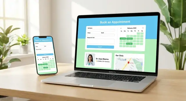
Your appointment request form is where interested patients decide whether booking with you feels easy—or stressful. The goal is to remove friction, set expectations, and collect just enough information for your team to respond quickly.
For most practices, a two-step approach works best: start with a short request form, then gather more details after your staff confirms availability.
This keeps the website form fast, which typically increases completion rates—especially on mobile.
Aim for the minimum information required to contact the patient and match them to the right appointment type:
Avoid requesting sensitive medical details unless there’s a clear operational need. If you include a “reason for visit,” keep it optional and encourage brevity.
Include clear checkboxes so patients understand what happens after they submit:
Keep the language simple and visible near the submit button.
Use friendly, specific error messages (e.g., “Please enter a valid phone number”) and keep required fields to a minimum.
After submission, show a confirmation page that answers the patient’s immediate questions:
Not everyone will want to submit a form. Provide a clear call option (tap-to-call on mobile) and, when appropriate, add brief safety guidance such as: “If this is an emergency, call 911 or go to the nearest emergency room.”
Adding scheduling isn’t just a website feature—it’s an operational decision. Pick the option that matches how your front desk works today, then document exactly what happens after a patient clicks “Request.”
This approach uses an appointment request form that collects the basics (name, phone, preferred times) and sends it to your team for confirmation. It’s ideal if you triage requests, verify insurance, or coordinate multiple providers.
Keep the promise clear on the page: “Submit a request and our team will contact you to confirm.” Avoid wording that implies a guaranteed appointment.
If your practice already uses online scheduling, you can embed a widget or integrate via API so patients can pick real-time openings. This reduces phone time and can increase completed bookings, but it requires clean schedules, visit-type rules, and staff buy-in.
Even simple routing saves time. Decide how requests are categorized and where they go based on:
Set up immediate email/SMS confirmations that acknowledge receipt without including sensitive details. Then document the workflow: who monitors requests, expected response time (for example, within 1 business hour), and template replies for common outcomes (confirmed, needs info, redirected, emergency symptoms). A shared inbox or ticketing view helps ensure nothing gets missed.
Patients will only use your online appointment request option if it feels safe. Security and privacy are also where small website decisions (a plugin, a form field, a vendor) can create big risks, so it’s worth setting a few clear rules before you publish.
Your medical practice website should run on HTTPS (a valid SSL/TLS certificate). It protects data in transit and prevents “Not Secure” warnings in browsers.
Also treat every login as a high-value target:
An appointment request form is not the same as a full patient intake form. For first contact, limit what you collect to what your staff needs to respond and schedule.
Good “minimum” fields often include: name, best callback number, email (optional), preferred times, and a short reason for visit.
Avoid collecting sensitive details too early—especially Social Security numbers or detailed medical history—unless you have a clear, compliant workflow and a strong reason. If you need clinical information, consider a separate, secure process after the appointment is confirmed.
Add a simple privacy notice that explains:
Link this notice near every form submit button, and in the footer. Keep it readable—patients shouldn’t need legal training to understand it.
Healthcare forms attract spam. Use protections that don’t create accessibility barriers:
Try to avoid challenges that confuse users (especially on mobile) unless spam becomes severe.
If your practice must meet HIPAA requirements, don’t assume your website tools automatically qualify. Confirm whether your form provider, hosting, analytics, email workflow, and scheduling vendor support HIPAA-appropriate configurations and agreements (for example, a Business Associate Agreement where required). This is not legal advice—when in doubt, review your setup with a qualified compliance professional.
A practical rule: if form submissions are being emailed as plain text to a shared inbox, that may not match your compliance needs. Plan the workflow before you embed the form.
Most patients will find your medical practice website on a phone—often between tasks, with limited time and attention. A mobile-first layout isn’t just “nice to have”; it directly affects whether someone successfully submits an appointment request.
Make the most common actions effortless:
Accessibility helps patients with disabilities, older patients, and anyone using a small screen or poor lighting.
Use one primary phrase everywhere—typically “Request an appointment”—and keep button styling consistent. Patients shouldn’t have to guess whether “Contact us,” “Book,” and “Send” do the same thing.
If your practice serves multiple languages, add translated key pages and form instructions. Even a focused approach—home page, services, insurance info, and appointment request guidance—can make patients feel welcomed and reduce misunderstandings.
Local SEO helps your practice show up when nearby patients search “doctor near me” or a specific service in your area. The goal is simple: make it easy for search engines (and humans) to confirm who you are, what you offer, and where you’re located.
Start by adding complete NAP (name, address, phone) on every location page—written exactly the same way everywhere (including suite numbers and abbreviations). If you have multiple locations, give each one its own page with unique details (parking notes, entrance info, nearby landmarks) rather than copying and pasting.
Embed a map so patients can confirm the location quickly and tap for directions.
Create service pages for common searches (e.g., annual physicals, cleanings). These pages should explain:
Optimize titles/meta, headers, and FAQs with patient-friendly keywords. For example, “Annual Physical in Springfield” is clearer than internal jargon. FAQs are especially useful for long-tail searches like “Do I need to fast for bloodwork?”
Add schema markup for medical organizations/locations so search engines can confidently connect your practice name, address, hours, and services. If your platform supports it, add “MedicalOrganization” and “LocalBusiness” (or a medical-specific subtype) schema to your location pages.
Encourage reviews and link to your profiles (no incentives or fake reviews). A simple post-visit message like “If you’d like to share feedback, you can review us here” works well. Also, respond professionally—thank patients and avoid discussing any personal health details.
For more on structuring your pages, see /blog/plan-site-structure-and-patient-flow.
If you don’t measure what patients do on your site, you’ll end up guessing why appointment requests are slow—or why they spike. Good tracking focuses on a few patient actions that signal intent, then helps you improve pages without adding friction.
Start with a small set of “key events” and make sure each one is recorded reliably:
Also track where the patient came from (Google Business Profile, organic search, paid ads, referrals), but keep it high level.
Healthcare sites should be conservative with data. Configure analytics to avoid collecting unnecessary details—especially anything that could identify a patient.
Practical guidelines:
Create a lightweight dashboard that an owner or office manager can check in 2–3 minutes each week: sessions, top pages, key events, and conversion rate (event ÷ visits). Note any sudden drops after site edits.
Run simple experiments one at a time: button text (“Request Appointment” vs. “Book a Visit”), form length, or page layout. Judge success by increases in completed requests, not just clicks.
An appointment request is only a “maybe” until your team confirms it. The difference between a full schedule and a leaky funnel is often what happens in the first hour after a request arrives.
After a patient submits your appointment request form, send them to a dedicated thank-you page that clearly explains what happens next. Include:
This reduces repeat submissions and builds trust by removing uncertainty.
Make sure requests reach the right person without relying on someone “checking the inbox.” Set up a secure internal notification—either to an office email monitored during business hours or, better, a ticketing/task system your staff already uses. Keep the notification short and avoid sending sensitive details if email isn’t secured for healthcare communications.
Create a few ready-to-send message templates so staff can respond quickly and consistently:
Templates speed up responses while still allowing staff to personalize.
Many confirmations happen by phone—and many calls go unanswered. Have a simple workflow for:
Track outcomes weekly (requests received vs. confirmed visits) so you can spot delays and fix bottlenecks quickly.
Launching a medical practice website isn’t just pressing “publish.” A short, repeatable checklist helps you avoid missed calls, lost appointment requests, and patient frustration.
Before you share the site publicly, confirm the basics:
Run end-to-end tests from:
Verify that the request arrives where staff expect it (inbox, dashboard, or EHR integration), and that you can reply or call back without hunting for details. If you send an auto-reply, make sure it doesn’t promise a confirmed time—use language like “We’ll contact you to confirm.”
Put maintenance on the calendar:
Plan small, low-effort updates: new services, insurance notes, holiday hours, and staff announcements. As an optional next step, publish short patient guidance posts in /blog and link them back to key service pages to support discovery and reduce repetitive front-desk questions.
Start by choosing a single primary action:
Your primary goal should determine your button text, how many form fields you require, and how quickly your team must respond to avoid losing motivated patients.
Use a builder (Squarespace/Wix-style) if you want a simple brochure site and an appointment request form that staff can maintain easily. Choose WordPress if you need stronger SEO/content flexibility and more form/workflow options. Consider a custom build only when you have unique scheduling workflows or complex integrations that off-the-shelf tools can’t handle.
Make sure the practice owns the accounts for:
Store logins in a shared password manager, enable MFA, and avoid tying critical access to a single staff member or agency. This prevents outages and delays if someone leaves.
Most practices can start with:
Add a persistent patient portal link (e.g., /patient-portal) if you already use one, and keep navigation to roughly 5–7 items so patients can find the next step fast.
Design around common paths:
Each path should end in one clear outcome: , , or .
Keep it short and mobile-friendly with a two-step approach:
Show a confirmation message that states when you’ll respond and how, so patients don’t re-submit or call repeatedly.
Add two clear checkboxes near the submit button:
Use plain language explaining what happens next and avoid implying the appointment is confirmed until staff verifies availability.
Start with basics that protect users and reduce risk:
If you have HIPAA obligations, confirm whether each vendor in the workflow (forms, hosting, scheduling, email handling) supports HIPAA-appropriate configurations and agreements where required.
Prioritize the actions patients need most:
Also check accessibility basics: readable contrast, logical keyboard navigation, and visible labels (not placeholders only).
Track a small set of high-intent events:
Keep analytics privacy-forward: don’t send names, phone numbers, symptoms, or form contents into analytics. Review results weekly so you can spot drops after site edits.