Aug 31, 2025·8 min
Create a Mobile App to Capture Decisions in the Moment
Learn how to plan and build a mobile app that captures decisions the moment they happen—fast input, reminders, offline support, and privacy.
Learn how to plan and build a mobile app that captures decisions the moment they happen—fast input, reminders, offline support, and privacy.
“Capturing decisions in the moment” means recording a choice as close as possible to when it’s made—while details are still fresh. In a decision capture app, that typically looks like a quick entry that’s automatically timestamped and saved with enough context to make sense later: who decided, what was decided, why, and what happens next.
The goal isn’t long-form writing. It’s a lightweight, moment-based logging habit: a few taps, a short phrase, maybe a voice note, and you’re done.
A strong in-the-moment record is:
In each case, the value is the same: the decision is easy to forget, but costly to misremember.
When people capture decisions right away, you get:
This is a practical build plan for designing and shipping an MVP decision capture app—focused on product decisions, UX, data, and reliability. It’s not a full coding tutorial, but it will help you define what to build and why.
Before you design screens, get clear about where and how decisions actually happen. A decision capture app isn’t used at a desk with perfect focus—it’s used in the mess of real life.
Think in moments, not personas. Common situations include:
Users typically struggle with:
You don’t need long form, but you do need enough context to make the entry useful later:
Expect:
Design decisions should flow from these constraints: fewer steps, forgiving inputs, and context captured automatically when possible.
An MVP for a decision capture app isn’t “a smaller version of everything.” It’s a clear promise: when a decision happens, the app helps you record it before the moment passes.
Design around one primary action path:
Open app → log decision → save.
If you can’t consistently do this in under 10 seconds (one hand, distracted, on the move), the MVP is too heavy. Treat anything beyond that as “nice later.”
Your capture UI determines whether people actually use the app. Common MVP-friendly formats:
A practical default is: one sentence (“Decided to…”) plus an optional category.
Make only one field required: the decision itself. Everything else should be optional and quick:
If a field doesn’t improve recall or follow-through later, don’t force it now.
Track a few measurable outcomes so you know what to improve:
These metrics keep the MVP focused on behavior, not features.
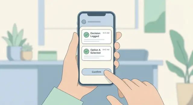
When a decision happens, the interface has one job: get out of the way. Speed comes from fewer choices, minimal typing, and a “Save” action that’s obvious and reachable.
Quick Add should open instantly and default to the simplest capture: a short title plus a single tap to save. Everything else is optional.
Decision Details is where users can refine later—add context, tags, people involved, or outcomes—without pressure in the moment.
Timeline/Feed acts like a receipt roll: newest first, easy scanning, quick filters, and one-tap access back into details.
Search should be a single field with recent searches and suggestions, so retrieval doesn’t become work.
Settings is where you hide complexity: notification rules, privacy options, export, and accessibility toggles.
Design for one thumb. Put the primary action (Save) in the easiest-to-reach zone, keep secondary actions away from it, and use big tap targets so users can log while walking, commuting, or holding something.
Keep typing optional:
Treat the first save as a timestamped snapshot:
User enters a few words (or taps a preset)
App saves immediately with the current time
A subtle prompt offers “Add details” but never blocks completion
This protects moment-based logging even if the user gets interrupted.
Readable fonts and strong contrast improve glanceability for everyone. Support dynamic text sizing, keep layouts stable as text grows, and use large touch targets.
Voice input can be a strong option for quick capture—especially when typing is inconvenient. Even a simple “tap mic, speak title, save” flow can cut entry time dramatically.
A “decision” is the core object in your app. If the model is too heavy, capture slows down. If it’s too thin, the record won’t be useful later. Aim for a small required set, plus optional context you can ask for when it adds value.
Start with fields that make saving and searching reliable:
This supports fast capture while still enabling review, filtering, and follow-ups.
Context makes decisions searchable and defensible, but each extra field risks slowing input. Treat these as optional:
Keep defaults smart (last used project, suggested categories) so users don’t have to think.
Two prompts often matter later, but shouldn’t block saving:
Make them optional “add more” fields so the one-tap save flow stays intact.
Decisions evolve. You have two approaches:
Choose based on your users’ risk level and whether “what changed later” is a real requirement.
If your app only works when the connection is perfect, it will fail at the exact moments people need it most—hallways, elevators, job sites, airplanes, or low-signal buildings. An offline-first approach means the app treats saving a decision as “done” the instant it’s recorded on the device, then worries about the server later.
The core goal is simple: capture must never be blocked by connectivity. Store decisions locally (including tags, timestamps, and optional context) and queue them for upload. The user shouldn’t have to think about Wi‑Fi, logins expiring, or server hiccups when they’re trying to move fast.
Sync is where the hard choices show up. Decide your rules up front:
A practical middle ground: last write wins for simple fields, manual merge only when two edits happen to the same decision before either device has synced.
People trust what they can see. Use simple states:
Add a “Sync now” action and a lightweight retry option per item. Don’t punish users for network problems.
Attachments (photos, audio) can drain battery and fill storage quickly. Consider compressing images, limiting audio length, and uploading attachments only on Wi‑Fi (user-configurable). Provide a clear “storage used” view and a safe cleanup option after successful sync.
Reminders can multiply the value of a decision capture app: they help people remember to log decisions and revisit the ones that matter. But the fastest way to lose trust is to interrupt users too often, at the wrong time, with messages that feel generic.
A good starting set covers three different needs:
Don’t ship all of these at once if it complicates the product. Start with scheduled nudges and follow-ups, then add context prompts only if they clearly improve capture rates.
Treat notifications as a user-controlled tool, not a growth lever.
Offer opt-in when the value is obvious (after the first saved decision), include quiet hours, and add frequency caps (for example, “no more than 1 nudge per day” or “pause for a week”). Let users switch off specific reminder types without disabling everything.
If a notification doesn’t lead directly to the fastest capture screen, it’s wasted. A tap should open Quick Add with a suggested template already selected (for example, “Decision made in a meeting” with fields prefilled).
This is where moment-based logging shines: the notification can ask a single question (“What did you decide?”), and the app opens ready for a one-line entry.
Many decisions aren’t final—they’re commitments to re-check later. Add a simple follow-up date field when saving, and use it to schedule a reminder and surface the decision in a “Needs review” list. Keep the follow-up interaction minimal: confirm, adjust, or mark as resolved.
People will only log decisions in the moment if they feel safe doing it. Trust is a product feature: it affects whether users capture honestly, how often they use the app, and whether they recommend it.
Start by clarifying what counts as sensitive in your app. A decision note can quietly include health details, legal issues, workplace conflicts, finances, or names.
A simple rule: collect the minimum needed to make the decision useful later.
Fast capture shouldn’t mean weak access control.
Protect data in two places: on the device and in transit.
On-device: use the platform’s secure storage and enable device-level encryption; consider encrypting the local database if you store decisions offline.
In transit: use HTTPS/TLS for all server communication and avoid sending sensitive data to third-party analytics.
Give users clear control over their information:
Finally, write a plain-language privacy policy and surface it inside the app where users will actually look for it.
Capturing a decision is only half the job. If people can’t quickly pull it back up—during a meeting, a handoff, or a “why did we do this?” moment—the app becomes a dumping ground. Treat retrieval as a primary feature, not a nice-to-have.
Different users recall decisions in different ways, so offer a few simple entry points:
Keep the default view lightweight: show a short title, date/time, and a one-line summary. Let users tap for full details instead of forcing everything upfront.
Search should work even when users only remember fragments. Aim for:
A small detail that matters: let users search within a specific project by default, with an easy toggle to search “all.” It prevents noisy results.
Add a dedicated Decision Summary area that turns raw logs into something actionable:
When retrieval leaves the app, keep options clear:
The goal: decisions should be easy to find, easy to understand, and easy to pass along.
Tech stack decisions can stall a project that’s supposed to help people make faster decisions. The goal is to choose something “good enough” for an MVP, with a clear path to improve later.
Native (Swift for iOS, Kotlin for Android) is best when you need the smoothest performance, deepest device integration, or platform-specific UI polish. The trade-off is building (and maintaining) two codebases.
Cross-platform (React Native or Flutter) lets you share most code across iOS and Android, which often means faster MVP delivery and simpler iteration. The trade-off is occasional edge cases: certain OS features may require custom native work, and you’ll want extra attention on “feel” so the app doesn’t seem generic.
For a decision-capture MVP (quick input, offline notes, reminders), cross-platform is often a practical default—unless you already have a strong native team.
Start with a small API + database: authentication, decision records, sync status, and timestamps. This is enough for reliable cross-device sync and later analytics.
You can go serverless (managed functions + managed database) if you want less infrastructure work and predictable scaling. It’s a good fit when your API is simple and you don’t need complex background jobs yet.
Pick a short list:
Avoid adding extras “just in case.” Every SDK adds setup time and ongoing maintenance.
Design for growth by keeping your data model stable and your sync strategy explicit—but ship the MVP first. You can upgrade architecture after you’ve proven people actually capture decisions the way you expect.
If you want to validate the flow quickly before committing to a full engineering cycle, a vibe-coding platform like Koder.ai can help you stand up an MVP from a chat-driven spec. You can iterate on the capture UX (Quick Add → Save → Timeline), basic auth, and a minimal sync API in days—then refine based on real usage.
Koder.ai is especially relevant if your plan already leans toward React for web tooling, Go + PostgreSQL on the backend, or Flutter for a cross-platform mobile app. When you’re ready, you can export source code, deploy and host with custom domains, and rely on snapshots/rollback to keep rapid iterations safe.
A decision-capture app succeeds or fails on speed and trust. Analytics should help you remove friction without turning the product into a surveillance tool. Measure the flow (how people use the app), not the content (what they wrote).
Start with a small set of events that map directly to your core promise: “capture a decision quickly.” Useful metrics include:
Keep event names consistent (e.g., capture_started, capture_saved, decision_edited, search_performed) and attach only safe properties like device type, app version, and screen name.
Numbers show where friction happens; people tell you why. Add a lightweight in-app prompt after 5–10 captures:
Keep surveys short, skippable, and spaced out. If you run a beta, follow up with a 3–5 question survey focused on the capture moment: context, time pressure, and what they wish the app did automatically.
Run small tests that affect the capture screen:
Define success before you start: lower time-to-save, fewer abandonments, or higher weekly captures—never “more taps.”
Avoid collecting personal content in analytics. Track events, not sensitive text: no decision text, no contact names, no locations unless absolutely required. If you need examples for UX research, ask users explicitly and let them opt in.
A capture-in-the-moment app succeeds or fails on reliability. Your goal in testing and launch is to prove the flow works when life is messy: no signal, one hand, interruptions, and low patience.
Test on a few devices and OS versions, but prioritize scenarios that break quick-capture apps:
Also track time-to-capture (start app → saved decision) and aim for consistency more than perfection.
Start with a small group (10–30 people) who will actually use it in daily life. Ask them to capture real decisions for a week, then interview them about:
During beta, prioritize fixes in this order: crashers and data loss, then sync issues, then UX polish.
Before release, prepare store screenshots that show the one-tap capture flow, write a clear value proposition (“capture now, review later”), and include a support contact that’s easy to find.
After launch, set a 30-day iteration plan: ship small improvements weekly, and build a roadmap around proven needs—templates, team sharing, and integrations—based on actual usage data, not guesses.
If you’re building on a platform like Koder.ai, treat this iteration cycle as a strength: planning mode can help you map changes before generating them, and snapshots/rollback give you a safer way to ship frequent updates while you validate offline sync, reminders, and retrieval in the real world.
It means logging a choice as close as possible to when it’s made, so the details don’t decay. In practice, it’s a quick entry that’s automatically timestamped and includes just enough context (what, who, why, what’s next) to be useful later.
Because decisions are easy to forget and expensive to misremember. A moment-based log reduces:
Design for low attention, high context situations:
These constraints push you toward fewer steps, bigger tap targets, and automatic context capture.
A “good capture” should be:
Make only one field required: the decision statement (a short title or one sentence). Keep everything else optional and quick—tags, category, people involved, confidence, follow-up date—so the core flow stays under ~10 seconds.
A practical MVP is:
Pure free text is fastest but harder to search; pure picklists are consistent but can feel restrictive. A hybrid usually balances both.
Keep it to the essentials:
Start with a minimum viable decision object:
Use an offline-first approach: saving locally is “done,” then sync happens in the background. Include clear states like Pending / Synced / Failed, plus retry controls. Decide conflict rules early (e.g., last-write-wins for most fields, manual merge only when simultaneous edits occur).
Minimize sensitive collection and keep access fast:
Trust is critical—people won’t log honest decisions if they don’t feel safe.
Aim for “save now, refine later” as the default behavior.
idtitle (what was decided)bodytimestamp (when decided, not when synced)tagsstatus (e.g., draft/final/reversed)attachmentsAdd context fields (location, project, participants, category) only if they improve recall or retrieval without slowing capture.