Jul 23, 2025·8 min
How to Build a Mobile App to Capture Work-in-Progress Thoughts
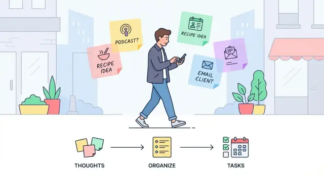
Learn how to design and build a mobile app that captures work-in-progress thoughts fast—notes, voice, tags, offline mode, sync, reminders, and search.
Clarify the Problem You’re Solving
Before thinking about screens or features, get precise about what you’re capturing. “Work-in-progress thoughts” aren’t polished notes—they’re the messy middle: a sentence you don’t want to forget, a half-formed plan, a question to ask later, a quick insight after a meeting, or a snippet of something you want to write.
What counts as a work-in-progress thought?
For most audiences, these thoughts fall into a few buckets:
- Ideas and sparks (product ideas, content hooks, solutions)
- Half-formed plans (next steps, outlines, drafts)
- Snippets (quotes, phrases, numbers, names)
- Questions and uncertainties (“Ask Sam about…”, “Why is X happening?”)
The key detail: they’re captured fast, often without context, and need help becoming useful later.
The core use cases
Your app is mainly serving three moments:
- On-the-go capture: during a commute, between meetings, while cooking—when attention is limited.
- Later review: a dedicated pass where users scan what they captured and decide what matters.
- Turning thoughts into actions: converting a thought into a task, calendar reminder, message to send, or a more complete note.
If your product doesn’t support all three, users will fall back to whatever tool helps them finish the loop.
How you’ll measure success
Define success criteria early so decisions stay grounded:
- Capture speed: from intent to saved in a few seconds.
- Retrieval speed: find it again when it matters.
- Low friction: minimal typing, minimal setup, minimal decisions.
- Trust: users believe their thought is saved and will sync correctly.
Real-world constraints you must design for
Assume capture happens under pressure: one-hand use, noisy environments (voice may fail), unreliable networks, and short attention spans. Your app should work when conditions are bad—because that’s when people need it most.
Know Your Users and Their Capture Moments
A “capture” app succeeds or fails based on a simple truth: people don’t forget ideas because they don’t care—they forget because the moment is awkward. Your job is to understand who your app is for, and what real-life situations cause thoughts to appear (and disappear).
Identify your primary users
Start with a few clear user groups and the job they’re trying to do:
- Students: lecture takeaways, assignment ideas, study questions, quick definitions.
- Founders: product insights, customer feedback snippets, experiments to run, pitch wording.
- Managers: meeting follow-ups, decisions, risks, team observations, phrasing for feedback.
- Creatives: hooks, sketches-in-words, visual references, sudden concepts.
- Field workers: on-site observations, checklists, issues to report, measurements, safety notes.
Pick one or two groups for your first release. “Everyone” sounds big, but it blurs priorities.
Map where thoughts actually happen
Capture moments are often predictable. Ask users to walk you through their week and pinpoint where ideas show up:
Commuting (one hand, noisy), meetings (social pressure, limited attention), workouts (sweaty hands, short breath), late-night (low energy, dim light), cooking (messy hands), childcare (constant interruptions).
Each setting implies constraints: speed, privacy, audio quality, screen time, and whether the user can look at the phone.
Run fast interviews focused on failure points
Keep interviews short (10–15 minutes) and practical. Useful prompts:
- “Tell me about the last time you had a good idea and lost it.”
- “What stopped you—unlocking, typing, finding the right place, fear of forgetting later?”
- “What did you do instead (send yourself a text, voice memo, scraps of paper)?”
- “When do you review these notes, if ever?”
Listen for “friction words”: too many steps, didn’t want to look rude, couldn’t type, couldn’t find it later.
Study competitors without copying
Scan reviews of popular notes and voice memo apps. Don’t clone features; extract patterns:
- What do users praise as “instant”?
- What do they complain is “cluttered” or “hard to find later”?
- Which small annoyances cause people to abandon the habit?
Your goal is a user-informed definition of “fast enough” for the moments that matter most.
Define the Core Workflow (Capture → Review → Act)
A thought-capture app succeeds or fails on one thing: how quickly a messy idea becomes something you can trust and return to. The workflow should feel like a straight line—no decisions unless they’re truly needed.
Capture: the shortest path
Design the default path to be: open app → capture → done. Every extra screen, prompt, or choice increases drop-off.
Start by choosing your primary input types and making them instantly available:
- Text for fast typing and quick edits
- Voice for hands-busy moments (with optional transcription later)
- Photo for whiteboards, receipts, or visual context
- Quick checklists for bite-sized steps
Review: a safe place for “unfinished”
Review is where users clean up without pressure. Keep review lightweight: a simple inbox of recent captures, grouped by time, with easy actions.
Avoid forcing organization during capture; instead, make it easy to add structure later.
Decide what metadata is required vs. optional:
- Required: usually nothing, or at most a title generated from the first words
- Optional: tag, project, priority, mood, location
Optional metadata should be one tap away during review, not a gate during capture.
Act: what does “finished” mean?
Define clear “end states” for a thought so users don’t accumulate an endless pile:
- Save only (stays as a note)
- Convert to task (adds a checkbox, due date, or task list entry)
- Schedule reminder (time-based nudge)
Make these actions consistent and reversible. Users should feel confident that capturing is effortless—and that acting on it later won’t be complicated.
Plan Features That Make Capturing Truly Fast
Speed is a feature. If capturing a thought takes more than a couple of seconds, people will postpone it—and then forget. The goal here isn’t to build a “powerful editor”; it’s to remove friction so the app feels like an extension of the user’s memory.
Make “New thought” a one-tap action
Treat capture as the primary screen, not something buried behind menus.
A one-tap “New thought” button should be large, obvious, and reachable with one hand. Keep touch targets generous and avoid tiny icons that require precision. If the user can open the app and start typing in under a second, you’re on the right track.
Support voice capture (with safe fallbacks)
Many capture moments happen while walking, commuting, or switching between tasks. Voice is often the fastest input.
Offer voice capture with live transcription, but assume it won’t always be perfect. Users should be able to:
- Start recording instantly
- See transcription appear live (when available)
- Quickly fix obvious mistakes with a simple edit flow
Also keep the original audio (when users want it) so they can verify meaning later.
Put capture on the lock screen and home screen
Reduce “time to first input” by adding entry points where the platform allows:
- Home screen widget with a “New thought” action
- Lock screen shortcut (or quick action) for rapid capture
The first tap shouldn’t be “open the app,” it should be “capture the thought.”
Provide quick templates for common situations
Templates reduce thinking about structure. Keep them short and opinionated, such as:
- Meeting note
- Idea
- Question
- Next step
Each template should insert just enough scaffolding (a title prompt, a couple of fields, or a checklist) without turning capture into form-filling.
Capture context automatically (only if it’s helpful)
Context makes later retrieval easier, and it shouldn’t cost the user time.
Always add an automatic timestamp. Consider optional location capture, but only with clear consent and a simple “on/off” control. If you collect location, be transparent about when it’s saved and how it’s used, and make it easy to delete.
The rule: capture first, enrich second. If context interrupts capture, it’s not helping.
Design the Data Model for Thoughts and Context
A capture app lives or dies by how well it can preserve meaning. The simplest model is usually the most flexible: a Thought (the content) plus Attributes (lightweight context you can filter and act on later).
Start with a “Thought” as the unit of work
Treat every capture as a single record with:
- id (unique)
- content (text, transcript, or a short summary)
- created_at / updated_at
Then add attributes that stay optional, so capture stays fast.
Add attributes that support real decisions
A practical set of Attributes:
- tags (free-form keywords)
- project (one pick; optional)
- status (what happens next)
Statuses keep your app from turning into a pile of notes. A good starting set is:
- Inbox (new, unprocessed)
- In progress (actively being shaped)
- Turned into task (promoted into action elsewhere or in-app)
- Archived (kept, but out of the way)
Link related thoughts without overengineering
People don’t think in isolation. Support relationships with one of these simple patterns:
- Threading (a thought can have a parent)
- Backlinks (store an array of related ids)
- A single related field (one link is often enough)
Start minimal: you can always grow into richer linking later.
Plan attachments and limits honestly
If you support audio or images, model attachments separately:
- attachment type (audio/image)
- uri/path (where it is stored)
- size, duration (for audio), created_at
Decide early how you’ll handle storage limits (per-note caps, total quota, or “best effort”), and reflect that in the model so the product doesn’t make promises you can’t keep.
Build for Offline Use and Reliable Sync
Scale up when you’re ready
Move faster on search, tags, reminders, and syncing with more build capacity when you need it.
Capturing a thought is a “now” problem. If the app needs a connection, you’ll lose the moment. An offline-first approach treats the device as the source of truth for capture: every note, voice snippet, or photo is saved locally first, instantly, then synced later.
Make offline capture feel normal
Design it so users don’t have to think about connectivity. Create should always work, and the Inbox should load immediately.
If you record voice, save the raw file locally and attach it to the note right away; upload can happen later.
Sync quietly, but show clear status
Sync should run in the background whenever the network returns, without interrupting capture. Still, people need confidence their ideas are safe.
Include a small, consistent sync state (for example: “Saved on device”, “Syncing…”, “Synced”) and show a “Last updated” time in a predictable place such as the Inbox header or settings.
Handle conflicts with minimal drama
Conflicts happen when the same note is edited on two devices before syncing. Avoid complex merge screens for a quick-capture app. Two practical options:
- Keep both versions and mark one as “Newer” (best for trust)
- Use “last edit wins” but keep a simple edit history so nothing is lost
The goal is to preserve thoughts, not force users into decisions.
Keep performance fast as notes grow
Speed is part of reliability. Load the Inbox instantly from local storage, and lazy-load older items as the user scrolls or searches.
Sync should not block scrolling, typing, or recording—capture stays responsive even if uploads are slow.
Create a Simple UX for One-Handed, Low-Effort Use
A capture app succeeds or fails on friction. When someone is walking, in a meeting, or switching contexts, they should be able to save a thought in seconds—with one thumb and minimal decision-making.
Make the “home” screen do almost everything
Use a single main screen that combines an Inbox list (what you’ve captured) with one prominent capture action. The Inbox should feel like a safe drop zone: everything lands there first, without forcing the user to file it perfectly.
Keep the capture button reachable in the lower area of the screen, and make the default action predictable (e.g., tap to type, long-press for voice). If you support multiple capture types, treat them as quick alternates—not a menu that interrupts the flow.
Keep editing minimal and fast
Don’t turn every note into a form. Inline editing should cover most needs: tap the text, make a small change, done.
Use swipe actions for the common moves:
- Archive (or “Done”) to clear noise quickly
- Add a reminder for time-sensitive thoughts
- Add a tag (or quick label) for light organization
These actions should be reversible with an undo, so users feel safe moving quickly.
Add a lightweight “triage” mode
Capturing is messy; reviewing is where clarity happens. A daily triage mode can guide users through the Inbox with simple choices: tag it, merge duplicates, convert to a task, or archive.
Keep this mode optional and short—designed for two minutes, not twenty.
Bake in accessibility and reduce clutter
Use readable fonts, strong contrast, and large tap targets so the app stays comfortable under stress. Offer voice input prominently (not buried), and ensure key actions work with one hand.
Avoid clutter by hiding advanced features until they’re needed. Power options can exist, but they shouldn’t compete with the single job the app must do well: capture now, think later.
Add Retrieval: Search, Tags, and Smart Filters
Get to a testable release
Ship an internal test build quickly and iterate based on real capture moments.
Capturing is only half the job. If people can’t reliably find what they captured—especially under pressure—the app slowly turns into a junk drawer.
Retrieval should feel effortless, fast, and forgiving, even when users don’t remember exact wording.
Make search work the way humans remember
Start with full-text search across the note body and title. Treat typos, partial phrases, and “close enough” queries as normal behavior.
Add quick filters that match common recall cues:
- Tags and projects (what it was related to)
- Date ranges (when it happened)
- Status like Unreviewed, Reviewed, or Needs action
A good default is a single search bar that supports filtering without forcing users into a complex “advanced search” screen.
Keep organization lightweight (but powerful)
Offer a small set of tools that stay out of the way during capture:
- Tags: user-defined, optional, and quick to apply
- Projects/areas: a simple grouping for bigger buckets (e.g., “Client A”, “Hiring”)
- Pinned items / Favorites: for the few notes that must stay visible
Avoid making tags mandatory. Many people will happily search by words most of the time and tag only when it helps later.
Add smart suggestions that reduce effort
Speed improves when the app “remembers” patterns without feeling intrusive. Useful suggestions include:
- Recent tags and recent projects shown as tappable chips
- Auto-complete for tag names to prevent duplicates like “meeting” vs “meetings”
- Common pairings (e.g., if a user often tags “roadmap” with “Product”, surface both)
These hints should appear at the moment of action (during capture and filtering), not buried in settings.
Summaries that encourage review
Retrieval isn’t always “find one thing.” Sometimes it’s “help me understand what I captured.” Consider simple, high-signal views:
- Unreviewed thoughts: a focused queue that prevents backlog anxiety
- What did I capture this week?: a lightweight weekly digest sorted by time, tag, or project
Done well, these features turn quick notes into a usable system—without turning the app into a complicated productivity tool.
Use Reminders and Notifications Without Being Annoying
Reminders should feel like a helpful assistant, not a nag. The easiest way to earn trust is to make notifications clearly user-driven: they appear because the user asked for them, at the time they chose, and they’re easy to silence.
Treat reminders as follow-ups, not prompts
Use push notifications to bring people back to a specific thought they already captured (“Revisit: draft client email”), not to encourage constant capturing.
A reminder tied to a note should open directly into that note, with one obvious next action: mark done, snooze, or reschedule.
Make time controls simple and forgiving
Offer a small set of options that cover most situations:
- Choose time: later today, tomorrow, pick a date/time
- Snooze: 10 minutes, 1 hour, tomorrow morning
- Repeat: daily/weekly, with an “end after” or “until done” option
Keep the UI light: one screen, minimal fields, and clear wording (“Remind me on…”).
Add an optional daily review nudge
A “daily review” notification can help users close loops on work-in-progress thoughts. Make it explicitly opt-in during onboarding or in settings, and include an easy opt-out right there.
The message should be neutral (“2 notes to review”) and avoid guilt.
Calendar-style reminders: only if they stay clear
Calendar integration or calendar-like scheduling can be useful, but only if it doesn’t introduce complexity. If you support it, limit it to essentials (date/time, optional repeat) and show a plain summary (“Fri 3:00 PM, repeats weekly”) so users always know what will happen.
The goal is consistency: reminders should be predictable, controllable, and quick to dismiss—so users keep them turned on.
Pick Your MVP Scope and Platform Strategy
Your first release should prove one thing: people can capture a thought in seconds and trust it won’t disappear. That means resisting “nice-to-have” features until the core habit is established.
Define a tight MVP
A practical first scope is:
- Text capture with an always-available input (widget/shortcut later, but start simple)
- Voice notes + dictation for moments when typing is inconvenient
- Tags (lightweight, optional) to add quick meaning
- Search that’s fast and forgiving (handles partial words)
- Offline save by default, so a thought is never blocked by connectivity
Skip complex collaboration, heavy templates, and automation rules early on. If capture isn’t effortless, none of those will matter.
Choose your platform path
Decide based on where your target users already live:
- iOS first if your audience is heavily Apple-based and expects polish and consistency
- Android first if you need broad device coverage or your users skew Android
- Cross-platform if you need both quickly and your team can accept small trade-offs in “native feel”
What matters more than the choice is committing to one path and shipping.
Outline the minimum backend
Even a small app benefits from clarity here:
- Auth: optional at first (local-only can work), but plan for sign-in if you want device sync
- Sync API: a simple “upload changes / download changes” model
- Storage: text plus media storage for voice files
If you want to prototype faster, a vibe-coding workflow can help you validate the capture → review → act loop before you invest in a full engineering pipeline. For example, Koder.ai lets you build web, backend, and mobile experiences from a chat-driven spec, iterate quickly in a planning mode, and export source code when you’re ready to harden the product.
Set non-negotiables
Treat these as release blockers:
- App launch speed (capture should feel instant)
- Crash-free sessions (trust is everything)
- Data safety (local persistence, safe updates, and backups/sync when enabled)
Handle Privacy, Security, and Data Ownership Thoughtfully
Plan the core workflow fast
Draft the capture-review-act workflow in Planning Mode before you commit to screens and data models.
People use an idea-capture app at their most unfiltered: half-formed thoughts, meeting notes, private reminders, and voice snippets they wouldn’t want on a shared screen.
Treat privacy as part of the product experience, not just a checkbox.
Set clear privacy basics
Start with fundamentals that users can understand. Encrypt data in transit whenever anything leaves the device.
Keep permissions tight: if you don’t need contacts, location, or microphone access at all times, don’t ask for them. When you do need access (for example, voice notes), explain the benefit in plain language right at the moment you request it.
Be explicit about what lives where
Avoid surprises by describing what’s stored locally vs. what’s synced. A simple “Storage & Sync” screen can answer:
- What is saved on this phone
- What is uploaded to a server (and when)
- What happens if the user signs out or switches devices
This clarity builds trust and reduces support issues later.
Give users control over their data
If feasible, offer export in common formats like plain text, CSV, or JSON. Exports are valuable for personal backups, switching devices, or moving to another tool.
Also consider a clear “Delete my data” option that explains the scope (local only, cloud only, or both).
Add an app lock for expected audiences
For work or personal journaling use cases, a simple passcode or biometric lock can be the difference between “I’ll try it” and “I can’t use this.” Keep it optional, fast to unlock, and consistent with the rest of the low-effort capture flow.
Test, Launch, and Improve Based on Real Usage
A thought-capture app only “works” if it works in the messy moments it’s meant for. Before you worry about polish, validate that people can reliably get an idea out of their head and into the app—fast, with minimal friction, and without losing it.
Test the capture flow in real conditions
Run short, practical sessions that simulate real life:
- Walking with the phone in one hand
- Low signal or airplane mode
- A noisy room when using voice notes or dictation
- Switching quickly between apps (e.g., after a call)
Watch where people hesitate. The most useful findings are tiny: an unclear button label, a keyboard that covers a field, a confirmation step that slows everything down.
Measure what matters
Set a few simple metrics you can track from day one:
- Time to capture: from app open to saved thought
- Capture success rate: how often a thought is saved without retries or abandonment
- Search success rate: whether users can find a past note within a short time
These numbers keep you honest when feature requests start piling up.
Add lightweight feedback loops
Include an in-app feedback option and a basic bug report flow (device info, app version, steps to reproduce). Keep it short; people will only use it when it’s effortless.
Launch with helpful guidance
Prepare launch assets that reduce confusion:
- A tiny onboarding that demonstrates “capture → review → act”
- Short tips that appear only when relevant
- A simple help page explaining sync, offline behavior, and privacy in plain language
Iterate post-launch
Plan a few focused iteration themes, rather than random tweaks:
- Improve sync reliability and conflict handling
- Refine reminders so they feel timely, not nagging
- Tune search relevance (recency, titles, tags, and partial matches)
If you’re shipping quickly and iterating often, operational tooling matters too. Platforms like Koder.ai include snapshots and rollback, which can be useful when a release accidentally adds friction to your capture flow and you need to recover fast.
Treat launch as the start of learning, not the finish line.