Apr 16, 2025·8 min
How to Create a Mobile App for Client Visit Summaries
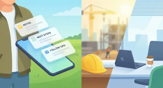
Learn how to plan, design, and build a mobile app that captures client visit notes, action items, and follow-ups—offline, secure, and easy to share.
Learn how to plan, design, and build a mobile app that captures client visit notes, action items, and follow-ups—offline, secure, and easy to share.
Before you sketch screens or pick tools, get clear on what “a client visit summary” means in your organization. Different teams use the same words to describe very different outcomes.
Write a one-paragraph definition everyone can agree on. For example: a short record of what happened on-site, what the client asked for, what you promised, and what happens next.
Decide which fields are mandatory vs. optional. Typical essentials include:
Be specific about the pain you’re removing:
Name your primary users (field sales, service techs) and secondary users (managers, operations, customer success). Each group needs different views: quick mobile data capture in the field, and clear rollups back at the office.
Pick measurable indicators you can track from day one:
These metrics guide trade-offs later—especially around offline mobile forms, CRM integration, and how much detail the app should require.
Before you sketch screens, write down what actually happens from “arrive on site” to “client gets the summary.” A clear workflow map prevents you from building a note-taking app that doesn’t produce a usable report.
Pick one common visit type (sales call, installation, service check) and map the steps in plain language:
Include who does each step and where the data lives (paper notebook, phone photos, email draft, CRM record).
Most teams leak details in predictable spots:
Mark these points on your workflow map. Each one is a strong candidate for an in-app prompt or required field.
Your app needs a default “next step” the moment the visit ends:
Be explicit about timing: “within 15 minutes,” “same day,” or “before leaving the parking lot.”
Some teams require a manager review; others can auto-send. Define:
Once this workflow is agreed, you can design screens and automation that match real work instead of ideal work.
A good data model makes summaries consistent, searchable, and easy to share—without forcing reps to write essays. Think of it as the “shape” of every visit record: what’s required, what’s optional, and how pieces like action items and attachments connect.
Require only what you need to identify the visit and report on activity later:
These fields should be structured (dropdowns/lookup where possible) so they’re reliable for filtering and CRM sync.
Instead of one long note, create clear sections that match how people recall a meeting:
Each section can still be free text, but keeping them separate improves scanning and makes summaries more reusable in a visit report template.
Action items deserve their own mini-records tied to the visit:
This structure powers follow-up tasks, reminders, and clean CRM integration.
Keep these optional so reps stay fast:
Finally, include metadata like created by, last edited, and version to support auditing and conflict handling later.
The best visit summary app is the one your team can complete in the parking lot before the next stop. That means designing for speed, low effort, and “good enough” details that can be refined later.
Start with a single, obvious action: New Summary. From there, keep the first screen lightweight—think 3–5 fields max:
Aim for a flow that works one-handed, with large tap targets and sensible defaults. If you already know the user is at a client site (from their selection or calendar), pre-fill what you can so they aren’t re-entering basics.
Most visits repeat patterns: installation, QBR, troubleshooting, renewal discussion. Create templates that automatically load the right fields and prompts.
Use dropdowns, toggles, and short pickers for:
This reduces typing and makes summaries consistent across the team, which helps when managers review reports.
Typing long paragraphs on a phone is slow. Offer voice-to-text for a “Notes” field, with lightweight editing tools (undo, punctuation, and a clear “clean up text” option).
Pair that with quick chips—tap-to-insert phrases like:
Chips should be customizable per team so the language matches how they actually work.
People get interrupted: phone calls, security gates, bad reception. Treat every summary as a draft by default and autosave continuously.
Include:
This prevents data loss and removes the anxiety of hitting “Submit” too early.
A client visit rarely happens in perfect connectivity—basements, rural sites, secure facilities, and elevators all break assumptions. Offline mode isn’t a “nice to have”; it determines whether reps trust the app.
Start by deciding what users can do without internet:
If you pick read/write, define exactly which actions must be blocked (for example, sending emails) and which can be queued (creating follow-up tasks).
Be explicit about what data is stored locally, and for how long:
This policy should be visible to admins and aligned with your security requirements.
Reliable syncing is more about rules than technology:
Users should always know what’s happening:
Put these states directly in the visit list and on the summary screen, with a clear “Try again” action when needed.
A visit summary becomes far more useful when it includes evidence and context: a photo of the installed equipment, a signed acceptance, or a copy of a quote. The key is to make attachments feel effortless—one or two taps, then back to writing.
Before users add supporting details, make client selection quick and reliable:
Once selected, auto-fill what you can from your CRM or internal directory: location, service contract, contact person, asset ID, and standard visit type. This reduces retyping and helps attachments land in the right place.
Photos are the most common “proof” for service visits and field sales. Build a lightweight flow:
For service visits, include an optional signature step at the end:
Keep signatures optional so they don’t slow down routine visits, but available when compliance or customer expectations require it.
A visit summary only helps if it’s easy to send, easy to read, and easy to act on. Treat the output as a “client-ready” artifact: consistent formatting, clear decisions, and an obvious list of what happens next.
Different customers and teams prefer different channels. Your app should generate a readable summary in:
Keep the layout simple: who/when/where, key points, decisions, and then next steps. If you already use a visit report template, mirror that structure so clients recognize it.
Add a dedicated Next steps section that’s not just free text. Each item should have:
This turns service visit notes into trackable follow-up tasks, not forgotten paragraphs.
Before sending, let the user choose recipients (To/CC/BCC) and add a short personal message at the top. This is especially important for field sales mobile app workflows where a quick “Great meeting—here’s what we agreed” increases response rates.
Maintain an audit trail that records:
That trail reduces “I never got it” confusion and supports internal compliance without adding extra work for the user.
Your client visit summary app becomes far more valuable when it fits into the systems your team already uses. The goal is simple: reps shouldn’t have to retype the same details into a CRM, email, and task tool after every visit.
Start with the tools that drive daily work:
Pick only what you can support well—every integration adds edge cases and testing.
Be explicit about what moves into the app versus what you write back.
Common “pull” data:
Common “push” data:
This is where you align your visit report template fields with CRM objects so notes don’t end up as unsearchable blobs.
Design clear endpoints for creating/updating summaries, e.g. POST /visit-summaries and PATCH /visit-summaries/{id}. Use webhooks (or polling) to catch changes made elsewhere—like a contact update or task reassignment.
Assign stable external IDs (CRM ID, calendar event ID) and document dedupe rules (e.g., “same account + same meeting time + same author = one summary”). This prevents duplicates when offline submissions sync later, and it keeps your CRM integration trustworthy.
Client visit summaries often include personal data, commercial terms, or sensitive service visit notes. Treat security as a product feature, not a checkbox—especially if your team will rely on the app as their primary client visit summary app.
Pick sign-in that matches how your organization already works.
If you have corporate identity (Microsoft Entra ID/Okta/Google Workspace), use SSO so offboarding and password policies are centrally managed. If you need a simpler rollout, email login can work, but pair it with MFA and device requirements (PIN/biometrics, no rooted/jailbroken devices) when possible.
Not everyone should see everything. Typical roles:
Also consider customer/account scoping (e.g., reps can only access assigned accounts) and field-level permissions (hide pricing or health notes from broader roles).
Use TLS for all API calls. Encrypt sensitive data at rest on the device and on the server.
For mobile data capture in offline mode, ensure the local database is encrypted and that attachments (photos/files) are stored in an encrypted container. On the backend, use managed key services (KMS) and rotate keys. Limit what’s logged—avoid writing raw notes or signatures to analytics and debug logs.
Define how long visit summaries and attachments are kept, and why (contract, compliance, internal policy). Implement:
If you share summaries externally, add time-limited links and explicit permission checks before download.
The right stack keeps your client visit summary app fast in the field, simple to maintain, and easy to integrate later. Start with two decisions: how you’ll build the mobile app, and how data will flow between phones and your backend.
A practical middle ground is cross‑platform for speed, with small native modules only for things like advanced image handling or signature capture.
Keep the first version of your backend straightforward. At minimum, you’ll want:
For hosting, a standard REST/GraphQL API + database works well (e.g., Node.js/Java/.NET with Postgres). If your team prefers managed services, a backend-as-a-service can speed up authentication, storage, and syncing.
If you want to move faster from workflow to working software, a vibe-coding platform like Koder.ai can help you prototype the mobile and web experience via chat, then export source code when you’re ready. It’s especially useful for form-heavy flows (offline drafts, follow-up tasks, review screens) and for iterating quickly with a pilot team.
Photos can quickly become the #1 source of slow sync and high costs. Store files in object storage (e.g., S3-compatible), and upload via short‑lived signed URLs.
Compress images on-device (resize + quality setting) before upload, and generate thumbnails for the timeline view. This keeps “add photo to visit” quick even on weak connections.
Treat observability as a core feature:
These signals help you improve reliability and prove adoption without guessing.
This is where your app becomes a habit—not just a feature list. The goal is to ship a small, dependable first version, learn quickly, and then scale with confidence.
Keep the first release focused on the essential workflow:
If users can’t complete a summary in under a few minutes, the MVP isn’t ready.
If you’re building the MVP with Koder.ai, take advantage of snapshots/rollback while iterating on templates and required fields—small changes in the form flow often have an outsized impact on time-to-submit.
Choose a pilot group that represents real conditions: people who travel, work in basements, visit multiple sites per day, or handle sensitive accounts. Run the pilot for 2–4 weeks and collect feedback weekly using a short form:
Prioritize fixes that reduce time-to-submit and prevent lost work.
Visit-summary apps fail when they’re unreliable. Specifically test:
Also test the “day two” experience: reopening drafts, finding past summaries, and resending.
Before wider release, define:
A rollout succeeds when the app makes people faster on their busiest day—not only on a demo call.
Start by writing a one-paragraph definition everyone can agree on (what happened, what was asked, what was promised, what happens next). Then lock a small set of required fields (client, date/time, attendees, location) and make everything else optional so the app stays fast in the field.
Use metrics you can track from day one:
These metrics help you decide how strict forms should be and how much automation you need.
Map one common visit type end-to-end: prep → during → after. Write down who does each step and where data currently lives (notebook, camera roll, email, CRM). Then mark where details are lost—those points become prompts, required fields, or automation in the app.
Start with structured, filterable identifiers:
Then split the narrative into sections (Agenda, Observations, Questions, Decisions, Risks) and model action items as separate records (owner, due date, priority, status) so follow-ups don’t disappear inside text.
Design the default path for “parking lot completion”:
Treat everything as a draft by default and make “Mark as complete” explicit.
Add voice-to-text for notes plus lightweight cleanup/editing. Pair it with customizable quick chips (tap-to-insert common phrases) so users can capture repeatable language without typing. Keep chips team-specific so they match real workflows and terminology.
If reps work in basements, rural areas, or secure facilities, choose read/write offline so they can create and edit summaries without signal. Then define:
Make sync status obvious: Synced, Pending, Failed, Needs attention.
Keep attachments low-friction:
Consider limits and “Wi‑Fi only” for large uploads to protect speed and data usage.
Offer multiple output formats:
Make “Next steps” structured (owner, due date, status) and keep an audit trail of who received what, when, and which version was shared.
Integrate only what you can support well. Common priorities are CRM + calendar + email + tasks.
Define two-way flows:
Use stable external IDs (CRM ID, calendar event ID) and clear dedupe rules (e.g., same account + meeting time + author) to avoid duplicates—especially after offline sync.