Jul 08, 2025·8 min
How to Create Contextual Reminders in a Mobile App Without Overload
Learn how to build a contextual reminder app that helps users at the right moment without notification fatigue—signals, UX patterns, privacy, and testing.
Learn how to build a contextual reminder app that helps users at the right moment without notification fatigue—signals, UX patterns, privacy, and testing.
Before you design contextual reminders, define the user outcome in plain language: the right reminder, at the right time, with minimal interruptions. If that sentence isn’t true in real life, “smart notifications” quickly turn into notification fatigue.
A useful starting prompt is: “What did the user forget, and what would have helped them remember without breaking their focus?” This keeps contextual reminders grounded in real moments, not clever automation.
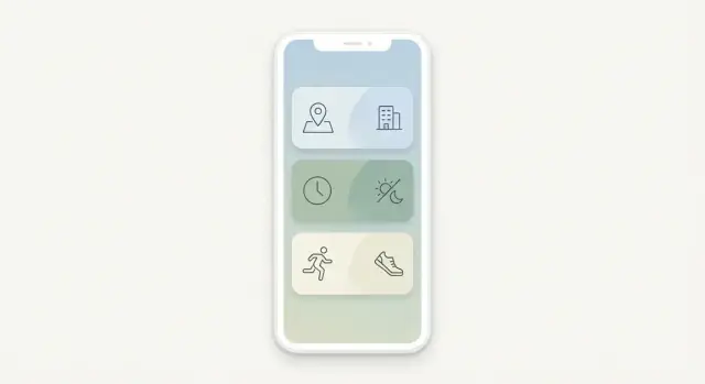
In mobile app design, “context” is simply the signals that help you choose when and how to remind. Common context signals include:
Be explicit about which signals you support and why. A reminder app UX can be “contextual” with just time + calendar + device state—no need to start with everything.
Choose a few metrics that reflect “helpful, not noisy”:
Contextual reminders are shaped by constraints: OS notification limits, background execution rules, battery impact, and permissions. Also define your privacy by design stance up front: collect the minimum context signals needed, process as much as possible on-device, and avoid “surprise” personalization that users can’t explain.
Contextual reminders only feel “smart” when they match real life. Start your research by focusing on moments (when a reminder could help), jobs (what people are trying to get done), and failure modes (how reminders go wrong).
Pick a small set you can design for end-to-end:
Write each persona with a daily rhythm, constraints (hands-free, quiet hours, shared devices), and what “success” means (less stress, fewer missed tasks, more predictability).
Aim for repeatable, high-value jobs such as:
Phrase jobs in plain language: “Help me remember X when Y happens,” not feature requests.
Identify the handful of moments where timing is everything:
Capture where the phone is (pocket, bag, mounted), and whether sound/vibration is acceptable.
Document what users hate, then design guardrails:
These failures should directly inform your prioritization rules, quiet hours, and notification copy later.
Context can make reminders feel magically well-timed—or uncomfortably “watched.” A good rule is to start with signals that are both high-value and low-friction, then expand only when users clearly benefit.
A practical order for most reminder apps is:
If a signal doesn’t noticeably improve timing or reduce effort, it’s not worth the permission cost.
Define a “no-permissions” baseline that still works well (typically time-based reminders). Treat richer context as opt-in upgrades:
Signals fail: GPS is off, calendars aren’t connected, background restrictions apply. Each reminder should have a fallback:
Write down boundaries early and keep them consistent: no microphone access, no continuous tracking, no selling or sharing of raw context data. These decisions simplify product scope and make trust easier to earn.
Contextual reminders feel “smart” only if they also feel safe. People will forgive a missed reminder; they won’t forgive a reminder that implies you’re tracking them without permission.
Permission prompts shouldn’t be vague or scary. Be explicit about what you want, why you need it, and the benefit the user gets right now.
For example:
If you can provide value without a permission, do that first and ask later—when the user understands the feature.
Default to minimal data collection. If a reminder can be triggered on-device (time windows, geofences, motion states), prefer that over sending raw context data to a server.
Practical guardrails:
Trust is built when users can change their mind without hunting through settings.
Include quick controls such as:
Add an in-app privacy explanation written like a help article, not a contract: what you store, what you don’t, how long you keep it, and how to turn it off. Transparent apps get more permissions—and fewer uninstalls.
A contextual reminder feels “smart” mostly because the model is clear. Before UI, define a reminder as a small set of building blocks that can be evaluated consistently.
At minimum, model each reminder with:
A simple representation can look like:
{
  "trigger": "arrive:home",
  "conditions": ["weekday", "not_completed"],
  "message": "Ask Alex about the keys",
  "action": "open:reminder_detail",
  "priority": "normal",
  "expiry": "2026-01-10T20:00:00Z",
  "no_repeat": true
}
Support reusable templates users understand instantly, such as “When I arrive at…”, “When I leave…”, “At a time…”, and “After a call with…”. Templates should map cleanly to the same underlying fields, so editing stays predictable.
Default every reminder to an expiry (even a generous one). Add no-repeat (fire once) and cooldowns (don’t fire again for X hours) so the system can’t nag.
After a reminder fires, offer fast controls: Done, Snooze, Mute this context, Edit, Delete. This is where users teach your model what “helpful” means.
A contextual reminder system fails the moment it starts “spraying” notifications. Your default should be restraint: fewer, higher-confidence reminders beat many low-confidence guesses. Treat every push as a scarce resource.
Create a small set of priority tiers that map to clear user value. For example:
Only the top tier should be eligible for disruptive alerts. Everything else should “earn” interruption through strong context signals.
Instead of deciding “notify or not,” use a progression:
This gives you room to be helpful without being noisy.
Implement frequency caps (per hour/day) per category and overall. Then add cooldown windows after key interactions—if the user snoozes, completes, or dismisses a reminder, don’t re-ping immediately. Cooldowns should be longer after a dismissal than after a completion.
When multiple reminders cluster (same place, same time window, same project), bundle them into one notification with a short summary. Let the tap open a clean list so users can act in one go, instead of being interrupted repeatedly.
A contextual reminder succeeds or fails on the notification itself: the wording, the timing cue, and what the user can do in one tap. Treat the notification as a tiny decision screen, not a mini essay.
Keep the message concise and scannable:
Example structure: “Pick up prescription — you’re near City Pharmacy — Open list.” If the “why now” could feel creepy (exact location), soften it: “You’re nearby” or “On your way out.”
Offer 2–3 actions max:
Avoid adding extra buttons like “Edit,” “Share,” or “Reschedule” inside the notification—those belong in the app.
Snooze presets should match real situations:
If you can’t reliably support a preset (e.g., “next location”), don’t show it.
Skip guilt, urgency, or pressure (“Don’t forget!” “You must…”). Prefer calm phrasing: “Reminder: water plants” and “Snoozed until 7pm.” A respectful tone lowers stress and makes users more willing to keep notifications enabled.
Contextual reminders feel “smart” only when users feel in control. The fastest way to build that trust is to make every reminder understandable and adjustable in a tap or two—without sending people on a settings scavenger hunt.
Notifications are easy to miss, especially during meetings or quiet hours. An in-app Reminders inbox lets people catch up at their own pace without extra pings.
Keep it simple: a chronological list with clear labels (e.g., “Due now”, “Later today”), lightweight actions (Done, Snooze), and a way to search or filter. This reduces pressure to “act instantly” and lowers notification fatigue.
Every contextual reminder should include a short explanation panel:
Write it in plain language: “You’re near Home, and you asked to be reminded about Laundry when you get here.” Avoid technical phrasing like “geofence triggered.”
When a reminder feels wrong, users shouldn’t have to dig into settings. Add one-tap controls such as:
Use simple language (“Quiet hours”, “Places”, “How often”) instead of dense toggles. Surface these controls from the inbox and the “Why this” view so users learn they exist exactly when they need them.
A contextual reminder is only “smart” if it fires at the right time without draining the phone. The goal is to lean on the operating system’s scheduling tools instead of running your own constant background checks.
Local-first with sync is usually the safest default for reminders. Rules are evaluated on-device, so triggers work offline and can respect device settings like Focus/Do Not Disturb.
Server-driven rules can work when context signals are primarily server-side (e.g., calendar from your backend), but you’ll still need an on-device layer to schedule actual notifications reliably.
A practical hybrid is: define rules in the cloud (for consistency across devices), but compile them into on-device schedules.
If you’re prototyping this kind of hybrid quickly, a vibe-coding workflow (for example, using Koder.ai to generate a React-based admin console plus a Go/PostgreSQL backend) can speed up the iteration loop—especially for rule modeling, event logging, and an internal “why this fired” debug view.
Mobile platforms tightly limit background execution:
Design triggers around OS primitives: scheduled notifications, geofence entry/exit, significant location change, and system task schedulers.
Avoid polling. Instead:
Make reminders dependable without spamming:
Treat every trigger as “best effort,” and build safeguards so “late” becomes “next best time,” not “multiple pings.”
A reminder app earns attention before it asks for access. Treat onboarding as a short “proof of usefulness” flow, not a permissions checklist.
Start with a simple, time-based reminder that works without any special access. Let the user create one reminder in under a minute and experience the payoff (a well-timed notification) before you ask for notification permission.
When you do ask, be specific: “Allow notifications so we can remind you at 6:00 PM.” This feels purposeful, not pushy.
Introduce context signals gradually:
If a feature requires background location, explain the tradeoff in plain language and offer “Only while using the app” as a stepping stone when possible.
Offer a small set of templates users can adopt instantly:
Templates teach what “good reminders” look like—short, actionable, and not too frequent.
During onboarding, ask for a preferred quiet window (for example, evenings or sleep hours) and state your default limits: “We’ll never send more than X reminders per day unless you choose otherwise.”
Include an obvious Pause reminders option right in the first-run experience. Giving users an escape hatch reduces anxiety—and makes them more willing to enable notifications in the first place.
Contextual reminders feel magical only when they stay relevant. The fastest way to drift into noise is to “set and forget” your logic. Treat reminders as a living system you continuously measure and refine.
Start with a small, consistent event schema so you can compare changes over time. At minimum, track:
Pair these with context metadata (e.g., trigger type, time window, bundle vs single) to understand what works—not just what was sent.
Overload often shows up indirectly. Monitor trends like high dismiss rates, rapid “mute all” actions, permission revokes, decreasing opens after week one, and app uninstalls following a spike in notifications. These are your smoke alarms; don’t wait for support tickets.
Test one variable at a time and define “helpful” metrics upfront (not only opens). Practical experiments include timing windows, copy tone and length, bundling rules, and daily/weekly caps. A good reminder can have a lower open rate but still reduce snoozes and repeated dismissals.
After key interactions—like a dismissal streak or a mute action—ask a one-tap question: “Not relevant,” “Bad timing,” “Too frequent,” or “Other.” Keep it optional, and use responses to tune rules, priority, and expiry rather than adding more notifications.
Contextual reminders feel “smart” only when they work for everyone, everywhere, and in situations where interruptions can be harmful. Designing these edge cases early prevents painful rework later.
Start by testing the full reminder flow with screen readers (VoiceOver/TalkBack): the notification text, any action buttons, and the destination screen after tapping. Ensure actions are reachable without precise gestures.
Support large text and dynamic type so reminder titles don’t truncate into something ambiguous. Keep language scannable: a short title plus a clear next step.
Also check color contrast and state indicators. If you use color to convey urgency or category, add a secondary cue (icon, label, or text) so meaning isn’t lost for color-blind users.
Localize time and date formats automatically (12/24-hour clock, week start day, relative time phrasing). Avoid idioms and slang in reminder copy—phrases that sound friendly in one region can read as rude or confusing in another.
Make room for longer text in languages like German, and verify that plurals and gendered language render correctly.
Shift workers may sleep at unconventional times—quiet hours should be customizable and not assume nights. Travel and time zones can break “at 9 AM” reminders; decide whether reminders follow the device’s current time zone or stay pinned to the original one, and communicate that choice.
Shared devices add risk: notifications can expose private content. Offer discreet notification content (e.g., “You have a reminder”) and require unlock to reveal details.
Respect “driving” or “do not disturb” states where possible, and avoid interactive prompts that encourage phone use while moving. For medical or urgent reminders, add an optional escalation path (repeat after X minutes, louder channel) but keep it opt-in with clear warnings—false urgency erodes trust fast.
A contextual reminder system can grow into a monster fast: more signals, more settings, more edge cases. The easiest way to avoid overload is to start narrow, ship something reliable, then expand only when user behavior proves it’s worth it.
Pick one high-frequency scenario where “timing + context” clearly beats a basic alarm. For example: “Remind me to buy detergent when I’m near my usual store,” or “Nudge me to stretch after 60 minutes of inactivity.”
Define the MVP boundaries upfront:
Success criteria should be measurable (e.g., completion rate, dismiss rate, user opt-outs), not “users like it.”
If you want to validate scope fast, building the MVP in a platform like Koder.ai can be practical: you can prototype the reminder flows via chat, iterate on a React UI, and evolve a Go/PostgreSQL model for triggers and audit events—then export source code when you’re ready to move to a standard engineering pipeline.
Once the MVP is stable, grow in small, testable steps:
Each addition should earn its place by reducing taps, improving completion, or lowering notification volume.
Treat reminders like a core reliability feature:
Finally, make support simple: an in-app “Report a bad reminder” path and a lightweight feedback loop that feeds directly into triage, experiments, and roadmap decisions.
Start with a plain-language outcome: the right reminder, at the right time, with minimal interruptions. Then write 2–3 measurable success metrics (e.g., completion after reminder, snooze vs. dismiss, opt-outs) and treat every added context signal as something that must improve those metrics—not just add “smartness.”
“Context” is the set of signals you use to decide when and how to remind—most commonly:
Pick a small, explicit set you can explain and reliably support.
Start with high-value, low-friction signals and expand only when users clearly benefit:
If a signal doesn’t materially improve timing or reduce effort, skip it.
Ask for permissions at the moment of need, with a concrete benefit:
Provide a useful baseline without permissions (time-based reminders), then offer context as an opt-in upgrade. Also include fast controls to pause, mute, or revoke a feature without digging through settings.
Model each reminder with consistent building blocks:
This prevents “mystery logic” and makes behavior predictable across templates and UI.
Use guardrails that assume restraint:
Aim for fewer, higher-confidence reminders rather than many low-confidence ones.
Make each notification a tiny decision screen that answers:
Keep actions to 2–3 (Done, Snooze, Open). Use neutral tone, avoid guilt, and be careful with “creepy” specificity (e.g., soften exact location phrasing when appropriate).
Build an in-app “Why you’re seeing this” panel that shows:
Pair it with quick tuning (Mute for today, Less like this, Only at this place). If users can understand and adjust a reminder in 1–2 taps, they’ll tolerate—and trust—more context.
Design for failure by adding fallbacks and graceful degradation:
Also implement dedupe IDs, backoff retries with cutoffs, and offline-first scheduling so you don’t compensate for unreliability by sending multiple pings.
Track the full lifecycle and treat “overload” as a measurable risk:
Watch for rising dismiss rates, permission revokes, and post-enable churn. Run focused A/B tests (timing windows, copy, bundling, caps) and add lightweight one-tap feedback (“Bad timing”, “Too frequent”, “Not relevant”).