Oct 14, 2025·8 min
How to Create a Diet Planner App with Nutrition Tracking
Learn how to build a mobile app for diet planning and nutrition tracking: features, UX, data needs, integrations, privacy basics, and launch steps.
Learn how to build a mobile app for diet planning and nutrition tracking: features, UX, data needs, integrations, privacy basics, and launch steps.
Before wireframes or food databases, decide who you’re building for and what “success” looks like. Diet apps fail most often when they try to serve everyone with every feature on day one.
Different users need different experiences:
Choose your primary segment and make it obvious in onboarding and marketing copy. You can expand later.
Define the app’s “job” in one sentence, for example:
This outcome becomes your filter: if a feature doesn’t improve planning or daily logging, it probably doesn’t belong in the MVP.
Set a small set of metrics that map to real behavior:
Look at top calorie counter and nutrition tracking app reviews. Write down what users praise (speed, barcode accuracy, UX) and what they complain about (cluttered UI, inaccurate food database, aggressive paywalls). Use that list to shape your product promises.
Be honest about budget, timeline, team skills, and target platforms (iOS, Android, or both). A realistic constraint list helps you ship a focused MVP mobile app instead of a half-finished “everything app.”
An MVP for a diet planning app isn’t “a smaller MyFitnessPal.” It’s a tight set of flows that users can complete daily with minimal friction. Start by mapping the journey end-to-end, then cut everything that doesn’t support that journey.
Your baseline flow typically looks like:
Onboarding → set goals → plan meals → log food → review progress.
Sketch these as simple user stories:
If a feature doesn’t improve one of these steps, it’s probably not MVP.
Must-have: account or local profile, goal setting, basic meal planning, food logging, daily summary.
Nice-to-have (later): recipes, social sharing, challenges, advanced analytics, coaching, meal photos, wearable sync.
A good rule: aim for one great logging method (search or recent foods) rather than three mediocre ones.
Offline support matters for grocery stores and travel. Decide what works without an account (e.g., last 7 days of foods, recent items, today’s plan) and what requires sign-in (backup, multi-device sync). This decision affects development time and support complexity.
In 8–12 weeks, pick one platform (iOS or Android), one primary logging flow, and one progress view. Everything else becomes Version 2.
Keep it to 2–4 pages: target user, MVP goals, the five key screens, acceptance criteria (e.g., “log a meal in <30 seconds”), and what’s explicitly out of scope. This prevents “just one more feature” from quietly doubling your timeline.
Daily logging is the make-or-break moment for a nutrition tracking app. Most people won’t quit because your calculations are wrong—they’ll quit because logging lunch feels like work. Your UX should prioritize speed, clarity, and “I can fix this later.”
Ask only the questions that improve the first week of use:
Make onboarding skippable, and make every answer editable later from Settings. This reduces drop-off and builds trust—people change goals, routines, and diets.
Avoid nutrition jargon wherever possible. Instead of “serving size,” try “How much did you eat?” and offer friendly choices:
When users need to enter portions, show examples next to units so they don’t feel forced to guess.
The home screen should make common actions one tap away:
Small touches matter: default to the last used meal (Breakfast/Lunch), remember portions, and keep search results readable.
Use readable fonts, strong color contrast, and large tap targets—especially for portion steppers and “Add” buttons. Support Dynamic Type (or equivalent) so the app stays usable on busy, one-handed days.
If your app is positioned as a diet planning app or nutrition tracking app, users arrive with a clear mental checklist. Nail the “expected” features first, and you’ll earn trust before you ask them to change habits.
The core of any calorie counter app is logging. Make it fast enough for daily use:
A key decision: allow “good enough” entries (e.g., generic foods) so people don’t abandon a log when they can’t find an exact match.
Meal planning should reduce decisions, not add steps. The basics that work:
This is where meal planning and macro tracking connect: planned meals should preview daily totals so users can adjust before they eat.
Users expect to set targets like daily calories, macro goals, and a weight target pace. Hydration can be optional, but keep it lightweight.
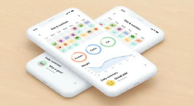
Progress screens should focus on clarity: trend lines, weekly summaries, and adherence vs. plan (planned vs. logged) so people learn patterns without guilt.
Use gentle notifications for:
Let users control frequency and quiet hours—retention improves when the app respects their day.
Food data is the backbone of a nutrition tracking app. If your database is inconsistent, users will feel it immediately: wrong calories, confusing serving sizes, and search results full of duplicates.
You typically have three paths:
A practical approach is a licensed or curated base dataset plus user submissions that you review or auto-check.
Users expect barcode scanning to “just work,” but coverage will never be 100%.
Plan for:
People log food in grams, cups, tablespoons, slices, pieces—not just “100 g.” Store a standard base unit (usually grams or milliliters), then map common household measures to that base.
Include unit conversion rules, and make serving options predictable (e.g., 1 piece, 100 g, 1 cup).
Create rules for duplicates, missing nutrients, and suspicious values (e.g., calories not matching macros). Track “verified” vs. “community” items.
Localization matters early: support metric/imperial, multiple languages, and regional foods so search results feel relevant in each market.
Meal planning is where a diet planning app starts to feel “made for me.” The goal isn’t just to generate meals—it’s to match a user’s targets, constraints, and real life.
Start with clear inputs and simple defaults:
Then translate those into rules your planner follows, like: “daily calories ±5%,” “protein minimum 120g,” “no peanuts,” and “2 vegetarian dinners per week.”
Suggestions should account for context, not just nutrition:
A practical approach is to score recipes against these factors and pick the highest-scoring options while still meeting daily targets.
A recipe importer is a retention feature because it lets users plan with food they already want. Import a URL, parse ingredients, map them to your food database, and always allow edits:
Generate a grocery list directly from the weekly plan, but treat pantry staples (oil, salt, spices) differently. Let users mark staples once, then exclude them by default—while still allowing “add anyway” for low-stock items.
Show a simple “Why this plan?” panel: “We aimed for 2,000 kcal/day and 140g protein. We avoided shellfish and kept cooking time under 20 minutes on weekdays. Recipes were chosen because you rated similar meals highly and they share ingredients to reduce cost.”
A diet planning app feels simple on the surface—log food, see macros, follow a plan—but the architecture decides whether it stays fast, reliable, and easy to extend.
Most apps support at least one of these:
A practical approach is guest → convert to account, so early users aren’t blocked, but serious users can sync and restore.
Even if the app is mobile-first, the backend should be the source of truth for:
Keep the API centered on a few clear objects (User, LogEntry, MealPlan) to avoid a tangled system.
Users often log in a grocery store or at the gym, so plan for intermittent connectivity:
A relational database (PostgreSQL) is usually easiest to maintain for logs, subscriptions, and analytics because relationships matter (user → days → entries). A document database can work, but tends to get messy when you need reporting and cross-entity queries. Choose the option your team can operate confidently.
Track a few core events to guide product decisions:
These signals help you improve retention without guessing.
If your team is trying to ship an MVP quickly (and iterate based on retention and logging speed), a vibe-coding platform like Koder.ai can help you move faster without committing to a heavy, bespoke pipeline on day one. You can describe your user flows (onboarding → plan → log → progress), data objects (User, LogEntry, MealPlan), and acceptance criteria in chat, then generate a working web/server/mobile foundation you can refine.
Koder.ai is particularly useful when you want a modern baseline stack—React for web, Go + PostgreSQL for the backend, and Flutter for mobile—plus practical capabilities like source code export, hosting/deployments, custom domains, and snapshots with rollback. That combination can reduce the time between “PRD is ready” and “beta users are logging meals.”
Integrations can make a diet planning app feel “automatic,” but they also add complexity, edge cases, and ongoing maintenance. A good rule: only integrate what clearly improves daily logging and user trust.
Most users will log food in one of three ways:
If your MVP supports barcode scanning, design the UI so users can quickly switch to manual entry without feeling blocked.
Pulling in weight, steps, or activity can help users see progress without re-entering data. Consider these integrations if your app uses the data for meaningful features (trend charts, calorie targets, adaptive goals)—not just because the integration exists.
Keep the scope tight:
Supporting every device is rarely worth it in an MVP. Prioritize:
Often, a single platform integration (Apple Health / Health Connect) covers many devices indirectly.
Camera-based label scanning can speed up logging, but it’s sensitive to lighting, language, and packaging formats. If you ship it, include clear fallbacks:
Ask permissions at the moment they’re needed, and say exactly why. Users should understand what data is accessed, what’s stored, and what’s optional. If a permission isn’t essential, don’t request it yet—trust is a feature.
A diet planning app handles highly personal information (weight, habits, and sometimes medical context). Treat privacy and security as product features, not afterthoughts—especially if you plan to expand into coaching, integrations, or employer/clinical programs later.
Start with data minimization: only ask for what you truly need to deliver nutrition tracking. For example, if calorie targets can be calculated without a birthdate, don’t collect it. Be clear about why each data point is requested and whether it’s optional.
Document where data lives (device, backend, third-party analytics) and keep retention rules simple: delete what you no longer need.
Give users straightforward controls to:
Your privacy policy should match actual behavior. If you use analytics, allow an opt-out where required.
At minimum, implement:
Also plan for backups and incident response: who gets alerted, and what you disclose to users.
If your app isn’t intended as medical advice, say so clearly in onboarding and settings (e.g., “for educational purposes only”). Avoid diagnosing language or claims (“treats diabetes”) unless you are prepared for regulated requirements.
If you target regulated use cases (HIPAA-adjacent workflows, clinical programs, children, or specific regions with strict rules like GDPR/UK GDPR), involve legal counsel early to avoid expensive rework later.
Testing a diet planning app isn’t just about “no crashes.” People will rely on your numbers and daily streaks, so quality work needs to cover user experience, data accuracy, and real-world conditions.
Start with the critical paths and write test cases as short, repeatable steps:
Create a small set of known foods with expected outputs and verify every platform matches:
Diet logging happens in kitchens, grocery stores, and spotty reception. Validate:
Recruit target users (not just teammates) and collect structured feedback via a short form: task success, time-to-log, and “what confused you.”
For app store submission, prepare: screenshots that show logging/search, a clear description, a support URL (e.g., /support), and accurate privacy labels that match your data collection and sharing behavior.
Monetization works best when it feels like a fair upgrade, not a toll booth. In a diet planning app, users are already doing work every day—logging meals, making choices—so your business model should reward that effort with clearer outcomes.
A freemium base is usually the safest starting point: let people track calories and macros with minimal friction, then sell improvements. From there, offer subscription tiers (e.g., Basic vs. Pro) so users can match price to commitment level. A one-time purchase can also work for a “lifetime” plan, but it’s harder to sustain ongoing costs like food databases and recipe updates.
Keep the core loop—daily logging and basic summaries—free or very accessible. Paywalls feel most reasonable when they unlock “extra leverage,” such as:
Trials can work, but only if the value is obvious quickly. Make onboarding helpful: set a realistic goal, show how to log a meal in seconds, and generate a first weekly forecast. If someone cancels, offer a simple downgrade path, explain what they’ll keep, and make cancellation clean—no dark patterns.
Use gentle motivators: streaks that allow “skip days,” weekly reports that highlight small wins, and goals that adapt (e.g., maintenance weeks after travel). Focus on consistency over perfection.
Add in-app help with searchable FAQs and a quick contact option. A simple form at /contact plus “report a food” and “fix my stats” shortcuts can prevent small issues from becoming cancellations.
A good launch isn’t a single day—it’s a controlled rollout plus a plan for what you’ll learn next. Your goal is to ship a stable MVP, measure real usage, and turn feedback into a clear Version 2 roadmap.
Before you submit to app stores, confirm you can answer “yes” to these:
App stores reward clarity and relevance. Start with:
Use a simple rule: prioritize work that improves (1) activation (first log), (2) daily logging speed, or (3) retention. Combine quantitative data (drop-off points) with qualitative input (top 20 support requests).
Consider additions that deepen engagement without bloating the core:
Refactor when you’re improving speed, stability, or maintainability without changing fundamentals. Consider a rebuild only when the current architecture blocks key product goals (e.g., personalization) and the cost of patching exceeds starting fresh—with a staged migration plan to avoid disrupting existing users.
Start with one primary segment and design everything around their daily routine:
Your onboarding and marketing should make the segment obvious, and your MVP should say “no” to the others for now.
Write the app’s “job” in one sentence and use it as a scope filter, for example: “Plan the week’s meals and log intake in under 2 minutes/day.”
Then define 3–5 measurable success metrics tied to behavior:
Your MVP should support the core journey end-to-end:
If a feature doesn’t improve one of these steps, push it to Version 2.
Define “must-have” as what’s required for daily use:
Everything else is “nice-to-have” later (recipes, social, coaching, wearables, advanced analytics). A practical rule: build one great logging method (search or recents/favorites) instead of multiple mediocre ones.
Optimize for “log in 10 seconds” by making common actions one tap away:
Reduce friction with sensible defaults: remember last meal type, last portion, and keep search results readable. Also allow “good enough” generic entries so users don’t abandon a log when they can’t find an exact match.
Make onboarding optional and only ask what improves the first week:
Ensure everything is editable later in Settings. This reduces drop-off and builds trust because goals and routines change.
You have three main options:
A common approach is a curated base dataset plus user submissions labeled as “community” vs “verified,” with checks for suspicious values (like calories that don’t match macros).
Assume barcode coverage won’t be 100% and design a fallback flow:
The key UX principle: never let scanning become a dead end—manual entry should be one tap away.
Store nutrition in a standard base unit (usually grams/ml), then map household measures to that base:
This prevents inconsistent totals and makes portion editing feel intuitive.
Collect less data, protect what you store, and give users control:
If the app isn’t medical advice, include clear disclaimers and avoid “treats/diagnoses” language unless you’re prepared for regulated requirements.