Dec 13, 2025·8 min
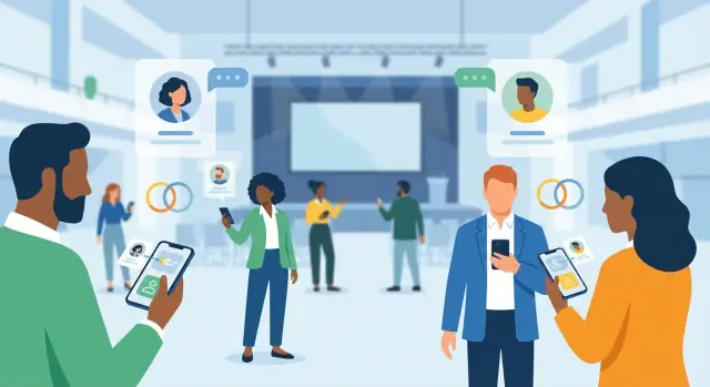
How to Create a Mobile App for Event Networking & Matchmaking
Learn the key features, user flows, matching options, privacy needs, and launch steps to build an event networking and matchmaking mobile app.
Define the Purpose, Audience, and Success Metrics
Before you think about features or design, get specific about why this event networking app exists. A clear purpose prevents you from building a generic “social feed” that nobody uses—and it helps you make smarter trade-offs when time and budget get tight.
Start with the event type and the main networking outcome
Different events create different networking needs:
- Conference: help attendees find relevant peers and book 1:1 meetings between sessions.
- Meetup/community event: encourage lightweight intros and small-group chats.
- Job fair: connect candidates with recruiters and make follow-ups frictionless.
- Expo/trade show: drive qualified booth visits and sponsor leads.
Write one sentence that describes the primary goal, for example: “Help first-time attendees meet 3 relevant people and schedule at least one conversation on day one.” That sentence will guide everything else.
Define success metrics you can measure
Pick a small set of metrics that reflect real networking value (not vanity numbers). Common options include:
- Meetings booked (and held, if you can confirm via check-in)
- Messages sent and reply rate
- Matches accepted (accept/decline is a strong signal)
- Retention across phases: pre-event activation → onsite usage → post-event follow-up
Also define what “good” looks like for your event size (e.g., “30% of attendees send at least 1 message” or “10% book a meeting”).
Identify your primary users (and their incentives)
Most event apps serve multiple audiences:
- Attendees: want relevant people, fast context, and control over privacy.
- Sponsors/exhibitors: want lead quality, not just traffic.
- Speakers: want targeted connections (media, partners, VIPs).
- Organizers: want adoption, safety, and clear reporting.
List what each group is trying to accomplish—and what would make them stop using the app.
Decide when the app is used: pre-event, onsite, post-event
Networking behavior changes over time. Pre-event is best for discovery and scheduling; onsite is about speed and coordination; post-event is about follow-up and exporting value.
Note constraints early
Capture practical limits up front: budget and timeline, venues with poor Wi‑Fi/offline needs, and what attendee/company data organizers can actually provide (and when). These constraints should shape your MVP scope and your definition of success.
Plan the Core User Journeys
Before you choose features, map how attendees actually move through the app during an event. Great networking apps feel effortless because the primary flows are obvious, fast, and forgiving.
Start with the “happy path”
Draft one main flow end-to-end:
Sign up → create profile → onboarding questions → see matches → start a chat → schedule a meeting.
Keep each step tiny. If profile creation takes more than a minute, people will postpone it until “later” (and later never arrives). Aim for a path where someone can get their first useful match within 2–3 minutes.
Add common alternative journeys
Not everyone wants algorithmic matches first. Include secondary routes that still lead to meetings:
- Browse attendees (by role, company, tag)
- Search by interests or keywords
- Scan badges/QR to connect instantly after a conversation
These alternatives also reduce frustration if matching is still warming up.
Design for short, on-the-go sessions
Assume usage happens in 30–90 second bursts: “I have 5 minutes between talks.” Prioritize quick actions: save a match, send a templated opener, propose a time slot, or pin someone for later.
Cover edge cases early
Your journeys should explicitly handle:
- No matches yet (offer browsing + tips to improve profile)
- First-time user confusion (a guided first action, not a tour)
- Incomplete profiles (progress indicator + minimal required fields)
Define MVP vs. backlog
For MVP, ship only the paths that create a real-world meeting: onboarding, matches/browse, chat, and meeting requests. Place “nice-to-have” items (icebreakers, advanced filters, gamification) into a backlog so you can launch on time and learn from real attendee behavior.
If you need to validate scope quickly, tools like Koder.ai can help you prototype the core flows (attendee onboarding, matching, chat requests, and an organizer dashboard) via a chat-driven build process, then export the source code when you’re ready to take it in-house.
Design the Matchmaking Model and Rules
Your matchmaking model is the “engine” behind an event networking app. Get it right and attendees feel like the app understands them; get it wrong and they’ll swipe past everything.
Choose the inputs (what you match on)
Start with a small set of high-signal fields you can reliably collect:
- Interests and topics (selected from the event’s taxonomy)
- Goals (e.g., “find clients,” “learn,” “hire,” “invest”)
- Role and industry
- Company size and stage
- Location and time zone (useful for hybrid or multi-day events)
Avoid asking for too much up front. You can add optional questions later to improve precision without hurting onboarding.
Pick a matching approach
Common options:
- Rule-based: simple filters (e.g., only show mentors to mentees). Fast to ship and easy to understand.
- Scoring: assign points for overlaps (topics + goals + industry) and rank suggestions.
- Mutual preferences: prioritize pairs where both sides explicitly want the connection.
- Hybrid: rules for eligibility + scoring for ranking (often the best balance).
Define “who can match whom”
Be explicit about allowed pair types, because each needs different rules:
- Attendee ↔ attendee
- Attendee ↔ sponsor/exhibitor
- Mentor ↔ mentee
For example, sponsors may appear in a dedicated track with limits so they don’t overwhelm attendee discovery.
Add fairness and diversity controls
Prevent the app from showing the same people repeatedly. Use rotation (cooldowns), caps (max impressions per profile), and balancing (ensure newer or less-connected attendees still get exposure).
Build trust with explainability
Show a short “Why this match” line (e.g., “Shared: FinTech, Hiring; Goal: partnerships”). This helps users decide faster and increases acceptance rates.
Create Profiles, Preferences, and Privacy Controls
Profiles are the foundation of your event networking app: they fuel discovery, matching, and messaging. The trick is to collect enough signal for good recommendations without making registration feel like a form marathon.
Keep profile fields minimal (but meaningful)
Start with a small set of fields that directly support matchmaking:
- Name and company (or “independent”)
- Role/title and industry
- Networking goals (e.g., “find leads,” “hire,” “learn,” “meet investors”)
- Interests/tags (choose from a controlled list to avoid messy duplicates)
- Availability (time windows or “open to meetings during breaks only”)
If you want richer profiles (bio, LinkedIn, topics, portfolio), make them optional and progressively ask later—after users see value.
Add badges and credibility signals
Trust drives replies. Simple badges help attendees decide who to engage with:
- Speaker, sponsor, exhibitor, staff
- “Verified company” (e.g., confirmed domain, admin approval, or ticket type)
- Community roles (mentor, hiring, hiring manager)
Badges should be visible in search and chat requests, not hidden in a secondary screen.
Build preference controls people actually use
Give attendees clear, plain-language controls:
- Discoverability: show/hide profile; appear in suggestions
- Who can contact me: everyone, 2nd-degree only, matched only, or “message requests”
- Context limits: visible only during the event dates (or specific sessions)
Plan consent and safety from day one
Networking is social, but your app must support boundaries:
- Report and block (easy to find, fast to use)
- Message requests (opt-in conversations instead of forced open DMs)
- Clear indicators when someone is “off the clock” (not available)
Decide what’s required vs. optional
Require only what you need to unlock the first useful screen (typically: name, role, goals). Everything else should be optional, skippable, and editable—because a low-drop-off onboarding beats a perfect profile nobody finishes.
Enable Messaging and Meeting Scheduling
Messaging is where networking apps either shine or fall apart. The goal is to help attendees start relevant conversations quickly—without creating a flood of unwanted pings.
Pick the right messaging model
Choose one of three patterns based on your event’s tone and privacy expectations:
- Open chat: anyone can message anyone. Works for smaller, community-style events, but needs strong anti-spam controls.
- Request-to-chat: a lightweight approval step (like “message request”). A good default for most conferences.
- Match-required chat: only matched attendees can chat. Best when the event uses a structured matchmaking flow and you want high intent.
Whichever model you pick, make it obvious why someone can (or can’t) message another person.
Make scheduling effortless
Networking doesn’t happen until a meeting is on the calendar. Support:
- Propose time slots (e.g., “Today 2:00–2:30 or 4:30–5:00?”)
- Meeting details: location notes like “Expo Hall, Booth B12” or “Lobby coffee bar”
- Calendar integration: add to Google/Apple/Outlook with one tap
If your event has dedicated meeting areas, include quick-pick locations to reduce back-and-forth.
Support 1:1 and group conversations
1:1 chat is essential, but group messaging can unlock more value:
- Tables/meetups (people attending the same social table)
- Session-based groups (attendees of a workshop)
- Communities (topics like “Fintech founders” or “Hiring managers”)
Keep group creation controlled (organizer-created or moderated) to avoid noise.
Notifications and safety tools
Notifications should be helpful, not stressful: meeting reminders, new match alerts, and message requests—each with granular toggles.
Add safety from day one: rate limits for new chats, spam detection cues (copy/paste blasts), a clear report flow, and fast admin actions (mute, restrict, suspend). This protects attendees and preserves trust in the networking experience.
Integrate the Event Program and Context
Build Your MVP Fast
Prototype your event networking MVP from a chat prompt and iterate as you learn.
Networking works best when it’s anchored to why people are at the event. Instead of treating matchmaking as a separate “people directory,” tie it directly to the program so recommendations feel timely and relevant.
Import the event structure (and keep it current)
Start by importing the full structure of the event: agenda, sessions, speakers, exhibitors, and venue maps. This data shouldn’t live in PDFs—make it searchable and filterable so attendees can quickly answer “what’s next?” and “where do I go?”
Plan for last-minute changes from day one. Events change constantly (room switches, speaker swaps, sessions added). Support real-time updates and make change notifications obvious and specific (what changed, when, and what attendees should do). Avoid noisy alerts; let users control notification types.
Connect matchmaking to what attendees actually do
Use program context as intent signals. For example, match attendees based on:
- Sessions they saved to their schedule
- Topics or tracks they follow
- Speakers or exhibitors they bookmarked
This creates natural conversation starters (“I saw you’re attending the AI governance panel—are you working on policy or product?”) and makes suggestions feel less random.
Enable session actions that feed back into networking
Give attendees a few lightweight session actions: add to schedule, reminders, and personal notes. Optional extras like Q&A can work well, but only if moderation and speaker workflows are clear.
Decide what works offline
Onsite connectivity can be unreliable. At minimum, cache the schedule, venue essentials, and each attendee’s ticket/QR code for check-in. If something can’t work offline, be transparent and fail gracefully rather than showing blank screens.
Build a Smooth Onsite Experience (QR, Check-In, Venue)
A great matchmaking flow can still fail onsite if the app feels slow, confusing, or fragile when people are rushing between sessions. The onsite experience should reduce friction: get attendees checked in quickly, help them navigate the venue, and make it effortless to meet and exchange details.
QR scanning for instant connections
QR codes are the fastest way to turn a hallway conversation into a real connection. Add a dedicated “Scan” button that’s always reachable (e.g., bottom nav), opens the camera instantly, and confirms success with a clear, calm screen.
Keep the action outcome simple:
- Connect + save contact (adds to “My connections”)
- Send a quick intro (pre-filled message like “Great meeting you at {event}!”)
- Exchange details safely (only what both sides allow in privacy settings)
Check-in that works for every attendee
Onsite lines are where satisfaction drops fastest. Support multiple check-in paths so staff can handle any scenario:
- Attendee badge QR (scan to validate and mark as checked in)
- Ticket wallet / email QR (Apple Wallet, Google Wallet, PDF)
- Onsite registration (lightweight form + payment/verification, if applicable)
Also show attendees a “My badge” screen with their QR and a fallback code in case the camera or brightness is an issue.
Venue tools: maps, rooms, and “near me” (optional)
Add a venue map that answers real questions: “Where is Room C?” “How far is the sponsor hall?” “Which floor am I on?” A searchable room finder, session location links from the agenda, and step-by-step directions (when possible) make the app feel genuinely helpful.
If you offer “near me” networking, make it clearly opt-in, time-boxed (e.g., only during the event), and transparent about what’s shared.
Plan for unreliable connectivity
Venues can be unpredictable. Design for shaky Wi‑Fi and overloaded cell networks:
- Queue actions (connect requests, messages, check-ins) and sync later
- Use graceful retries with clear status (“Sending… Will retry”)
- Cache essentials: agenda, maps, tickets, and your own QR
Accessibility that’s easy to use
Offer a few high-impact options: larger text, high contrast mode, and simple navigation with consistent labels. Onsite is not the moment for hidden gestures or tiny tap targets.
Add Organizer, Sponsor, and Admin Tools
Choose a Pricing Tier
Pick a tier that fits your timeline, team, and how many apps you want to ship.
A networking app succeeds when attendees can meet the right people—but it runs smoothly only when organizers and partners can operate it without asking your team for help every hour. Build a “back office” that makes the event manageable in real time.
Organizer dashboard: control the event day-to-day
Give organizers a single place to manage the core building blocks:
- Attendees: import/approve registrations, segment by ticket type or company, and handle manual edits.
- Sessions & content: update agendas, speakers, room changes, and last-minute cancellations.
- Announcements: publish in-app banners and push notifications (with scheduling and audience targeting).
- Exports: CSV exports for attendance lists, meeting counts, sponsor leads, and post-event follow-up.
A small touch that matters: include an audit log so organizers can see who changed what and when.
Sponsor and exhibitor tools: make partnerships measurable
Sponsors typically want outcomes, not just impressions. Add:
- Lead capture: QR scanning for badges, quick notes, and opt-in consent flags.
- Team accounts: multiple booth staff under one exhibitor, shared lead lists, role-based access.
- Follow-ups: email export templates and reminders so leads don’t disappear after the show.
Roles, permissions, and moderation
Define clear roles such as admin, staff, exhibitor, and speaker. Staff may need check-in access; exhibitors should never see full attendee exports.
For trust and safety, include moderation tools: review user reports, remove messages/profile content, and suspend or restore accounts. Keep actions reversible and documented.
Templates that save time
Ship ready-to-edit templates for onboarding emails, push notification drafts, and attendee FAQs. When organizers can launch communications from the dashboard, adoption improves without extra ops work.
Choose the Tech Stack and App Architecture
Your tech stack decisions will shape timeline, budget, and how quickly you can iterate when attendee feedback arrives. Aim for an architecture that lets you improve matching, messaging, and event content without rewriting the whole app.
Build approach: native vs cross-platform (plus web admin)
- Native (iOS + Android): best platform fit and performance, but two codebases.
- Cross-platform (e.g., Flutter/React Native): one mobile codebase, faster iteration for most teams.
- Hybrid + web admin: a focused mobile app for attendees, plus a web dashboard for organizers/sponsors/admins (usually the most productive setup).
Pick based on your update pace and team skills—not hype. For many event products, cross-platform is enough because the real complexity lives in the backend (matching rules, chat, analytics, and moderation).
If you want to move fast without locking yourself into a dead-end prototype, Koder.ai aligns well with this “mobile app + web admin + strong backend” pattern: React for web surfaces, Go + PostgreSQL for backend/data, and Flutter for mobile—plus features like planning mode, deploy/hosting, and snapshots/rollback to support rapid iteration.
Core components to plan upfront
At minimum, define these building blocks:
- Auth & identity (email, ticket-based access, SSO if needed)
- Profiles & preferences (with privacy controls)
- Matching service (rules + scoring)
- Messaging (in-app chat) and notifications (push + email)
- Admin tools (event setup, support actions, content management)
A modular backend (separate services or clearly separated modules) makes it easier to swap parts later—like upgrading your attendee matching algorithm without touching chat.
Data storage, logs, and retention
Plan where each type of data lives:
- User data (profiles, preferences, privacy settings)
- Event data (sessions, venues, sponsors)
- Operational logs (delivery failures, abuse reports)
- Analytics (funnel steps, match quality signals)
Define retention rules early (e.g., delete chat history X days after the event; anonymize analytics). This reduces privacy risk and support burden.
Integrations and an API contract
Common integrations include ticketing/CRM imports, calendar invites, email, and push providers. Document an API contract early (endpoints, payloads, error states, rate limits). It prevents rework between mobile and backend teams and speeds up QA—especially for high-traffic moments like check-in and session breaks.
Design UX, Onboarding, and Discovery
A networking app succeeds or fails on how quickly someone can get to a high-quality first match. The goal for UX is simple: users should install, understand the value, and take a meaningful action (match, chat, or meeting request) in under a minute.
Onboarding: collect the minimum, then earn the rest
Start with just enough information to generate relevant matches without feeling like a survey. Ask a few high-signal questions first—role, industry, what they’re looking for (sales leads, hiring, partners), and availability. Then use progressive profiling: as users engage, request more detail (budget range, company size, topics of interest, goals) at natural moments, like after they save a match or book a meeting.
Keep the flow skippable and transparent:
- Show why each question matters (“Improves match quality”)
- Provide defaults and quick-pick chips
- Let users edit later from their profile
Discovery: make “what to do next” obvious
Design clear, action-first CTAs that appear consistently across screens:
- Find matches (primary)
- Request chat (secondary)
- Book meeting (when availability overlaps)
Discovery should be opinionated. Instead of showing an endless directory first, lead with a curated “Top matches” queue and a lightweight “Why this match” explanation (mutual interests, shared sessions, similar goals).
Trust cues that increase response rates
People respond when they feel safe and the match feels real. Add subtle credibility signals:
- Profile completeness indicator
- Mutual interests and shared sessions badge
- “Recently active” (without exposing exact timestamps)
- Clear privacy controls directly accessible from the profile
The 60-second usability checklist
On first open, users should be able to: view 3–5 suggested matches, see why they’re suggested, and send one chat/meeting request—without hunting through menus. If that path isn’t effortless, fix the path before adding more features.
Analytics, Quality Signals, and Moderation
Ship a Mobile App
Start a Flutter attendee app that fits quick onsite sessions and QR-based connections.
Analytics is where an event networking app becomes a product you can improve, not just a feature list. Instrument the right events, define quality signals, and keep the community safe—without turning the app into a surveillance tool.
Track the networking funnel (end-to-end)
Start with a simple funnel that matches how attendees actually use the app. Track key events like:
- Profile completion (and which fields are skipped)
- Match views and “interested” actions
- Accepts / mutual matches
- Chats started and first response time
- Meetings proposed, scheduled, and checked-in
This funnel makes it easy to see whether you have a discovery problem (not enough relevant matches), a conversion problem (people don’t accept), or an execution problem (meetings aren’t happening).
Measure match quality, not just volume
A good attendee matching algorithm should produce outcomes, not only “more matches.” Useful quality signals include:
- Response rate in chats (by segment, e.g., sponsors vs. attendees)
- Meeting show rate (scheduled vs. attended)
- Post-event follow-ups (e.g., contact exchange, continued messaging)
Treat these as leading indicators for event ROI and exhibitor satisfaction.
Run focused A/B tests
Small tests often outperform big redesigns. Good candidates:
- Onboarding questions (short vs. detailed)
- Match cards (what info appears above the fold)
- Notification timing (immediate vs. digest; local time windows)
Keep A/B tests scoped to one change at a time, and tie results back to the funnel and match quality signals.
Community health metrics and moderation workflows
Plan for spam and harassment early. Track reports per user, spam flags, and blocked users, and set clear thresholds for review. Build lightweight tools for moderators: view conversation context, apply warnings, suspend accounts, and handle appeals.
Organizer reports that answer practical questions
Your organizer dashboard should summarize what worked: who engaged, which sessions boosted networking, which segments were under-matched, and whether meeting spaces were used as planned. The goal is a debrief that directly informs the next event’s program, staffing, and sponsorship packages.
Testing, Launch, Adoption, and Post-Event Retention
A networking app can look great in demos and still fail on the show floor. Plan for real-world testing, a tight launch process, and simple adoption tactics that don’t rely on attendees “figuring it out.”
Pilot before you bet the event
Run a pilot at a smaller meetup or a single track within a larger conference. Validate the essentials: the matching quality (do people agree the suggestions make sense?), messaging reliability (deliverability, notifications, spam prevention), and the “first 2 minutes” experience (how quickly can someone get to their first useful connection?).
Use pilot feedback to tune matching rules, tighten profile fields, and adjust privacy defaults—small changes here have a big impact on trust.
Launch checklist (don’t improvise)
Have a simple release plan that includes:
- App store pages: screenshots that show “match → message → meet,” plus clear value props
- Privacy copy: plain-English explanations of what’s public, what’s optional, and how to hide or limit visibility
- Support workflows: a contact path inside the app, an FAQ, and a clear “report” flow for bad behavior
Drive attendee adoption onsite
Adoption is an operations task as much as a product task. Prepare QR posters at entrances and high-traffic areas, ask speakers/MCs to mention the app on stage, and schedule email/SMS nudges tied to moments that matter (before day 1, after keynotes, before networking breaks). Light incentives help—e.g., “complete your profile to unlock better matches.”
Post-event retention that feels useful
After the event, help people keep momentum without nagging:
- Export connections (CSV, vCard, or CRM integrations) so relationships don’t get stuck in the app
- Follow-up reminders based on context (e.g., “You met 3 people—send a recap?”)
- A “keep-in-touch” mode that keeps chat history and connections while turning off event-specific noise
If you’re building under a tight deadline, consider validating the MVP in a platform like Koder.ai first: you can iterate on flows with planning mode, roll back safely with snapshots, and later export the source code for a fully custom roadmap.
If you want help scoping your launch plan or choosing the right feature set, explore /pricing or reach out via /contact.
FAQ
How do I define the purpose and success metrics for an event networking app?
Start by writing a single-sentence goal tied to a measurable outcome (e.g., “Help first-time attendees meet 3 relevant people and schedule one conversation on day one”). Then pick 2–4 success metrics that reflect real networking value, such as:
- Meetings booked (and held, if you can confirm)
- Messages sent + reply rate
- Matches accepted
- Pre-event → onsite → post-event retention
Who are the primary users of an event matchmaking app, and what do they need?
Map each primary user group to their incentives and failure points:
- Attendees: relevant people, fast context, privacy control
- Sponsors/exhibitors: lead quality and follow-up
- Speakers: targeted connections (media, partners, VIPs)
- Organizers: adoption, safety, reporting
Use these incentives to set defaults (e.g., request-to-chat) and to prioritize MVP journeys.
When should the app be used—pre-event, onsite, or post-event?
Design around three phases because behavior changes:
- Pre-event: discovery + scheduling
- Onsite: speed, coordination, QR-based connections
- Post-event: follow-up, exports, keeping value
Make sure your analytics and notifications are phase-aware so you don’t over-notify onsite or lose momentum after the event.
What are the core user journeys I should design first?
Define the “happy path” and make it fast:
Sign up → minimal profile → onboarding questions → see matches → start chat → propose meeting.
Aim for the first useful match within 2–3 minutes. Add alternative routes (browse/search/QR scan) so users aren’t stuck if matching is still warming up.
What features belong in the MVP for an event networking app?
Ship only what creates real-world meetings:
- Onboarding + minimal profiles
- Match suggestions and/or browse/search
- Chat (with a clear permission model)
- Meeting requests and scheduling
Put nice-to-haves (advanced filters, gamification, icebreakers) in the backlog until you have real usage data.
How should I design the matchmaking algorithm and its inputs?
Start with high-signal inputs you can reliably collect:
- Goals (hire, invest, sell, learn)
- Interests/topics (controlled taxonomy)
- Role/industry
- Company stage/size
- Availability (simple time windows)
Use a hybrid model for many events: eligibility rules (who can match whom) + scoring to rank suggestions. Add a short “Why this match” line to build trust and speed decisions.
What profile and privacy settings are essential to include?
Use controls that are plain-language and easy to find:
- Discoverability (show/hide profile)
- Who can contact me (everyone, matched only, requests)
- Context limits (visible only during event dates)
Require only what unlocks value (often name, role, goals). Make everything else optional and editable later to reduce onboarding drop-off.
What’s the best messaging and meeting scheduling model for networking apps?
Pick one of three messaging patterns based on event tone:
- Open chat: simple but needs strong anti-spam
- Request-to-chat: good default for conferences
- Match-required: high intent, structured flows
For scheduling, support time-slot proposals, location notes, and one-tap calendar adds (Google/Apple/Outlook). These reduce back-and-forth and increase meeting completion.
How do I integrate the event agenda and handle onsite connectivity issues?
Anchor networking to the program so matches feel timely:
- Import agenda, sessions, speakers, exhibitors, maps
- Use saved sessions/bookmarks as intent signals for matching
- Support real-time updates (room changes, cancellations) with targeted notifications
At minimum, cache essentials (agenda, maps, ticket/QR) so the app stays useful with poor Wi‑Fi.
What admin, sponsor, and moderation tools are needed to run the app smoothly?
Plan a back office so the event can run without constant engineering support:
- Organizer dashboard: attendee imports, session updates, announcements, exports, audit log
- Sponsor tools: lead capture (QR), notes, consent flags, team accounts, follow-up exports
- Moderation: reports, block flows, admin actions (mute/restrict/suspend) with reversible logs
This protects trust onsite and makes sponsor ROI measurable after the event.