Nov 19, 2025·8 min
How to Create a Fitness App: Tracking, Plans, and UX
Learn how to create a mobile fitness app with tracking and workout plans: key features, UX flows, data choices, tech stack, privacy, testing, and launch.
Learn how to create a mobile fitness app with tracking and workout plans: key features, UX flows, data choices, tech stack, privacy, testing, and launch.
Most fitness apps fail for a simple reason: they try to be everything at once. Before you sketch screens or pick a tech stack, decide what your app is really for—and what it is not.
Choose one primary promise users can repeat back in a sentence. For example:
This decision drives every later trade-off: the home screen, notifications, what data you store, and which features can wait.
Avoid “everyone who works out.” Pick a group with shared routines and constraints:
When in doubt, choose the audience you can reach and interview easily.
Tie metrics to the promise:
Your MVP should prove value with the fewest moving parts. A practical MVP for a workout plan app might include: account creation, a small exercise library, 1–3 beginner plans, workout logging, and a simple progress view.
Save wearables, social feeds, and advanced personalization for later—once users consistently finish week one.
Before you write specs for a fitness tracking app or workout plan app, map the market. Competitor research isn’t about copying features—it’s about spotting patterns, user frustrations, and what people are already paying for.
Here are common reference points you can review in 30–60 minutes each:
As you compare, look for gaps that users actually feel:
Write a single sentence you can defend:
“A beginner-friendly workout planner that generates a clear 8-week program in under 2 minutes, then auto-adjusts weights and volume based on completed sets—no manual math.”
If you can’t say it in one sentence, it’s not a differentiator yet.
Run 5–10 quick interviews (15 minutes each) or a short survey. Ask:
Record exact phrases users say—those become your app UX design cues and your marketing copy later.
Before adding “fun” features, lock down the two engines of your product: tracking (what the user did) and plans (what the user should do next). If these feel effortless, people return.
Start with the minimum that supports real progress and quick logging:
Make logging fast: default to the last used values, allow “repeat last workout,” and keep editing simple. A useful rule: users should be able to record a set in a few taps, even mid-workout.
A workout plan app needs structure without forcing everyone into one style:
Keep the plan flexible: people miss sessions. Let them move workouts, swap exercises, and continue without “breaking” the program.
Add simple retention features that support the habit:
Streaks, milestones (e.g., “10 workouts completed”), and gentle reminders tied to the plan schedule. Avoid over-gamifying early; the core reward should be visible progress.
Include: profile, goals, preferred units (kg/lb), and available equipment (gym, home, dumbbells). These choices should personalize templates and exercise options.
Social feeds, coaching marketplaces, challenges, and nutrition logging can be valuable—but they add complexity and moderation overhead. Ship the MVP with tracking + plans first, then expand based on what users actually ask for.
A fitness tracking app lives or dies by what happens in the first five minutes. Your job is to get someone from “I downloaded this” to “I completed something” with as little friction as possible.
Start by sketching the critical path:
Keep this flow “happy-path” friendly. If the user gets stuck choosing between 12 goals or setting up detailed metrics, they’ll bounce before they ever see value.
Ask only what you need to deliver a reasonable first experience. A simple approach:
Everything else can wait until after the first win. If you want extra details (equipment, injuries, preferences), collect them gradually with small prompts after a workout or on the Plan screen.
Most users return to do one of four things. Organize navigation accordingly:
Offer a beginner plan and simple tracking as the default. Let people start with “good enough” logging (e.g., time + effort) and unlock more detailed tracking later.
A quick start reduces decision fatigue and builds trust because the app feels helpful, not demanding.
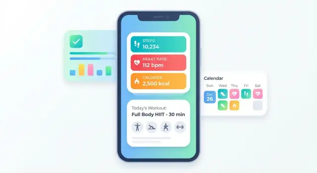
A fitness app feels “smart” when it remembers the right things—and shows progress in a way that matches how people actually train. That starts with a clean data model that can survive real-life behavior: missed workouts, edited weights, traveling across time zones, and spotty connectivity.
Model the core objects you’ll need for tracking and planning:
Keep optional fields truly optional. Notes, RPE, and attachments shouldn’t block saving a session.
Pick a clear strategy for measurement units (kg/lb, km/mi) and store values in a consistent base unit while displaying the user’s preference.
For time, store timestamps in UTC plus the user’s local time zone at the moment of logging. This prevents weekly summaries from breaking when someone travels.
Also decide how you handle change:
Even if your MVP is online-only, plan identifiers and conflict rules as if offline will exist. Use stable IDs for sessions/sets, track “last updated,” and define what happens if the same workout is edited on two devices.
Define a few progress views that feel rewarding and practical:
Keep insights descriptive and optional (“Your weekly volume is up 12%”) rather than implying health outcomes or medical guidance.
A workout plan system is the “engine” that turns a fitness tracking app into something users can follow day-to-day. The key is to model plans as flexible building blocks rather than hard-coded routines.
Start with a consistent structure so every plan can be created, displayed, and edited the same way. A practical minimum set:
Then represent each week/day as a sequence of workouts, and each workout as a list of exercises with sets, reps, time, rest, and notes.
People expect plans to evolve. Add simple progression logic you can explain clearly:
Keep the rules transparent: show what will change next week and why.
Users will want to adjust around real life. Support:
Offer two ways to record workouts:
Add safety notes and form cues where relevant (non-medical), such as “keep a neutral spine” or “stop if you feel sharp pain,” without pretending to diagnose or treat injuries.
Your workout plan system is only as good as the exercise content behind it. Clear instructions, consistent naming, and fast search are what make a fitness tracking app feel “easy” rather than overwhelming.
Start with the formats that teach the movement quickly:
If you’re building an MVP for a fitness app, it’s better to cover fewer exercises with high-quality guidance than to dump hundreds of vague entries.
Consistency matters for both UX and search. Pick one naming style (e.g., “Dumbbell Bench Press” vs “Bench Press (Dumbbell)”) and stick to it.
Create tags that match how beginners think:
This tagging becomes the backbone for filters in your workout planner and prevents duplicate exercises later.
You typically have three options: in-house, licensed, or user-generated (usually later, once moderation and trust are solved). Early on, keep ownership clear—especially if you use trainers, stock video, or third-party libraries.
Short clips beat long videos. Aim for small file sizes, offer “download on Wi‑Fi,” and avoid autoplay in lists. Fast loading improves retention and reduces data usage complaints.
Beginners won’t type perfect terms. Support synonyms (“abs” → “core”), common misspellings, and simple filters like No equipment, Back pain friendly (only if medically appropriate), and Beginner.
A good rule: users should find a safe option in under 10 seconds.
Your tech stack should match your team’s strengths and the speed you need, not just what’s trendy. For a fitness tracking app, the architecture has to support offline use, reliable sync, and frequent iteration as you refine metrics and plans.
If your team is already strong in Swift (iOS) and Kotlin (Android), native apps often deliver the smoothest UI and easiest access to device sensors.
If you need to ship faster with one codebase, cross-platform frameworks like Flutter or React Native can work well—especially for MVPs—provided you plan extra time for edge cases (background sync, Bluetooth/wearables, performance on older devices).
Even a simple workout planner benefits from a small but solid backend. At minimum, outline:
This prevents “feature debt” where you rebuild core parts later.
Fitness apps are used in gyms with spotty reception, so design for offline by default. A common approach is:
Wearables and health platforms (Apple Health, Google Fit, Garmin, etc.) can increase retention—but only if they support your core use cases. Treat integrations as add-ons: build the core tracking experience first, then connect where it adds real value.
Before coding, write a lightweight spec: key screens, data fields, and API endpoints. A simple shared document (or /blog/product-spec-template) aligns design and development and helps you avoid rebuilding flows mid-sprint.
If your main constraint is time-to-first-release, consider using a build workflow that can generate a working baseline app from your spec and iterate quickly. For example, Koder.ai lets teams “vibe-code” web, backend, and mobile apps via chat—useful for rapidly prototyping flows like onboarding, workout logging, and plan scheduling—then export the source code when you’re ready to take over with a traditional engineering process. Features like planning mode and snapshots/rollback are especially helpful when you’re iterating on product requirements weekly.
A fitness tracking app quickly becomes personal: workouts, body metrics, routines, even location if you log runs. Trust isn’t a “nice to have”—it’s a core product feature.
The simplest rule: collect the minimum data you need to deliver the experience you promised.
Request permissions at the moment they’re needed (not on first launch), and explain the reason in plain language.
For example:
Avoid “permission creep.” If a feature doesn’t require sensitive access, don’t request it “just in case.”
Basic controls should be available from Settings, without hunting:
These controls reduce support tickets and increase long-term confidence.
At minimum, protect accounts with strong password rules and rate limiting. Consider adding:
Also think about shared devices: provide an in-app lock (PIN/biometric) if you expect gym tablets or family phones.
If you store body measurements, injuries, pregnancy-related notes, or anything medical-adjacent, consult legal guidance for your target regions. Requirements can vary by country and by what data you store.
Write clear consent screens that match real behavior. No hidden tracking, no vague wording. If you use analytics, name the purpose (“improve onboarding completion”) and allow users to opt out where appropriate.
Done well, privacy doesn’t slow growth—it builds a product people recommend.
A fitness app lives or dies on trust: users expect their workouts to save correctly, metrics to add up, and plans to stay usable when life (and connectivity) gets messy. Before launch, focus your testing on the handful of actions people will repeat every day.
Run “happy path” tests as if you’re a new user. Can someone complete onboarding, log a workout in under a minute, and start following a plan without getting stuck?
Also test the common detours: skipping onboarding steps, changing goals mid-way, editing a logged set, or abandoning a workout and coming back later. These are where frustration (and churn) often starts.
Test on a mix of older and newer devices. Pay attention to startup time, scroll performance in long lists (exercise search, history), and battery impact during activity tracking.
Include offline scenarios: log a workout with no signal, then reconnect. Confirm data sync is predictable and doesn’t create duplicates or missing sessions.
Crash checks matter: force-close mid-workout, switch apps during logging, rotate the screen, and validate nothing breaks.
Treat your progress metrics like accounting. Create small test workouts where you already know the correct totals (volume, time, calories if you show them), streak behavior, plan completion rates, and weekly summaries.
Write these expectations down and re-run them after changes. It’s an easy way to catch subtle regressions.
Recruit a small beta group that matches your target audience and ask them to use the app for a week. Look for patterns: where they hesitate, what they ignore, and what they misunderstand.
Set a simple issue triage routine: label bugs by severity (blocking, major, minor), fix the top blockers first, and keep a short “next build” list so improvements ship quickly.
Monetization should feel like a fair upgrade, not a toll booth. The fastest way to lose trust is to block the core habit loop (log workout → see progress → stay motivated) behind paywalls or surprise users with sudden restrictions.
Most fitness apps succeed with free + paid subscription because it aligns revenue with ongoing value (new plans, insights, content). A one-time purchase can work for a smaller app with limited ongoing updates.
Avoid launching with multiple payment models at once—choose one and make it clear.
A common approach:
The paid tier should feel like “better results with less effort,” not “now you can finally use the app.”
Start with one paid plan (monthly + yearly). Too many tiers create hesitation, increase support load, and make your onboarding harder. You can segment later when you have real usage data.
Create a focused /pricing page that answers:
Track trial-to-paid conversion, churn, and feature engagement (what paid users actually use). Let those numbers guide future pricing and packaging changes—small tweaks can outperform big redesigns.
Launching isn’t the finish line—it’s the start of learning what people actually do in your product. Treat your first release as a focused experiment: ship a clear MVP, measure the key behaviors you care about, and improve quickly.
Before you hit “Publish,” create a simple checklist so nothing important is missed:
Set up analytics events that map to your success definition. For a fitness tracking app, start with a small, high-signal set:
Add properties like plan type, workout duration, and whether the session was completed, skipped, or edited. This helps you spot where users drop off without drowning in data.
Early growth is mostly retention. Keep it lightweight and supportive:
Add a visible feedback button, simple FAQs, and a “report an issue” flow. Categorize incoming messages (bugs, content requests, feature ideas) and review them weekly.
Plan the next iterations based on your data:
Ship improvements in small batches, validate them against your core events, and keep the app experience focused.
Start by writing a one-sentence promise users can repeat, then build only what supports it.
Examples:
Use that promise to decide what not to build in v1 (e.g., social feeds, wearables, deep personalization).
Pick a group with shared routines and constraints so your onboarding, defaults, and templates are coherent.
Good starting segments:
If unsure, choose the audience you can interview and recruit fastest.
Use 3–5 metrics that reflect your app’s core promise and daily habit loop.
Common picks:
Avoid vanity metrics early (downloads without retention).
A solid MVP proves value with the fewest moving parts.
For a workout plan app, a practical MVP is:
Save advanced features (wearables, social, challenges, nutrition) until users reliably finish week one.
Scan a handful of popular apps and write down patterns, frustrations, and what users pay for.
Then define a one-sentence differentiator you can defend, such as:
“A beginner-friendly planner that generates a clear 8-week program in under 2 minutes and auto-adjusts weights based on completed sets.”
If you can’t say it in one sentence, it’s not clear enough yet.
Keep onboarding minimal and oriented around the first win: completing a workout.
Ask only what you need to produce a reasonable plan:
Collect extras (equipment, injuries, preferences) later via small prompts after a workout or on the Plan screen. Make onboarding skippable when possible.
Model the basics for tracking + plans, and design for real-world messiness.
Core entities often include:
Practical rules:
Make plans structured but flexible so users can miss days without “breaking” the program.
Include:
Support real-life edits:
Ship fewer exercises with high-quality guidance and consistent naming.
Best practices:
Aim for: users can find a safe option in under 10 seconds.
Choose tech based on your team and the product’s constraints (offline use, reliable sync, frequent iteration).
Common architecture:
Backend basics even for MVP:
Keep sensitive permissions contextual (ask when needed) and provide user controls like export and delete account.