Apr 10, 2025·8 min
How to Create a Mobile App for Local Marketplaces (Step-by-Step)
Learn how to plan, design, build, and launch a mobile app for a local marketplace—core features, tech choices, payments, trust, and growth steps.
1) Define Your Local Marketplace Concept
Before screens, features, or budgets, get clear on what you’re building. A “local marketplace app” can mean anything from a neighborhood buy/sell board to a city-wide service booking app. If you don’t define it early, you’ll end up with an MVP that tries to satisfy everyone—and delights no one.
Define what “local” means
Pick a boundary that matches how people actually trade:
- City-based (e.g., “Austin only”) for simpler marketing and moderation
- Radius-based (e.g., “within 10 miles”) for suburbs and commuters
- Neighborhoods for tight communities and safer meetups
Also decide whether users can browse outside their area (useful for planning) while still prioritizing nearby results.
Choose your marketplace model
Your model determines the user flow and your future “marketplace app features” list:
- Goods (secondhand items)
- Services (cleaning, tutoring, repairs)
- Rentals (tools, gear, spaces)
- Events/food (tickets, home cooking, pop-ups)
- Mixed (harder to keep search and categories clean)
Clarify your main value
Write one sentence that explains why someone would switch from existing options:
- Sell faster (better local discovery)
- Meet safer (identity checks, verified pickup spots)
- Higher quality (curated sellers/providers)
- Lower fees (simple pricing)
Identify the two audiences
Marketplaces always have two sides: buyers and sellers (or clients and providers). Decide which side you’ll prioritize first, and what “success” looks like for each (e.g., time-to-first-sale vs. time-to-first-booking).
List your constraints
Be honest about:
- Budget and timeline (your “mobile marketplace MVP” scope)
- Team size (who supports users and moderates listings?)
- Operating hours (will disputes be handled same-day or next-day?)
This concept brief becomes your filter for every decision that follows.
2) Validate Demand and Pick a Clear Niche
Before you design screens or choose features, make sure people actually want what you plan to build—and that you can explain it in one sentence. Validation isn’t a big research project; it’s a short, practical sprint to reduce risk.
Talk to real buyers and sellers (10–20 interviews)
Aim for quick conversations with people who would use your app in the first month. Split them roughly evenly between sellers and buyers.
Ask about:
- What they sell/buy locally, how often, and what “local” means to them (2 km? same neighborhood? same city?)
- Where they post today (Facebook groups, classifieds, WhatsApp, in-person markets) and what they like/hate about it
- The last time a transaction went wrong (no-shows, scams, price haggling, delivery confusion)
Look for patterns, not compliments like “I would totally use this.” A useful signal is when they describe a workaround they already do weekly.
Map alternatives and find the gap
Write down the current options people use—and what those options fail at. For example:
- Facebook groups: huge reach, but messy search and weak moderation
- WhatsApp: trusted circles, but poor discovery and zero browsing
- Classifieds: searchable, but low trust and lots of stale listings
Your niche often sits in the gap: a specific category + a specific area + a specific promise.
Write 3–5 simple user stories
Keep them concrete and time-bound. Examples:
- “I want to sell today within 2 km without spending hours answering the same questions.”
- “I want to find a used stroller within a 20-minute walk and confirm it’s still available.”
- “I want to message safely without sharing my phone number.”
If you can’t write clear stories, the niche is still fuzzy.
Decide the niche for the first launch—and define success
Pick one primary category (e.g., kids items), one starting location (e.g., two neighborhoods), and one core audience (e.g., parents). Then set 90-day metrics you can actually track: number of new listings per week, percent of listings with a reply, weekly active users, and completed transactions (or confirmed meetups).
A focused niche makes your first version easier to explain, easier to market, and easier to improve.
3) Plan Local Go-to-Market and Supply Acquisition
A local marketplace lives or dies on supply. Before you spend time polishing features, decide where you’ll launch and how you’ll ensure buyers open the app and immediately see relevant listings.
Pick a launch area with “fast feedback”
Choose one compact area you can serve well—typically a dense neighborhood or small city where people already buy/sell locally. Look for:
- Enough population density that search results won’t feel empty
- Existing seller activity (Facebook groups, flea markets, local shops)
- A clear category pull (e.g., kids gear near family-heavy neighborhoods)
Keep the initial radius tight so you can learn quickly, show busy inventory, and handle support without spreading yourself thin.
How to get the first listings (without waiting)
Plan a supply acquisition sprint for your first 100–300 listings. Common sources:
- Local partners: repair stores, consignment shops, studios, community orgs
- Ambassadors: students, creators, neighborhood connectors paid per quality listing
- Power sellers: people already listing frequently in community groups
Make it easy: offer a “we’ll post it for you” concierge flow for early sellers, then transition to self-serve onboarding.
Incentives that don’t ruin your unit economics
Early perks should create momentum without becoming permanent discounts:
- Free listings for a limited time or limited quantity
- Featured spots earned via activity (fast replies, completed sales), not only cash
- Referral rewards capped per user and tied to completed transactions
Offline support that actually drives installs
Local marketplaces grow offline. Prepare:
- Simple posters with QR codes for cafés, gyms, libraries, campuses
- Presence at community events (swap meets, school fairs)
- A short playbook for posting in local groups (with admin-friendly language)
Publish clear rules and an onboarding checklist
Create a lightweight “marketplace rules” page (prohibited items, meetup safety, returns expectations, spam policy) and link it in onboarding and listing creation. Keep it simple and visible—this reduces disputes and support load later. If you need a model structure, build a single /rules page and iterate as you learn.
4) Define MVP Scope and User Flows
Your MVP is the smallest version of the app that can complete a real local transaction end-to-end. If it can’t reliably get a buyer from “I want this” to “I got it,” it’s not a marketplace yet.
Non‑negotiable MVP features (buyer + seller)
For sellers, keep it to: account creation, create/edit a listing (photos, title, price, category, location), manage availability (mark sold/hidden), and respond to messages.
For buyers, focus on: browse/search listings, basic filters (category + distance), view listing details, save/share, and message the seller.
Across both sides, you also need: location permission + manual location entry, push notifications for messages, and a lightweight admin tool to remove bad content.
What to delay (on purpose)
To ship faster, explicitly push these to “later”: ratings/reviews, subscriptions, delivery logistics, in-app payments, advanced filters (size, condition, brand trees), promoted listings, and referral programs. You can still validate demand without them.
Define the core user flows
Write and review these flows before design:
- Sign up / log in (phone or email, verify, set location)
- Create listing (photos → details → publish)
- Search & discovery (home feed → search → filter by distance)
- Chat (start conversation → negotiate → confirm pickup time/place)
- Transact (offline meetup or simple “mark as sold”)
- Review (optional in MVP; if delayed, prioritize “report user” instead)
Ship in one cycle: 8–12 weeks
A practical MVP scope fits a single build cycle (8–12 weeks is a common target). Create a backlog labeled Must-have / Should-have / Later, and be strict: if a feature doesn’t support the flows above, it goes to “Later.” If you’re unsure, keep it out and revisit after your first 50–100 transactions.
5) Core Features for Listings, Search, and Messaging
If your app nails three things—posting, finding, and talking—you’ll feel useful on day one. Everything else can evolve, but these basics decide whether locals stick around.
Listings: make posting feel effortless
Your listing form should be short, predictable, and forgiving. Aim for a flow that takes under a minute for a first-time seller.
Include only what buyers need to decide whether to click:
- Photos (guide users to add 3–6; auto-suggest “first photo = cover”)
- Title (simple prompt: “What are you selling?”)
- Price (allow “free” or “negotiable” if it fits your niche)
- Category (keep the first version tight—too many options slows people down)
- Location (area/neighborhood, not a full address)
- Availability (e.g., “weekends,” “after 6pm,” or “pickup only”)
Small detail that helps: show a lightweight preview of the listing before posting, so users can spot mistakes.
Search & filters: help people find “near me” fast
Search is your marketplace’s “front door.” Add filters that match local intent:
- Distance (e.g., 1/5/10/25 miles)
- Category
- Price range
- Condition (new/like new/used) when relevant
Also consider saved searches (“Baby stroller under $100 within 5 miles”) so users can come back without redoing work.
Messaging: keep it safe, simple, and structured
Messaging should feel like texting, but with guardrails:
- Block/report actions in every conversation
- Limit personal info sharing by default (hide phone/email until users choose)
- Optional prompts like “Is this still available?” to reduce friction
Add clear expectations in-chat (“Meet in a public place”) and link to your safety basics.
Notifications & accessibility: retention without annoyance
Use notifications for high-intent moments: new messages, saved search matches, price drops, and order updates (if you support payments).
For accessibility, cover the basics early: readable text, large tap targets, and strong color contrast—especially on listing screens and chat.
6) Location, Maps, and Local Logistics
Go live with your brand
Add a custom domain when you’re ready to invite real local users.
Location is what makes a local marketplace feel “right.” Get it wrong and people see irrelevant listings; get it right and discovery feels effortless.
Choose how location works (and make it obvious)
You have two common options:
- Manual selection (city/neighborhood): Great for privacy and for users browsing before they’re ready to share GPS. It also helps when people shop “near work” or “near family.”
- GPS radius (e.g., within 2–10 miles/km): Great for quick, nearby discovery—but only if you clearly show the current radius and let users adjust it.
A practical approach for an MVP: default to manual neighborhood/city, then offer an optional “Use my location” button to refine results.
Maps are optional; list view should carry the experience
A map view can be helpful for categories like rentals, services, or bulky items. But it adds complexity and can distract from browsing.
Keep list view as the default, and add a map only if it answers a real question, such as: “Is this item actually near me?” If you do add it, make it a toggle (“List / Map”) rather than the main entry point.
Local logistics: start simple, then deepen
Most local marketplaces succeed with lightweight logistics first:
- Meetup guidance: Suggest public places (busy cafes, store parking lots), daytime time windows, and basic tips like bringing a friend for high-value items.
- Delivery: If delivery matters, start with seller-arranged delivery (seller chooses courier or drop-off) before building full delivery tracking.
Don’t forget local details
If your audience spans different communities, plan for multiple languages and local units/currencies early—even if you launch with one. Small touches like miles vs km or “£” vs “$” reduce confusion and improve conversion.
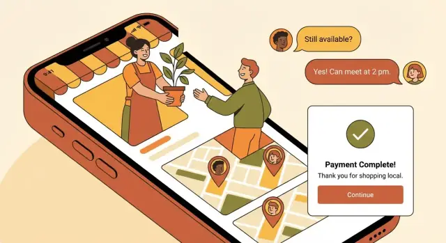
7) Payments, Fees, and Monetization Options
Payments and pricing decisions shape user trust and your unit economics. The goal is to keep buying and selling simple, while making fees predictable.
Choose your transaction type
Start by deciding how transactions will happen:
- Chat-to-meet (offline payment): fastest to launch and common for local pickups. You monetize mainly through promoted listings or subscriptions.
- In-app checkout: you can take a commission, but you’ll need payouts, refunds, and support processes.
- Both: offers flexibility (great for mixed categories), but be clear about when each option is available.
If you use payments: define the basics early
Even at MVP stage, outline the core rules so users know what to expect:
- Payouts: when sellers get paid (e.g., instantly, daily, or after delivery confirmation).
- Refunds: what qualifies for a refund and how quickly it’s processed.
- Disputes: a simple flow like “buyer reports an issue → seller responds → marketplace decides or escalates.”
For higher-trust categories (electronics, rentals, services with deposits), consider escrow (release funds after confirmation) or payment on delivery to reduce anxiety on both sides.
Monetization options that work locally
Common approaches include:
- Commission (take rate): a percentage per completed in-app transaction.
- Listing fees: charge to post in specific categories or above a free limit.
- Promoted listings: sellers pay for better placement and faster visibility.
- Subscriptions: power-seller plans with perks (more listings, analytics, priority support).
Make fees feel fair (and visible)
Avoid surprise charges: show fees before checkout and again in the final confirmation. A simple breakdown (“Item price + service fee + delivery (if any) = total”) prevents drop-offs and support tickets.
8) Trust, Safety, and Moderation
Build your marketplace MVP
Turn your marketplace MVP plan into a working app using a chat-based build workflow.
Trust is the difference between a marketplace people try once and a marketplace they recommend. Build safety into everyday actions (posting, messaging, paying) so it feels natural—not like extra work.
Identity signals that make users comfortable
Start with lightweight verification that reduces fake accounts without adding friction:
- Verified phone number and email (shown as small badges on profiles and in chat)
- Optional ID verification for higher-value categories (e.g., vehicles, rentals, services)
Make these signals visible wherever a decision happens: listing pages, seller profiles, and message threads.
Moderation tools you’ll actually use
Even a small app needs clear, fast controls for harmful content. Add:
- Report listing and report user (with a short reason list)
- Admin actions to remove content, warn, or ban users
- A simple audit trail (who was banned, why, when) to keep support consistent
Prohibited items and simple rule enforcement
Write a short “not allowed” list (weapons, drugs, counterfeit goods, adult services, etc.) and connect it to categories.
A practical approach is category-based rules: if someone selects a risky category or uses restricted keywords, require extra confirmation or send the listing to review.
Ratings and reviews that don’t get spammy
Ratings work best when they reflect real transactions. Allow reviews only after a completed transaction (or a confirmed handoff), and show the context (e.g., “Purchased on May 12”). This reduces fake “5-star” loops.
Anti-fraud basics you can add early
You don’t need complex systems to catch common abuse:
- Rate limits for messages and listing posts
- Duplicate detection for repeated photos/titles
- Suspicious activity alerts (many reports, rapid reposting, multiple accounts on one device)
The goal is simple: make good users feel safe, and make bad behavior expensive and inconvenient.
9) Tech Stack and Build Approach (Without Jargon)
Your “tech stack” is simply the set of tools you’ll use to build and run the app: what users install on their phones, what runs on your servers, and what your team uses to manage everything.
iOS + Android: native vs cross‑platform
- Native (separate iOS and Android apps): best if you need the smoothest performance and platform-specific polish, but it usually costs more because you’re building twice.
- Cross-platform (one codebase for both): faster and often cheaper to get to a solid MVP. Many marketplace apps start here and only go fully native later if needed.
A practical rule: if speed to launch matters most, choose cross-platform; if you’re building a highly interactive experience from day one, consider native.
What the “backend” must handle
Even a simple local marketplace needs a reliable back office that supports:
- User accounts: sign-up, login, profiles, device management
- Listings: create/edit items, photos, categories, status (available/sold)
- Chat & messaging: safe messaging, reporting, blocking
- Search: keywords + filters (price, distance, category)
- Payments (if you take them in-app): checkout, refunds, fees, payout tracking
- Admin tools: user support, moderation actions, content management
Build vs buy for an MVP
- Custom build: best long-term fit, but highest upfront time and cost.
- Templates/marketplace “starter kits”: quicker launch, but you may hit limits when you need unique flows or monetization.
- No-code/low-code: good for validating demand; plan a path to rebuild once you confirm traction.
If you want speed without locking yourself into a rigid template, a vibe-coding approach can be a middle ground. For example, Koder.ai lets teams generate a React web app, a Go + PostgreSQL backend, and even Flutter mobile clients through a chat-based workflow—then export the source code when you’re ready to take full control. Features like planning mode and snapshots/rollback can also help you iterate on flows (listing → search → chat) without derailing the build.
Data storage you shouldn’t forget
Beyond basic profiles and listings, plan storage for images, messages, location data, and audit logs (who changed what and when). Audit logs are especially helpful when you need to resolve disputes or enforce rules fairly.
10) UX, UI, and Testing With Real Local Users
A local marketplace app succeeds when people can do two things quickly: browse nearby items and post a listing without friction. Before you invest in polished visuals, make sure the core experience feels obvious on a small screen.
Start with low‑fidelity wireframes
Create simple wireframes (paper sketches or grayscale screens) for the main flows:
- Browse/search results → listing details → message seller
- Post item/service → add photos → set price → publish
- Profile → trust signals (ratings, verification) → settings
Keep these early screens “ugly on purpose” so feedback focuses on clarity, not color preferences.
Test with 5–8 local users (fast)
Run short usability sessions with people who match your target area and niche. Give them tasks like: “Find a bike under $200 within 3 miles” or “Post a cleaning service for Saturday.” Watch where they hesitate, what they tap first, and what they misunderstand.
After each round, fix the biggest blockers and test again. Two quick cycles will usually reveal the majority of confusing navigation, missing info, and wording issues.
Build a small design system early
Even in an MVP, consistency reduces mistakes. Define a mini design system: button styles, typography, spacing, empty states, and error messages (e.g., what happens when photos fail to upload). This keeps your UI cohesive as you add screens.
Onboarding that reaches value in minutes
Don’t force sign-up immediately. Let new users browse first, then prompt them to create an account when they try to message or post. Make “first listing” and “first message” feel guided and quick.
Microcopy that prevents support tickets
Write clear, friendly text for safety tips, fees, pickup expectations, and “what happens next” after posting. Good microcopy builds trust and reduces abandoned listings—especially when users are meeting locally.
11) Launch Checklist, Analytics, and Support Operations
Launch on web and mobile
Spin up web, server, and mobile clients without juggling multiple tools.
A local marketplace app doesn’t “launch” the moment it appears in the App Store or Google Play. Your first week is really about reducing friction: helping people complete their first listing, first message, and first successful transaction—then learning where they get stuck.
A practical launch checklist (so you don’t scramble later)
Before submission, prepare the basics that store reviewers and new users look for:
- App store assets: icon, short description, longer description, keywords, and a clear “what this app is for” tagline
- Screenshots that show the core flow (browse → open listing → message → pay/pickup), not just pretty UI
- Privacy links: a working Privacy Policy and Terms link inside the app and on the store listing
- A monitored support email (and ideally an in-app “Contact support” option)
Also decide what “soft launch” means for you. Many teams start with one neighborhood/city to control supply, measure conversion, and fix operational issues before expanding.
Analytics that actually help you improve conversion
Skip vanity metrics at first. Track the steps that indicate real progress:
- Activation rate: % of new installs that complete onboarding and view multiple listings
- Listing creation rate: % of sellers who successfully publish a listing
- Search-to-chat: how often a search leads to a conversation
- Chat-to-sale: how often a conversation leads to a completed transaction
Instrument key events so you can find drop-offs quickly:
- created_listing
- saved_search
- message_sent
- order_paid
If you don’t capture these consistently, you’ll end up guessing whether your problem is demand (not enough buyers), supply (not enough listings), or flow friction (people can’t complete the steps).
Support operations: small team, clear workflows
Local marketplaces generate “human” issues—late pickups, misunderstandings, refunds, suspicious users. Set expectations early:
- Publish lightweight FAQs for common questions (payments, cancellations, safety tips)
- Use a simple ticketing tool (even a shared inbox is fine) with response-time targets
- Define escalation rules: payment disputes, safety reports, suspected fraud, repeated harassment
Build a feedback loop you can run every week
Add a short in-app survey after the first successful transaction (buyer and seller). Ask one or two questions max: “How easy was it?” and “What almost stopped you?” Pair that with support tags (e.g., “pickup issue,” “payment confusion”) so your product roadmap reflects real local user pain—not internal opinions.
12) Legal Basics, Growth, and Scaling to New Areas
Getting the legal and operational basics right early prevents painful rework later—especially once you expand beyond one neighborhood.
Legal and compliance essentials (keep it simple)
Start with three plain-language documents: Terms of Service, Privacy Policy, and an Acceptable Use Policy. Your goal is clarity: what users can list, how disputes are handled, what happens if rules are broken, and how data is used.
Also sanity-check these common areas:
- User-generated content: your right to remove listings, suspend accounts, and cooperate with law enforcement when required.
- Age and identity: minimum age to use the app, and whether certain categories require extra verification.
- Payments and taxes (if you process payments): refund rules, chargebacks, and how fees are disclosed at checkout.
Keep these docs easy to find in the app and on the website (e.g., /terms, /privacy).
Growth loops you can run locally
Local marketplaces grow through repeated small wins. Try a few loops that reinforce each other:
- Referrals with a clear reward (discount on fees, boosted listing, or small credit)
- Saved searches + alerts so buyers come back when the right item appears
- Local partnerships with community groups, schools, property managers, or neighborhood newsletters
- Seasonal campaigns: moving season, back-to-school, holiday clear-outs
Retention features that keep supply fresh
Support sellers, not just buyers. Add: favorites, re-listing in one tap, gentle pricing suggestions, and simple seller performance tips (response time, photo checklist, shipping/pickup options).
Scaling roadmap: from one area to many
Expand in layers: categories → neighborhoods → cities. For each new area, plan who handles onboarding, moderation, and support. If volume grows, staffing usually follows this order: support → moderation → partnerships.
Watch unit economics early
Review monthly: CAC, take rate, refunds/chargebacks, and support cost per order. If support costs rise faster than revenue, tighten category rules, improve listing quality checks, and automate the most frequent help requests.
FAQ
What exactly counts as a “local marketplace app,” and how do I define mine?
Define it in 3 decisions:
- Geography: city, radius, or neighborhoods (and whether users can browse outside it).
- Model: goods, services, rentals, events/food, or a tightly controlled mix.
- Core promise: one sentence like “sell faster within 2 km” or “safer meetups with verification.”
Write these down as a one-page concept brief and use it to cut features that don’t support the first real transactions.
How do I validate demand before building anything?
Run a fast validation sprint:
- Do 10–20 interviews, split between buyers and sellers/providers.
- Ask about recent real transactions (where they posted, what went wrong, what workaround they use weekly).
- Map alternatives (groups, classifieds, messaging apps) and identify the gap.
A strong signal is repeated pain (no-shows, scams, messy search) plus an existing habit you can replace or improve.
How do I choose a niche that makes a first launch easier?
Pick a niche you can explain in one line: category + area + promise.
Example structure:
- “Used kids gear in two neighborhoods, with faster replies and safer meetups.”
Then set 90‑day success metrics you can track, such as:
- listings/week
How do I get the first listings and avoid an empty marketplace?
Prioritize supply so the app doesn’t feel empty:
- Choose a tight launch area with density and existing local trading.
- Run a “first 100–300 listings” sprint via partners, ambassadors, and power sellers.
- Offer a temporary concierge flow (“we’ll post it for you”) to seed inventory.
What features are non-negotiable for a local marketplace MVP?
Your MVP must complete a transaction end-to-end (even if payment is offline).
Minimum set:
- Seller: sign up, create/edit listing (photos, price, category, area), mark sold/hidden, reply to messages
- Buyer: browse/search, basic filters (category + distance), listing details, save/share, message seller
- Platform: location selection, push notifications for messages, and a simple admin removal tool
Delay ratings, delivery, in-app payments, advanced filters, promos, and referrals until you see repeated demand.
What’s the simplest way to handle location and maps in the first version?
Start with privacy-friendly clarity:
- Default to manual city/neighborhood selection so users can browse without GPS.
- Add an optional “Use my location” button for better nearby results.
- Make distance filters obvious (e.g., 1/5/10/25 miles or km).
Treat maps as optional—ship a strong list view first and add a “List/Map” toggle only if users truly need it.
When should I add in-app payments, and how do I set fees?
Choose one transaction style first:
- Chat-to-meet (offline payment): fastest launch; monetize via promoted listings or subscriptions.
- In-app checkout: enables commission, but requires payouts, refunds, disputes, and more support.
If you do in-app payments, define early:
- payout timing
- refund rules
What trust and safety features matter most early on?
Build lightweight trust that’s visible at decision points:
- Verified phone/email badges
- Optional ID verification for higher-risk categories
- In-chat block/report actions
- Clear prohibited items + category-based rule prompts
Operationally, you need moderation basics from day one:
Should I build native or cross-platform, and what does the backend need?
Optimize for speed to a reliable MVP:
- Cross-platform (one codebase) is often faster/cheaper for an MVP; go native later if needed.
- Your backend must cover: accounts, listings, images, chat, search + distance filters, admin moderation.
- Don’t forget data you’ll need for operations: message history, location data, and audit logs.
If you use a template or no-code tool to validate, plan a rebuild path once you confirm traction.
What should be on my launch checklist, and what analytics should I track first?
Treat launch as an operations + learning week: