Apr 16, 2025·8 min
How to Create a Mobile App for Capturing User Feedback
Learn how to plan, design, and build a mobile app that captures in-the-moment feedback, works offline, protects privacy, and turns responses into action.
Learn how to plan, design, and build a mobile app that captures in-the-moment feedback, works offline, protects privacy, and turns responses into action.
Mobile feedback capture means collecting opinions, ratings, and issue reports directly from people on their phones—right when an experience is fresh. Instead of relying on long email surveys later, the app helps you gather short, contextual input tied to a specific moment (after a visit, after using a feature, at checkout).
It’s most valuable when timing and context matter, or when your users aren’t sitting at a desk. Common use cases include:
A mobile feedback capture app should make it easy to:
Set expectations early: the first version shouldn’t try to measure everything. Build a small, focused MVP (one or two feedback flows, a clear data model, basic reporting). Then iterate based on response quality: completion rate, comment usefulness, and whether teams can actually act on what you collect.
If you want to move fast on the first version, consider prototyping the flows with a vibe-coding tool like Koder.ai. It can help you stand up a working React web admin dashboard, a Go/PostgreSQL backend, and even a Flutter mobile client from a chat-driven plan—useful when you’re validating UX, triggers, and the data schema before investing in deeper custom engineering.
Done well, the outcome is simple: better decisions, faster issue discovery, and higher customer satisfaction—because feedback arrives while it still matters.
Before you sketch screens or pick survey questions, get specific about who will use the app and why. A feedback app that works for customers sitting on a couch will fail for field agents standing in the rain with one hand free.
Start by naming your primary audience:
Then list the environments: on-site, on-the-go, in a store, on unstable networks, or in regulated settings (healthcare, finance). These constraints should shape everything from form length to whether you prioritize one-tap ratings over long text.
Most teams try to do too much. Choose two or three primary goals, such as:
If a feature doesn’t serve those goals, park it for later. Focus helps you design a simpler experience and makes your reporting clearer.
Good metrics turn feedback app development into a measurable product, not a “nice-to-have.” Common metrics include:
“Actionable” should be explicit. For example: a message is actionable if it can be routed to an owner (Billing, Product, Support), triggers an alert (crash spike, safety issue), or creates a follow-up task.
Write this definition down and align on routing rules early—your app will feel smarter, and your team will trust the analytics for feedback that follow.
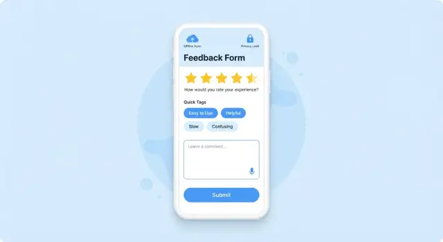
The best mobile feedback capture apps don’t rely on a single survey template. They offer a small set of methods that fit different user moods, contexts, and time budgets—and they make it easy to choose the lightest option that still answers your question.
If you need a fast, quantifiable signal, use structured inputs:
When you need nuance, add open-ended options:
Ask right after meaningfully completing a task, after a purchase, or once a support ticket is closed. Use periodic pulse checks for broader sentiment, and avoid interrupting users mid-flow.
Start with one question (rating/NPS/CSAT). If the score is low (or high), show optional follow-ups like “What’s the main reason?” and “Anything else to add?”
If your audience spans regions, design feedback prompts, answer choices, and free-text handling for multiple languages from day one. Even basic localization (plus language-aware analytics) can prevent misleading conclusions later.
Getting feedback is less about adding a survey and more about choosing the right moment and channel so users don’t feel interrupted.
Start with a small set of triggers and expand once you see what works:
A helpful rule: ask closest to the experience you want to measure, not at random times.
Even relevant prompts become annoying if they repeat. Build in:
Targeting increases response rates and improves data quality. Common inputs include:
Assume some users will deny notifications, location, or camera access. Provide alternative paths:
Well-designed capture flows make feedback feel like a natural part of the experience—not an interruption.
Good feedback UX reduces effort and uncertainty. Your goal is to make answering feel like a quick, safe “tap-and-done” moment, not another task.
Most people respond while holding a phone in one hand. Keep primary actions (Next, Submit, Skip) within easy reach and use large tap targets.
Prefer taps over typing:
Use labels that describe what you want, not what the form field is:
Minimize typing by splitting long prompts into two steps (rate first, explain second). Make “Why?” follow-ups optional.
People quit when they feel trapped or unsure how long it will take.
Accessibility improvements often increase response rates for everyone:
Validate as users go (e.g., required email format) and explain how to fix issues in plain language. Keep the Submit button visible and disable it only when necessary, with a clear reason.
A feedback app lives or dies on how cleanly it captures answers. If your data model is messy, reporting becomes manual work and question updates turn into fire drills. The goal is a schema that stays stable while your forms evolve.
Model every submission as a response that contains:
{question_id, type, value}Keep answer types explicit (single choice, multi-select, rating, free text, file upload). This makes analytics consistent and prevents “everything is a string.”
Questions will change. If you overwrite a question’s meaning but reuse the same question_id, old and new answers become impossible to compare.
A simple rule set:
question_id stays tied to a specific meaning.question_id.form_version whenever you reorder, add, or remove questions.Store the form definition separately (even as JSON) so you can render the exact form version later for audits or support cases.
Context turns “I had an issue” into something you can fix. Add optional fields such as screen_name, feature_used, order_id, or session_id—but only when it supports a clear workflow (like support follow-up or debugging).
If you attach IDs, document why, how long you keep them, and who can access them.
To speed up triage, include lightweight metadata:
Avoid “black box” labels. If you auto-tag, keep the original text and provide a reason code so teams trust the routing.
Your tech choices should support the feedback experience you want—fast to ship, easy to maintain, and dependable when users report issues.
If you need the best performance and tight OS features (camera, file picker, background upload), native iOS/Android can be worth it—especially for attachment-heavy feedback.
For most feedback products, a cross-platform stack is a strong default. Flutter and React Native let you share UI and business logic across iOS and Android while still accessing native capabilities when needed.
A PWA (web app) is fastest to distribute and can work well for kiosk or internal employee feedback, but access to device features and background sync can be limited depending on the platform.
Even “simple” feedback needs a reliable backend:
Keep the first version focused: store feedback, view it, and route it to the right place.
If your goal is speed with a maintainable baseline, Koder.ai’s default architecture (React on the web, Go services, PostgreSQL, and Flutter for mobile) maps well to typical feedback app development needs. It’s especially useful for quickly generating an internal admin panel and API scaffolding, then iterating on form versions and routing rules.
Third-party tools can shorten development time:
Build your own where it matters: your data model, workflows, and reporting that turns feedback into action.
Plan a small set of integrations that match your team’s workflow:
Start with one “primary” integration, make it configurable, and add more after launch. If you want a clean path, publish a simple webhook first and grow from there.
Offline support isn’t a “nice to have” for a mobile feedback capture app. If your users collect feedback in stores, factories, events, planes, trains, or rural areas, connectivity will drop at the worst moment. Losing a long response (or a photo) is a quick way to lose trust—and future feedback.
Treat every submission as local by default, then sync when possible. A simple pattern is a local outbox (queue): each feedback item is stored on-device with its form fields, metadata (time, location if permitted), and any attachments. Your UI can immediately confirm “Saved on this device,” even with zero signal.
For attachments (photos, audio, files), store a lightweight record in the queue plus a pointer to the file on the device. This makes it possible to upload the text response first and add media later.
Your sync engine should:
If a user edits a saved draft that’s already syncing, avoid conflicts by locking that specific submission during upload, or by versioning (v1, v2) and letting the server accept the newest version.
Reliability is also a UX problem. Show clear states:
Include a “Try again” button, a “Send later on Wi‑Fi” option, and an outbox screen where users can manage pending items. This turns shaky connectivity into a predictable experience.
A feedback app is often a data-collection app. Even if you only ask a couple of questions, you may be handling personal data (email, device IDs, recordings, location, free-text that includes names). Building trust starts with limiting what you collect and being clear about why you collect it.
Start with a simple data inventory: list every field you plan to store and the purpose for it. If a field doesn’t directly support your goals (triage, follow-up, analytics), remove it.
This habit also makes later compliance work easier—your privacy policy, support scripts, and admin tools will all align with the same “what we collect and why.”
Use explicit consent where required or where expectations are sensitive—especially for:
Give people clear choices: “Include screenshot,” “Share diagnostic logs,” “Allow follow-up.” If you use in-app surveys or push notification surveys, include a simple opt-out path in settings.
Protect data in transit with HTTPS/TLS. Protect data at rest with encryption (on your server/database) and store secrets safely on-device (Keychain on iOS, Keystore on Android). Avoid putting tokens, emails, or survey responses in plain text logs.
If you integrate analytics for feedback, double-check what those SDKs collect by default and disable anything unnecessary.
Plan how long you keep feedback and how it can be deleted. You’ll want:
Write these rules down early, and make them testable—privacy isn’t only a policy, it’s a product feature.
Collecting feedback is only useful if your team can act on it quickly. Reporting should reduce confusion, not add another place to “check later.” The goal is to turn raw comments into a clear queue of decisions and follow-ups.
Start with a lightweight status pipeline so every item has a home:
This workflow works best when it’s visible inside the app’s admin view and consistent with your existing tools (e.g., tickets), but it should still function on its own.
Good reporting screens don’t show “more data.” They answer:
Use grouping by theme, feature area, and app version to spot regressions after releases.
Dashboards should be simple enough to scan in a standup:
When possible, let users drill down from a chart to the underlying submissions—charts without examples invite misinterpretation.
Reporting should trigger follow-through: send a short follow-up message when a request is addressed, link to a changelog page like /changelog, and show status updates (“Planned,” “In progress,” “Shipped”) when appropriate. Closing the loop increases trust—and response rates the next time you ask.
Shipping a feedback capture app without testing it in real conditions is risky: the app might “work” in the office, but fail where feedback actually happens. Treat testing and rollout as part of product design, not a last step.
Run sessions with people who match your audience and ask them to capture feedback during normal tasks.
Test in realistic conditions: poor network, bright sun, noisy environments, and one-handed use. Watch for friction points like the keyboard covering fields, unreadable contrast outdoors, or people abandoning because the prompt appears at the wrong time.
Analytics is how you’ll learn which prompts and flows work. Before releasing widely, confirm event tracking is accurate and consistent across iOS/Android.
Track the full funnel: prompts shown → started → submitted → abandoned.
Include key context (without collecting sensitive data): screen name, trigger type (in-app, push), survey version, and connectivity state. This makes it possible to compare changes over time and avoid guessing.
Use feature flags or remote config so you can turn prompts on/off without an app update.
Roll out in stages:
During early rollout, watch crash rates, time-to-submit, and repeated retries—signals that the flow is unclear.
Make improvements continuously, but in small batches:
Set a cadence (weekly or biweekly) to review results and ship one or two changes at a time so you can attribute impact. Keep a changelog of survey versions and link each version to analytics events for clean comparisons.
If you’re iterating quickly, tools like Koder.ai can also help: its planning mode, snapshots, and rollback are handy when you’re running rapid experiments on form versions, routing rules, and admin workflows—and you need a safe way to test changes without destabilizing production.
Start by picking 2–3 core goals (e.g., measure CSAT/NPS, collect bug reports, validate a new feature). Then design a single, short capture flow that directly supports those goals and define what “actionable” means for your team (routing, alerts, follow-ups).
Avoid building a “survey platform” first—ship a narrow MVP and iterate based on completion rate, comment usefulness, and time-to-triage.
Use structured inputs (stars/thumbs, CSAT, NPS, single-choice polls) when you need fast, comparable signals.
Add open-ended input when you need the “why,” but keep it optional:
Trigger prompts right after a meaningful event:
For broader sentiment, use periodic pulse checks. Avoid interrupting users mid-flow or asking at random times—timing and context are the difference between useful feedback and noise.
Add controls that respect the user:
This protects response rates over time and reduces annoyance-driven low-quality answers.
Design for one-thumb, tap-first completion:
If you need text, keep prompts specific (“What happened?”) and fields short.
A stable schema usually treats each submission as a response with:
response_id, timestampsform_id and form_versionVersion forms from day one:
question_id tied to a single meaningquestion_idform_version when you add/remove/reorder questionsStore the form definition separately (even as JSON) so you can render and audit exactly what users saw when they submitted feedback.
Use an offline-first approach:
In the UI, show clear states (Saved locally, Uploading, Sent, Failed) and provide “Try again” plus an outbox screen for pending items.
Collect less data, and be explicit about why you collect it:
If you use analytics SDKs, review what they collect by default and disable anything unnecessary.
Make feedback easy to act on with a simple pipeline:
Then provide reporting that answers:
Close the loop when possible—status updates and links like /changelog can increase trust and future response rates.
answers[] as {question_id, type, value}locale plus minimal app/device info you’ll actually useKeep answer types explicit (rating vs. text vs. multi-select) so reporting stays consistent and you don’t end up with “everything is a string.”