Mar 29, 2025·8 min
How to Create a Mobile App for Parent–Teacher Updates
Learn how to plan, design, and build a parent–teacher update app with secure messaging, announcements, calendars, and privacy-first workflows.
Learn how to plan, design, and build a parent–teacher update app with secure messaging, announcements, calendars, and privacy-first workflows.
A parent–teacher updates app isn’t just “messaging on a phone.” Its real job is to deliver timely, relevant information to the right people—without creating a constant stream of interruptions.
Schools already send updates through paper notes, email, and multiple apps. The app should reduce the “where did that message go?” problem while also preventing notification fatigue.
Good outcomes look like:
At a minimum, design for three groups:
Most schools need a consistent structure for:
Homework and classroom announcements, behavior notes (sensitive), attendance/absences, reminders (forms, fees), event notices, and calendar changes.
Before building features, agree on how you’ll measure “working,” such as:
For an MVP, focus on dependable delivery: announcements, one-to-one messaging, attachments, and basic acknowledgements.
Save advanced items (analytics dashboards, integrations, automation) for later phases once real usage shows what families and staff actually need.
A parent–teacher updates app succeeds or fails based on whether it fits into real school days—not ideal ones. Before you choose features, get clear on what people are doing while they communicate: supervising kids, moving between classrooms, commuting, working shifts, or translating messages for family members.
Look for recurring friction in what schools already use:
Capture specific examples (screenshots with names removed, anonymized stories, “this happened on Thursday after dismissal…”). Concrete incidents will guide better design than opinions.
Aim for 5–10 teachers and 5–10 parents to start. Keep questions grounded:
Include edge cases: substitute teachers, divorced co-parents, families with limited connectivity, and parents who rely on translated messages.
Plot communication needs by time and context:
This helps you define notification rules and expected response times.
Document accessibility needs early: languages, readability, large tap targets, and simple navigation. Then separate must-have requirements (e.g., reliable delivery, translations, quiet hours) from nice-to-have requests (e.g., themes, stickers). This becomes your foundation for scoping an MVP without losing what users actually need.
An updates app succeeds when it reduces back-and-forth and makes it easy for families to stay informed without creating extra work for staff. Start with a small set of features that cover the most common communication moments, then add complexity only after schools are using it.
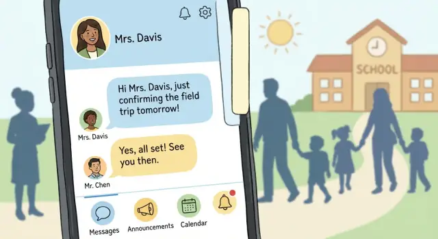
Private messaging is the heart of a parent teacher communication app, but it needs guardrails. Keep the experience simple: a single thread per student/teacher pairing (or per class) so people don’t lose context.
Support essentials like attachments (PDFs, images), translated message previews if your audience needs it, and clear delivery status (sent/delivered). Avoid “chatty” expectations by setting norms in the UI—e.g., office hours or an auto-reply option for teachers.
Announcements reduce repeated questions and ensure everyone sees the same information. Treat these as one-to-many posts with a clean, scannable format: title, short body, key dates, and optional attachment.
Read receipts can help for critical notices, but they can also increase pressure on families and staff. Make them optional per post (or per school policy) and consider a softer metric like “viewed” rather than “read.”
A built-in calendar should answer: “What’s happening, and when?” Include events like parent nights, early dismissals, deadlines, field trips, and conferences.
Keep it frictionless: one tap to add to the device calendar, clear time zones, and reminders that respect quiet hours. If you already have a school calendar feed, prioritize syncing rather than asking staff to duplicate entries.
Families want timely, student-specific information—progress notes, behavior, attendance, and quick check-ins. Schools vary widely on what can be shared and how, so design these updates as structured templates (not free-form) and make each category configurable.
For example, a “progress note” could be a short text plus tags (Needs practice/Improving/Great work) to keep messages consistent and reduce misunderstandings.
When a parent asks, “What did we decide last time?” the app should answer in seconds. Add global search across messages and announcements, filters by student/class/date, and a reliable history that doesn’t disappear when devices change.
This is also where trust is built: consistent threading, easy access to past attachments, and clear timestamps make the app feel dependable—especially during busy weeks.
Getting roles and permissions right is what prevents awkward (and sometimes serious) mistakes—like a message meant for one class going to every family in the grade.
Most parent–teacher updates apps need three primary roles:
If you anticipate counselors, coaches, or substitute teachers, model them as staff with scoped permissions rather than inventing new “special” roles.
Build two clear communication channels:
Design the UI so the sender can’t accidentally pick the wrong audience. For example, require a visible “You are messaging: Class 3B” or “You are messaging: Student: Maya K.” confirmation before sending.
Common verification options include invite codes, school-managed roster imports (SIS/CSV), or admin approval. Many schools prefer a roster import plus admin approval for exceptions, so access matches official records.
Support multiple guardians per student (shared custody, grandparents) and multiple classes per teacher. Model these as flexible links (Guardian ↔ Student, Teacher ↔ Class) so permissions update automatically when rosters change.
Make device changes painless: phone/email verification, backup codes, and an admin-assisted recovery path. Recovery should preserve access history and role rules—never “reset” a user into broader permissions by accident.
Messaging is where parent–teacher updates succeed or fail. If notifications feel noisy or unclear, parents mute the app—and important information gets missed. A good design treats every message as a decision: who needs it, how fast, and in what format.
Not every update deserves a lock-screen interruption. Build at least two notification types:
This simple split helps families understand what requires action now versus later.
Parents and teachers have different schedules. Offer quiet hours (e.g., 9pm–7am) and frequency controls:
For teachers, add safeguards like “Send tomorrow morning” and a preview showing how many families will be notified.
Teachers send the same messages repeatedly: reminders, supplies, dismissal changes, missing work. Provide templates with editable fields:
Templates reduce typing on mobile and keep messaging consistent across classes.
Plan translation early. Options include:
Make the choice visible in the composer so teachers know what families will receive.
Parents often check updates in transit or during busy pickup times. Cache recent messages and announcements so the inbox remains readable offline, and clearly show what’s new once connectivity returns.
A parent–teacher communication app succeeds when it respects attention and time. Most users will open it for 20–60 seconds: to check what’s new today, reply to a message, or confirm an event. Design for quick wins, not exploration.
A simple home screen reduces cognitive load and support requests. A practical structure is:
Avoid hiding essentials behind menus. If “Today” shows everything important at a glance, users won’t have to hunt.
Busy teachers should never wonder where to tap to send a classroom update, and parents should always see how to respond.
Use clear primary actions such as “Send update”, “Reply”, and “Add event”. Place them consistently (e.g., a primary button at the bottom of key screens). When an action is sensitive—like messaging an entire class—add a short confirmation step that shows who will receive it.
Prefer words over clever icons. “Announcements” is clearer than a megaphone icon alone. “Absence note” is clearer than “Attendance request.” If you must use icons, pair them with labels.
Also keep message metadata understandable: “Delivered,” “Read,” and “Needs reply” are more helpful than technical states.
Accessibility features aren’t only for edge cases; they make the app easier for tired, distracted users.
Check for:
Prototype 2–3 critical flows and test with real parents and teachers:
You’ll quickly learn what labels confuse people, where they hesitate, and which screens can be simplified—before any engineering time is spent.
A parent–teacher updates app handles information families care about deeply. The safest approach is to design for “minimum necessary data” from day one, then make your choices visible to users.
Start with a short list of required data: parent/guardian names, a way to link each account to a class (or student), contact info for sign-in and alerts, and the message content itself. Everything else should be optional and justified.
Keep student details out of push notifications whenever possible. A lock-screen preview that says “New message from Ms. Rivera” is safer than “Jordan missed math homework again.” Let users choose whether previews show full text.
Don’t hide privacy information in legal pages only. Add a simple “Why we ask this” line near sensitive fields, and offer in-app controls such as:
Create retention rules for messages, photos, and files. Decide what “delete” means: removed from the device only, removed from the server, removed from backups after a set period, and whether teachers can delete messages for everyone or only themselves.
Schools need control and accountability. Plan admin features early:
These basics reduce risk, build trust, and make future compliance requirements much easier to meet.
Your build approach affects everything: how quickly you can launch, how “native” the experience feels, and how much effort it takes to maintain over time.
Native (iOS + Android separately) is best when you need top-tier performance, deep device access (camera, push notifications, background tasks), and platform-perfect UI.
Cross-platform (Flutter/React Native) is often the sweet spot for school apps: one shared codebase, fast iteration, and good access to device features.
Responsive web app (PWA) can work for pilots or small schools. It’s easiest to deploy and update, but can be weaker on push notifications, offline use, and some device capabilities.
Avoid rework by confirming the “source of truth” up front:
Design for multiple schools from day one: tenant-aware data, role-based access, and audit logs. Even if you start with a single campus, this keeps expansion predictable.
If your biggest risk is speed-to-pilot, consider a build workflow that produces a real, deployable app early, then iterates with school feedback. For example, Koder.ai is a vibe-coding platform where you can describe screens, roles, and message flows in chat, then generate a working React web app (and backend services) quickly—useful for prototypes, internal demos, and MVPs. Features like planning mode, snapshots, and rollback also help when you’re testing permission rules and notification logic and need safe iteration.
An MVP (minimum viable product) for a parent–teacher updates app isn’t “the smallest app you can ship.” It’s the smallest set of features that makes communication noticeably easier for a real class, starting next week.
For a first pilot, prioritize features that support the core loop: teacher sends an update → parents see it quickly → parents can respond or acknowledge.
A strong MVP set usually looks like:
Anything that adds complexity—multi-language automation, advanced analytics, complex scheduling—can wait until the pilot proves the fundamentals.
Create a short list of user stories that match real tasks:
For each story, define acceptance criteria (what “done” means). Example: “When a teacher posts, all parents in that class receive a notification within 30 seconds; parents without the app receive an email; the post appears in the class feed and is searchable by keyword.”
Build a clickable prototype (Figma is fine) to validate flow before building. Then run a short pilot with one class or one grade for 1–2 weeks.
Use feedback to cut, simplify, or reorder features. If teachers say “posting takes too long,” fix creation speed before adding anything new. If parents say “too many pings,” improve notification controls before expanding scope.
Wireframes help everyone agree on “what goes where.” A build-ready specification turns that agreement into clear instructions for design, development, and testing—so your parent teacher communication app doesn’t drift into last-minute decisions.
Start with a tight set of screens and write a one-paragraph purpose for each:
Document the core objects and how they connect:
A simple diagram (even in a doc) prevents confusion about “who can message whom” later.
Write rules people can follow. Define categories like Homework, Schedule, Behavior, Health, Admin, and Emergency. Clarify what qualifies as an urgent alert (and who can send it), plus suggested tone: short, respectful, actionable.
Set allowed types (photos, PDFs), size limits, and whether teacher uploads need approvals. Note any restrictions around student photos and where consent is stored.
Choose a few signals for your student updates mobile app:
Add properties (role, class id, category) so you can see what’s working without collecting unnecessary personal data.
A parent–teacher communication app succeeds or fails on trust. If a message goes to the wrong parent, a notification arrives hours late, or an account gets hijacked, schools won’t “work around it”—they’ll abandon it. Testing and support aren’t the last step; they’re part of what makes your school messaging app feel safe and dependable.
Prioritize real-life journeys over isolated feature tests. Set up test accounts that mimic how a school actually uses a student updates mobile app, then run these flows on every build:
If you can, run “day-in-the-life” tests: 10 updates sent during a school day, with parents on different devices and network conditions.
Education is full of non-standard family and staffing scenarios. Build test fixtures for:
These cases help validate your roles/permissions model and prevent accidental oversharing.
Run basic accessibility checks (font scaling, contrast, screen readers, tap targets) so every guardian can use the app under stress.
Also test on older phones and weak connections. A school calendar app feature that works on a flagship device but stalls on a five-year-old phone will generate support tickets instantly.
Schools need clear paths for problems that involve safety and privacy in education apps:
Decide what support can do (and what only a school admin can do), and document it.
A lightweight checklist keeps education app development predictable:
Treat every release like it’s going live to a principal’s phone—because it is.
A parent–teacher updates app succeeds or fails after release based on how quickly people feel it saves time (not adds another inbox). Treat launch as a learning phase, not a finish line.
Pilot with one school, grade level, or a small set of classes. This keeps training manageable and makes issues easier to spot.
Track adoption weekly using simple metrics: invite acceptance rate, first-message rate, weekly active parents/teachers, and how many announcements are actually viewed. Pair numbers with short check-ins with office staff and a few teachers—often the “why” behind drop-off is a small friction (confusing login, too many notifications, unclear class setup).
Busy users won’t read long docs. Provide:
If you offer a teacher/admin sandbox, keep it clearly labeled so no one sends a real message by accident.
Add an in-app feedback entry point that’s always available but not intrusive (e.g., “Help & feedback” in the menu). Ask for lightweight input: a one-tap rating plus an optional note and screenshot. Also include a “Report a problem” option on messages/threads for quick moderation signals.
Plan ongoing improvements based on pilot learnings—commonly: stronger moderation tools, smarter message templates, scheduling (send later), and clearer notification controls.
When you’re ready to expand beyond the pilot, set expectations for pricing, support, and rollout timelines (see /pricing), and make it easy for schools to reach your team for a structured rollout plan (/contact).
Start with the core loop: teacher sends an update → parents see it quickly → parents can acknowledge or reply.
A strong MVP usually includes:
Save dashboards, automation, and deep integrations until you’ve validated real usage in a pilot.
Use at least two notification tiers:
Add quiet hours, per-class/per-student toggles, and “mute for a week” controls so families don’t disable notifications entirely.
Model three primary roles and keep permissions scoped:
Separate announcements from sensitive updates, and make the selected audience extremely obvious before sending (e.g., “You are messaging: Class 3B”).
Plan for multiple guardians per student and multiple classes per teacher from day one.
Practically, you need:
This prevents brittle logic when custody situations, emergency contacts, or class assignments change mid-year.
Translation works best when the UI is explicit about what families will receive.
Common approaches:
Also decide early where translation happens (composer vs. reader) so teachers aren’t surprised by the final output.
Keep the home screen focused on “what needs attention” in 20–60 seconds.
A practical structure:
Use plain labels, large tap targets, and predictable placement for primary actions like and .
Treat announcements as scannable one-to-many posts:
If you use read receipts, make them optional per post or policy to avoid pressure and reduce conflicts over what “read” means.
Prioritize trust-building basics:
Also provide in-app controls for notification previews and data export/delete where policy allows.
Use verification that matches school reality:
For recovery, support phone/email verification, optional backup codes, and an admin-assisted path—without ever “resetting” a user into broader permissions than they should have.
Pilot first, then choose the architecture that fits your constraints:
Regardless of approach, decide early on your “source of truth” integrations (rosters/SIS, calendar feeds, SMS/email fallback) to avoid expensive rework later.