Oct 14, 2025·8 min
How to Create a Mobile App for Personal Insight Accumulation
A practical guide to planning, designing, and building a mobile app that helps users capture notes, track moods, and turn daily moments into actionable insights.
A practical guide to planning, designing, and building a mobile app that helps users capture notes, track moods, and turn daily moments into actionable insights.
“Personal insight accumulation” is the practice of steadily collecting small observations about your life and turning them into useful understanding over time. The value compounds: the more consistently you capture, the easier it becomes to spot patterns and make better decisions.
At its simplest, it’s a loop:
Capture: Quickly record what happened (a moment, feeling, thought, decision, or outcome) while it’s still fresh.
Reflect: Add meaning—why it mattered, what you learned, what you wish you’d done differently.
Connect: Link today’s entry to earlier ones (similar situations, repeating triggers, recurring goals). This is where insight starts to compound.
Act: Turn the insight into a small next step: a decision, an experiment, a habit tweak, or a boundary.
A crucial early decision is choosing a primary user, because “insight” means different things to different people:
A strong v1 picks one primary audience and makes their core loop feel effortless.
Most people aren’t motivated by “journaling” as a goal. They want results like:
Before building features, decide what “working” means. Useful starter metrics include retention, entries per week, and insights saved (when a user marks something as “learned”). Streaks can help some users, but should be optional—insight accumulation should feel supportive, not punishing.
Before you sketch features, decide what your app is for and who it serves. “Personal insight accumulation” can range from a lightweight reflection journal to a structured habit-and-mood tracker. A clear goal keeps the product simple and makes early testing meaningful.
Pick a primary user you can picture and design around:
Once you choose one, it becomes much easier to say “no” to features that don’t help that person.
Write a short set you can build and test:
What should happen in the first 60 seconds?
Example: the user writes one entry, selects a mood, and immediately sees a simple “Today” card that feels saved, private, and easy to return to.
For v1, commit to “capture + retrieve + one basic review.” Push these to later: social features, advanced AI summaries, complex dashboards, integrations, and multi-device edge cases.
A tight v1 lets you learn what insights users actually want—before you build everything.
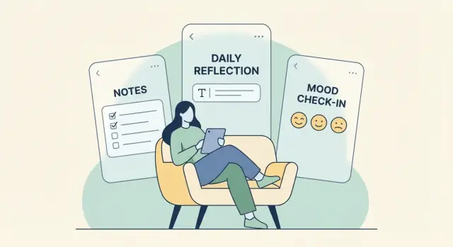
A personal insight app succeeds when it reduces friction at the moment of capture, then makes it easy to turn messy life notes into patterns you can use. Think of the feature set as a loop: capture → organize → reflect → review.
People log insights in real life—walking, commuting, half-asleep, mid-conversation. Offer multiple capture paths so users can choose what fits the moment:
Keep the first screen simple: content first, details later.
Organization should feel optional, not like filing paperwork. Add small pieces of metadata that users can apply in seconds and that unlock meaningful filtering later:
A good default is “save now, enrich later.” Let users add metadata during or after capture.
Reflection features should guide thinking without forcing it. Offer:
The goal is to shorten the distance between an experience and an actionable takeaway.
Build a gentle review rhythm: daily and weekly check-ins, highlights, and a “Saved Insights” collection. Users should be able to:
When capture is effortless and review feels rewarding, people return without being pushed.
A personal insight app lives or dies on how quickly someone can capture a thought and find it later. The best structure is simple enough to use daily, but flexible enough to reveal patterns over time.
Start with an “entry” as the core object. Keep required fields minimal: text and an automatic timestamp.
Then add optional fields that help reflection without slowing capture:
This lets users write a plain note, or enrich it when they have time.
Avoid heavy hierarchies early. Folders tend to force a “one right place,” which doesn’t match real life.
A lightweight approach:
Encourage reuse (autosuggest existing tags) to prevent messy duplicates.
Insights often appear when entries connect. Support:
Plan search from day one:
When users can retrieve a moment in seconds, they keep adding more—and the archive becomes genuinely valuable.
A reflection app succeeds or fails on one thing: whether people can use it when they’re tired, busy, or emotional. Good UX removes decision-making and turns “I should reflect” into “I already did, in 20 seconds.”
Start with a default screen that’s ready to record something immediately—no menu, no mode selection, no empty-state confusion. A single input field (plus an obvious “Save”) beats a beautiful dashboard that takes multiple taps before anything is recorded.
One-tap actions are your best friend: quick mood, quick highlight, quick win, quick worry. Keep them optional, not mandatory.
Offline-first matters more than most teams expect. People reflect on trains, in waiting rooms, or late at night with poor connectivity. If capture works reliably offline and syncs later, users learn to trust the app and stop postponing entries.
Reflection can be simple, but the UI often makes it complicated: tags, templates, scores, attachments, privacy toggles, and formatting—all on one screen.
Instead, show only the essentials during capture:
Then reveal advanced options only when needed: add tags after saving, attach photos from an “Add more” drawer, or expose custom fields on the second session once the user is engaged.
Prompts work best when they align with real routines. Build a few predictable moments rather than constant nudges:
Keep prompts short, skippable, and easy to answer. If a prompt requires a long response to be “valid,” users will ignore it.
Readable typography (sensible font sizes, strong contrast, good line spacing) directly affects whether people want to write.
Voice input can remove friction for users who think faster than they type, and it helps when writing feels like work. Haptics can add reassurance for key actions (saved, logged), but make them optional and respectful—reflection is a quiet activity for many people.
The goal is simple: the app should feel like a comfortable notebook, not a productivity system that judges you.
Onboarding sets the emotional tone: “this helps me” versus “this wants my data.” For a personal insight app, the best onboarding feels like a quick handshake, not a questionnaire.
Offer two clear paths:
In the guided path, ask only what you truly need to deliver value on day one—typically a name (optional), a reminder preference (optional), and whether they want local-only storage or sync. Everything else can wait until the moment it’s useful.
Templates should feel like invitations, not rules. Include a small set that matches real reflection styles:
Let users mix templates and freeform entries. The goal is to help them start in under 30 seconds.
Explain privacy with concrete choices:
Use short sentences, avoid legal tone, and confirm the chosen setting in plain text (e.g., “You picked: Local-only”).
Your first week plan should be about small rewards:
If the app respects attention and privacy, users return because it feels supportive—not because it shouts.
Your app becomes valuable when it does more than store notes—it helps users notice patterns they’d miss on their own. The key is to choose a clear “insight engine” for v1 and keep it understandable.
Start by deciding which outputs you want to generate consistently:
Don’t try to ship all three at once. One reliable insight type beats a dozen half-working ones.
You can deliver meaningful insights with lightweight logic:
These are fast to compute, easy to test, and easier to trust. Once users engage with basic insights, you can add smarter summarization (including AI) without making the app feel unpredictable.
An insight should show its receipts. Instead of “You’re more productive on Tuesdays,” say:
“On 4 of the last 5 Tuesdays you tagged entries with ‘deep work’ and rated focus 4–5. On other days, it was 2–3.”
Explainability reduces the “creepy” factor and helps users correct the app when it’s wrong.
Treat each insight as a first-class object: an insight card the user can save, edit, and revisit.
An insight card might include a title, the supporting data range, the tags involved, and a space for the user to add their own interpretation. This turns insights into a personal library of learnings—not just fleeting notifications.
A personal insight app can hold intimate material: moods, health notes, relationship reflections, even location hints. If users don’t feel safe, they won’t write honestly—and the app fails at its core purpose.
Start with a simple baseline that’s easy to explain and verify:
Also plan for the boring-but-critical realities: secure password resets, rate limiting on login attempts, and a clear incident response plan.
People trust apps that let them stay in charge:
Collect only what you truly need to deliver the experience. If you don’t need contacts, precise location, ad identifiers, or microphone access—don’t request them.
Use plain-language settings for:
Trust is built when privacy isn’t a hidden policy—it’s a set of visible, user-friendly choices.
A personal insight app lives or dies by how dependable it feels. People will type sensitive notes, return weeks later, and expect everything to be there—searchable, fast, and private. Your architecture should prioritize reliability first, then add convenience features like sync and reminders.
On-device storage (for example SQLite or Realm) is the simplest way to get speed and offline access by default. It also helps privacy because data can stay local. The trade-off: users can lose data if they change phones unless you provide export/backup.
Cloud storage (a hosted database + auth) makes multi-device access easy and reduces “I lost my journal” support issues. The trade-off: more security responsibility, higher ongoing costs, and you must earn trust.
Hybrid is often best for reflection apps: keep a local database as the source for performance and offline use, then optionally sync encrypted copies to the cloud.
If you offer sync, assume users will edit offline and across devices.
A practical v1 approach:
Even if you don’t build advanced merging in v1, backups and restore matter: automatic periodic backups plus a user-triggered export can prevent catastrophic loss.
Reminders should feel like an invitation, not a scolding:
A few well-chosen integrations reduce friction:
An MVP for a personal knowledge app should prove one thing: people can capture thoughts quickly and come back later to find meaning. Everything else is secondary. Keep the first release small, reliable, and easy to test with real users.
Native (Swift for iOS, Kotlin for Android) is a good fit if you need the smoothest performance, deep OS integration, or you already have platform-specific expertise. The tradeoff is building everything twice.
Cross-platform (Flutter or React Native) is often faster for early iterations because you ship one codebase. It can also be easier to keep UI and features consistent. The tradeoff is occasional platform edge cases and plugin dependencies.
Choose based on team skills and speed to learning—not theory.
If you want to move even faster than a traditional build, a vibe-coding platform like Koder.ai can help you prototype the core loop (capture → timeline → search → basic insights) from a chat interface, then iterate in “planning mode” before you commit to implementation details. Koder.ai supports building web apps (React), backends (Go + PostgreSQL), and mobile apps (Flutter), with source code export if you later want to take the codebase in-house.
Start with a tight set of screens:
If a screen doesn’t help someone capture or reflect, postpone it.
Begin with a clickable Figma prototype to validate flow: how many taps to add an entry, how reflection is encouraged, and whether insights feel understandable.
Then implement a thin vertical slice: capture → save locally → appear in timeline → searchable → show one simple insight. This reveals real technical and UX constraints early.
If you’re testing quickly with real users, features like snapshots and rollback (available in platforms like Koder.ai) can be valuable: you can ship an experiment, observe behavior, and revert cleanly if it hurts retention.
Even in v1, include crash reporting, measure startup and typing lag on low-end devices, and run offline tests (airplane mode, poor connectivity, low storage). An insight journal app earns trust through stability.
If your app is meant to help people learn about themselves, your metrics should reflect that—without turning users into “data points.” Measure progress toward meaningful behavior (capturing, reflecting, returning), not vanity numbers.
Start with the smallest set of events that can answer product questions. Prefer aggregated reporting and avoid collecting raw content.
Track behaviors like:
Make analytics opt-in where expectations are high (journaling often implies privacy). Be explicit about what’s collected, and provide a simple toggle to disable tracking.
A useful funnel shows where people get stuck—and what to fix next. Focus on:
For each step, pair the conversion rate with “time to complete.” A fast first entry is often better than a perfect first entry.
Numbers tell you what happened; feedback tells you why.
Use lightweight methods:
Keep prompts short and skippable. Ask one question at a time.
A/B testing works best on specific moments, not the whole experience. Try experiments on:
Define success before you run the test (for example: more second-week returns without increasing opt-outs).
Shipping your insight journal app is less about a “big bang” and more about a clean first impression, clear pricing, and a plan for steady improvements.
Before you submit, treat the store listing as part of the product. It sets expectations and reduces refund requests.
Choose a model that rewards long-term use without locking people out of core journaling:
If you’re benchmarking, Koder.ai’s own tiering model (free, pro, business, enterprise) is a useful reminder that pricing can map to real user segments: solo users who just want capture, power users who need export and workflow depth, and teams/organizations that require governance and reliability.
Plan upgrades that deepen value rather than adding noise:
Publish short guides that teach reflection skills, not just app features: “How to do a weekly review,” “Tagging that doesn’t get messy,” and “Turning notes into next actions.” This builds trust and gives users reasons to return.
If you decide to document your build-in-public journey, consider adding a simple incentive: platforms like Koder.ai offer ways to earn credits by creating content about the platform (and via referrals). Even if you don’t use Koder.ai for development, the underlying tactic applies—reward community-driven education that helps new users succeed.
It’s a steady loop of Capture → Reflect → Connect → Act:
Choose one primary user early so v1 stays simple and tests are meaningful. Common fits include:
A focused audience makes your capture and review loop feel effortless.
Define a clear “working” definition before adding features. Practical starter metrics:
Keep streaks optional—they motivate some users but can feel punishing to others.
A strong v1 proves people can capture quickly and get value back. Prioritize:
Defer social features, complex dashboards, heavy integrations, and advanced AI until you learn what users actually use.
Aim for a “one-minute value” moment: the user creates a first entry and feels it’s safely stored and easy to revisit.
Example flow:
Offer multiple capture paths so logging works in real life:
Design the first screen as content first, details later.
Use an entry as the core object with minimal required fields:
Then add optional metadata that’s quick to apply:
Treat search as a core feature, not a nice-to-have. Include:
Fast retrieval is what turns the journal into a valuable personal archive.
Start with simple, explainable outputs that users can verify:
When you present an insight, show evidence (the entries/time range). Let users save an insight card and add a next step so it becomes actionable.
Trust is the product. Prioritize:
A good default is “save now, enrich later.”
Explain choices in plain language: local-only vs cloud sync, and what analytics (if any) are collected.