Sep 27, 2025·8 min
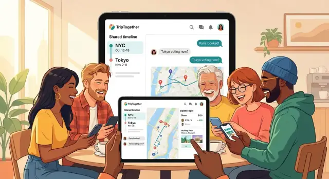
How to Create a Mobile App for Group Travel Coordination
Learn how to create a mobile app for group travel coordination: core features, MVP scope, UX tips, data needs, and a step-by-step build plan.
Learn how to create a mobile app for group travel coordination: core features, MVP scope, UX tips, data needs, and a step-by-step build plan.
A group travel app isn’t just a prettier itinerary. “Group travel coordination” means handling two realities at once: planning before the trip, and adapting during the trip when plans change. The best travel coordination app reduces chaos when someone’s flight is delayed, the weather flips, or the group suddenly wants a different restaurant.
Most groups struggle with the same moving parts:
If your app doesn’t address these, it becomes “just another chat.”
Be specific about your primary audience, because their needs differ:
This choice shapes everything from onboarding to whether you prioritize in-app group chat, a shared itinerary app, or an expense splitting feature.
Your core problems are usually scattered info, last-minute changes, and messy money tracking. Define success in measurable terms, for example:
These metrics will guide your MVP travel app scope and keep features focused.
A group travel app can’t optimize for everything at once. Separate the experience into before-trip planning, during-trip coordination, and post-trip wrap-up. Your first release should focus on one phase as the “home base,” then add the others over time.
Choose the situation where your app will be opened most often:
If you’re building a travel coordination app for frequent usage, “during-trip” often produces the clearest must-have moments (notifications, meeting points, quick polls).
Trip types change requirements more than most teams expect:
Pick one trip type as your design anchor and use it to define defaults (time blocks, map views, decision cadence).
State your assumptions: “best for 3–10 people” vs. “15+.” Define roles like organizer (creates structure, sends prompts) and participants (vote, confirm, add suggestions). Clear roles reduce friction and guide your permissions model.
List the moments your app must nail—usually voting, reminders, and meeting points. If those flows feel effortless, your MVP will feel useful even with a smaller feature set.
Your MVP should prove one thing: a group can plan and run a trip from the app without getting lost in scattered messages and spreadsheets. Keep the feature set tight, but complete enough to support a real weekend trip.
Start with a single trip screen that contains the essentials: members, simple roles (organizer vs. participant), invite links, and a few basic settings (currency, time zone, trip dates). The goal is to make joining frictionless while keeping enough control for the person coordinating.
Build an itinerary that supports days, activities, times, notes, and lightweight attachments (like a PDF ticket or a screenshot). The key MVP requirement is clarity: everyone should be able to answer “Where are we going next?” in two taps.
General chat is useful, but the MVP should prioritize comments attached to itinerary items (e.g., “Lunch at 1pm: can we push to 1:30?”). This keeps decisions and context from disappearing into a long chat history.
Implement the basics: who paid, amount, category, and who shares it. Provide a simple “who owes who” summary—skip complex balances, multi-currency optimization, and advanced reimbursements for now. You’re validating the core pain point: avoiding awkward post-trip math.
Include a map that shows saved places from the itinerary plus a couple of meeting points (hotel, station, “rally spot”). It doesn’t need advanced routing—just a reliable way to see what’s nearby and where to meet.
Add push notifications for changes (time edits, new items, cancellations) and simple reminders (“Leave in 30 minutes”). Make them configurable per trip so groups don’t mute your app entirely.
If you’re unsure what to cut, keep what supports coordination during the trip, and postpone “nice-to-have” features to a later iteration (see /blog/test-launch-iterate).
A “data model” is simply a clear agreement on what your app needs to remember. If you describe it in everyday language first, you’ll avoid painful rewrites later.
Each person can have an account linked to email, phone number, or social login. Decide early whether you allow guest mode.
Guest mode reduces friction (great for inviting friends quickly), but it creates trade-offs: guests may lose access if they change phones, can’t easily recover their profile, and make it harder to manage permissions or prevent spam. A common compromise is “guest now, account later” (let them upgrade seamlessly).
A Trip is the home for everything:
An Itinerary Item is anything scheduled or worth tracking:
Design so items can exist even without a location or exact time—real plans are messy.
An Expense needs:
A Settlement is a record of “Alex paid Sam $20” so the group can close out balances without redoing math.
Keep trip-level threads for general chat (“arrival times?”) and item-level threads for specifics (“meet at Gate B?”). This prevents important details from getting buried.
A group travel app succeeds when it removes coordination friction. Your UX goal is simple: let people answer the common questions (when, where, who’s in, how much) with as few taps as possible.
Design onboarding so a trip can be created, friends invited, and dates proposed in under 2 minutes. Default to the fastest path:
Use a familiar tab layout so users don’t hunt for features. A clean baseline is:
Keep each tab focused: the Itinerary shouldn’t feel like a chat feed, and Expenses shouldn’t hide inside settings.
Add one prominent action button that offers quick actions: Add activity, Add expense, Quick poll. Each should fit on one screen, with smart defaults (date = today, currency = trip default, participants = “everyone”).
Show times in local time, and add the user’s time when it prevents confusion (for example, during planning before arrival). Use readable text, strong color contrast, and large tap targets—especially for group decisions made on the go.
Group trips often fail on tiny coordination gaps: “Which day are we going?”, “Who’s free?”, “Did we decide this already?”. Your app can remove that friction with a small set of structured tools that sit alongside chat.
Add lightweight polls for the common choices: date/time, activity, and quick yes/no. Keep the poll UI simple: a question, options, and a clear “winning” state. Let people change their vote until the poll closes, and support a default close rule (for example, auto-close after 24 hours or when everyone votes).
A useful detail: show who has not voted yet. That reduces “anyone else?” messages without pressuring people in chat.
For scheduling, a basic “can/can’t” per proposed time slot is often enough. The key is to avoid complex calendars in v1.
Design it as: organizer proposes 3–6 slots → each member marks Can or Can’t (optionally “Maybe”) → the app highlights the best slot by count. Keep availability tied to the trip’s time zone and display it clearly to prevent accidental mismatches.
Every poll result and finalized slot should create a visible decision entry: what was decided, when, and by whom. Pin the latest decisions in a “Trip Decisions” view so new joiners can catch up instantly.
Edits are inevitable. Add “last updated by” labels on key items (time, meeting place, reservation notes), and keep a small version history for reversions. If two people edit at once, show a friendly conflict prompt instead of silently overwriting changes.
Maps are where group plans stop being abstract and start being actionable. A strong approach is to treat maps as a “view” of what the group already decided: saved places, meet-up points, and today’s plan.
Start with simple place search (name + category) and let the group save items into shared lists like Food, Sights, and Hotels. Keep each saved place lightweight: name, address, link/ID from the provider, notes (“book ahead”), and a tag like “Must-do.”
To reduce chaos, let people vote or “star” places rather than creating long comment threads.
Add a dedicated “Meet-up point” pin type. Each pin should have a short instruction field (e.g., “Main entrance, under the clock”) and a time window. This avoids the classic “I’m here” problem when there are multiple entrances or levels.
If you add location sharing for trips, make it strictly opt-in and user-controlled:
Assume weak signal. Cache key areas (city center + neighborhoods on the itinerary) and store itinerary addresses locally so the map can still show pins and basic context.
Don’t rebuild navigation. Provide a “Get directions” button that opens the native maps app (Apple Maps/Google Maps) with the destination pre-filled. This keeps your app focused on coordination, not turn-by-turn routing.
Money is where group trips often get tense. Your goal for a first version isn’t perfect accounting—it’s making it easy to capture costs quickly and agree on a fair “who owes whom” summary.
Keep the “add expense” flow fast enough to do at a café table:
Trips cross borders, and so do charges. A practical approach:
This keeps calculations stable even if rates change later.
After expenses are entered, generate a suggested settlement that minimizes transfers (e.g., “Jordan pays Mia $24, Mia pays Lee $18”). Show it as a clear list, not a spreadsheet.
Keep it transparent: tap a settlement line to see which expenses contributed to that balance.
Some groups want a backup. Add a lightweight export: CSV download and/or email summary (totals per person, balances, and settlements). This also helps if the group wants to settle outside the app.
Real-time sync is what makes a group travel app feel “alive.” When someone edits the dinner reservation, adds a new expense, or a poll closes, everyone should see it without pulling down to refresh. That’s how you avoid refresh anxiety—people stop asking “is this the latest plan?” and start trusting the app.
Focus on the items that create confusion when they’re stale:
Behind the scenes, the simplest rule is: one shared source of truth per trip, with immediate updates across devices and clear conflict handling (e.g., “Alex updated this 2 minutes ago”).
Notifications should be actionable and predictable:
Keep messages short, include the trip name, and deep-link into the exact screen (itinerary item, expense, or poll) so users don’t have to hunt.
Large groups can get noisy fast, so build controls early:
A good default: notify on “changes that affect the plan,” but let everything else be opt-in.
Group trips happen in airports, subway tunnels, mountain towns, and roaming zones where coverage is patchy. Your app should still be useful when the network is slow—or missing entirely.
Start by making the “read” experience dependable. At minimum, cache the latest itinerary, saved places, and the most recent expenses on the device so people can open the plan and keep moving.
A simple rule: if a screen is critical for the next hour of the trip, it should load from local storage first, then refresh when possible.
Offline editing is where things get tricky. Decide early what happens when two people change the same item.
For a first version, use understandable conflict rules:
Sync should run quietly in the background, but users need clarity. Add a small status line like “Last synced: 10:42” and show a subtle warning when someone is viewing stale data.
Queue changes locally and sync them in order. If sync fails, keep the queue and retry with backoff rather than blocking the app.
Keep the app lightweight under weak connections:
Group trips get messy when people aren’t sure what others can see or do. Clear privacy controls, basic security hygiene, and simple role-based permissions prevent awkward moments (and support tickets) later.
Default to sharing less, and let users opt in. For each trip, make visibility explicit:
Add a “Preview as other member” view so users can quickly confirm what the group sees.
Keep the baseline simple and standard:
Most group travel apps need only a few roles:
Support trip locking (freeze itinerary/expenses after settlement) and keep an audit log of major actions (member removed, trip locked, settlement finalized).
Set expectations in plain language: what’s stored, for how long, and why. Provide:
Make these controls easy to find in Trip Settings—not buried in a legal page.
Your tech choices should match your team’s skills and MVP scope. A group travel app is mostly “glue”: accounts, trip data, chat-like updates, maps, receipts, and notifications. The goal is to ship a reliable first version quickly, then improve.
If you need both iOS and Android from day one, cross-platform is often the fastest path:
A simple rule: pick the option your team can ship and maintain confidently—features and stability matter more than “perfect” tech.
For an MVP, managed backends (Firebase/Supabase/AWS Amplify) can save weeks: auth, databases, file storage, and push messaging are available out of the box.
A custom API (your own server + database) gives more control over data, costs, and complex logic, but adds engineering and operations overhead. Many teams start managed, then migrate parts to a custom API as needs grow.
If your biggest risk is time-to-first-usable-build, consider a vibe-coding platform like Koder.ai to prototype the core flows (trip space, itinerary, polls, expenses) from a chat-driven spec. Teams often use this approach to:
Even if you later refactor or rebuild parts, shipping an end-to-end MVP earlier makes your beta learning cycle dramatically more valuable.
Receipts and trip photos get expensive if you’re not careful. Store media in object storage, generate smaller thumbnails for the app, and set retention rules (for example, compress originals after 30 days). Track storage and bandwidth costs early so surprises don’t hit later.
Add analytics and crash reporting immediately so you learn what real groups do and where the app breaks. Track key events like “created trip,” “voted in poll,” “added expense,” and notification opens—without collecting more personal data than you need.
Before release, test:
Treat your build plan as a roadmap, not a promise—leave room for fixes and a second MVP pass.
A group travel app only proves itself when real people use it under real pressure: delayed trains, spotty Wi‑Fi, and friends who don’t reply. Before you polish every edge, put your travel coordination app into the hands of a few groups and watch what they actually do.
Start with 5–10 groups who already have a trip booked in the next 2–6 weeks. Aim for different trip types (weekend city break, road trip, festival) so your trip planner mobile app gets varied use.
Ask them to:
During the trip, capture feedback in context: a short in-app prompt after key moments (first invite accepted, first itinerary edit, first expense added) plus one 15-minute call after they return.
Skip vanity numbers early. Track signals that your app is doing its job:
Add lightweight event tracking, and review a single dashboard weekly. One “why” interview can explain a hundred data points.
Your listing should explain the value in one breath: “Plan together, decide faster, and keep costs fair.” Prepare:
A safe starting point is freemium limits: number of trips, trip members, or premium features like advanced settlements and exports. You can also explore “premium groups” (admins pay for extra tools) or paid trip templates for common scenarios.
If you build in public, you can also turn content into growth: for example, Koder.ai runs an earn-credits program for creators—useful if you’re documenting your build and want to offset tooling costs.
Ship improvements that remove friction first, then add expansion features. A practical next wave:
Keep each release tied to one outcome: fewer missed decisions, fewer duplicate messages, and fewer awkward money conversations.
Start by picking one “home base” phase:
For most groups, during-trip provides the clearest must-have moments: meeting points, reminders, and change notifications.
A tight MVP that supports a real weekend trip usually includes:
General chat becomes a long timeline where decisions get buried. Instead, keep:
This structure preserves context and makes it easier to find the latest plan without scrolling.
Define success in coordination outcomes, not downloads. Practical MVP metrics include:
These metrics keep scope focused and prevent building “nice-to-have” features too early.
At minimum, model:
Use a pragmatic approach:
This keeps totals stable even if rates change later, and it avoids recalculating old expenses with new rates.
Make sharing strictly opt-in and easy to understand:
Default to location off, and clearly signal when it’s on to prevent privacy surprises.
Prioritize reliability for the next hour of the trip:
For conflicts, keep rules simple: last-write-wins for low-risk fields, merge additive changes, and prompt users when it’s ambiguous.
Prevent missed updates without turning the app into spam:
Start with 5–10 groups that already have a trip in the next 2–6 weeks. Give them concrete tasks:
Collect feedback in context (short in-app prompts after key actions) and do a brief post-trip interview. Track activation (trip created → first itinerary item), invites accepted, itinerary edits, and expenses added.
Design itinerary items to work even with missing time or location—real plans aren’t neat.